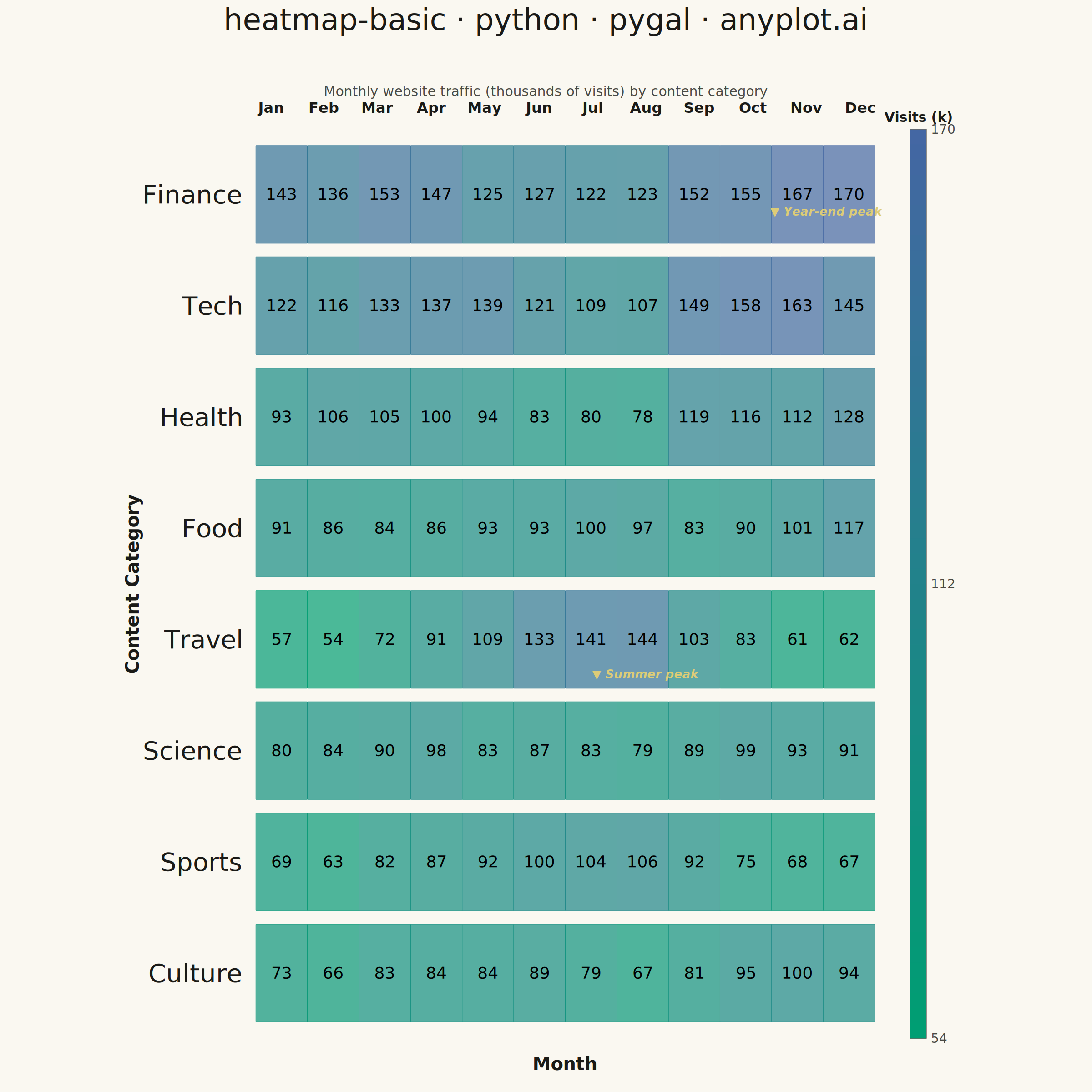
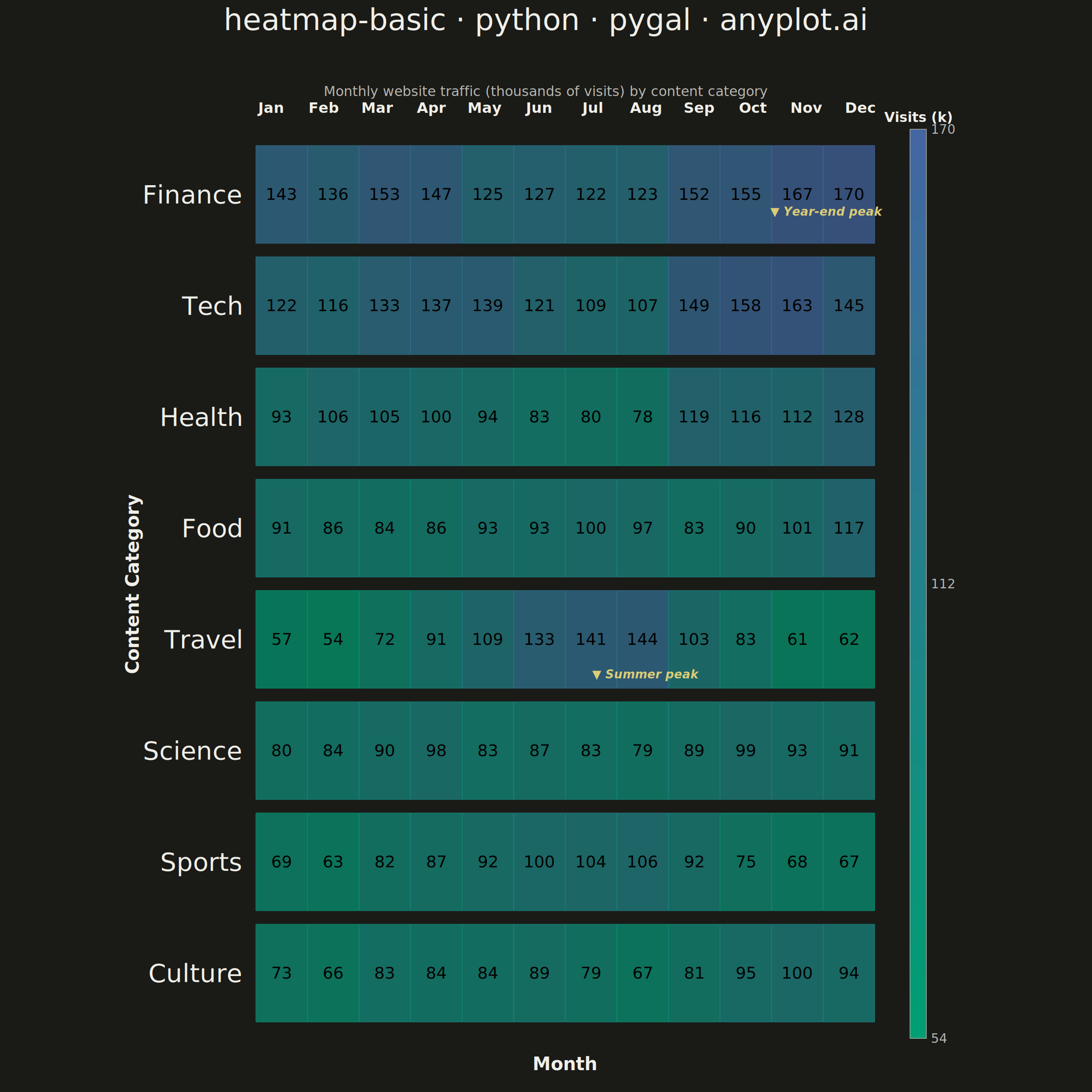
A heatmap displaying values in a matrix format using color intensity. Each cell's color represents the magnitude of the value, making it easy to identify patterns, clusters, and outliers in two-dimensional data. Essential for visualizing correlations, frequencies, and relationships between variables.
""" anyplot.ai
heatmap-basic: Basic Heatmap
Library: pygal 3.1.0 | Python 3.13.13
Quality: 88/100 | Updated: 2026-05-28
"""

import importlib
import os
import re
import sys

import numpy as np


# Import pygal avoiding name collision with this filename
_cwd = sys.path[0]
sys.path[:] = [p for p in sys.path if p != _cwd]
_pygal = importlib.import_module("pygal")
_Style = importlib.import_module("pygal.style").Style
_cairosvg = importlib.import_module("cairosvg")
sys.path.insert(0, _cwd)

# Theme tokens
THEME = os.getenv("ANYPLOT_THEME", "light")
PAGE_BG = "#FAF8F1" if THEME == "light" else "#1A1A17"
INK = "#1A1A17" if THEME == "light" else "#F0EFE8"
INK_SOFT = "#4A4A44" if THEME == "light" else "#B8B7B0"
INK_MUTED = "#6B6A63" if THEME == "light" else "#A8A79F"

# Data — Monthly website traffic (thousands) across content categories
np.random.seed(42)

months = ["Jan", "Feb", "Mar", "Apr", "May", "Jun", "Jul", "Aug", "Sep", "Oct", "Nov", "Dec"]

base_traffic = {
    "Tech": [120, 115, 130, 135, 140, 125, 110, 105, 145, 155, 160, 150],
    "Science": [85, 80, 90, 95, 88, 82, 78, 75, 92, 98, 95, 88],
    "Health": [95, 110, 105, 100, 90, 85, 80, 82, 115, 120, 108, 130],
    "Finance": [140, 135, 150, 145, 130, 125, 120, 118, 155, 160, 165, 173],
    "Sports": [70, 65, 80, 85, 95, 100, 105, 110, 90, 75, 72, 68],
    "Travel": [60, 55, 75, 90, 110, 130, 140, 148, 105, 80, 65, 58],
    "Food": [88, 82, 85, 90, 95, 92, 98, 100, 88, 92, 105, 115],
    "Culture": [72, 68, 78, 82, 85, 88, 75, 70, 80, 90, 95, 92],
}

categories = sorted(base_traffic.keys(), key=lambda c: sum(base_traffic[c]) / len(base_traffic[c]))

matrix = []
for cat in categories:
    row = [max(40, v + np.random.randint(-5, 6)) for v in base_traffic[cat]]
    matrix.append(row)

all_vals = [v for row in matrix for v in row]
vmin, vmax = min(all_vals), max(all_vals)

# Imprint sequential colormap: #009E73 (brand green) → #4467A3 (blue)
# Precompute all cell colors to avoid duplicating interpolation logic
_R0, _G0, _B0 = 0x00, 0x9E, 0x73  # #009E73
_R1, _G1, _B1 = 0x44, 0x67, 0xA3  # #4467A3

cell_hex = {}
cell_rgb = {}
for row_i in range(len(categories)):
    for col_j in range(len(months)):
        t = max(0.0, min(1.0, (matrix[row_i][col_j] - vmin) / (vmax - vmin)))
        rc = int(_R0 + (_R1 - _R0) * t)
        gc = int(_G0 + (_G1 - _G0) * t)
        bc = int(_B0 + (_B1 - _B0) * t)
        cell_hex[(row_i, col_j)] = f"#{rc:02x}{gc:02x}{bc:02x}"
        cell_rgb[(row_i, col_j)] = (rc, gc, bc)

# Colorbar gradient (60 stops, top = vmax, bottom = vmin)
N_CB = 60
cb_hex = []
for s in range(N_CB):
    t = max(0.0, min(1.0, 1.0 - s / (N_CB - 1)))
    rc = int(_R0 + (_R1 - _R0) * t)
    gc = int(_G0 + (_G1 - _G0) * t)
    bc = int(_B0 + (_B1 - _B0) * t)
    cb_hex.append(f"#{rc:02x}{gc:02x}{bc:02x}")

# Plot
title = "heatmap-basic · python · pygal · anyplot.ai"
title_font_size = max(44, round(66 * 67 / len(title))) if len(title) > 67 else 66

IMPRINT_COLORS = (
    "#009E73",
    "#C475FD",
    "#4467A3",
    "#BD8233",
    "#AE3030",
    "#2ABCCD",
    "#954477",
    "#99B314",
    "#009E73",
    "#C475FD",
    "#4467A3",
    "#BD8233",
)

custom_style = _Style(
    background=PAGE_BG,
    plot_background=PAGE_BG,
    foreground=INK,
    foreground_strong=INK,
    foreground_subtle=INK_MUTED,
    colors=IMPRINT_COLORS,
    title_font_size=title_font_size,
    label_font_size=56,
    major_label_font_size=44,
    legend_font_size=44,
    value_font_size=36,
    font_family="sans-serif",
)

chart = _pygal.HorizontalStackedBar(
    width=2400,
    height=2400,
    style=custom_style,
    title=title,
    show_legend=False,
    print_values=True,
    value_font_size=36,
    show_y_guides=False,
    show_x_guides=False,
    show_x_labels=False,
    margin_top=200,
    margin_bottom=100,
    margin_left=300,
    margin_right=450,
    range=(0, 12),
    spacing=0,
    rounded_bars=1,
)
chart.x_labels = categories

for col_j, month in enumerate(months):
    series_data = [
        {"value": 1, "color": cell_hex[(row_i, col_j)], "formatter": lambda x, v=matrix[row_i][col_j]: str(v)}
        for row_i in range(len(categories))
    ]
    chart.add(month, series_data)

# Render SVG via pygal
svg = chart.render(is_unicode=True)

# Post-process SVG: brightness-adaptive text colors for value annotations
overlay_match = re.search(
    r'(<g[^>]*class="plot text-overlay">)(.*?)(</g>\s*<g[^>]*class="plot tooltip-overlay")', svg, re.DOTALL
)
if overlay_match:
    overlay_content = overlay_match.group(2)
    for serie_match in re.finditer(r'(<g class="series serie-(\d+)[^"]*">)(.*?)(</g>)', overlay_content, re.DOTALL):
        col_j = int(serie_match.group(2))
        serie_content = serie_match.group(3)
        value_texts = sorted(
            [
                (float(m.group(2)), m)
                for m in re.finditer(
                    r'(<text\s+text-anchor="middle"\s+x="[^"]+"\s+y="([^"]+)"\s+class="value">)(\d+)(</text>)',
                    serie_content,
                )
            ],
            key=lambda x: x[0],
            reverse=True,
        )
        new_serie = serie_content
        for rank, (_, m) in enumerate(value_texts):
            rc, gc, bc = cell_rgb.get((rank, col_j), (200, 200, 200))
            brightness = (rc * 299 + gc * 587 + bc * 114) / 1000
            txt_color = "#ffffff" if brightness < 140 else "#1a1a1a"
            old_tag = m.group(0)
            new_tag = m.group(1).replace('class="value"', f'class="value" fill="{txt_color}"') + m.group(3) + m.group(4)
            new_serie = new_serie.replace(old_tag, new_tag, 1)
        overlay_content = overlay_content.replace(serie_match.group(3), new_serie, 1)
    svg = svg[: overlay_match.start(2)] + overlay_content + svg[overlay_match.end(2) :]

# Inject month headers, axis titles, colorbar, and peak annotations before </svg>
W, H = 2400, 2400

transform_match = re.search(r"translate\(([^,]+),\s*([^)]+)\)", svg)
plot_x = float(transform_match.group(1)) if transform_match else 400
plot_y = float(transform_match.group(2)) if transform_match else 200

bg_rects = re.findall(r'<rect[^>]*width="([^"]+)"[^>]*height="([^"]+)"[^>]*class="background"', svg)
if len(bg_rects) >= 2:
    plot_w, plot_h = float(bg_rects[1][0]), float(bg_rects[1][1])
else:
    plot_w, plot_h = 1720.0, 2100.0

grid_left = plot_x
grid_top = plot_y
grid_right = plot_x + plot_w
grid_bottom = plot_y + plot_h
cell_w = plot_w / len(months)
cell_h = plot_h / len(categories)

extra = []

# Subtitle
extra.append(
    f'<text x="{W / 2:.0f}" y="{grid_top - 55:.0f}" text-anchor="middle" fill="{INK_SOFT}" '
    f'style="font-size:30px;font-family:sans-serif">'
    f"Monthly website traffic (thousands of visits) by content category</text>"
)

# Month column headers
for col_j, mn in enumerate(months):
    mx = grid_left + col_j * cell_w + cell_w / 2
    extra.append(
        f'<text x="{mx:.0f}" y="{grid_top - 18:.0f}" text-anchor="middle" fill="{INK}" '
        f'style="font-size:32px;font-weight:600;font-family:sans-serif">{mn}</text>'
    )

# X-axis title
extra.append(
    f'<text x="{(grid_left + grid_right) / 2:.0f}" y="{grid_bottom + 52:.0f}" '
    f'text-anchor="middle" fill="{INK}" '
    f'style="font-size:40px;font-weight:bold;font-family:sans-serif">Month</text>'
)

# Y-axis title (rotated)
mid_y = (grid_top + grid_bottom) / 2
extra.append(
    f'<text x="{grid_left - 230:.0f}" y="{mid_y:.0f}" text-anchor="middle" fill="{INK}" '
    f'style="font-size:40px;font-weight:bold;font-family:sans-serif" '
    f'transform="rotate(-90,{grid_left - 230:.0f},{mid_y:.0f})">Content Category</text>'
)

# Colorbar
cb_x = grid_right + 50
cb_w = 36
cb_top = grid_top + 18
cb_bot = grid_bottom - 18
cb_h = cb_bot - cb_top
for s in range(N_CB):
    sy = cb_top + cb_h * s / N_CB
    extra.append(
        f'<rect x="{cb_x:.0f}" y="{sy:.1f}" width="{cb_w}" height="{cb_h / N_CB + 1:.1f}" fill="{cb_hex[s]}"/>'
    )
extra.append(
    f'<rect x="{cb_x:.0f}" y="{cb_top:.0f}" width="{cb_w}" height="{cb_h:.0f}" '
    f'fill="none" stroke="{INK_MUTED}" stroke-width="1.5"/>'
)
for frac, label_val in [(0.0, vmax), (0.5, (vmin + vmax) / 2), (1.0, vmin)]:
    ty = cb_top + cb_h * frac
    extra.append(
        f'<text x="{cb_x + cb_w + 10:.0f}" y="{ty + 10:.0f}" fill="{INK_SOFT}" '
        f'style="font-size:28px;font-family:sans-serif">{label_val:.0f}</text>'
    )
extra.append(
    f'<text x="{cb_x + cb_w / 2:.0f}" y="{cb_top - 16:.0f}" text-anchor="middle" '
    f'fill="{INK}" style="font-size:30px;font-weight:bold;font-family:sans-serif">Visits (k)</text>'
)

# Peak annotations — amber highlight for seasonal storytelling
for cat_name, col_j, label in [("Finance", 11, "Year-end peak"), ("Travel", 7, "Summer peak")]:
    row_i = categories.index(cat_name)
    svg_row = len(categories) - 1 - row_i
    ay = grid_top + svg_row * cell_h + cell_h * 0.82
    if col_j == len(months) - 1:
        ax = grid_right - 10
        anchor = "end"
    else:
        ax = grid_left + col_j * cell_w + cell_w / 2
        anchor = "middle"
    extra.append(
        f'<text x="{ax:.0f}" y="{ay:.0f}" text-anchor="{anchor}" fill="#DDCC77" '
        f'style="font-size:26px;font-weight:bold;font-family:sans-serif;font-style:italic">▼ {label}</text>'
    )

svg = svg.replace("</svg>", "\n".join(extra) + "\n</svg>")

# Save
_cairosvg.svg2png(bytestring=svg.encode("utf-8"), write_to=f"plot-{THEME}.png", output_width=2400, output_height=2400)

with open(f"plot-{THEME}.html", "w", encoding="utf-8") as fout:
    pygal_svg = chart.render(is_unicode=True)
    fout.write(
        f'<!DOCTYPE html>\n<html>\n<head>\n<meta charset="utf-8">\n'
        f"<title>heatmap-basic - python - pygal - anyplot.ai</title>\n"
        f"<style>body{{margin:0;display:flex;justify-content:center;align-items:center;"
        f"min-height:100vh;background:{PAGE_BG};}}.chart{{max-width:100%;height:auto;}}</style>\n"
        f'</head>\n<body>\n<figure class="chart">\n{pygal_svg}\n</figure>\n</body>\n</html>\n'
    )
Runnable source as JSON, for any HTTP client: https://api.anyplot.ai/specs/heatmap-basic/pygal/code. Any spec id and library id listed in llms-full.txt fit the same URL shape; every URL below is complete and callable.
{
  "spec_id": "heatmap-basic",
  "language": "python",
  "library": "pygal",
  "page": "https://anyplot.ai/heatmap-basic/python/pygal",
  "hub": "https://anyplot.ai/heatmap-basic",
  "code_json": "https://api.anyplot.ai/specs/heatmap-basic/pygal/code",
  "spec_json": "https://api.anyplot.ai/specs/heatmap-basic",
  "render_light_png": "https://storage.googleapis.com/anyplot-images/plots/heatmap-basic/python/pygal/plot-light.png",
  "render_dark_png": "https://storage.googleapis.com/anyplot-images/plots/heatmap-basic/python/pygal/plot-dark.png",
  "interactive_light_html": "https://storage.googleapis.com/anyplot-images/plots/heatmap-basic/python/pygal/plot-light.html",
  "interactive_dark_html": "https://storage.googleapis.com/anyplot-images/plots/heatmap-basic/python/pygal/plot-dark.html",
  "quality_score": 88.0,
  "license": "MIT",
  "guide": "https://anyplot.ai/llms.txt"
}
Part of Basic Heatmap on anyplot.ai.