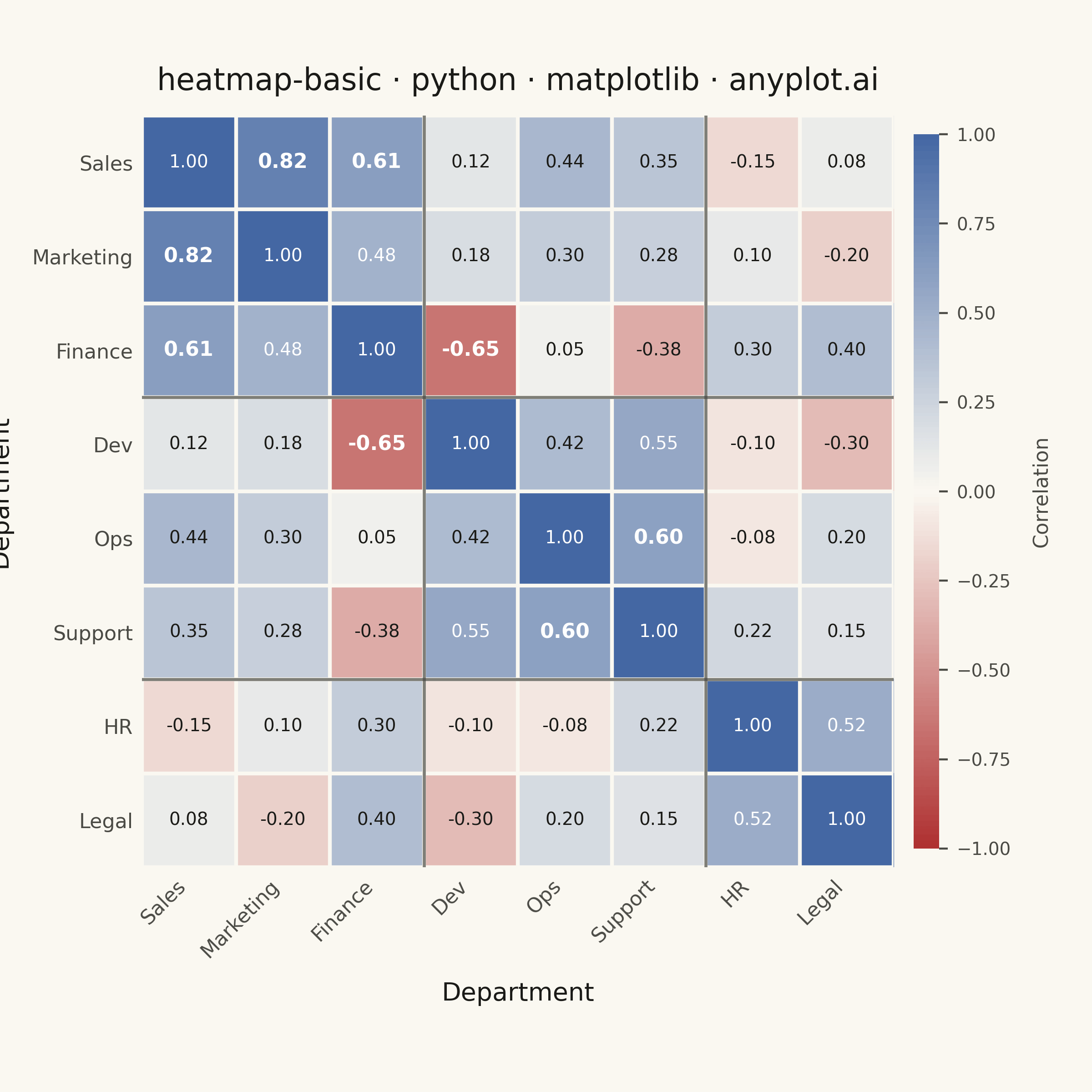
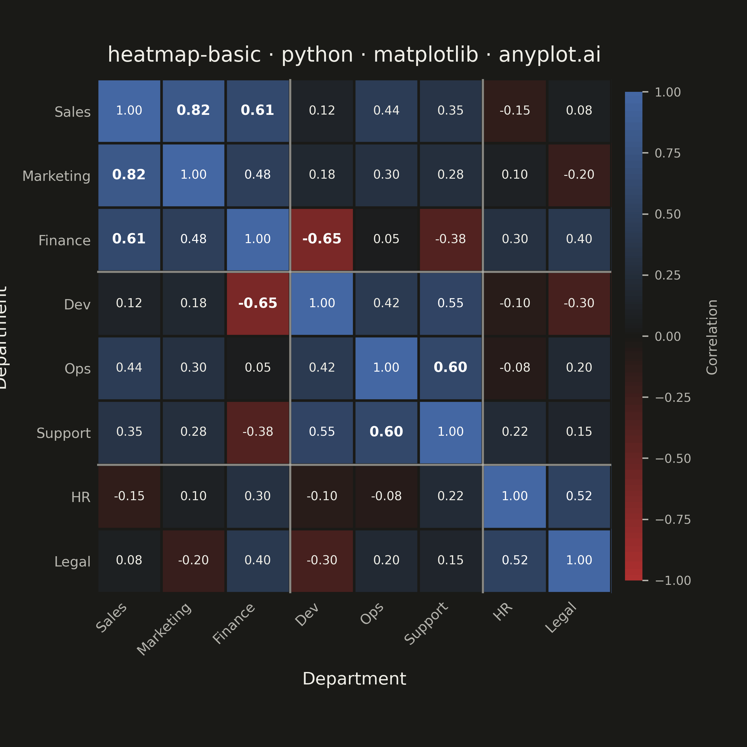
A heatmap displaying values in a matrix format using color intensity. Each cell's color represents the magnitude of the value, making it easy to identify patterns, clusters, and outliers in two-dimensional data. Essential for visualizing correlations, frequencies, and relationships between variables.
""" anyplot.ai
heatmap-basic: Basic Heatmap
Library: matplotlib 3.10.9 | Python 3.13.13
Quality: 92/100 | Updated: 2026-05-28
"""

import os
import sys


# Remove this script's directory from sys.path so "matplotlib" resolves to the
# installed package rather than this file (which shares its name).
_here = os.path.dirname(os.path.abspath(__file__))
sys.path = [p for p in sys.path if os.path.abspath(p) != _here and p != ""]

import matplotlib.pyplot as plt
import numpy as np
from matplotlib.colors import LinearSegmentedColormap, TwoSlopeNorm


# Theme tokens
THEME = os.getenv("ANYPLOT_THEME", "light")
PAGE_BG = "#FAF8F1" if THEME == "light" else "#1A1A17"
INK = "#1A1A17" if THEME == "light" else "#F0EFE8"
INK_SOFT = "#4A4A44" if THEME == "light" else "#B8B7B0"

# Imprint diverging colormap — theme-adaptive midpoint
midpoint = "#FAF8F1" if THEME == "light" else "#1A1A17"
imprint_div = LinearSegmentedColormap.from_list("imprint_div", ["#AE3030", midpoint, "#4467A3"])

# Data — department cross-correlation matrix
# Grouped: Revenue (Sales, Marketing, Finance), Technical (Dev, Ops, Support), Admin (HR, Legal)
departments = ["Sales", "Marketing", "Finance", "Dev", "Ops", "Support", "HR", "Legal"]
n = len(departments)

data = np.array(
    [
        [1.00, 0.82, 0.61, 0.12, 0.44, 0.35, -0.15, 0.08],  # Sales
        [0.82, 1.00, 0.48, 0.18, 0.30, 0.28, 0.10, -0.20],  # Marketing
        [0.61, 0.48, 1.00, -0.65, 0.05, -0.38, 0.30, 0.40],  # Finance
        [0.12, 0.18, -0.65, 1.00, 0.42, 0.55, -0.10, -0.30],  # Dev
        [0.44, 0.30, 0.05, 0.42, 1.00, 0.60, -0.08, 0.20],  # Ops
        [0.35, 0.28, -0.38, 0.55, 0.60, 1.00, 0.22, 0.15],  # Support
        [-0.15, 0.10, 0.30, -0.10, -0.08, 0.22, 1.00, 0.52],  # HR
        [0.08, -0.20, 0.40, -0.30, 0.20, 0.15, 0.52, 1.00],  # Legal
    ]
)

# Plot — square canvas for symmetric matrix (2400×2400 px)
fig, ax = plt.subplots(figsize=(6, 6), dpi=400, facecolor=PAGE_BG)
ax.set_facecolor(PAGE_BG)

norm = TwoSlopeNorm(vmin=-1, vcenter=0, vmax=1)
im = ax.imshow(data, cmap=imprint_div, norm=norm, aspect="equal")

# Remove spines
for spine in ax.spines.values():
    spine.set_visible(False)

# Cell separators via minor-tick grid
ax.set_xticks(np.arange(n + 1) - 0.5, minor=True)
ax.set_yticks(np.arange(n + 1) - 0.5, minor=True)
ax.grid(which="minor", color=PAGE_BG, linewidth=1.5)
ax.tick_params(which="minor", bottom=False, left=False)

# Tick labels
ax.set_xticks(np.arange(n))
ax.set_yticks(np.arange(n))
ax.set_xticklabels(departments, fontsize=8, rotation=45, ha="right", color=INK_SOFT)
ax.set_yticklabels(departments, fontsize=8, color=INK_SOFT)
ax.tick_params(axis="both", length=0, colors=INK_SOFT)

# Group separator lines — Revenue / Technical / Admin clusters
for pos in [2.5, 5.5]:
    ax.axhline(pos, color=INK_SOFT, linewidth=1.2, alpha=0.7, zorder=3)
    ax.axvline(pos, color=INK_SOFT, linewidth=1.2, alpha=0.7, zorder=3)

# Cell annotations — adaptive color: white on deep cells, INK on near-midpoint cells
for i in range(n):
    for j in range(n):
        val = data[i, j]
        strong = abs(val) >= 0.6 and i != j
        text_color = "white" if abs(val) > 0.45 else INK
        ax.text(
            j,
            i,
            f"{val:.2f}",
            ha="center",
            va="center",
            fontsize=7 if not strong else 8,
            fontweight="bold" if strong else "regular",
            color=text_color,
            zorder=4,
        )

# Colorbar — narrow, with symmetric padding
cbar = fig.colorbar(im, ax=ax, fraction=0.032, pad=0.025, aspect=28)
cbar.ax.tick_params(labelsize=7, colors=INK_SOFT)
cbar.set_label("Correlation", fontsize=8, color=INK_SOFT, labelpad=8)
cbar.outline.set_visible(False)

# Title and axis labels
title = "heatmap-basic · python · matplotlib · anyplot.ai"
title_fontsize = max(8, round(12 * 67 / len(title))) if len(title) > 67 else 12
ax.set_title(title, fontsize=title_fontsize, fontweight="medium", color=INK, pad=10)
ax.set_xlabel("Department", fontsize=10, color=INK, labelpad=8)
ax.set_ylabel("Department", fontsize=10, color=INK, labelpad=8)

fig.subplots_adjust(left=0.13, right=0.86, top=0.94, bottom=0.16)
plt.savefig(f"plot-{THEME}.png", dpi=400, facecolor=PAGE_BG)
Runnable source as JSON, for any HTTP client: https://api.anyplot.ai/specs/heatmap-basic/matplotlib/code. Any spec id and library id listed in llms-full.txt fit the same URL shape; every URL below is complete and callable.
{
  "spec_id": "heatmap-basic",
  "language": "python",
  "library": "matplotlib",
  "page": "https://anyplot.ai/heatmap-basic/python/matplotlib",
  "hub": "https://anyplot.ai/heatmap-basic",
  "code_json": "https://api.anyplot.ai/specs/heatmap-basic/matplotlib/code",
  "spec_json": "https://api.anyplot.ai/specs/heatmap-basic",
  "render_light_png": "https://storage.googleapis.com/anyplot-images/plots/heatmap-basic/python/matplotlib/plot-light.png",
  "render_dark_png": "https://storage.googleapis.com/anyplot-images/plots/heatmap-basic/python/matplotlib/plot-dark.png",
  "quality_score": 92.0,
  "license": "MIT",
  "guide": "https://anyplot.ai/llms.txt"
}
Part of Basic Heatmap on anyplot.ai.