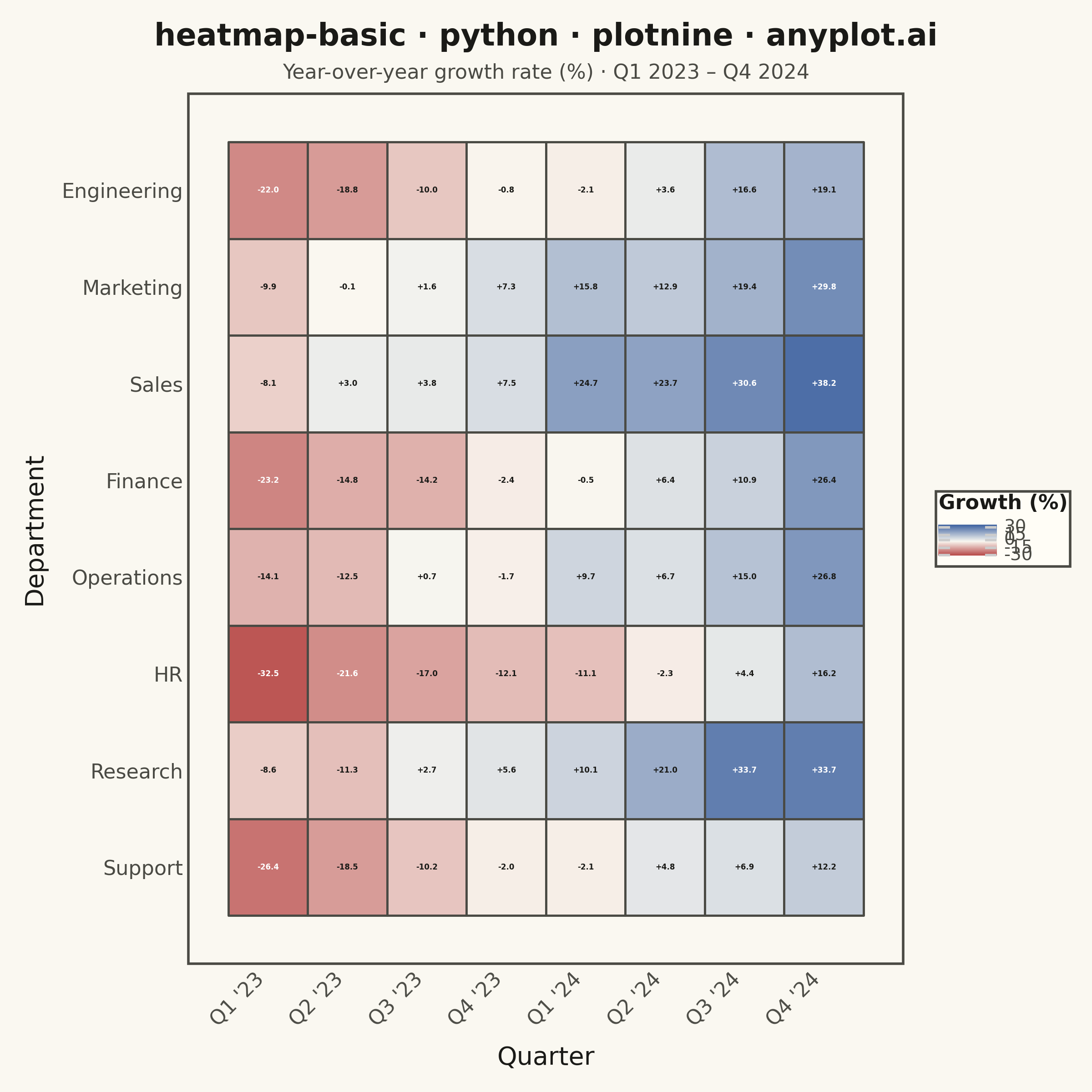
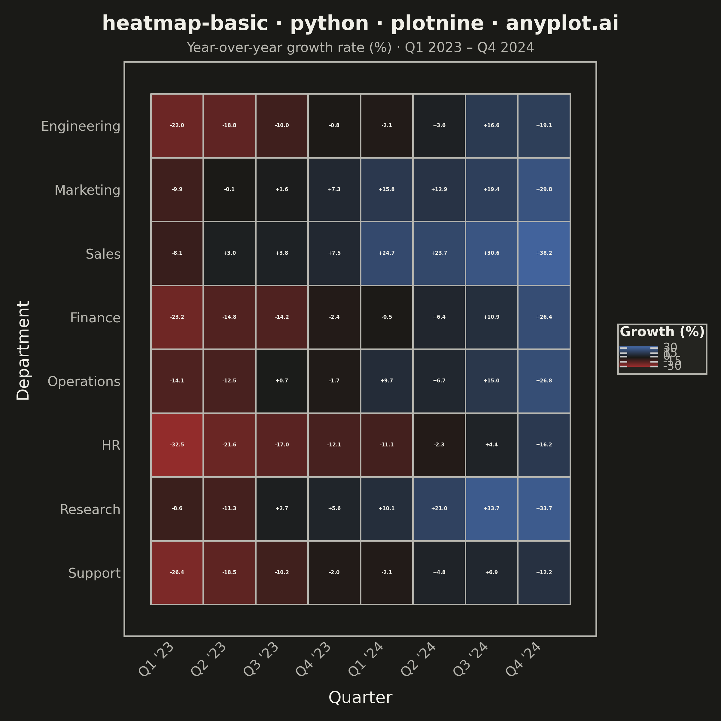
A heatmap displaying values in a matrix format using color intensity. Each cell's color represents the magnitude of the value, making it easy to identify patterns, clusters, and outliers in two-dimensional data. Essential for visualizing correlations, frequencies, and relationships between variables.
""" anyplot.ai
heatmap-basic: Basic Heatmap
Library: plotnine 0.15.4 | Python 3.13.13
Quality: 85/100 | Updated: 2026-05-28
"""

import os

import numpy as np
import pandas as pd
from plotnine import (
    aes,
    element_blank,
    element_rect,
    element_text,
    geom_text,
    geom_tile,
    ggplot,
    labs,
    scale_color_identity,
    scale_fill_gradient2,
    scale_x_discrete,
    scale_y_discrete,
    theme,
    theme_minimal,
)


# Theme tokens
THEME = os.getenv("ANYPLOT_THEME", "light")
PAGE_BG = "#FAF8F1" if THEME == "light" else "#1A1A17"
ELEVATED_BG = "#FFFDF6" if THEME == "light" else "#242420"
INK = "#1A1A17" if THEME == "light" else "#F0EFE8"
INK_SOFT = "#4A4A44" if THEME == "light" else "#B8B7B0"

# Imprint diverging colormap: matte-red → theme-adaptive midpoint → blue
CMAP_MID = "#FAF8F1" if THEME == "light" else "#1A1A17"

# Data — quarterly growth rates (%) across 8 departments over 8 quarters
np.random.seed(42)
departments = ["Engineering", "Marketing", "Sales", "Finance", "Operations", "HR", "Research", "Support"]
quarters = ["Q1 '23", "Q2 '23", "Q3 '23", "Q4 '23", "Q1 '24", "Q2 '24", "Q3 '24", "Q4 '24"]

base_trend = np.linspace(-18, 22, 8)
dept_offsets = np.array([-6, 10, 14, -3, 4, -10, 8, -5])
values = np.round(base_trend[np.newaxis, :] + dept_offsets[:, np.newaxis] + np.random.normal(0, 4, (8, 8)), 1)

values[5, 0] = -32.5  # HR deep crisis Q1 '23
values[2, 7] = 38.2  # Sales strong recovery Q4 '24
values[6, 6] = 33.7  # Research surge Q3 '24

dept_idx, qtr_idx = np.meshgrid(np.arange(8), np.arange(8), indexing="ij")
df = pd.DataFrame(
    {
        "Department": pd.Categorical(
            [departments[i] for i in dept_idx.ravel()], categories=departments[::-1], ordered=True
        ),
        "Quarter": pd.Categorical([quarters[j] for j in qtr_idx.ravel()], categories=quarters, ordered=True),
        "Growth (%)": values.ravel(),
    }
)

# Theme-adaptive text color: white on dark extremes, INK on mid-range
if THEME == "light":
    df["text_color"] = np.where(df["Growth (%)"] < -20, "white", np.where(df["Growth (%)"] > 28, "white", INK))
else:
    df["text_color"] = INK  # light cream on all dark cells in dark theme

df["label"] = [f"{v:+.1f}" for v in df["Growth (%)"]]

# Standard title format — no descriptive prefix needed on square canvas (2400px wide)
title = "heatmap-basic · python · plotnine · anyplot.ai"
n = len(title)
title_fs = max(8, round(12 * 67 / n)) if n > 67 else 12

# Plot
plot = (
    ggplot(df, aes(x="Quarter", y="Department"))
    + geom_tile(aes(fill="Growth (%)"), color=INK_SOFT, size=0.5)
    + geom_text(aes(label="label", color="text_color"), size=3, fontweight="bold", show_legend=False)
    + scale_fill_gradient2(
        low="#AE3030",
        mid=CMAP_MID,
        high="#4467A3",
        midpoint=0,
        name="Growth (%)",
        limits=(-35, 40),
        breaks=[-30, -15, 0, 15, 30],
    )
    + scale_color_identity()
    + scale_x_discrete(expand=(0, 0.5))
    + scale_y_discrete(expand=(0, 0.5))
    + labs(x="Quarter", y="Department", title=title, subtitle="Year-over-year growth rate (%) · Q1 2023 – Q4 2024")
    + theme_minimal()
    + theme(
        figure_size=(6, 6),
        text=element_text(family="sans-serif", color=INK),
        plot_title=element_text(size=title_fs, ha="center", weight="bold", color=INK),
        plot_subtitle=element_text(size=8, ha="center", color=INK_SOFT),
        axis_title_x=element_text(size=10, color=INK, margin={"t": 6}),
        axis_title_y=element_text(size=10, color=INK, margin={"r": 6}),
        axis_text_x=element_text(size=8, color=INK_SOFT, rotation=45, ha="right"),
        axis_text_y=element_text(size=8, color=INK_SOFT, ha="right"),
        legend_title=element_text(size=8, weight="bold", color=INK),
        legend_text=element_text(size=7, color=INK_SOFT),
        legend_position="right",
        legend_key_height=12,
        legend_background=element_rect(fill=ELEVATED_BG, color=INK_SOFT),
        panel_grid_major=element_blank(),
        panel_grid_minor=element_blank(),
        panel_background=element_rect(fill=PAGE_BG),
        panel_border=element_rect(color=INK_SOFT, fill=None),
        plot_background=element_rect(fill=PAGE_BG, color=PAGE_BG),
        plot_margin=0.02,
    )
)

plot.save(f"plot-{THEME}.png", dpi=400, width=6, height=6, units="in", verbose=False)
Runnable source as JSON, for any HTTP client: https://api.anyplot.ai/specs/heatmap-basic/plotnine/code. Any spec id and library id listed in llms-full.txt fit the same URL shape; every URL below is complete and callable.
{
  "spec_id": "heatmap-basic",
  "language": "python",
  "library": "plotnine",
  "page": "https://anyplot.ai/heatmap-basic/python/plotnine",
  "hub": "https://anyplot.ai/heatmap-basic",
  "code_json": "https://api.anyplot.ai/specs/heatmap-basic/plotnine/code",
  "spec_json": "https://api.anyplot.ai/specs/heatmap-basic",
  "render_light_png": "https://storage.googleapis.com/anyplot-images/plots/heatmap-basic/python/plotnine/plot-light.png",
  "render_dark_png": "https://storage.googleapis.com/anyplot-images/plots/heatmap-basic/python/plotnine/plot-dark.png",
  "quality_score": 85.0,
  "license": "MIT",
  "guide": "https://anyplot.ai/llms.txt"
}
Part of Basic Heatmap on anyplot.ai.