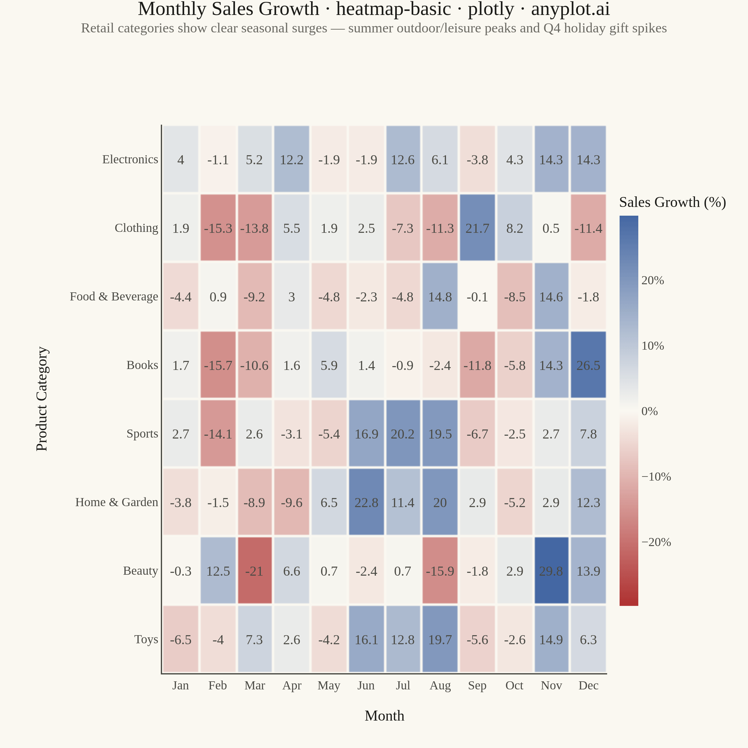
A heatmap displaying values in a matrix format using color intensity. Each cell's color represents the magnitude of the value, making it easy to identify patterns, clusters, and outliers in two-dimensional data. Essential for visualizing correlations, frequencies, and relationships between variables.
""" anyplot.ai
heatmap-basic: Basic Heatmap
Library: plotly 6.7.0 | Python 3.13.13
Quality: 91/100 | Updated: 2026-05-28
"""

import os

import numpy as np
import plotly.graph_objects as go


# Theme-adaptive chrome
THEME = os.getenv("ANYPLOT_THEME", "light")
PAGE_BG = "#FAF8F1" if THEME == "light" else "#1A1A17"
INK = "#1A1A17" if THEME == "light" else "#F0EFE8"
INK_SOFT = "#4A4A44" if THEME == "light" else "#B8B7B0"
INK_MUTED = "#6B6A63" if THEME == "light" else "#A8A79F"
GRID = "rgba(26,26,23,0.15)" if THEME == "light" else "rgba(240,239,232,0.15)"

# Imprint diverging colorscale — matte-red ↔ [theme-adaptive midpoint] ↔ blue
_mid = "#FAF8F1" if THEME == "light" else "#1A1A17"
imprint_div = [[0.0, "#AE3030"], [0.5, _mid], [1.0, "#4467A3"]]

# Data
np.random.seed(42)

months = ["Jan", "Feb", "Mar", "Apr", "May", "Jun", "Jul", "Aug", "Sep", "Oct", "Nov", "Dec"]
categories = ["Electronics", "Clothing", "Food & Beverage", "Books", "Sports", "Home & Garden", "Beauty", "Toys"]

# Monthly sales growth (%) relative to annual average — realistic seasonal patterns
base = np.random.randn(len(categories), len(months)) * 8
for i, cat in enumerate(categories):
    if cat in ("Sports", "Toys", "Home & Garden"):
        base[i, 5:8] += 12  # Summer peak
    if cat in ("Electronics", "Toys", "Books", "Beauty"):
        base[i, 10:12] += 18  # Holiday season lift
    if cat == "Food & Beverage":
        base[i, 10:12] += 8  # Modest holiday lift
    if cat == "Clothing":
        base[i, 3:5] += 10  # Spring fashion
        base[i, 8:10] += 10  # Back-to-school
values = np.round(base, 1)

# Symmetric color range so zero is exactly the midpoint of the diverging scale
abs_max = float(np.abs(values).max())

font_family = "Palatino, Georgia, serif"

# Plot
fig = go.Figure(
    data=go.Heatmap(
        z=values,
        x=months,
        y=categories,
        colorscale=imprint_div,
        zmid=0,
        zmin=-abs_max,
        zmax=abs_max,
        colorbar={
            "title": {"text": "Sales Growth (%)", "font": {"size": 12, "family": font_family, "color": INK}},
            "tickfont": {"size": 10, "family": font_family, "color": INK_SOFT},
            "ticksuffix": "%",
            "thickness": 15,
            "len": 0.80,
            "x": 1.01,
            "xpad": 6,
            "outlinewidth": 0,
            "bgcolor": PAGE_BG,
        },
        text=values,
        texttemplate="%{text:+.1f}",
        textfont={"size": 11, "family": font_family, "color": INK_SOFT},
        hovertemplate="<b>%{y}</b> · %{x}<br>Growth: %{z:+.1f}%<extra></extra>",
        xgap=2,
        ygap=2,
    )
)

title_str = (
    "Monthly Sales Growth · heatmap-basic · plotly · anyplot.ai"
    f"<br><sup style='color:{INK_MUTED}; font-size:10px;'>"
    "Retail categories show clear seasonal surges — "
    "summer outdoor/leisure peaks and Q4 holiday gift spikes"
    "</sup>"
)

fig.update_layout(
    autosize=False,
    paper_bgcolor=PAGE_BG,
    plot_bgcolor=PAGE_BG,
    font={"color": INK, "family": font_family},
    title={
        "text": title_str,
        "font": {"size": 16, "family": font_family, "color": INK},
        "x": 0.5,
        "xanchor": "center",
        "y": 0.98,
        "yanchor": "top",
    },
    xaxis={
        "title": {"text": "Month", "font": {"size": 12, "family": font_family, "color": INK}},
        "tickfont": {"size": 10, "family": font_family, "color": INK_SOFT},
        "side": "bottom",
        "showgrid": False,
        "linecolor": INK_SOFT,
    },
    yaxis={
        "title": {"text": "Product Category", "font": {"size": 12, "family": font_family, "color": INK}},
        "tickfont": {"size": 10, "family": font_family, "color": INK_SOFT},
        "autorange": "reversed",
        "showgrid": False,
        "linecolor": INK_SOFT,
    },
    template="plotly_white",
    # Square canvas: 600×600 at scale=4 → 2400×2400 px (heatmap = symmetric content)
    margin={"l": 130, "r": 80, "t": 100, "b": 60},
    width=600,
    height=600,
)

# Save — square 2400×2400 canvas
fig.write_image(f"plot-{THEME}.png", width=600, height=600, scale=4)
fig.write_html(f"plot-{THEME}.html", include_plotlyjs="cdn")
Runnable source as JSON, for any HTTP client: https://api.anyplot.ai/specs/heatmap-basic/plotly/code. Any spec id and library id listed in llms-full.txt fit the same URL shape; every URL below is complete and callable.
{
  "spec_id": "heatmap-basic",
  "language": "python",
  "library": "plotly",
  "page": "https://anyplot.ai/heatmap-basic/python/plotly",
  "hub": "https://anyplot.ai/heatmap-basic",
  "code_json": "https://api.anyplot.ai/specs/heatmap-basic/plotly/code",
  "spec_json": "https://api.anyplot.ai/specs/heatmap-basic",
  "render_light_png": "https://storage.googleapis.com/anyplot-images/plots/heatmap-basic/python/plotly/plot-light.png",
  "render_dark_png": "https://storage.googleapis.com/anyplot-images/plots/heatmap-basic/python/plotly/plot-dark.png",
  "interactive_light_html": "https://storage.googleapis.com/anyplot-images/plots/heatmap-basic/python/plotly/plot-light.html",
  "interactive_dark_html": "https://storage.googleapis.com/anyplot-images/plots/heatmap-basic/python/plotly/plot-dark.html",
  "quality_score": 91.0,
  "license": "MIT",
  "guide": "https://anyplot.ai/llms.txt"
}
Part of Basic Heatmap on anyplot.ai.