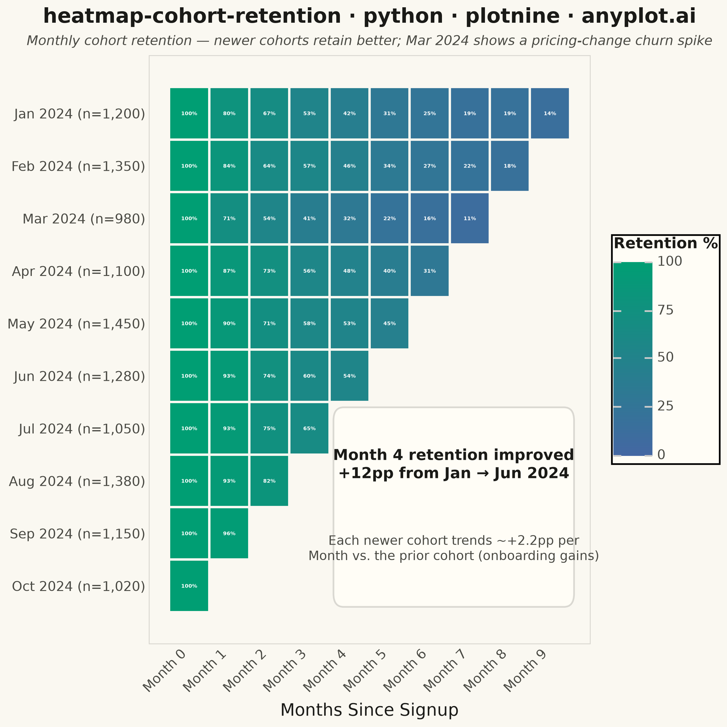
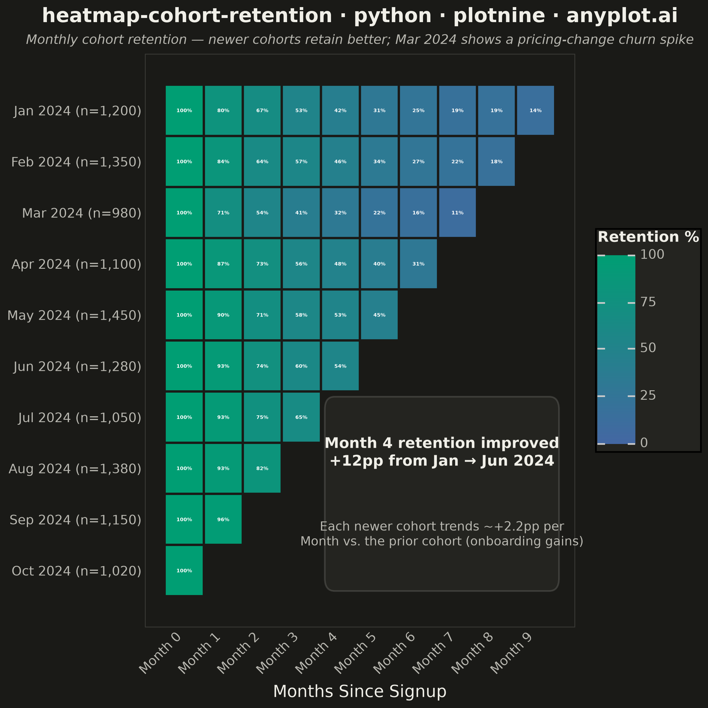
A triangular heatmap displaying user retention rates across signup cohorts and time periods. Each row represents a cohort (e.g., users who signed up in a specific month), each column represents periods since signup, and cell color intensity indicates the retention percentage. The triangular shape naturally emerges because more recent cohorts have fewer elapsed periods. This visualization reveals retention trends, highlights churn patterns, and enables comparison of cohort quality over time.
Preview render from the plotnine implementation.