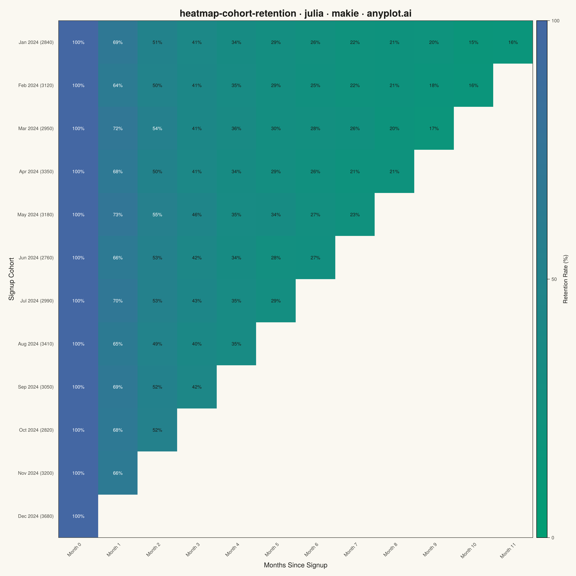
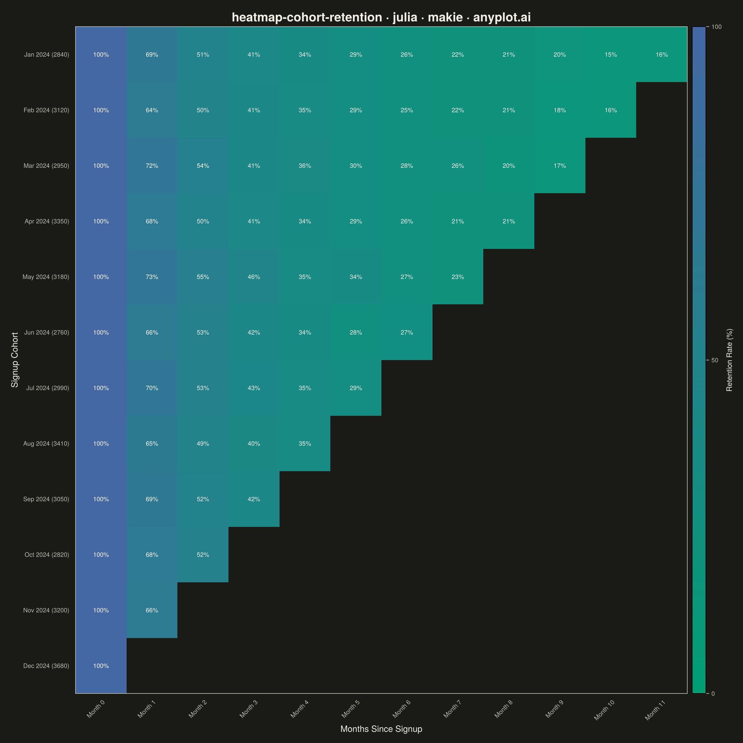
A triangular heatmap displaying user retention rates across signup cohorts and time periods. Each row represents a cohort (e.g., users who signed up in a specific month), each column represents periods since signup, and cell color intensity indicates the retention percentage. The triangular shape naturally emerges because more recent cohorts have fewer elapsed periods. This visualization reveals retention trends, highlights churn patterns, and enables comparison of cohort quality over time.
# anyplot.ai
# heatmap-cohort-retention: Cohort Retention Heatmap
# Library: makie 0.22.10 | Julia 1.11.9
# Quality: 87/100 | Created: 2026-06-20

using CairoMakie
using Colors
using ColorSchemes
using Random

Random.seed!(42)

# Theme tokens
const THEME       = get(ENV, "ANYPLOT_THEME", "light")
const PAGE_BG     = THEME == "light" ? colorant"#FAF8F1" : colorant"#1A1A17"
const ELEVATED_BG = THEME == "light" ? colorant"#FFFDF6" : colorant"#242420"
const INK         = THEME == "light" ? colorant"#1A1A17" : colorant"#F0EFE8"
const INK_SOFT    = THEME == "light" ? colorant"#4A4A44" : colorant"#B8B7B0"
const INK_MUTED   = THEME == "light" ? colorant"#6B6A63" : colorant"#A8A79F"

# Imprint sequential colormap for single-polarity continuous data (low → high retention)
const ANYPLOT_SEQ = cgrad([colorant"#009E73", colorant"#4467A3"])

# Data — monthly SaaS cohort retention, Jan–Dec 2024
const cohort_months = ["Jan 2024", "Feb 2024", "Mar 2024", "Apr 2024",
                       "May 2024", "Jun 2024", "Jul 2024", "Aug 2024",
                       "Sep 2024", "Oct 2024", "Nov 2024", "Dec 2024"]
const n_cohorts = 12
const n_periods = 12
const cohort_sizes  = [2840, 3120, 2950, 3350, 3180, 2760, 2990, 3410, 3050, 2820, 3200, 3680]
const base_rates    = [1.00, 0.68, 0.52, 0.42, 0.35, 0.30, 0.26, 0.23, 0.20, 0.18, 0.16, 0.15]
const cohort_quality = [1.00, 0.97, 1.03, 0.98, 1.05, 0.99, 1.02, 0.96, 1.04, 1.01, 0.98, 1.03]

# retention_data[period_idx, cohort_idx]; NaN for future periods (triangular shape)
retention_data = fill(NaN32, n_periods, n_cohorts)
for c in 1:n_cohorts
    for p in 0:(n_cohorts - c)
        pi = p + 1
        if p == 0
            retention_data[pi, c] = 100.0f0
        else
            v = base_rates[pi] * cohort_quality[c] + randn() * 0.015
            retention_data[pi, c] = Float32(clamp(v * 100.0, 5.0, 99.9))
        end
    end
end

# Tick labels
y_labels = ["$(cohort_months[c]) ($(cohort_sizes[c]))" for c in 1:n_cohorts]
x_labels = ["Month $(p-1)" for p in 1:n_periods]

# Plot — square canvas → 2400 × 2400 px output
fig = Figure(
    size            = (1200, 1200),
    fontsize        = 14,
    backgroundcolor = PAGE_BG,
)

ax = Axis(
    fig[1, 1];
    title               = "heatmap-cohort-retention · julia · makie · anyplot.ai",
    titlesize           = 20,
    titlecolor          = INK,
    xlabel              = "Months Since Signup",
    xlabelcolor         = INK,
    xlabelsize          = 14,
    ylabel              = "Signup Cohort",
    ylabelcolor         = INK,
    ylabelsize          = 14,
    xticklabelsize      = 10,
    yticklabelsize      = 10,
    xticklabelcolor     = INK_SOFT,
    yticklabelcolor     = INK_SOFT,
    xtickcolor          = PAGE_BG,
    ytickcolor          = PAGE_BG,
    xticklabelrotation  = π / 4,
    backgroundcolor     = PAGE_BG,
    topspinevisible     = true,
    rightspinevisible   = true,
    topspinecolor       = INK_SOFT,
    rightspinecolor     = INK_SOFT,
    leftspinecolor      = INK_SOFT,
    bottomspinecolor    = INK_SOFT,
    xgridvisible        = false,
    ygridvisible        = false,
    yreversed           = true,
    xticks              = (1:n_periods, x_labels),
    yticks              = (1:n_cohorts, y_labels),
)

# Heatmap — NaN cells rendered in PAGE_BG (triangular cutout)
hm = heatmap!(ax, 1:n_periods, 1:n_cohorts, retention_data;
    colormap   = ANYPLOT_SEQ,
    colorrange = (0.0f0, 100.0f0),
    nan_color  = PAGE_BG,
)

# Text annotations — batch all valid cells into one text! call
# Use luminance-adaptive text colors: dark ink on lighter cells, white on darker cells
function cell_text_color(v)
    t = clamp(v / 100.0, 0.0, 1.0)
    bg = get(ANYPLOT_SEQ, t)
    to_linear(c) = c <= 0.04045 ? c / 12.92 : ((c + 0.055) / 1.055)^2.4
    lum = 0.2126 * to_linear(red(bg)) + 0.7152 * to_linear(green(bg)) + 0.0722 * to_linear(blue(bg))
    return lum > 0.179 ? INK : colorant"#FFFFFF"
end

text_xs     = Float64[]
text_ys     = Float64[]
text_strs   = String[]
text_colors = RGBAf[]
for c in 1:n_cohorts, p in 1:n_periods
    v = retention_data[p, c]
    isnan(v) && continue
    push!(text_xs,     Float64(p))
    push!(text_ys,     Float64(c))
    push!(text_strs,   "$(round(Int, v))%")
    push!(text_colors, RGBAf(cell_text_color(v)))
end

text!(ax, text_xs, text_ys;
    text     = text_strs,
    color    = text_colors,
    align    = (:center, :center),
    fontsize = 10,
)

# Colorbar
Colorbar(fig[1, 2], hm;
    label          = "Retention Rate (%)",
    labelcolor     = INK,
    labelsize      = 12,
    ticklabelcolor = INK_SOFT,
    ticklabelsize  = 10,
    tickcolor      = INK_SOFT,
    width          = 22,
)

colgap!(fig.layout, 8)

# Save
save("plot-$(THEME).png", fig; px_per_unit = 2)
Runnable source as JSON, for any HTTP client: https://api.anyplot.ai/specs/heatmap-cohort-retention/makie/code. Any spec id and library id listed in llms-full.txt fit the same URL shape; every URL below is complete and callable.
{
  "spec_id": "heatmap-cohort-retention",
  "language": "julia",
  "library": "makie",
  "page": "https://anyplot.ai/heatmap-cohort-retention/julia/makie",
  "hub": "https://anyplot.ai/heatmap-cohort-retention",
  "code_json": "https://api.anyplot.ai/specs/heatmap-cohort-retention/makie/code",
  "spec_json": "https://api.anyplot.ai/specs/heatmap-cohort-retention",
  "render_light_png": "https://storage.googleapis.com/anyplot-images/plots/heatmap-cohort-retention/julia/makie/plot-light.png",
  "render_dark_png": "https://storage.googleapis.com/anyplot-images/plots/heatmap-cohort-retention/julia/makie/plot-dark.png",
  "quality_score": 87.0,
  "license": "MIT",
  "guide": "https://anyplot.ai/llms.txt"
}
Part of Cohort Retention Heatmap on anyplot.ai.