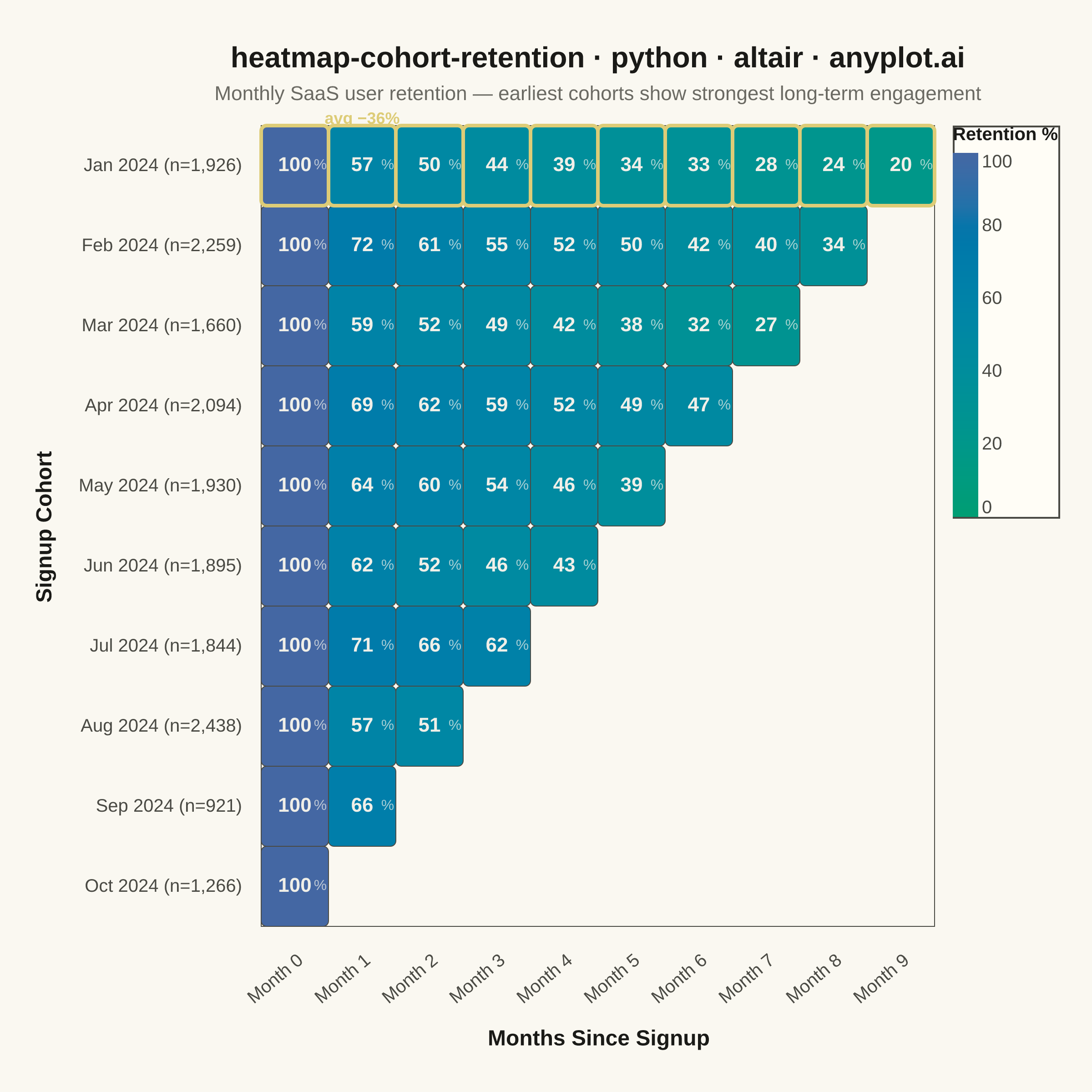
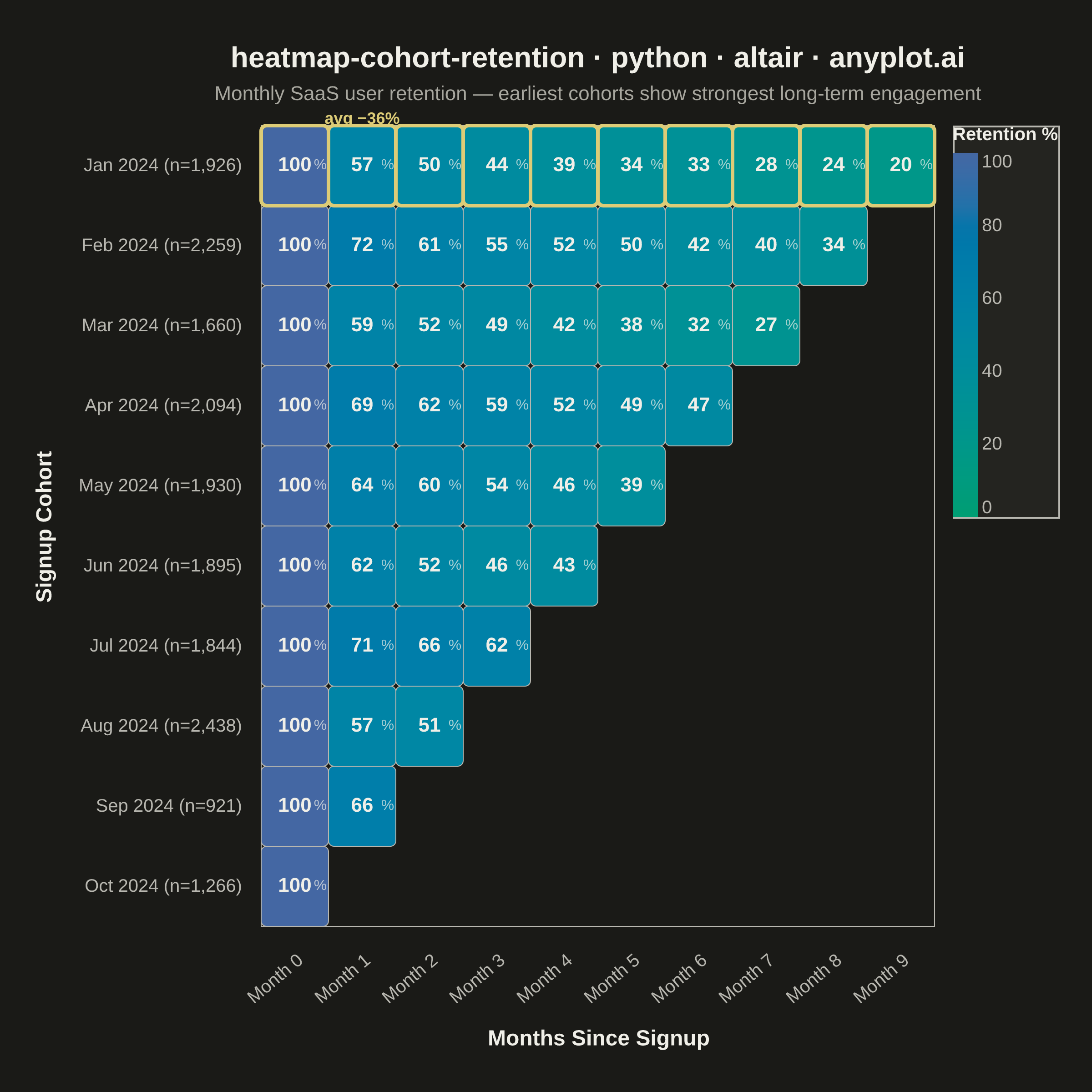
A triangular heatmap displaying user retention rates across signup cohorts and time periods. Each row represents a cohort (e.g., users who signed up in a specific month), each column represents periods since signup, and cell color intensity indicates the retention percentage. The triangular shape naturally emerges because more recent cohorts have fewer elapsed periods. This visualization reveals retention trends, highlights churn patterns, and enables comparison of cohort quality over time.
""" anyplot.ai
heatmap-cohort-retention: Cohort Retention Heatmap
Library: altair 6.2.1 | Python 3.13.14
Quality: 94/100 | Updated: 2026-06-20
"""

import os

import altair as alt
import numpy as np
import pandas as pd
from PIL import Image


# Theme tokens
THEME = os.getenv("ANYPLOT_THEME", "light")
PAGE_BG = "#FAF8F1" if THEME == "light" else "#1A1A17"
ELEVATED_BG = "#FFFDF6" if THEME == "light" else "#242420"
INK = "#1A1A17" if THEME == "light" else "#F0EFE8"
INK_SOFT = "#4A4A44" if THEME == "light" else "#B8B7B0"
INK_MUTED = "#6B6A63" if THEME == "light" else "#A8A79F"

# Imprint sequential colormap: brand green → blue (single-polarity continuous data)
SEQ_LOW = "#009E73"  # brand green — low retention
SEQ_HIGH = "#4467A3"  # blue — high retention
ANYPLOT_AMBER = "#DDCC77"  # warning / caution — callout annotations

# Data
np.random.seed(42)

cohort_labels = [
    "Jan 2024",
    "Feb 2024",
    "Mar 2024",
    "Apr 2024",
    "May 2024",
    "Jun 2024",
    "Jul 2024",
    "Aug 2024",
    "Sep 2024",
    "Oct 2024",
]
n_cohorts = len(cohort_labels)
n_periods = 10
cohort_sizes = np.random.randint(800, 2500, size=n_cohorts)

# Build retention data with realistic decay patterns
rows = []
for i, cohort in enumerate(cohort_labels):
    max_periods = n_cohorts - i
    for period in range(max_periods):
        if period == 0:
            retention = 100.0
        elif period == 1:
            retention = np.random.uniform(55, 72)
        else:
            decay = np.random.uniform(0.85, 0.95)
            retention = rows[-1]["retention_rate"] * decay
            retention += np.random.uniform(-2, 2)
            retention = max(5, min(retention, 100))
        rows.append(
            {
                "cohort": cohort,
                "cohort_label": f"{cohort} (n={cohort_sizes[i]:,})",
                "period": period,
                "period_label": f"Month {period}",
                "retention_rate": round(retention, 1),
            }
        )

df = pd.DataFrame(rows)

cohort_order = [f"{c} (n={s:,})" for c, s in zip(cohort_labels, cohort_sizes, strict=True)]
period_order = [f"Month {p}" for p in range(n_periods)]

# Average Month 0→1 retention drop — used for cliff callout annotation
avg_month1_retention = df[df["period"] == 1]["retention_rate"].mean()
avg_drop = round(100 - avg_month1_retention)

# Title — len=55 < 67, no font-size shrink needed; default 16px applies
title = "heatmap-cohort-retention · python · altair · anyplot.ai"
title_fontsize = 16

# Heatmap rectangles — Imprint sequential palette
heatmap = (
    alt.Chart(df)
    .mark_rect(stroke=INK_SOFT, strokeWidth=0.5, cornerRadius=3)
    .encode(
        x=alt.X(
            "period_label:O",
            title="Months Since Signup",
            sort=period_order,
            axis=alt.Axis(
                labelFontSize=10,
                titleFontSize=12,
                titleFontWeight="bold",
                labelAngle=-40,
                domainWidth=0,
                tickWidth=0,
                titlePadding=12,
                labelPadding=8,
            ),
        ),
        y=alt.Y(
            "cohort_label:O",
            title="Signup Cohort",
            sort=cohort_order,
            axis=alt.Axis(
                labelFontSize=10,
                titleFontSize=12,
                titleFontWeight="bold",
                domainWidth=0,
                tickWidth=0,
                titlePadding=12,
                labelPadding=6,
            ),
        ),
        color=alt.Color(
            "retention_rate:Q",
            scale=alt.Scale(domain=[0, 100], range=[SEQ_LOW, SEQ_HIGH]),
            legend=alt.Legend(
                title="Retention %",
                titleFontSize=10,
                titleFontWeight="bold",
                labelFontSize=10,
                gradientLength=200,
                gradientThickness=14,
                orient="right",
                offset=10,
            ),
        ),
        tooltip=[
            alt.Tooltip("cohort:N", title="Cohort"),
            alt.Tooltip("period_label:O", title="Period"),
            alt.Tooltip("retention_rate:Q", title="Retention %", format=".1f"),
        ],
    )
)

# Retention rate value inside each cell
text = (
    alt.Chart(df)
    .mark_text(fontSize=11, fontWeight="bold")
    .encode(
        x=alt.X("period_label:O", sort=period_order),
        y=alt.Y("cohort_label:O", sort=cohort_order),
        text=alt.Text("retention_rate:Q", format=".0f"),
        color=alt.value("#F0EFE8"),
    )
)

# Percent symbol — smaller, offset right for typographic polish
pct = (
    alt.Chart(df)
    .mark_text(fontSize=8, fontWeight="normal", dx=14)
    .encode(
        x=alt.X("period_label:O", sort=period_order),
        y=alt.Y("cohort_label:O", sort=cohort_order),
        text=alt.value("%"),
        color=alt.value("rgba(240,239,232,0.7)"),
    )
)

# Amber border on Jan 2024 row confirms the subtitle insight (earliest = strongest)
jan_df = df[df["cohort"] == "Jan 2024"].copy()
jan_highlight = (
    alt.Chart(jan_df)
    .mark_rect(fill=None, stroke=ANYPLOT_AMBER, strokeWidth=2, cornerRadius=3)
    .encode(x=alt.X("period_label:O", sort=period_order), y=alt.Y("cohort_label:O", sort=cohort_order))
)

# Callout annotation at top of Month 1 column for the ~Month 0→1 retention cliff
cliff_df = pd.DataFrame(
    [{"period_label": "Month 1", "cohort_label": cohort_order[0], "annotation": f"avg −{avg_drop}%"}]
)
cliff_label = (
    alt.Chart(cliff_df)
    .mark_text(fontSize=9, fontWeight="bold", dy=-26, color=ANYPLOT_AMBER, clip=False)
    .encode(
        x=alt.X("period_label:O", sort=period_order), y=alt.Y("cohort_label:O", sort=cohort_order), text="annotation:N"
    )
)

# Combine layers — square canvas (2400×2400) for symmetric heatmap grid
chart = (
    alt.layer(heatmap, jan_highlight, text, pct, cliff_label)
    .properties(
        width=370,
        height=440,
        background=PAGE_BG,
        title=alt.Title(
            title,
            fontSize=title_fontsize,
            fontWeight="bold",
            anchor="middle",
            color=INK,
            subtitle="Monthly SaaS user retention — earliest cohorts show strongest long-term engagement",
            subtitleFontSize=11,
            subtitleColor=INK_MUTED,
            subtitlePadding=6,
        ),
    )
    .configure_view(fill=PAGE_BG, stroke=INK_SOFT, strokeWidth=0.5)
    .configure_axis(domainColor=INK_SOFT, tickColor=INK_SOFT, gridOpacity=0.0, labelColor=INK_SOFT, titleColor=INK)
    .configure_legend(fillColor=ELEVATED_BG, strokeColor=INK_SOFT, labelColor=INK_SOFT, titleColor=INK)
)

# Save PNG — then pad-only to exactly 2400×2400
chart.save(f"plot-{THEME}.png", scale_factor=4.0)

TW, TH = 2400, 2400
_img = Image.open(f"plot-{THEME}.png").convert("RGB")
_w, _h = _img.size
if _w > TW or _h > TH:
    raise SystemExit(
        f"altair vl-convert produced {_w}×{_h}, exceeds target {TW}×{TH}. "
        f"Shrink chart .properties(width=, height=) values and re-render."
    )
if _w < TW or _h < TH:
    _canvas = Image.new("RGB", (TW, TH), PAGE_BG)
    _canvas.paste(_img, ((TW - _w) // 2, (TH - _h) // 2))
    _canvas.save(f"plot-{THEME}.png")

# Interactive HTML (no padding applied — only PNGs are gated)
chart.save(f"plot-{THEME}.html")
Runnable source as JSON, for any HTTP client: https://api.anyplot.ai/specs/heatmap-cohort-retention/altair/code. Any spec id and library id listed in llms-full.txt fit the same URL shape; every URL below is complete and callable.
{
  "spec_id": "heatmap-cohort-retention",
  "language": "python",
  "library": "altair",
  "page": "https://anyplot.ai/heatmap-cohort-retention/python/altair",
  "hub": "https://anyplot.ai/heatmap-cohort-retention",
  "code_json": "https://api.anyplot.ai/specs/heatmap-cohort-retention/altair/code",
  "spec_json": "https://api.anyplot.ai/specs/heatmap-cohort-retention",
  "render_light_png": "https://storage.googleapis.com/anyplot-images/plots/heatmap-cohort-retention/python/altair/plot-light.png",
  "render_dark_png": "https://storage.googleapis.com/anyplot-images/plots/heatmap-cohort-retention/python/altair/plot-dark.png",
  "interactive_light_html": "https://storage.googleapis.com/anyplot-images/plots/heatmap-cohort-retention/python/altair/plot-light.html",
  "interactive_dark_html": "https://storage.googleapis.com/anyplot-images/plots/heatmap-cohort-retention/python/altair/plot-dark.html",
  "quality_score": 94.0,
  "license": "MIT",
  "guide": "https://anyplot.ai/llms.txt"
}
Part of Cohort Retention Heatmap on anyplot.ai.