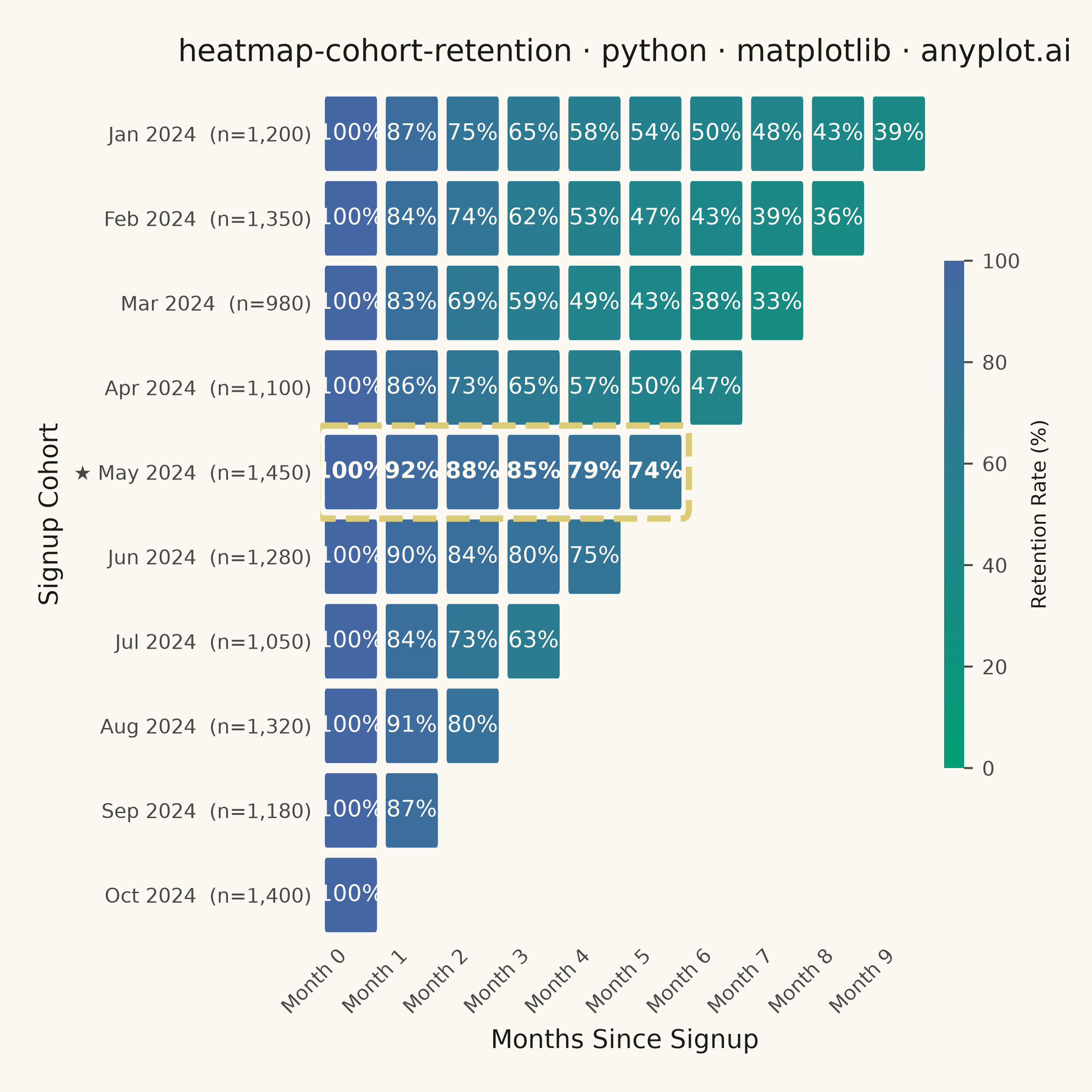
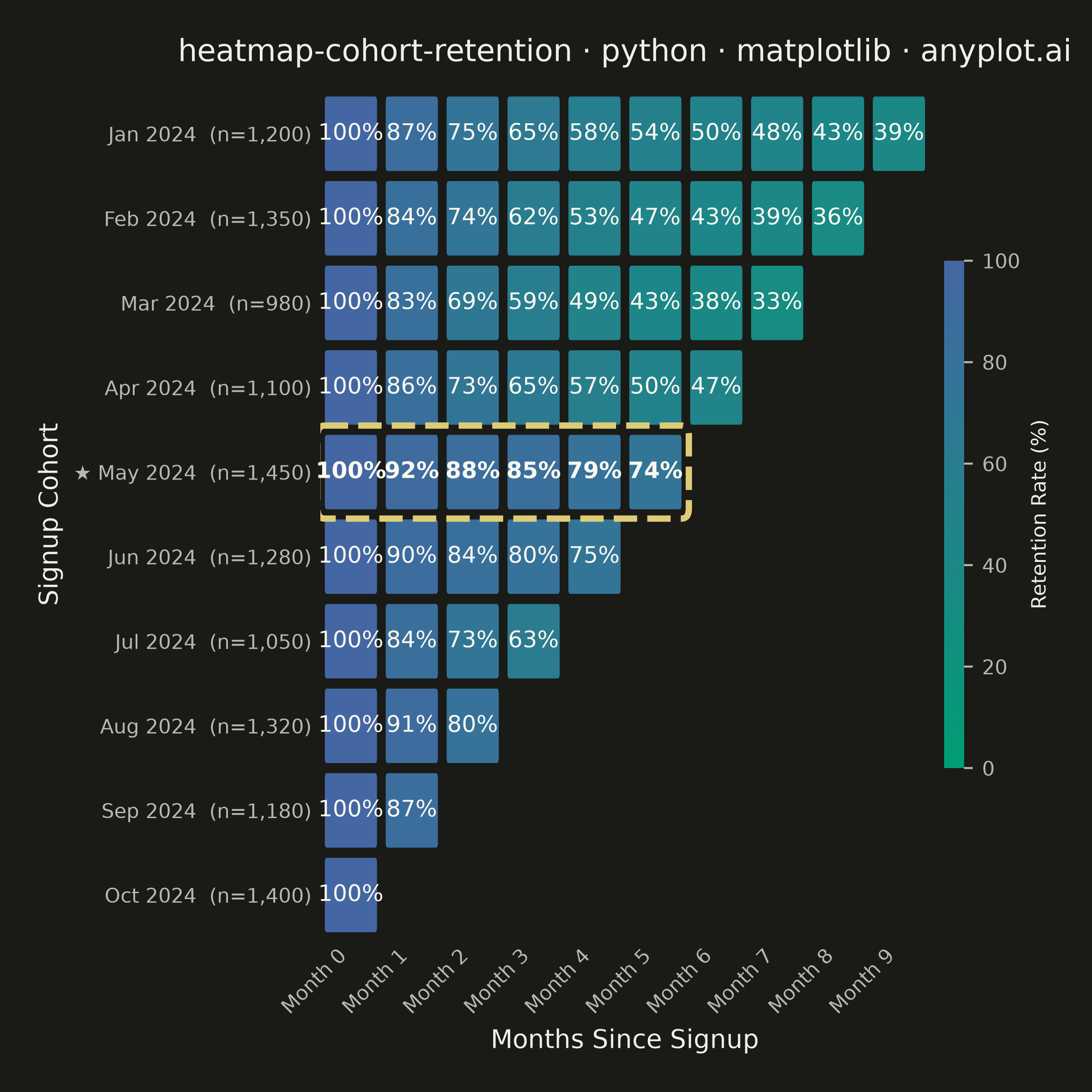
A triangular heatmap displaying user retention rates across signup cohorts and time periods. Each row represents a cohort (e.g., users who signed up in a specific month), each column represents periods since signup, and cell color intensity indicates the retention percentage. The triangular shape naturally emerges because more recent cohorts have fewer elapsed periods. This visualization reveals retention trends, highlights churn patterns, and enables comparison of cohort quality over time.
""" anyplot.ai
heatmap-cohort-retention: Cohort Retention Heatmap
Library: matplotlib 3.11.0 | Python 3.13.14
Quality: 94/100 | Updated: 2026-06-20
"""

import os
import sys


sys.path.pop(0)  # prevent this file from shadowing the installed matplotlib package

import matplotlib.colors as mcolors
import matplotlib.patches as mpatches
import matplotlib.pyplot as plt
import numpy as np
from matplotlib.colors import LinearSegmentedColormap


# Theme tokens — Imprint palette chrome
THEME = os.getenv("ANYPLOT_THEME", "light")
PAGE_BG = "#FAF8F1" if THEME == "light" else "#1A1A17"
ELEVATED_BG = "#FFFDF6" if THEME == "light" else "#242420"
INK = "#1A1A17" if THEME == "light" else "#F0EFE8"
INK_SOFT = "#4A4A44" if THEME == "light" else "#B8B7B0"
INK_MUTED = "#6B6A63" if THEME == "light" else "#A8A79F"
ANYPLOT_AMBER = "#DDCC77"  # warning / caution semantic anchor

# Imprint sequential colormap — canonical green→blue (low retention → green, high retention → blue)
imprint_seq = LinearSegmentedColormap.from_list("imprint_seq", ["#009E73", "#4467A3"])

# Data
np.random.seed(42)
cohort_labels = [
    "Jan 2024",
    "Feb 2024",
    "Mar 2024",
    "Apr 2024",
    "May 2024",
    "Jun 2024",
    "Jul 2024",
    "Aug 2024",
    "Sep 2024",
    "Oct 2024",
]
cohort_sizes = [1200, 1350, 980, 1100, 1450, 1280, 1050, 1320, 1180, 1400]
n_cohorts = len(cohort_labels)
n_periods = n_cohorts

# Generate realistic retention data with meaningful variation across cohorts
retention = np.full((n_cohorts, n_periods), np.nan)
decay_profiles = [1.0, 1.15, 1.3, 1.1, 0.55, 0.65, 1.2, 0.85, 1.05, 0.75]

for i in range(n_cohorts):
    max_periods = n_periods - i
    retention[i, 0] = 100.0
    for j in range(1, max_periods):
        base_drop = (15 * np.exp(-0.25 * j) + 1.5) * decay_profiles[i]
        noise = np.random.uniform(-2, 2)
        retention[i, j] = max(retention[i, j - 1] - base_drop - noise, 5)

# Find best-performing cohort (highest average retention across >= 4 periods)
avg_retention = [np.nanmean(retention[i, 1 : n_periods - i]) if n_periods - i >= 4 else 0.0 for i in range(n_cohorts)]
best_cohort = int(np.argmax(avg_retention))

# Plot — square canvas for symmetric heatmap
fig, ax = plt.subplots(figsize=(6, 6), dpi=400, facecolor=PAGE_BG)
ax.set_facecolor(PAGE_BG)

norm = mcolors.Normalize(vmin=0, vmax=100)

# Draw heatmap cells using FancyBboxPatch for rounded corners
for i in range(n_cohorts):
    for j in range(n_periods):
        if np.isnan(retention[i, j]):
            continue
        val = retention[i, j]
        color = imprint_seq(norm(val))
        rect = mpatches.FancyBboxPatch(
            (j - 0.47, i - 0.47),
            0.94,
            0.94,
            boxstyle=mpatches.BoxStyle.Round(pad=0, rounding_size=0.08),
            facecolor=color,
            edgecolor=PAGE_BG,
            linewidth=2.0,
        )
        ax.add_patch(rect)
        # Adaptive text: light on dark cells, dark on light cells
        luminance = 0.299 * color[0] + 0.587 * color[1] + 0.114 * color[2]
        text_color = "#FAF8F1" if luminance < 0.45 else "#1A1A17"
        ax.text(
            j,
            i,
            f"{val:.0f}%",
            ha="center",
            va="center",
            fontsize=9,
            fontweight="bold" if i == best_cohort else "medium",
            color=text_color,
        )

# Highlight best cohort row with amber dashed border
highlight_rect = mpatches.FancyBboxPatch(
    (-0.55, best_cohort - 0.55),
    n_periods - best_cohort + 0.1,
    1.1,
    boxstyle=mpatches.BoxStyle.Round(pad=0, rounding_size=0.12),
    facecolor="none",
    edgecolor=ANYPLOT_AMBER,
    linewidth=2.5,
    linestyle="--",
    zorder=5,
)
ax.add_patch(highlight_rect)

# Style
ax.set_xlim(-0.5, n_periods - 0.5)
ax.set_ylim(n_cohorts - 0.5, -0.5)
ax.set_xticks(range(n_periods))
ax.set_xticklabels([f"Month {p}" for p in range(n_periods)], fontsize=8, color=INK_SOFT, rotation=45, ha="right")
ax.set_yticks(range(n_cohorts))
ytick_labels = []
for idx, (label, size) in enumerate(zip(cohort_labels, cohort_sizes, strict=True)):
    text = f"{label}  (n={size:,})"
    if idx == best_cohort:
        text = f"★ {text}"
    ytick_labels.append(text)
ax.set_yticklabels(ytick_labels, fontsize=8, color=INK_SOFT)
ax.set_xlabel("Months Since Signup", fontsize=10, color=INK)
ax.set_ylabel("Signup Cohort", fontsize=10, color=INK)

title = "heatmap-cohort-retention · python · matplotlib · anyplot.ai"
title_fontsize = max(8, round(12 * 67 / len(title))) if len(title) > 67 else 12
ax.set_title(title, fontsize=title_fontsize, fontweight="medium", color=INK, pad=12)

for spine in ax.spines.values():
    spine.set_visible(False)
ax.tick_params(axis="both", length=0, labelcolor=INK_SOFT)

# Colorbar with theme-adaptive chrome
sm = plt.cm.ScalarMappable(cmap=imprint_seq, norm=norm)
sm.set_array([])
cbar = fig.colorbar(sm, ax=ax, shrink=0.6, aspect=25, pad=0.02)
cbar.set_label("Retention Rate (%)", fontsize=8, color=INK)
cbar.ax.tick_params(labelsize=8, labelcolor=INK_SOFT, colors=INK_SOFT)
cbar.outline.set_visible(False)

# Save
plt.tight_layout(pad=1.5)
plt.savefig(f"plot-{THEME}.png", dpi=400, facecolor=PAGE_BG)
Runnable source as JSON, for any HTTP client: https://api.anyplot.ai/specs/heatmap-cohort-retention/matplotlib/code. Any spec id and library id listed in llms-full.txt fit the same URL shape; every URL below is complete and callable.
{
  "spec_id": "heatmap-cohort-retention",
  "language": "python",
  "library": "matplotlib",
  "page": "https://anyplot.ai/heatmap-cohort-retention/python/matplotlib",
  "hub": "https://anyplot.ai/heatmap-cohort-retention",
  "code_json": "https://api.anyplot.ai/specs/heatmap-cohort-retention/matplotlib/code",
  "spec_json": "https://api.anyplot.ai/specs/heatmap-cohort-retention",
  "render_light_png": "https://storage.googleapis.com/anyplot-images/plots/heatmap-cohort-retention/python/matplotlib/plot-light.png",
  "render_dark_png": "https://storage.googleapis.com/anyplot-images/plots/heatmap-cohort-retention/python/matplotlib/plot-dark.png",
  "quality_score": 94.0,
  "license": "MIT",
  "guide": "https://anyplot.ai/llms.txt"
}
Part of Cohort Retention Heatmap on anyplot.ai.