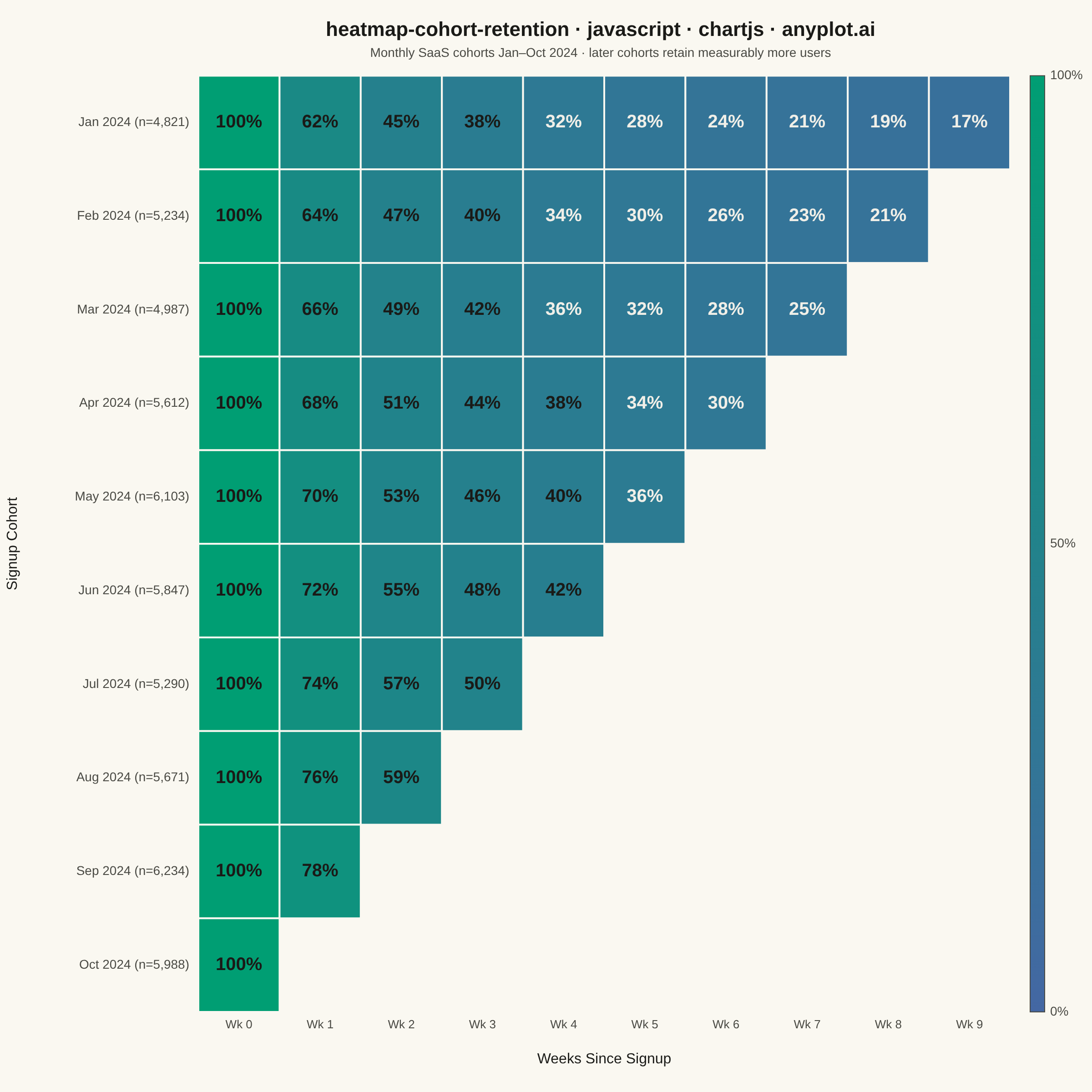
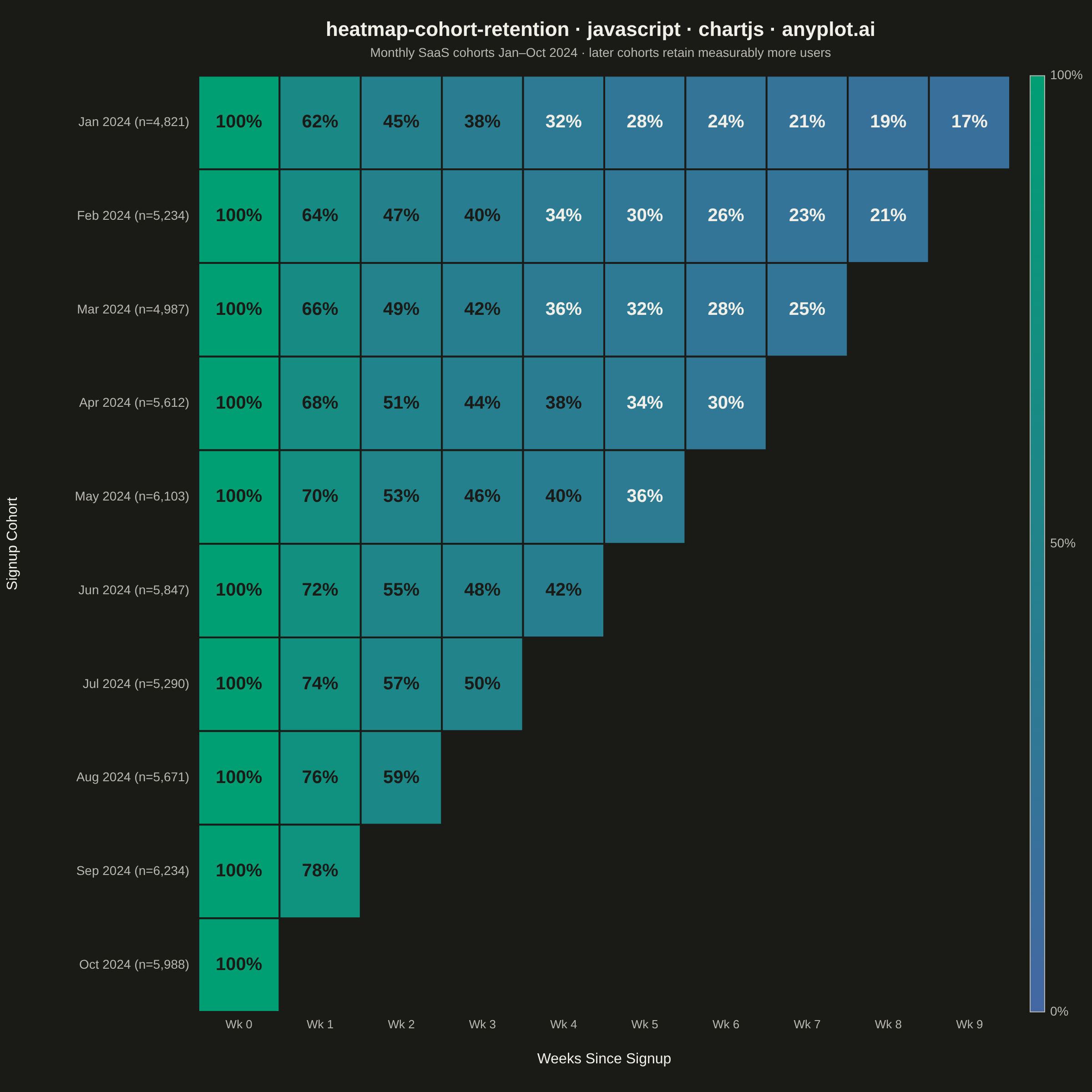
A triangular heatmap displaying user retention rates across signup cohorts and time periods. Each row represents a cohort (e.g., users who signed up in a specific month), each column represents periods since signup, and cell color intensity indicates the retention percentage. The triangular shape naturally emerges because more recent cohorts have fewer elapsed periods. This visualization reveals retention trends, highlights churn patterns, and enables comparison of cohort quality over time.
// anyplot.ai
// heatmap-cohort-retention: Cohort Retention Heatmap
// Library: chartjs 4.4.7 | JavaScript 22.22.3
// Quality: 91/100 | Created: 2026-06-20

//# anyplot-orientation: square

const t = window.ANYPLOT_TOKENS;

// --- Data ---
const COHORTS = [
  "Jan 2024", "Feb 2024", "Mar 2024", "Apr 2024", "May 2024",
  "Jun 2024", "Jul 2024", "Aug 2024", "Sep 2024", "Oct 2024"
];
const COHORT_SIZES = [4821, 5234, 4987, 5612, 6103, 5847, 5290, 5671, 6234, 5988];
const NUM_COHORTS = COHORTS.length;
const NUM_PERIODS = 10;

// Retention decay — later cohorts show measurable product improvement (+2% per cohort)
const BASE_DECAY = [100, 62, 45, 38, 32, 28, 24, 21, 19, 17];

const cells = [];
for (let c = 0; c < NUM_COHORTS; c++) {
  // Triangular shape: Jan cohort (c=0) has all 10 periods, Oct (c=9) only has period 0
  const maxPeriod = NUM_COHORTS - 1 - c;
  for (let p = 0; p <= maxPeriod; p++) {
    const value = p === 0 ? 100 : Math.round(Math.min(99, BASE_DECAY[p] + c * 2.0));
    cells.push({ cohort: c, period: p, value });
  }
}

// --- Color helpers (imprint_seq: #009E73 → #4467A3) ---
function hexToRgb(hex) {
  const n = parseInt(hex.replace('#', ''), 16);
  return [(n >> 16) & 255, (n >> 8) & 255, n & 255];
}

function interpColor(c1, c2, frac) {
  const a = hexToRgb(c1), b = hexToRgb(c2);
  return `rgb(${Math.round(a[0] + (b[0] - a[0]) * frac)},` +
    `${Math.round(a[1] + (b[1] - a[1]) * frac)},` +
    `${Math.round(a[2] + (b[2] - a[2]) * frac)})`;
}

// 100% → #009E73 (brand green), 0% → #4467A3 (blue)
function cellColor(value) {
  return interpColor(t.seq[0], t.seq[1], (100 - value) / 100);
}

function fmtNum(n) {
  return n.toString().replace(/\B(?=(\d{3})+(?!\d))/g, ',');
}

// --- Mount ---
const canvas = document.createElement('canvas');
document.getElementById('container').appendChild(canvas);

// --- Plugin: draws cells + all labels manually ---
const heatmapPlugin = {
  id: 'cohortHeatmap',
  afterDraw(chart) {
    const ctx = chart.ctx;
    const xs = chart.scales.x;
    const ys = chart.scales.y;
    const { top, bottom, left, right } = chart.chartArea;

    const cellW = xs.getPixelForValue(1) - xs.getPixelForValue(0);
    const cellH = ys.getPixelForValue(1) - ys.getPixelForValue(0); // positive with reverse:true

    // --- Cells ---
    cells.forEach(({ cohort, period, value }) => {
      const cx = xs.getPixelForValue(period);
      const cy = ys.getPixelForValue(cohort);
      const x = cx - cellW / 2;
      const y = cy - cellH / 2;

      ctx.fillStyle = cellColor(value);
      ctx.fillRect(x, y, cellW, cellH);

      ctx.strokeStyle = t.pageBg;
      ctx.lineWidth = 2;
      ctx.strokeRect(x, y, cellW, cellH);

      const fs = Math.round(Math.min(cellW * 0.22, cellH * 0.28));
      ctx.font = `bold ${fs}px sans-serif`;
      ctx.textAlign = 'center';
      ctx.textBaseline = 'middle';
      ctx.fillStyle = value < 38 ? '#F0EFE8' : '#1A1A17';
      ctx.fillText(`${value}%`, cx, cy);
    });

    // --- Y-axis labels (cohort name + size) ---
    ctx.textAlign = 'right';
    ctx.textBaseline = 'middle';
    ctx.font = '14px sans-serif';
    ctx.fillStyle = t.inkSoft;
    for (let c = 0; c < NUM_COHORTS; c++) {
      const cy = ys.getPixelForValue(c);
      ctx.fillText(`${COHORTS[c]} (n=${fmtNum(COHORT_SIZES[c])})`, left - 10, cy);
    }

    // --- Y-axis title (rotated, far left) ---
    ctx.save();
    ctx.translate(14, (top + bottom) / 2);
    ctx.rotate(-Math.PI / 2);
    ctx.font = '16px sans-serif';
    ctx.fillStyle = t.ink;
    ctx.textAlign = 'center';
    ctx.textBaseline = 'middle';
    ctx.fillText('Signup Cohort', 0, 0);
    ctx.restore();

    // --- X-axis labels (week numbers) ---
    ctx.textAlign = 'center';
    ctx.textBaseline = 'top';
    ctx.font = '13px sans-serif';
    ctx.fillStyle = t.inkSoft;
    for (let p = 0; p < NUM_PERIODS; p++) {
      ctx.fillText(`Wk ${p}`, xs.getPixelForValue(p), bottom + 8);
    }

    // --- X-axis title ---
    ctx.font = '16px sans-serif';
    ctx.fillStyle = t.ink;
    ctx.textAlign = 'center';
    ctx.textBaseline = 'top';
    ctx.fillText('Weeks Since Signup', (left + right) / 2, bottom + 44);

    // --- Colorbar ---
    const barX = right + 22;
    const barW = 16;
    const barH = bottom - top;

    const grad = ctx.createLinearGradient(0, top, 0, bottom);
    grad.addColorStop(0, t.seq[0]);  // top = 100% green
    grad.addColorStop(1, t.seq[1]);  // bottom = 0% blue
    ctx.fillStyle = grad;
    ctx.fillRect(barX, top, barW, barH);
    ctx.strokeStyle = t.inkSoft;
    ctx.lineWidth = 1;
    ctx.strokeRect(barX, top, barW, barH);

    const lx = barX + barW + 6;
    ctx.font = '14px sans-serif';
    ctx.fillStyle = t.inkSoft;
    ctx.textAlign = 'left';
    ctx.textBaseline = 'middle';
    ctx.fillText('100%', lx, top);
    ctx.fillText('50%', lx, top + barH / 2);
    ctx.fillText('0%', lx, bottom);
  }
};

// --- Chart ---
new Chart(canvas, {
  type: 'scatter',
  data: { datasets: [{ data: [], pointRadius: 0 }] },
  options: {
    responsive: true,
    maintainAspectRatio: false,
    animation: false,
    layout: {
      // Reserve space for manual labels: 210px left (cohort labels), 80px bottom (week labels + title)
      padding: { top: 20, right: 90, bottom: 80, left: 210 }
    },
    plugins: {
      title: {
        display: true,
        text: 'heatmap-cohort-retention · javascript · chartjs · anyplot.ai',
        color: t.ink,
        font: { size: 22, weight: 'bold' },
        padding: { bottom: 4 }
      },
      subtitle: {
        display: true,
        text: 'Monthly SaaS cohorts Jan–Oct 2024 · later cohorts retain measurably more users',
        color: t.inkSoft,
        font: { size: 14 },
        padding: { bottom: 16 }
      },
      legend: { display: false },
      tooltip: { enabled: false }
    },
    scales: {
      x: {
        type: 'linear',
        min: -0.5,
        max: NUM_PERIODS - 0.5,
        border: { display: false },
        ticks: { display: false },
        grid: { display: false }
      },
      y: {
        type: 'linear',
        min: -0.5,
        max: NUM_COHORTS - 0.5,
        reverse: true,
        border: { display: false },
        ticks: { display: false },
        grid: { display: false }
      }
    }
  },
  plugins: [heatmapPlugin]
});
Runnable source as JSON, for any HTTP client: https://api.anyplot.ai/specs/heatmap-cohort-retention/chartjs/code. Any spec id and library id listed in llms-full.txt fit the same URL shape; every URL below is complete and callable.
{
  "spec_id": "heatmap-cohort-retention",
  "language": "javascript",
  "library": "chartjs",
  "page": "https://anyplot.ai/heatmap-cohort-retention/javascript/chartjs",
  "hub": "https://anyplot.ai/heatmap-cohort-retention",
  "code_json": "https://api.anyplot.ai/specs/heatmap-cohort-retention/chartjs/code",
  "spec_json": "https://api.anyplot.ai/specs/heatmap-cohort-retention",
  "render_light_png": "https://storage.googleapis.com/anyplot-images/plots/heatmap-cohort-retention/javascript/chartjs/plot-light.png",
  "render_dark_png": "https://storage.googleapis.com/anyplot-images/plots/heatmap-cohort-retention/javascript/chartjs/plot-dark.png",
  "interactive_light_html": "https://storage.googleapis.com/anyplot-images/plots/heatmap-cohort-retention/javascript/chartjs/plot-light.html",
  "interactive_dark_html": "https://storage.googleapis.com/anyplot-images/plots/heatmap-cohort-retention/javascript/chartjs/plot-dark.html",
  "quality_score": 91.0,
  "license": "MIT",
  "guide": "https://anyplot.ai/llms.txt"
}
Part of Cohort Retention Heatmap on anyplot.ai.