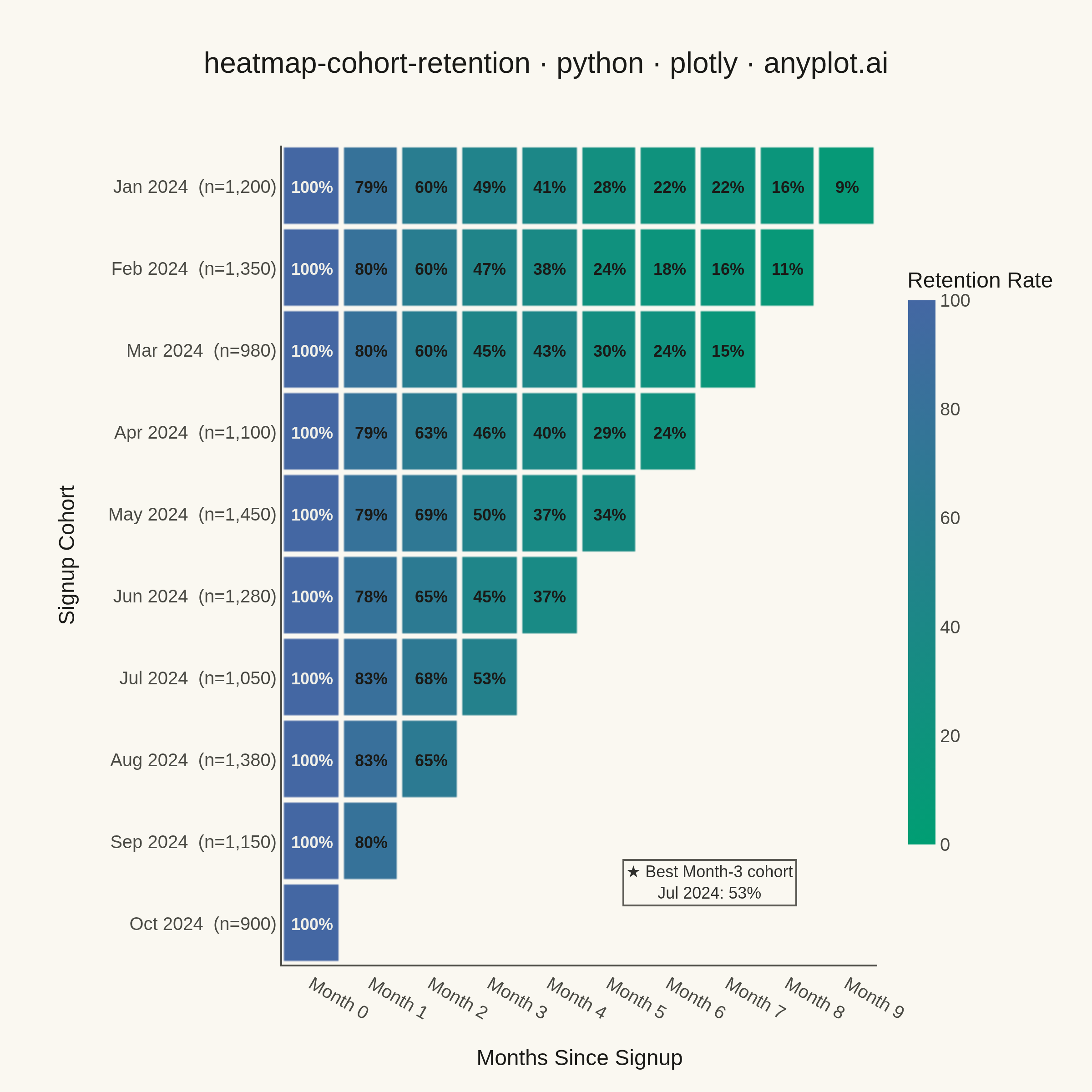
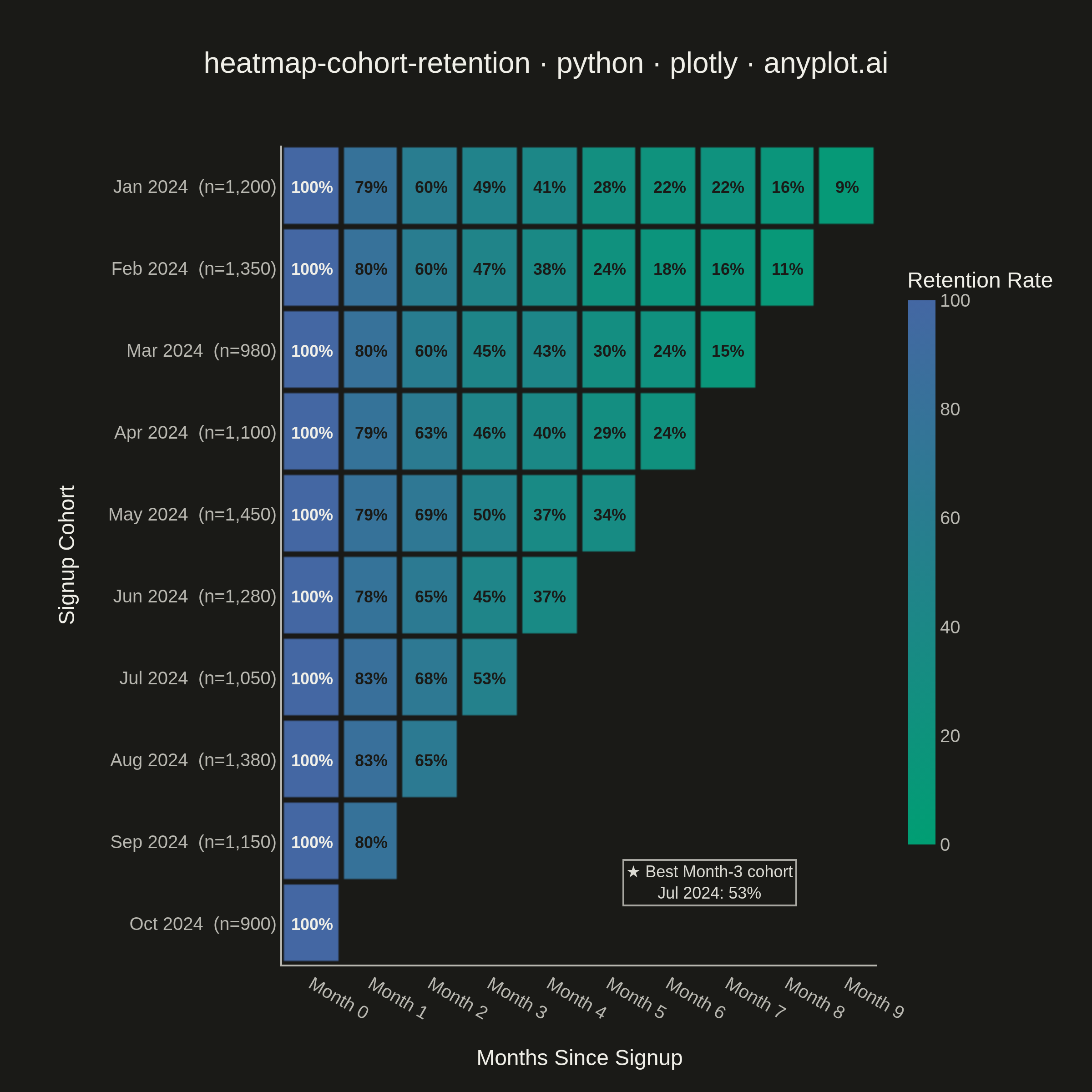
A triangular heatmap displaying user retention rates across signup cohorts and time periods. Each row represents a cohort (e.g., users who signed up in a specific month), each column represents periods since signup, and cell color intensity indicates the retention percentage. The triangular shape naturally emerges because more recent cohorts have fewer elapsed periods. This visualization reveals retention trends, highlights churn patterns, and enables comparison of cohort quality over time.
""" anyplot.ai
heatmap-cohort-retention: Cohort Retention Heatmap
Library: plotly 6.8.0 | Python 3.13.14
Quality: 89/100 | Updated: 2026-06-20
"""

import os

import numpy as np
import plotly.graph_objects as go


# Theme tokens
THEME = os.getenv("ANYPLOT_THEME", "light")
PAGE_BG = "#FAF8F1" if THEME == "light" else "#1A1A17"
INK = "#1A1A17" if THEME == "light" else "#F0EFE8"
INK_SOFT = "#4A4A44" if THEME == "light" else "#B8B7B0"

# Imprint sequential colormap for continuous retention data (green → blue)
imprint_seq = [[0.0, "#009E73"], [1.0, "#4467A3"]]

# Data
np.random.seed(42)

cohort_labels = [
    "Jan 2024",
    "Feb 2024",
    "Mar 2024",
    "Apr 2024",
    "May 2024",
    "Jun 2024",
    "Jul 2024",
    "Aug 2024",
    "Sep 2024",
    "Oct 2024",
]
num_cohorts = len(cohort_labels)
num_periods = num_cohorts
cohort_sizes = [1200, 1350, 980, 1100, 1450, 1280, 1050, 1380, 1150, 900]

retention = np.full((num_cohorts, num_periods), np.nan)
for i in range(num_cohorts):
    max_period = num_periods - i
    retention[i, 0] = 100.0
    for j in range(1, max_period):
        base_drop = np.exp(-0.25 * j) * 100
        noise = np.random.normal(0, 3)
        trend_bonus = i * 0.8
        retention[i, j] = np.clip(base_drop + noise + trend_bonus, 5, 100)

y_labels = [f"{label}  (n={size:,})" for label, size in zip(cohort_labels, cohort_sizes, strict=False)]
x_labels = [f"Month {i}" for i in range(num_periods)]

# Hover text and cell annotations
hover_text = []
cell_annotations = []
for i in range(num_cohorts):
    row_hover = []
    for j in range(num_periods):
        if np.isnan(retention[i, j]):
            row_hover.append("")
        else:
            val = retention[i, j]
            row_hover.append(
                f"<b>{cohort_labels[i]}</b> · Month {j}<br>"
                f"Cohort size: {cohort_sizes[i]:,} users<br>"
                f"Retained: <b>{val:.1f}%</b>"
            )
            # Luminance-based contrast: WCAG crossover on imprint_seq is ~88%
            text_color = "#F0EFE8" if val >= 88 else "#1A1A17"
            cell_annotations.append(
                {
                    "x": x_labels[j],
                    "y": y_labels[i],
                    "text": f"<b>{val:.0f}%</b>",
                    "showarrow": False,
                    "font": {"size": 9, "color": text_color},
                }
            )
    hover_text.append(row_hover)

# Storytelling: identify the cohort with the best Month-3 retention
m3_entries = [(retention[i, 3], i) for i in range(num_cohorts) if not np.isnan(retention[i, 3])]
best_m3_val, best_m3_i = max(m3_entries)

# Plot
fig = go.Figure(
    data=go.Heatmap(
        z=retention,
        x=x_labels,
        y=y_labels,
        showscale=True,
        hovertext=hover_text,
        hoverinfo="text",
        colorscale=imprint_seq,
        zmin=0,
        zmax=100,
        colorbar={
            "title": {"text": "Retention Rate", "font": {"size": 12, "color": INK}},
            "tickfont": {"size": 10, "color": INK_SOFT},
            "ticksuffix": "%",
            "tickvals": [0, 20, 40, 60, 80, 100],
            "len": 0.75,
            "thickness": 15,
            "outlinewidth": 0,
        },
        xgap=3,
        ygap=3,
    )
)

for ann in cell_annotations:
    fig.add_annotation(**ann)

# Storytelling annotation in the empty lower-right triangle (newer cohorts, later months)
fig.add_annotation(
    xref="paper",
    yref="paper",
    x=0.72,
    y=0.10,
    text=f"★ Best Month-3 cohort<br>{cohort_labels[best_m3_i]}: {best_m3_val:.0f}%",
    showarrow=False,
    font={"size": 9, "color": INK, "family": "Arial, Helvetica, sans-serif"},
    bgcolor=PAGE_BG,
    bordercolor=INK_SOFT,
    borderwidth=1,
    xanchor="center",
    yanchor="middle",
    opacity=0.9,
)

title = "heatmap-cohort-retention · python · plotly · anyplot.ai"

fig.update_layout(
    autosize=False,
    paper_bgcolor=PAGE_BG,
    plot_bgcolor=PAGE_BG,
    font={"family": "Arial, Helvetica, sans-serif", "color": INK},
    title={"text": title, "font": {"size": 16, "color": INK}, "x": 0.5, "xanchor": "center"},
    xaxis={
        "title": {"text": "Months Since Signup", "font": {"size": 12, "color": INK}},
        "tickfont": {"size": 10, "color": INK_SOFT},
        "linecolor": INK_SOFT,
        "showgrid": False,
    },
    yaxis={
        "title": {"text": "Signup Cohort", "font": {"size": 12, "color": INK}},
        "tickfont": {"size": 10, "color": INK_SOFT},
        "autorange": "reversed",
        "linecolor": INK_SOFT,
        "showgrid": False,
    },
    margin={"l": 155, "r": 90, "t": 80, "b": 70},
)

# Save — 2400 × 2400 square canvas (heatmap)
fig.write_image(f"plot-{THEME}.png", width=600, height=600, scale=4)
fig.write_html(f"plot-{THEME}.html", include_plotlyjs="cdn")
Runnable source as JSON, for any HTTP client: https://api.anyplot.ai/specs/heatmap-cohort-retention/plotly/code. Any spec id and library id listed in llms-full.txt fit the same URL shape; every URL below is complete and callable.
{
  "spec_id": "heatmap-cohort-retention",
  "language": "python",
  "library": "plotly",
  "page": "https://anyplot.ai/heatmap-cohort-retention/python/plotly",
  "hub": "https://anyplot.ai/heatmap-cohort-retention",
  "code_json": "https://api.anyplot.ai/specs/heatmap-cohort-retention/plotly/code",
  "spec_json": "https://api.anyplot.ai/specs/heatmap-cohort-retention",
  "render_light_png": "https://storage.googleapis.com/anyplot-images/plots/heatmap-cohort-retention/python/plotly/plot-light.png",
  "render_dark_png": "https://storage.googleapis.com/anyplot-images/plots/heatmap-cohort-retention/python/plotly/plot-dark.png",
  "interactive_light_html": "https://storage.googleapis.com/anyplot-images/plots/heatmap-cohort-retention/python/plotly/plot-light.html",
  "interactive_dark_html": "https://storage.googleapis.com/anyplot-images/plots/heatmap-cohort-retention/python/plotly/plot-dark.html",
  "quality_score": 89.0,
  "license": "MIT",
  "guide": "https://anyplot.ai/llms.txt"
}
Part of Cohort Retention Heatmap on anyplot.ai.