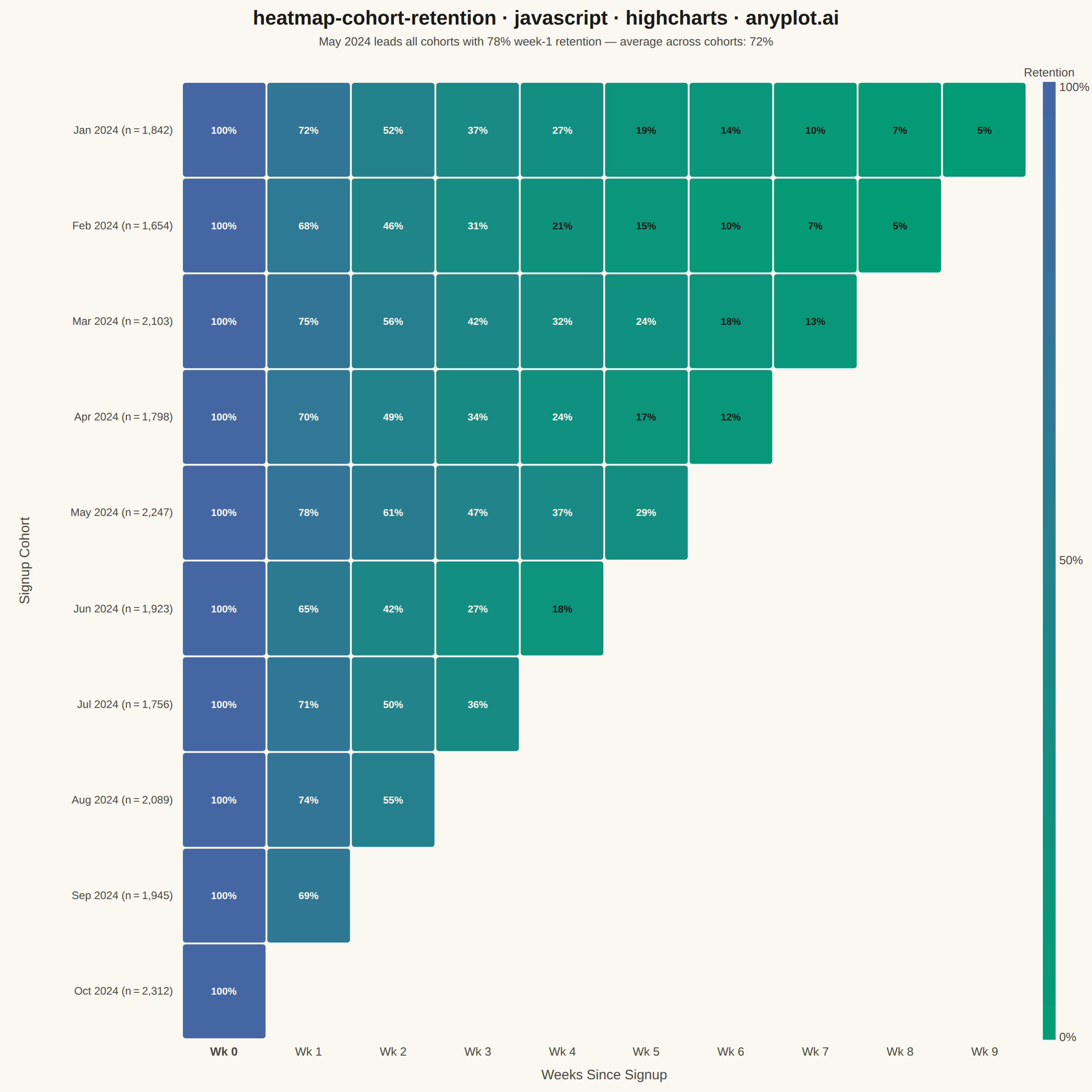
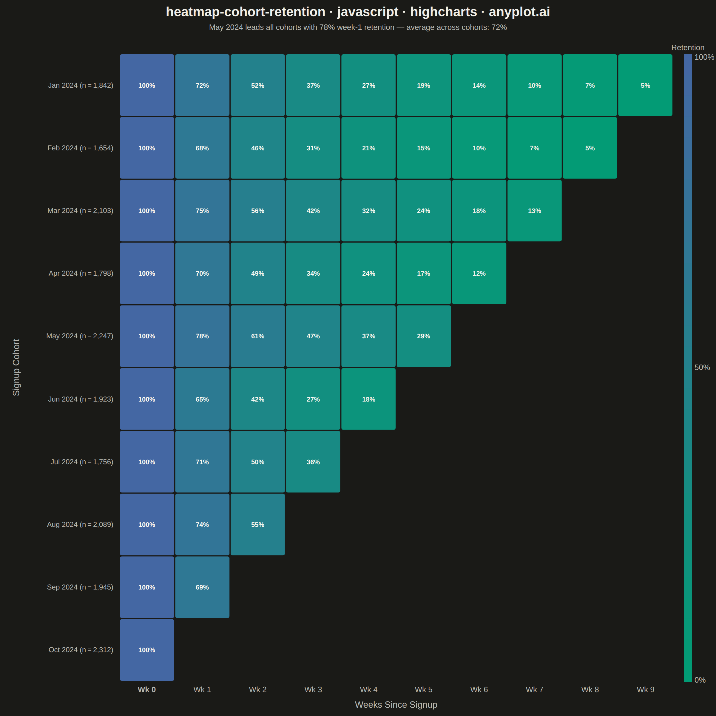
A triangular heatmap displaying user retention rates across signup cohorts and time periods. Each row represents a cohort (e.g., users who signed up in a specific month), each column represents periods since signup, and cell color intensity indicates the retention percentage. The triangular shape naturally emerges because more recent cohorts have fewer elapsed periods. This visualization reveals retention trends, highlights churn patterns, and enables comparison of cohort quality over time.
// anyplot.ai
// heatmap-cohort-retention: Cohort Retention Heatmap
// Library: highcharts 12.6.0 | JavaScript 22.22.3
// Quality: 89/100 | Created: 2026-06-20
//# anyplot-orientation: square
// anyplot.ai
// heatmap-cohort-retention: Cohort Retention Heatmap
// Library: Highcharts 12.6.0 | Node 22
// License: Highcharts — commercial license, free for non-commercial use (highcharts.com/license)
// Quality: pending | Created: 2026-06-20

const t = window.ANYPLOT_TOKENS;

const COHORT_LABELS = [
  'Jan 2024', 'Feb 2024', 'Mar 2024', 'Apr 2024', 'May 2024',
  'Jun 2024', 'Jul 2024', 'Aug 2024', 'Sep 2024', 'Oct 2024'
];
const COHORT_SIZES = ['1,842', '1,654', '2,103', '1,798', '2,247', '1,923', '1,756', '2,089', '1,945', '2,312'];
const N_COHORTS = COHORT_LABELS.length;  // 10
const N_PERIODS = N_COHORTS;             // 10 periods: Wk 0 … Wk 9

// Deterministic week-1 retention rate per cohort (power-decay model)
const BASE_RETENTION = [0.72, 0.68, 0.75, 0.70, 0.78, 0.65, 0.71, 0.74, 0.69, 0.76];

function getRetention(cohort, period) {
  if (period === 0) return 100;
  // Triangular: cohort c has data only up to period (N_COHORTS - c - 1)
  if (period > N_COHORTS - cohort - 1) return null;
  return Math.round(100 * Math.pow(BASE_RETENTION[cohort], period));
}

const heatData = [];
for (let c = 0; c < N_COHORTS; c++) {
  for (let p = 0; p < N_PERIODS; p++) {
    const v = getRetention(c, p);
    if (v !== null) heatData.push({ cohort: c, period: p, value: v });
  }
}

// Imprint sequential: #009E73 (low retention) → #4467A3 (high retention)
const SEQ0 = { r: 0, g: 158, b: 115 };   // #009E73
const SEQ1 = { r: 68, g: 103, b: 163 };  // #4467A3

function cellRgb(value) {
  const f = value / 100;
  return {
    r: Math.round(SEQ0.r + f * (SEQ1.r - SEQ0.r)),
    g: Math.round(SEQ0.g + f * (SEQ1.g - SEQ0.g)),
    b: Math.round(SEQ0.b + f * (SEQ1.b - SEQ0.b))
  };
}

function cellBg(value) {
  const { r, g, b } = cellRgb(value);
  return `rgb(${r},${g},${b})`;
}

// Relative luminance — pick text color for maximum contrast
function cellTextColor(value) {
  const { r, g, b } = cellRgb(value);
  const lin = x => x <= 0.04045 ? x / 12.92 : Math.pow((x + 0.055) / 1.055, 2.4);
  const L = 0.2126 * lin(r / 255) + 0.7152 * lin(g / 255) + 0.0722 * lin(b / 255);
  return L < 0.22 ? '#FAF8F1' : t.ink;
}

const periodLabels = Array.from({ length: N_PERIODS }, (_, i) => `Wk ${i}`);

const drawn = [];

function clearDrawn() {
  drawn.forEach(el => { try { el.destroy(); } catch (_) {} });
  drawn.length = 0;
}

function drawAll() {
  const ch = this;
  clearDrawn();
  const r = ch.renderer;

  // Cell dimensions tiling the full plot area
  const cW = ch.plotWidth / N_PERIODS;
  const cH = ch.plotHeight / N_COHORTS;

  // Heatmap cells (triangular: older cohorts have more columns)
  heatData.forEach(d => {
    const x = ch.plotLeft + d.period * cW;
    const y = ch.plotTop + d.cohort * cH;
    const bg = cellBg(d.value);

    drawn.push(
      r.rect(x + 1, y + 1, cW - 2, cH - 2, 3)
        .attr({ fill: bg, zIndex: 3 })
        .add()
    );

    const fs = cH < 50 ? '9px' : '11px';
    drawn.push(
      r.text(d.value + '%', x + cW / 2, y + cH / 2 + 4)
        .attr({ align: 'center', zIndex: 4 })
        .css({ color: cellTextColor(d.value), fontSize: fs, fontWeight: '700' })
        .add()
    );
  });

  // Y-axis labels: cohort name + size, right-aligned, vertically centered in each row
  COHORT_LABELS.forEach((lbl, c) => {
    const py = ch.plotTop + (c + 0.5) * cH + 4;
    drawn.push(
      r.text(`${lbl}  (n = ${COHORT_SIZES[c]})`, ch.plotLeft - 10, py)
        .attr({ align: 'right', zIndex: 3 })
        .css({ color: t.inkSoft, fontSize: '12px' })
        .add()
    );
  });

  // X-axis labels: "Wk 0" … "Wk 9", centered in each column; bold Wk 0 to anchor the 100% baseline
  periodLabels.forEach((lbl, p) => {
    const px = ch.plotLeft + (p + 0.5) * cW;
    drawn.push(
      r.text(lbl, px, ch.plotTop + ch.plotHeight + 18)
        .attr({ align: 'center', zIndex: 3 })
        .css({ color: t.inkSoft, fontSize: '13px', fontWeight: p === 0 ? '700' : '400' })
        .add()
    );
  });

  // Axis titles
  drawn.push(
    r.text('Weeks Since Signup',
           ch.plotLeft + ch.plotWidth / 2,
           ch.plotTop + ch.plotHeight + 44)
      .attr({ align: 'center', zIndex: 3 })
      .css({ color: t.inkSoft, fontSize: '15px' })
      .add()
  );

  drawn.push(
    r.text('Signup Cohort',
           ch.plotLeft - 168,
           ch.plotTop + ch.plotHeight / 2)
      .attr({ align: 'center', rotation: -90, zIndex: 3 })
      .css({ color: t.inkSoft, fontSize: '15px' })
      .add()
  );

  // Sequential color legend bar (right of plot, high retention at top)
  const bX = ch.plotLeft + ch.plotWidth + 18;
  const bY = ch.plotTop;
  const bH = ch.plotHeight;
  const bW = 14;
  const N_SEG = 30;
  const sH = bH / N_SEG;

  for (let i = 0; i < N_SEG; i++) {
    const f = 1 - i / N_SEG;  // top = 100%, bottom = ~0%
    drawn.push(
      r.rect(bX, bY + i * sH, bW, sH + 0.5)
        .attr({ fill: cellBg(f * 100), zIndex: 3 })
        .add()
    );
  }

  [['100%', bY + 10], ['50%', bY + bH / 2 + 4], ['0%', bY + bH + 2]].forEach(([txt, cy]) => {
    drawn.push(
      r.text(txt, bX + bW + 4, cy)
        .css({ color: t.inkSoft, fontSize: '13px' })
        .add()
    );
  });

  drawn.push(
    r.text('Retention', bX + bW / 2, bY - 6)
      .attr({ align: 'center', zIndex: 3 })
      .css({ color: t.inkSoft, fontSize: '13px' })
      .add()
  );
}

Highcharts.chart('container', {
  chart: {
    backgroundColor: 'transparent',
    animation: false,
    style: { fontFamily: 'inherit' },
    margin: [90, 72, 58, 200],
    events: { load: drawAll, redraw: drawAll }
  },
  credits: { enabled: false },
  title: {
    text: 'heatmap-cohort-retention · javascript · highcharts · anyplot.ai',
    style: { color: t.ink, fontSize: '22px', fontWeight: '600' }
  },
  subtitle: {
    text: 'May 2024 leads all cohorts with 78% week-1 retention — average across cohorts: 72%',
    style: { color: t.inkSoft, fontSize: '13px' }
  },
  xAxis: { visible: false },
  yAxis: { visible: false, gridLineWidth: 0 },
  legend: { enabled: false },
  tooltip: { enabled: false },
  plotOptions: { series: { animation: false } },
  series: []
});
Runnable source as JSON, for any HTTP client: https://api.anyplot.ai/specs/heatmap-cohort-retention/highcharts/code. Any spec id and library id listed in llms-full.txt fit the same URL shape; every URL below is complete and callable.
{
  "spec_id": "heatmap-cohort-retention",
  "language": "javascript",
  "library": "highcharts",
  "page": "https://anyplot.ai/heatmap-cohort-retention/javascript/highcharts",
  "hub": "https://anyplot.ai/heatmap-cohort-retention",
  "code_json": "https://api.anyplot.ai/specs/heatmap-cohort-retention/highcharts/code",
  "spec_json": "https://api.anyplot.ai/specs/heatmap-cohort-retention",
  "render_light_png": "https://storage.googleapis.com/anyplot-images/plots/heatmap-cohort-retention/javascript/highcharts/plot-light.png",
  "render_dark_png": "https://storage.googleapis.com/anyplot-images/plots/heatmap-cohort-retention/javascript/highcharts/plot-dark.png",
  "interactive_light_html": "https://storage.googleapis.com/anyplot-images/plots/heatmap-cohort-retention/javascript/highcharts/plot-light.html",
  "interactive_dark_html": "https://storage.googleapis.com/anyplot-images/plots/heatmap-cohort-retention/javascript/highcharts/plot-dark.html",
  "quality_score": 89.0,
  "license": "MIT",
  "guide": "https://anyplot.ai/llms.txt"
}
Part of Cohort Retention Heatmap on anyplot.ai.