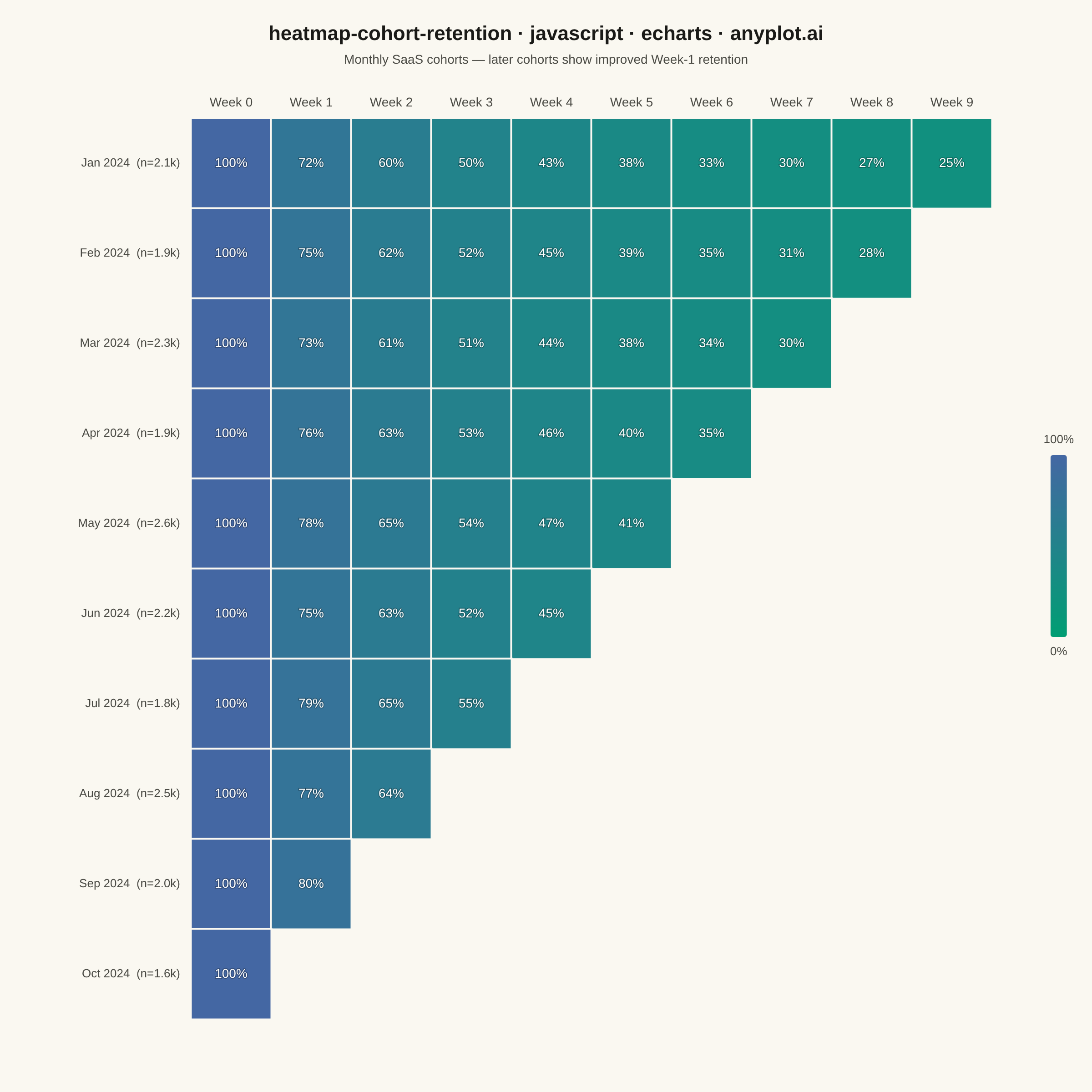
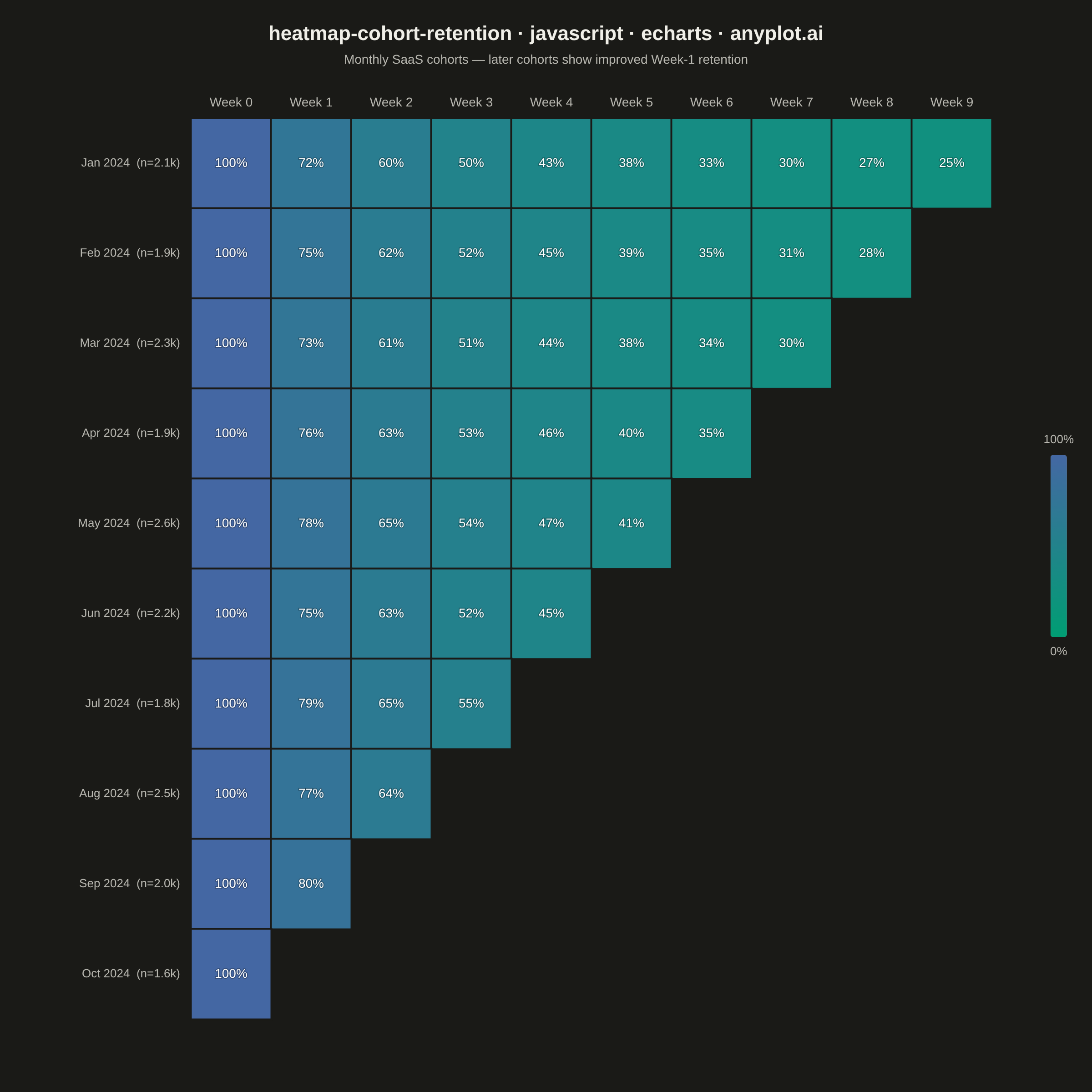
A triangular heatmap displaying user retention rates across signup cohorts and time periods. Each row represents a cohort (e.g., users who signed up in a specific month), each column represents periods since signup, and cell color intensity indicates the retention percentage. The triangular shape naturally emerges because more recent cohorts have fewer elapsed periods. This visualization reveals retention trends, highlights churn patterns, and enables comparison of cohort quality over time.
// anyplot.ai
// heatmap-cohort-retention: Cohort Retention Heatmap
// Library: echarts 5.5.1 | JavaScript 22.22.3
// Quality: 88/100 | Created: 2026-06-20
//# anyplot-orientation: square

const t = window.ANYPLOT_TOKENS;

// --- Data (deterministic, SaaS product analytics — weekly cohort retention) ---
const cohortMonths = ["Jan", "Feb", "Mar", "Apr", "May", "Jun", "Jul", "Aug", "Sep", "Oct"];
const cohortYear = "2024";
const cohortSizes = [2100, 1850, 2340, 1920, 2580, 2210, 1760, 2450, 2030, 1640];

// Base weekly retention curve (typical SaaS decay pattern)
const baseRetention = [100, 82, 68, 57, 49, 43, 38, 34, 31, 28];

// Cohort quality multipliers — product improvements drove higher retention over the year
const cohortMult = [0.88, 0.91, 0.89, 0.93, 0.95, 0.92, 0.96, 0.94, 0.97, 0.99];

const numCohorts = cohortMonths.length;
const numPeriods = 10;

// Build triangular heatmap data: [x_period, y_cohort, value]
// Older cohorts (Jan) have all periods; newer cohorts (Oct) have fewer
const heatmapData = [];
for (let ci = 0; ci < numCohorts; ci++) {
  const maxPeriod = numPeriods - ci;
  for (let p = 0; p < maxPeriod; p++) {
    const rate = p === 0 ? 100 : Math.round(baseRetention[p] * cohortMult[ci]);
    heatmapData.push([p, ci, rate]);
  }
}

// X-axis: weekly periods
const weekLabels = Array.from({ length: numPeriods }, (_, i) => `Week ${i}`);

// Y-axis: cohort labels with cohort sizes
const formatSize = (n) => {
  const k = n / 1000;
  return k % 1 === 0 ? `${k}k` : `${k.toFixed(1)}k`;
};
const cohortLabels = cohortMonths.map(
  (m, i) => `${m} ${cohortYear}  (n=${formatSize(cohortSizes[i])})`
);

// --- Init ---
const chart = echarts.init(document.getElementById("container"));

// --- Option ---
const titleText = "heatmap-cohort-retention · javascript · echarts · anyplot.ai";

chart.setOption({
  animation: false,
  backgroundColor: t.pageBg,
  color: t.palette,

  title: {
    text: titleText,
    subtext: "Monthly SaaS cohorts — later cohorts show improved Week-1 retention",
    left: "center",
    top: 22,
    textStyle: { color: t.ink, fontSize: 22, fontWeight: "600" },
    subtextStyle: { color: t.inkSoft, fontSize: 14 }
  },

  tooltip: {
    trigger: "item",
    formatter: (params) => {
      const [period, cohortIdx, val] = params.value;
      const month = cohortMonths[cohortIdx];
      return `${month} ${cohortYear} cohort · Week ${period}<br/>Retention: <b>${val}%</b>`;
    }
  },

  grid: {
    left: 210,
    right: 110,
    top: 130,
    bottom: 80
  },

  xAxis: {
    type: "category",
    data: weekLabels,
    position: "top",
    axisLabel: { color: t.inkSoft, fontSize: 14, margin: 10 },
    axisLine: { show: false },
    axisTick: { show: false },
    splitLine: { show: false }
  },

  yAxis: {
    type: "category",
    data: cohortLabels,
    inverse: true,
    axisLabel: { color: t.inkSoft, fontSize: 13, margin: 12 },
    axisLine: { show: false },
    axisTick: { show: false },
    splitLine: { show: false }
  },

  visualMap: {
    min: 0,
    max: 100,
    calculable: false,
    show: true,
    orient: "vertical",
    right: 15,
    top: "middle",
    itemWidth: 18,
    itemHeight: 200,
    text: ["100%", "0%"],
    textStyle: { color: t.inkSoft, fontSize: 13 },
    inRange: { color: t.seq }
  },

  series: [{
    name: "Retention %",
    type: "heatmap",
    data: heatmapData,
    label: {
      show: true,
      formatter: (params) => `${params.value[2]}%`,
      color: "#FFFFFF",
      textBorderColor: "rgba(0,0,0,0.25)",
      textBorderWidth: 2,
      fontSize: 14,
      fontWeight: "500"
    },
    itemStyle: {
      borderWidth: 2,
      borderColor: t.pageBg
    }
  }]
});
Runnable source as JSON, for any HTTP client: https://api.anyplot.ai/specs/heatmap-cohort-retention/echarts/code. Any spec id and library id listed in llms-full.txt fit the same URL shape; every URL below is complete and callable.
{
  "spec_id": "heatmap-cohort-retention",
  "language": "javascript",
  "library": "echarts",
  "page": "https://anyplot.ai/heatmap-cohort-retention/javascript/echarts",
  "hub": "https://anyplot.ai/heatmap-cohort-retention",
  "code_json": "https://api.anyplot.ai/specs/heatmap-cohort-retention/echarts/code",
  "spec_json": "https://api.anyplot.ai/specs/heatmap-cohort-retention",
  "render_light_png": "https://storage.googleapis.com/anyplot-images/plots/heatmap-cohort-retention/javascript/echarts/plot-light.png",
  "render_dark_png": "https://storage.googleapis.com/anyplot-images/plots/heatmap-cohort-retention/javascript/echarts/plot-dark.png",
  "interactive_light_html": "https://storage.googleapis.com/anyplot-images/plots/heatmap-cohort-retention/javascript/echarts/plot-light.html",
  "interactive_dark_html": "https://storage.googleapis.com/anyplot-images/plots/heatmap-cohort-retention/javascript/echarts/plot-dark.html",
  "quality_score": 88.0,
  "license": "MIT",
  "guide": "https://anyplot.ai/llms.txt"
}
Part of Cohort Retention Heatmap on anyplot.ai.