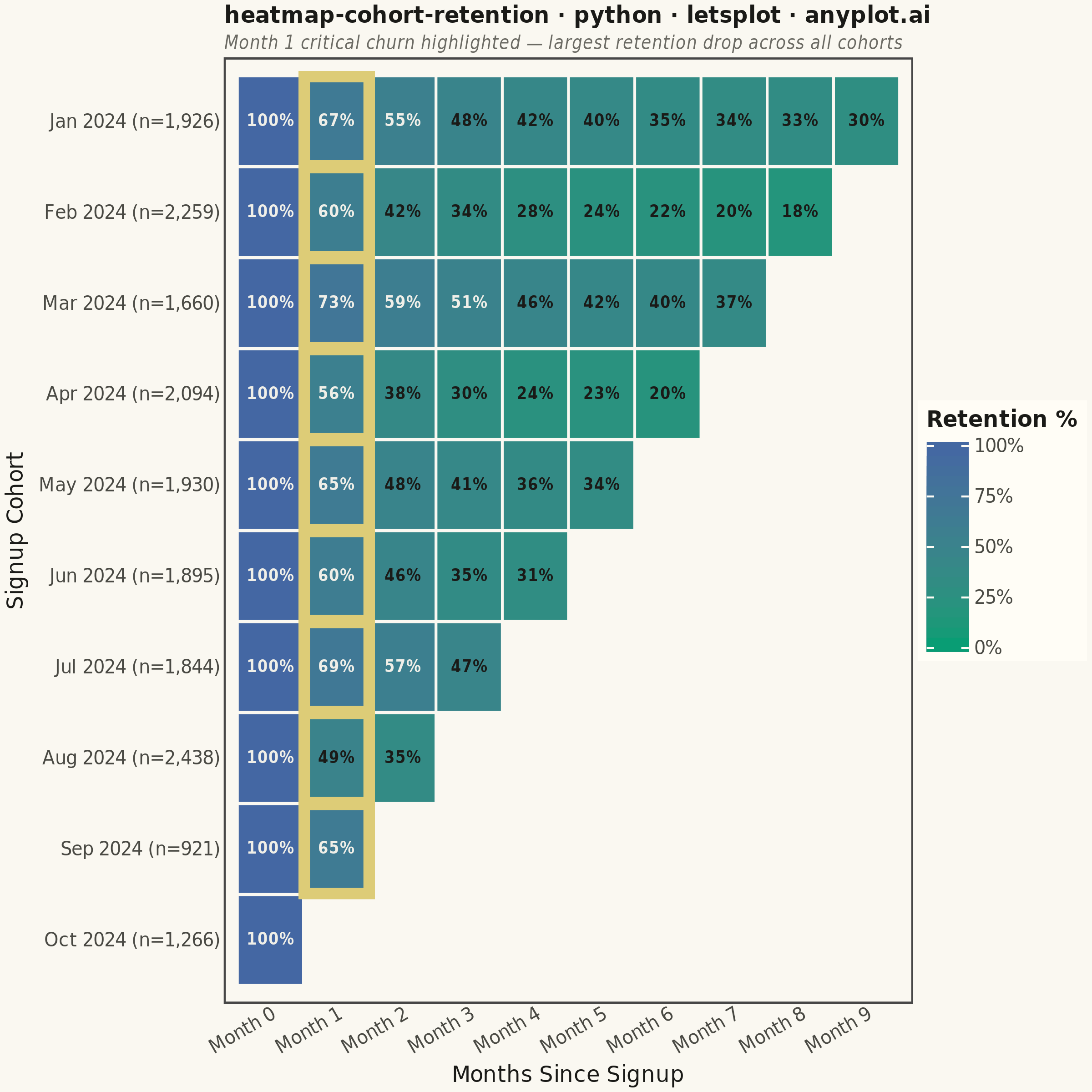
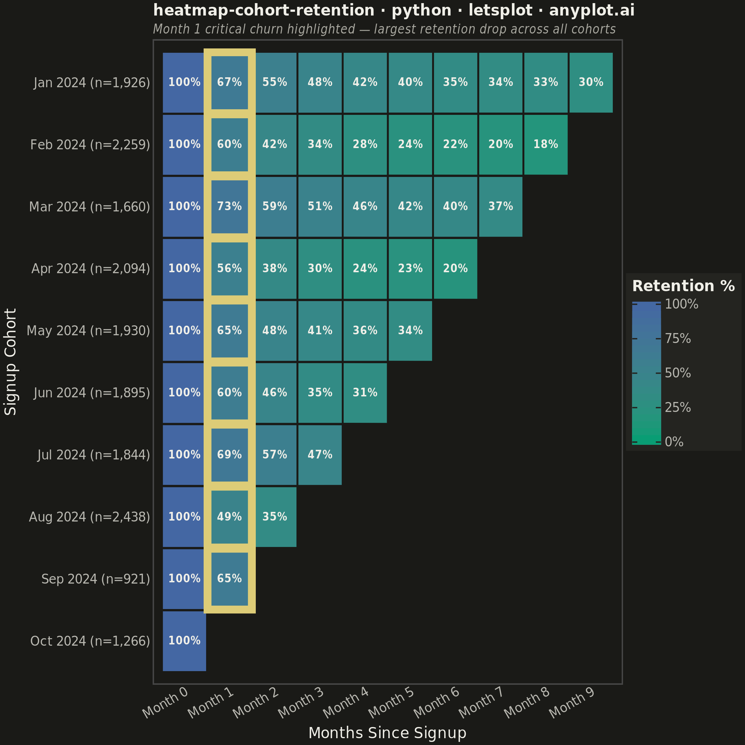
A triangular heatmap displaying user retention rates across signup cohorts and time periods. Each row represents a cohort (e.g., users who signed up in a specific month), each column represents periods since signup, and cell color intensity indicates the retention percentage. The triangular shape naturally emerges because more recent cohorts have fewer elapsed periods. This visualization reveals retention trends, highlights churn patterns, and enables comparison of cohort quality over time.
""" anyplot.ai
heatmap-cohort-retention: Cohort Retention Heatmap
Library: letsplot 4.10.1 | Python 3.13.14
Quality: 88/100 | Updated: 2026-06-20
"""

import os

import numpy as np
import pandas as pd
from lets_plot import *


LetsPlot.setup_html()

# Theme tokens — Imprint palette, theme-adaptive chrome
THEME = os.getenv("ANYPLOT_THEME", "light")
PAGE_BG = "#FAF8F1" if THEME == "light" else "#1A1A17"
ELEVATED_BG = "#FFFDF6" if THEME == "light" else "#242420"
INK = "#1A1A17" if THEME == "light" else "#F0EFE8"
INK_SOFT = "#4A4A44" if THEME == "light" else "#B8B7B0"
INK_MUTED = "#6B6A63" if THEME == "light" else "#A8A79F"
ANYPLOT_AMBER = "#DDCC77"  # caution/attention accent (outside categorical pool)

# Data — monthly SaaS cohort retention over 10 months
np.random.seed(42)
cohort_labels = [
    "Jan 2024",
    "Feb 2024",
    "Mar 2024",
    "Apr 2024",
    "May 2024",
    "Jun 2024",
    "Jul 2024",
    "Aug 2024",
    "Sep 2024",
    "Oct 2024",
]
n_cohorts = len(cohort_labels)
n_periods = 10
cohort_sizes = np.random.randint(800, 2500, n_cohorts)

# Distinct per-cohort profiles for visible variation across rows
cohort_profiles = [
    np.array([100.0, 68, 55, 48, 43, 39, 36, 34, 32, 31]),  # Jan - strong
    np.array([100.0, 58, 42, 34, 29, 25, 22, 20, 19, 18]),  # Feb - weak
    np.array([100.0, 72, 60, 52, 46, 42, 39, 37, 35, 34]),  # Mar - best
    np.array([100.0, 55, 38, 30, 25, 22, 20, 18, 17, 16]),  # Apr - poor
    np.array([100.0, 65, 50, 42, 37, 33, 30, 28, 26, 25]),  # May - average
    np.array([100.0, 60, 45, 36, 31, 27, 24, 22, 21, 20]),  # Jun - below avg
    np.array([100.0, 70, 56, 47, 41, 37, 34, 32, 30, 29]),  # Jul - improving
    np.array([100.0, 50, 35, 27, 23, 20, 18, 16, 15, 14]),  # Aug - worst
    np.array([100.0, 66, 52, 44, 38, 34, 31, 29, 27, 26]),  # Sep - recovery
    np.array([100.0, 63, 48, 40, 35, 31, 28, 26, 24, 23]),  # Oct - steady
]

# Triangular retention matrix — earlier cohorts have more observed periods
rows = []
for i in range(n_cohorts):
    available_periods = n_periods - i
    prev_retention = 100.0
    for j in range(available_periods):
        if j == 0:
            retention = 100.0
        else:
            noise = np.random.uniform(-1.5, 1.5)
            retention = np.clip(cohort_profiles[i][j] + noise, 5, 100)
            retention = min(retention, prev_retention - 0.5)
        prev_retention = retention
        rows.append(
            {
                "cohort": f"{cohort_labels[i]} (n={cohort_sizes[i]:,})",
                "period": f"Month {j}",
                "period_num": j,
                "retention": round(retention, 1),
            }
        )

df = pd.DataFrame(rows)

# Categorical ordering for correct axis display (newest cohort at top)
cohort_order = [f"{c} (n={s:,})" for c, s in zip(cohort_labels, cohort_sizes, strict=False)]
period_order = [f"Month {j}" for j in range(n_periods)]
df["cohort"] = pd.Categorical(df["cohort"], categories=cohort_order[::-1], ordered=True)
df["period"] = pd.Categorical(df["period"], categories=period_order, ordered=True)

# Cell labels with adaptive text contrast
# imprint_seq: low=#009E73 (green) → high=#4467A3 (blue)
# Both are mid-dark; near-white text suits high-retention cells, INK suits low-retention
df["label"] = df["retention"].apply(lambda v: f"{v:.0f}%")
df["use_dark_text"] = df["retention"] < 50
df_dark_text = df[df["use_dark_text"]].copy()
df_light_text = df[~df["use_dark_text"]].copy()

# Month 1 subset — highlight critical first-month churn across all cohorts
df_drop = df[df["period_num"] == 1].copy()

# Tooltips
tile_tooltips = (
    layer_tooltips().format("retention", ".1f").line("@cohort").line("@period | Retention: @retention%").min_width(220)
)

# Title: 57 chars; square canvas (600px base) is narrower than landscape (800px),
# so scale the 16px baseline by 600/800 to avoid overflow on the right edge
title = "heatmap-cohort-retention · python · letsplot · anyplot.ai"
n = len(title)
ratio = 67 / n if n > 67 else 1.0
title_fontsize = max(round(16 * ratio * (600 / 800)), 11)

# Theme-adaptive chrome — standard scale-based sizes per default-style-guide.md
anyplot_theme = theme(
    plot_background=element_rect(fill=PAGE_BG, color=PAGE_BG),
    panel_background=element_rect(fill=PAGE_BG),
    panel_grid=element_blank(),
    plot_title=element_text(size=title_fontsize, color=INK, face="bold"),
    plot_subtitle=element_text(size=10, color=INK_MUTED, face="italic"),
    axis_title=element_text(size=12, color=INK),
    axis_text=element_text(size=10, color=INK_SOFT),
    legend_background=element_rect(fill=ELEVATED_BG, color=INK_SOFT),
    legend_text=element_text(size=10, color=INK_SOFT),
    legend_title=element_text(size=12, color=INK, face="bold"),
)

# Plot
plot = (
    ggplot(df, aes(x="period", y="cohort", fill="retention"))
    + geom_tile(tooltips=tile_tooltips, color=PAGE_BG, size=0.3, width=0.98, height=0.98)
    # Orange borders highlight the critical Month 1 churn drop across all cohorts
    + geom_tile(
        aes(x="period", y="cohort"),
        data=df_drop,
        fill="rgba(0,0,0,0)",
        color=ANYPLOT_AMBER,
        size=2.8,
        width=0.98,
        height=0.98,
        tooltips="none",
    )
    + geom_text(
        aes(x="period", y="cohort", label="label"), data=df_light_text, color="#F0EFE8", size=4, fontface="bold"
    )
    + geom_text(aes(x="period", y="cohort", label="label"), data=df_dark_text, color=INK, size=4, fontface="bold")
    # Imprint sequential colormap: green→blue (single-polarity retention scale)
    + scale_fill_gradient(
        low="#009E73",
        high="#4467A3",
        limits=[0, 100],
        name="Retention %",
        breaks=[0, 25, 50, 75, 100],
        labels=["0%", "25%", "50%", "75%", "100%"],
    )
    + labs(
        x="Months Since Signup",
        y="Signup Cohort",
        title=title,
        subtitle="Month 1 critical churn highlighted — largest retention drop across all cohorts",
    )
    + theme_minimal()
    + anyplot_theme
    + ggsize(600, 600)
)

# Save — square canvas: ggsize(600, 600) × scale=4 → 2400×2400 px
ggsave(plot, f"plot-{THEME}.png", path=".", scale=4)
ggsave(plot, f"plot-{THEME}.html", path=".")
Runnable source as JSON, for any HTTP client: https://api.anyplot.ai/specs/heatmap-cohort-retention/letsplot/code. Any spec id and library id listed in llms-full.txt fit the same URL shape; every URL below is complete and callable.
{
  "spec_id": "heatmap-cohort-retention",
  "language": "python",
  "library": "letsplot",
  "page": "https://anyplot.ai/heatmap-cohort-retention/python/letsplot",
  "hub": "https://anyplot.ai/heatmap-cohort-retention",
  "code_json": "https://api.anyplot.ai/specs/heatmap-cohort-retention/letsplot/code",
  "spec_json": "https://api.anyplot.ai/specs/heatmap-cohort-retention",
  "render_light_png": "https://storage.googleapis.com/anyplot-images/plots/heatmap-cohort-retention/python/letsplot/plot-light.png",
  "render_dark_png": "https://storage.googleapis.com/anyplot-images/plots/heatmap-cohort-retention/python/letsplot/plot-dark.png",
  "interactive_light_html": "https://storage.googleapis.com/anyplot-images/plots/heatmap-cohort-retention/python/letsplot/plot-light.html",
  "interactive_dark_html": "https://storage.googleapis.com/anyplot-images/plots/heatmap-cohort-retention/python/letsplot/plot-dark.html",
  "quality_score": 88.0,
  "license": "MIT",
  "guide": "https://anyplot.ai/llms.txt"
}
Part of Cohort Retention Heatmap on anyplot.ai.