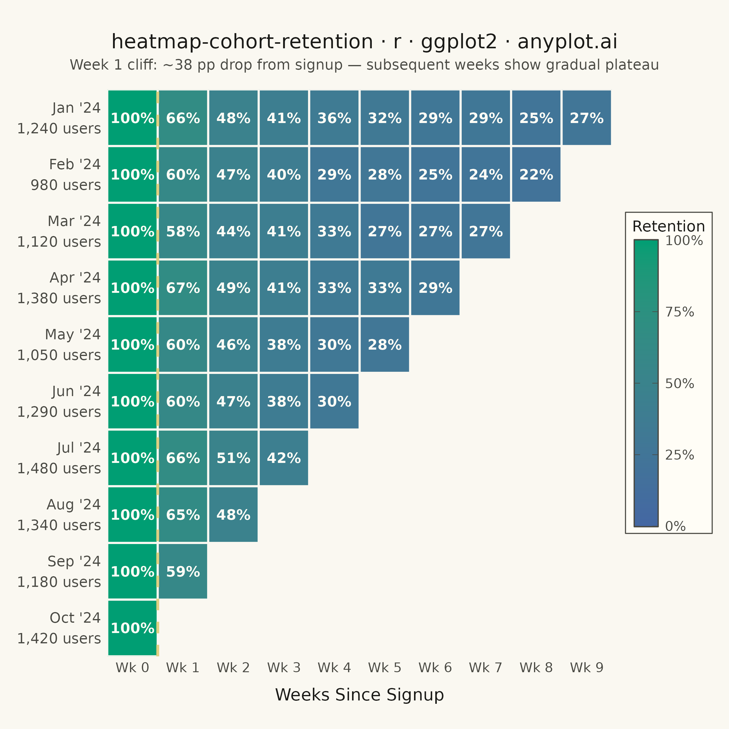
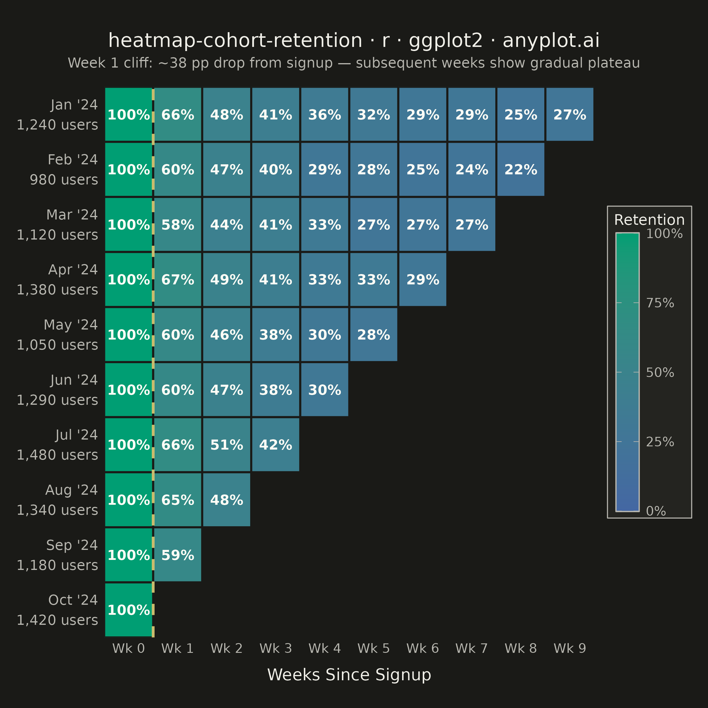
A triangular heatmap displaying user retention rates across signup cohorts and time periods. Each row represents a cohort (e.g., users who signed up in a specific month), each column represents periods since signup, and cell color intensity indicates the retention percentage. The triangular shape naturally emerges because more recent cohorts have fewer elapsed periods. This visualization reveals retention trends, highlights churn patterns, and enables comparison of cohort quality over time.
#' anyplot.ai
#' heatmap-cohort-retention: Cohort Retention Heatmap
#' Library: ggplot2 3.5.1 | R 4.4.1
#' Quality: 90/100 | Created: 2026-06-20

library(ggplot2)
library(ragg)

set.seed(42)

# --- Theme tokens ---
THEME         <- Sys.getenv("ANYPLOT_THEME", "light")
PAGE_BG       <- if (THEME == "light") "#FAF8F1" else "#1A1A17"
ELEVATED_BG   <- if (THEME == "light") "#FFFDF6" else "#242420"
INK           <- if (THEME == "light") "#1A1A17" else "#F0EFE8"
INK_SOFT      <- if (THEME == "light") "#4A4A44" else "#B8B7B0"
ANYPLOT_AMBER <- "#DDCC77"

# --- Data ---
cohort_names <- c("Jan '24", "Feb '24", "Mar '24", "Apr '24", "May '24",
                  "Jun '24", "Jul '24", "Aug '24", "Sep '24", "Oct '24")
cohort_sizes <- c(1240L, 980L, 1120L, 1380L, 1050L, 1290L, 1480L, 1340L, 1180L, 1420L)
n_cohorts    <- length(cohort_names)

# Realistic retention decay: steep initial drop then gradual plateau
period_base  <- c(100.0, 61.5, 47.0, 38.5, 33.0, 29.5, 27.0, 25.0, 23.5, 22.0)

# Per-cohort quality offset (product improvements lift retention over time)
cohort_drift <- c(2.0, -1.5, 0.5, 3.0, -2.0, 1.0, 4.0, 2.5, -0.5, 1.5)

rows <- list()
for (i in seq_along(cohort_names)) {
  n_periods <- n_cohorts - i + 1L  # Jan: 10 periods, ..., Oct: 1 period
  for (p in 0L:(n_periods - 1L)) {
    rate <- if (p == 0L) {
      100.0
    } else {
      raw <- period_base[p + 1L] + cohort_drift[i] + rnorm(1L, 0, 1.5)
      max(8.0, min(95.0, raw))
    }
    rows[[length(rows) + 1L]] <- data.frame(
      cohort      = cohort_names[i],
      cohort_size = cohort_sizes[i],
      period      = p,
      ret_rate    = round(rate),
      stringsAsFactors = FALSE
    )
  }
}
df <- do.call(rbind, rows)

# Week 1 cliff: the key insight in this chart
wk1_avg    <- round(mean(df$ret_rate[df$period == 1L]))
cliff_drop <- 100L - wk1_avg

# Y-axis labels: "Jan '24\n1,240 users" (two lines)
size_fmt <- formatC(cohort_sizes, format = "d", big.mark = ",")
y_labels_full <- paste0(cohort_names, "\n", size_fmt, " users")

df$cohort_label <- paste0(
  df$cohort, "\n",
  formatC(df$cohort_size, format = "d", big.mark = ","), " users"
)

# Factor for y-axis: levels bottom-to-top = Oct → Jan (Jan displayed at top)
df$cohort_label <- factor(df$cohort_label, levels = rev(y_labels_full))

# Factor for x-axis: Wk 0 → Wk 9 (all levels present via Jan's full row)
df$week_label <- factor(
  paste0("Wk ", df$period),
  levels = paste0("Wk ", 0L:(n_cohorts - 1L))
)

# --- Plot ---
TITLE    <- "heatmap-cohort-retention · r · ggplot2 · anyplot.ai"
SUBTITLE <- sprintf(
  "Week 1 cliff: ~%d pp drop from signup — subsequent weeks show gradual plateau",
  cliff_drop
)

p <- ggplot(df, aes(x = week_label, y = cohort_label, fill = ret_rate)) +
  geom_tile(color = PAGE_BG, linewidth = 0.6) +
  geom_text(
    aes(label = paste0(ret_rate, "%")),
    color    = "#FFFDF6",
    size     = 3.0,
    fontface = "bold"
  ) +
  # Amber dashed separator marks the "cliff" between Wk 0 and Wk 1
  geom_vline(
    xintercept = 1.5,
    color      = ANYPLOT_AMBER,
    linewidth  = 0.8,
    linetype   = "dashed",
    alpha      = 0.9
  ) +
  scale_fill_gradient(
    low    = "#4467A3",  # Imprint blue  → low retention
    high   = "#009E73", # Imprint green → high retention (positive signal)
    name   = "Retention",
    labels = function(x) paste0(x, "%"),
    limits = c(0, 100),
    breaks = c(0, 25, 50, 75, 100)
  ) +
  scale_x_discrete(expand = expansion(add = 0.5)) +
  scale_y_discrete(expand = expansion(add = 0.5)) +
  guides(fill = guide_colorbar(
    barheight    = unit(6, "cm"),
    barwidth     = unit(0.5, "cm"),
    title.hjust  = 0.5,
    ticks.colour = INK_SOFT,
    frame.colour = INK_SOFT
  )) +
  labs(
    title    = TITLE,
    subtitle = SUBTITLE,
    x        = "Weeks Since Signup",
    y        = NULL
  ) +
  theme_minimal(base_size = 8) +
  theme(
    plot.background     = element_rect(fill = PAGE_BG, color = PAGE_BG),
    panel.background    = element_rect(fill = PAGE_BG, color = NA),
    panel.grid          = element_blank(),
    axis.title.x        = element_text(color = INK, size = 10,
                                       margin = margin(t = 8)),
    axis.text.x         = element_text(color = INK_SOFT, size = 8),
    axis.text.y         = element_text(color = INK_SOFT, size = 8.5,
                                       lineheight = 1.2, hjust = 1),
    plot.title          = element_text(color = INK, size = 12,
                                       hjust = 0.5,
                                       margin = margin(b = 4)),
    plot.subtitle       = element_text(color = INK_SOFT, size = 8.5,
                                       hjust = 0.5,
                                       margin = margin(b = 10)),
    plot.title.position = "plot",
    legend.position     = "right",
    legend.background   = element_rect(fill = ELEVATED_BG, color = INK_SOFT,
                                       linewidth = 0.3),
    legend.text         = element_text(color = INK_SOFT, size = 8),
    legend.title        = element_text(color = INK, size = 9),
    legend.key.height   = unit(1.5, "cm"),
    legend.key.width    = unit(0.5, "cm"),
    plot.margin         = margin(t = 20, r = 10, b = 15, l = 10)
  )

# --- Save (square canvas: 2400x2400 px) ---
ggsave(
  filename = sprintf("plot-%s.png", THEME),
  plot     = p,
  device   = ragg::agg_png,
  width    = 6,
  height   = 6,
  units    = "in",
  dpi      = 400
)
Runnable source as JSON, for any HTTP client: https://api.anyplot.ai/specs/heatmap-cohort-retention/ggplot2/code. Any spec id and library id listed in llms-full.txt fit the same URL shape; every URL below is complete and callable.
{
  "spec_id": "heatmap-cohort-retention",
  "language": "r",
  "library": "ggplot2",
  "page": "https://anyplot.ai/heatmap-cohort-retention/r/ggplot2",
  "hub": "https://anyplot.ai/heatmap-cohort-retention",
  "code_json": "https://api.anyplot.ai/specs/heatmap-cohort-retention/ggplot2/code",
  "spec_json": "https://api.anyplot.ai/specs/heatmap-cohort-retention",
  "render_light_png": "https://storage.googleapis.com/anyplot-images/plots/heatmap-cohort-retention/r/ggplot2/plot-light.png",
  "render_dark_png": "https://storage.googleapis.com/anyplot-images/plots/heatmap-cohort-retention/r/ggplot2/plot-dark.png",
  "quality_score": 90.0,
  "license": "MIT",
  "guide": "https://anyplot.ai/llms.txt"
}
Part of Cohort Retention Heatmap on anyplot.ai.