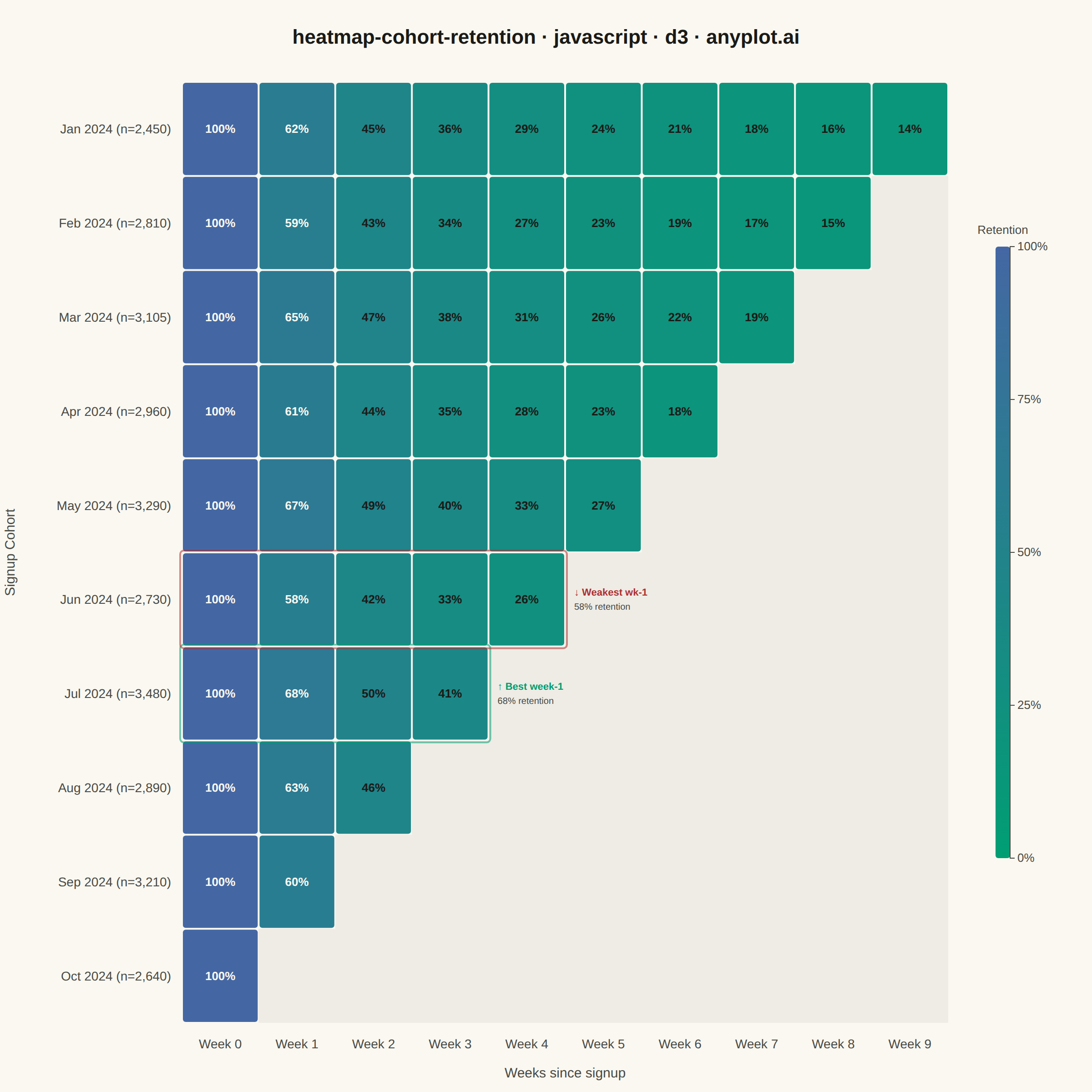
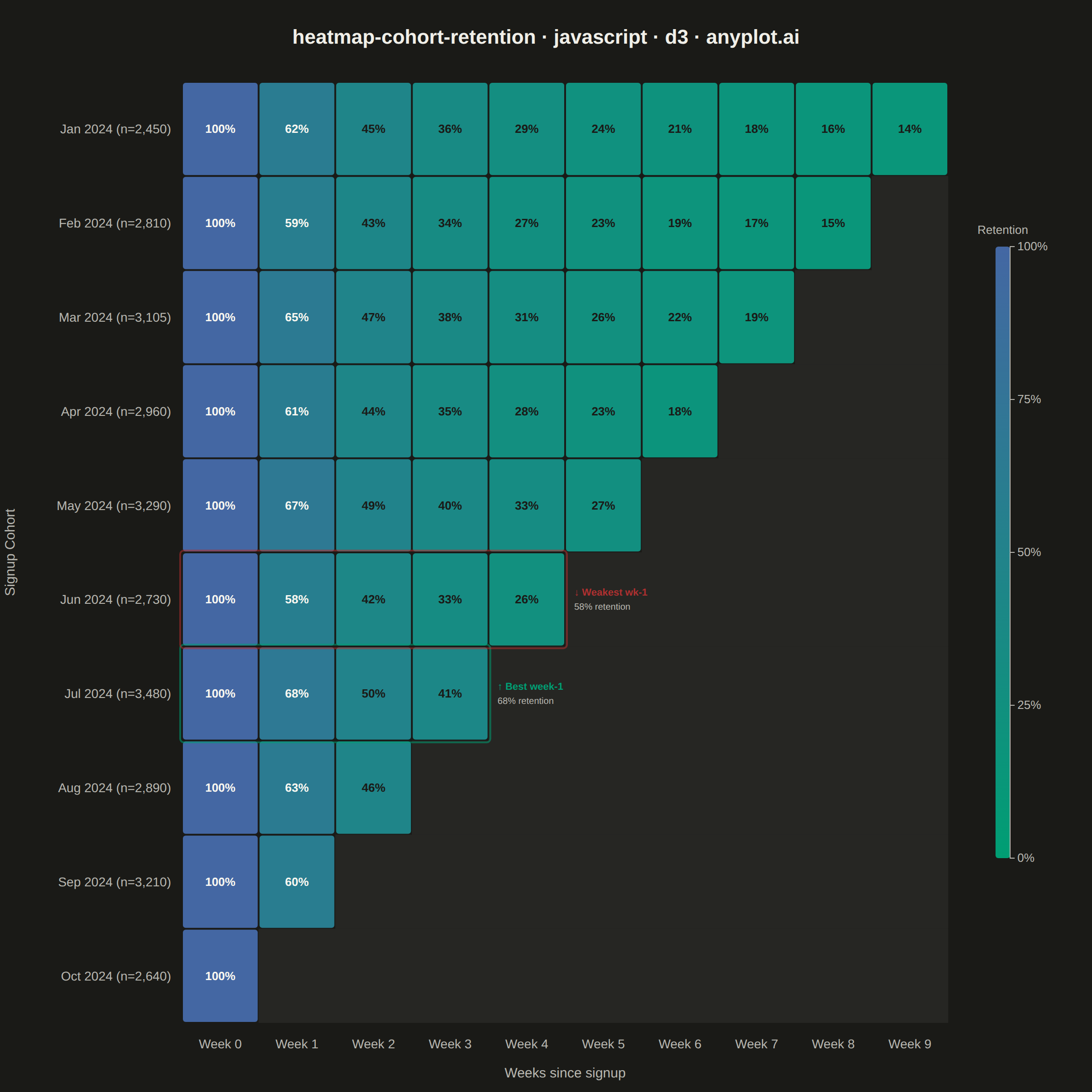
A triangular heatmap displaying user retention rates across signup cohorts and time periods. Each row represents a cohort (e.g., users who signed up in a specific month), each column represents periods since signup, and cell color intensity indicates the retention percentage. The triangular shape naturally emerges because more recent cohorts have fewer elapsed periods. This visualization reveals retention trends, highlights churn patterns, and enables comparison of cohort quality over time.
// anyplot.ai
// heatmap-cohort-retention: Cohort Retention Heatmap
// Library: d3 7.9.0 | JavaScript 22.22.3
// Quality: 90/100 | Created: 2026-06-20
//# anyplot-orientation: square

const t = window.ANYPLOT_TOKENS;
const { width, height } = window.ANYPLOT_SIZE;

// --- Data: SaaS product analytics — monthly signup cohorts, weekly retention ---
const cohortData = [
  { label: "Jan 2024", size: 2450, rates: [100, 62, 45, 36, 29, 24, 21, 18, 16, 14] },
  { label: "Feb 2024", size: 2810, rates: [100, 59, 43, 34, 27, 23, 19, 17, 15] },
  { label: "Mar 2024", size: 3105, rates: [100, 65, 47, 38, 31, 26, 22, 19] },
  { label: "Apr 2024", size: 2960, rates: [100, 61, 44, 35, 28, 23, 18] },
  { label: "May 2024", size: 3290, rates: [100, 67, 49, 40, 33, 27] },
  { label: "Jun 2024", size: 2730, rates: [100, 58, 42, 33, 26] },
  { label: "Jul 2024", size: 3480, rates: [100, 68, 50, 41] },
  { label: "Aug 2024", size: 2890, rates: [100, 63, 46] },
  { label: "Sep 2024", size: 3210, rates: [100, 60] },
  { label: "Oct 2024", size: 2640, rates: [100] },
];

const maxPeriods = 10;

const cells = [];
cohortData.forEach((cohort, ci) => {
  cohort.rates.forEach((rate, pi) => {
    cells.push({ ci, pi, rate });
  });
});

// --- Layout (increased left margin to prevent y-axis label overlap with cohort labels) ---
const margin = { top: 90, right: 158, bottom: 76, left: 200 };
const iw = width - margin.left - margin.right;
const ih = height - margin.top - margin.bottom;
const cellW = iw / maxPeriods;
const cellH = ih / cohortData.length;

// --- SVG root ---
const svg = d3
  .select("#container")
  .append("svg")
  .attr("width", width)
  .attr("height", height);

const g = svg.append("g").attr("transform", `translate(${margin.left},${margin.top})`);

// --- Sequential color scale: Imprint seq (green→blue), low=green, high=blue ---
const colorScale = d3.scaleSequential(d3.interpolateRgbBasis(t.seq)).domain([0, 100]);

// --- Shade empty upper-right triangle to emphasize the cohort format's shape ---
const emptyFill =
  window.ANYPLOT_THEME === "dark" ? "rgba(240,239,232,0.06)" : "rgba(26,26,23,0.05)";
cohortData.forEach((cohort, ci) => {
  const emptyStart = cohort.rates.length;
  if (emptyStart < maxPeriods) {
    g.append("rect")
      .attr("x", emptyStart * cellW)
      .attr("y", ci * cellH)
      .attr("width", (maxPeriods - emptyStart) * cellW)
      .attr("height", cellH)
      .attr("fill", emptyFill);
  }
});

// --- Heatmap cells (triangular: older cohorts have more periods) ---
const gap = 2;
g.selectAll(".cell")
  .data(cells)
  .join("rect")
  .attr("class", "cell")
  .attr("x", (d) => d.pi * cellW + gap / 2)
  .attr("y", (d) => d.ci * cellH + gap / 2)
  .attr("width", cellW - gap)
  .attr("height", cellH - gap)
  .attr("rx", 3)
  .attr("fill", (d) => colorScale(d.rate));

// --- Best cohort highlight: Jul 2024 (68% wk-1, highest initial retention) ---
const bestCi = 6;
const bestPeriods = cohortData[bestCi].rates.length;
g.append("rect")
  .attr("x", -2)
  .attr("y", bestCi * cellH - 2)
  .attr("width", bestPeriods * cellW + 4)
  .attr("height", cellH + 4)
  .attr("rx", 4)
  .attr("fill", "none")
  .attr("stroke", t.palette[0])
  .attr("stroke-width", 2)
  .attr("opacity", 0.55);

// --- Worst cohort highlight: Jun 2024 (58% wk-1, lowest initial retention) ---
const worstCi = 5;
const worstPeriods = cohortData[worstCi].rates.length;
g.append("rect")
  .attr("x", -2)
  .attr("y", worstCi * cellH - 2)
  .attr("width", worstPeriods * cellW + 4)
  .attr("height", cellH + 4)
  .attr("rx", 4)
  .attr("fill", "none")
  .attr("stroke", t.palette[4])
  .attr("stroke-width", 2)
  .attr("opacity", 0.55);

// --- Retention % labels inside each cell (dark text on lighter cells, light on darker) ---
g.selectAll(".cell-label")
  .data(cells)
  .join("text")
  .attr("class", "cell-label")
  .attr("x", (d) => d.pi * cellW + cellW / 2)
  .attr("y", (d) => d.ci * cellH + cellH / 2)
  .attr("text-anchor", "middle")
  .attr("dominant-baseline", "central")
  .attr("fill", (d) => (d.rate >= 55 ? "#FAF8F1" : "#1A1A17"))
  .style("font-size", "13px")
  .style("font-weight", "600")
  .text((d) => `${d.rate}%`);

// --- X axis: week period labels ---
g.append("g")
  .attr("transform", `translate(0,${ih})`)
  .selectAll("text")
  .data(d3.range(maxPeriods))
  .join("text")
  .attr("x", (d) => d * cellW + cellW / 2)
  .attr("y", 28)
  .attr("text-anchor", "middle")
  .attr("fill", t.inkSoft)
  .style("font-size", "14px")
  .text((d) => `Week ${d}`);

// --- Y axis: cohort labels with cohort sizes ---
g.selectAll(".cohort-label")
  .data(cohortData)
  .join("text")
  .attr("class", "cohort-label")
  .attr("x", -12)
  .attr("y", (d, i) => i * cellH + cellH / 2)
  .attr("text-anchor", "end")
  .attr("dominant-baseline", "central")
  .attr("fill", t.inkSoft)
  .style("font-size", "14px")
  .text((d) => `${d.label} (n=${d.size.toLocaleString()})`);

// --- Cohort insight annotations (appear in the empty triangle area beside each row) ---
g.append("text")
  .attr("x", bestPeriods * cellW + 10)
  .attr("y", bestCi * cellH + cellH / 2 - 7)
  .attr("dominant-baseline", "central")
  .attr("fill", t.palette[0])
  .style("font-size", "11px")
  .style("font-weight", "600")
  .text("↑ Best week-1");
g.append("text")
  .attr("x", bestPeriods * cellW + 10)
  .attr("y", bestCi * cellH + cellH / 2 + 9)
  .attr("dominant-baseline", "central")
  .attr("fill", t.inkSoft)
  .style("font-size", "10px")
  .text("68% retention");

g.append("text")
  .attr("x", worstPeriods * cellW + 10)
  .attr("y", worstCi * cellH + cellH / 2 - 7)
  .attr("dominant-baseline", "central")
  .attr("fill", t.palette[4])
  .style("font-size", "11px")
  .style("font-weight", "600")
  .text("↓ Weakest wk-1");
g.append("text")
  .attr("x", worstPeriods * cellW + 10)
  .attr("y", worstCi * cellH + cellH / 2 + 9)
  .attr("dominant-baseline", "central")
  .attr("fill", t.inkSoft)
  .style("font-size", "10px")
  .text("58% retention");

// --- Axis descriptor labels ---
svg
  .append("text")
  .attr("x", margin.left + iw / 2)
  .attr("y", height - 16)
  .attr("text-anchor", "middle")
  .attr("fill", t.inkSoft)
  .style("font-size", "15px")
  .text("Weeks since signup");

// Y-axis label moved to y=16 to avoid overlap with cohort row labels
svg
  .append("text")
  .attr("transform", "rotate(-90)")
  .attr("x", -(margin.top + ih / 2))
  .attr("y", 16)
  .attr("text-anchor", "middle")
  .attr("fill", t.inkSoft)
  .style("font-size", "15px")
  .text("Signup Cohort");

// --- Color bar legend (Imprint sequential: low → high retention) ---
const barW = 16;
const barH = ih * 0.65;
const barX = iw + 52;
const barY = (ih - barH) / 2;

const defs = svg.append("defs");
const grad = defs
  .append("linearGradient")
  .attr("id", "retention-seq")
  .attr("x1", "0%")
  .attr("y1", "100%")
  .attr("x2", "0%")
  .attr("y2", "0%");

[0, 25, 50, 75, 100].forEach((v) => {
  grad.append("stop").attr("offset", `${v}%`).attr("stop-color", colorScale(v));
});

g.append("rect")
  .attr("x", barX)
  .attr("y", barY)
  .attr("width", barW)
  .attr("height", barH)
  .attr("rx", 3)
  .attr("fill", "url(#retention-seq)");

const legendScale = d3.scaleLinear().domain([0, 100]).range([barY + barH, barY]);

const legendG = g
  .append("g")
  .attr("transform", `translate(${barX + barW},0)`)
  .call(
    d3
      .axisRight(legendScale)
      .tickValues([0, 25, 50, 75, 100])
      .tickFormat((d) => `${d}%`)
      .tickSize(5)
  );

legendG.select(".domain").attr("stroke", t.inkSoft);
legendG.selectAll(".tick line").attr("stroke", t.inkSoft);
legendG.selectAll(".tick text").attr("fill", t.inkSoft).style("font-size", "13px");

g.append("text")
  .attr("x", barX + barW / 2)
  .attr("y", barY - 14)
  .attr("text-anchor", "middle")
  .attr("fill", t.inkSoft)
  .style("font-size", "13px")
  .text("Retention");

// --- Chart title ---
svg
  .append("text")
  .attr("x", width / 2)
  .attr("y", 48)
  .attr("text-anchor", "middle")
  .attr("fill", t.ink)
  .style("font-size", "22px")
  .style("font-weight", "600")
  .text("heatmap-cohort-retention · javascript · d3 · anyplot.ai");
Runnable source as JSON, for any HTTP client: https://api.anyplot.ai/specs/heatmap-cohort-retention/d3/code. Any spec id and library id listed in llms-full.txt fit the same URL shape; every URL below is complete and callable.
{
  "spec_id": "heatmap-cohort-retention",
  "language": "javascript",
  "library": "d3",
  "page": "https://anyplot.ai/heatmap-cohort-retention/javascript/d3",
  "hub": "https://anyplot.ai/heatmap-cohort-retention",
  "code_json": "https://api.anyplot.ai/specs/heatmap-cohort-retention/d3/code",
  "spec_json": "https://api.anyplot.ai/specs/heatmap-cohort-retention",
  "render_light_png": "https://storage.googleapis.com/anyplot-images/plots/heatmap-cohort-retention/javascript/d3/plot-light.png",
  "render_dark_png": "https://storage.googleapis.com/anyplot-images/plots/heatmap-cohort-retention/javascript/d3/plot-dark.png",
  "interactive_light_html": "https://storage.googleapis.com/anyplot-images/plots/heatmap-cohort-retention/javascript/d3/plot-light.html",
  "interactive_dark_html": "https://storage.googleapis.com/anyplot-images/plots/heatmap-cohort-retention/javascript/d3/plot-dark.html",
  "quality_score": 90.0,
  "license": "MIT",
  "guide": "https://anyplot.ai/llms.txt"
}
Part of Cohort Retention Heatmap on anyplot.ai.