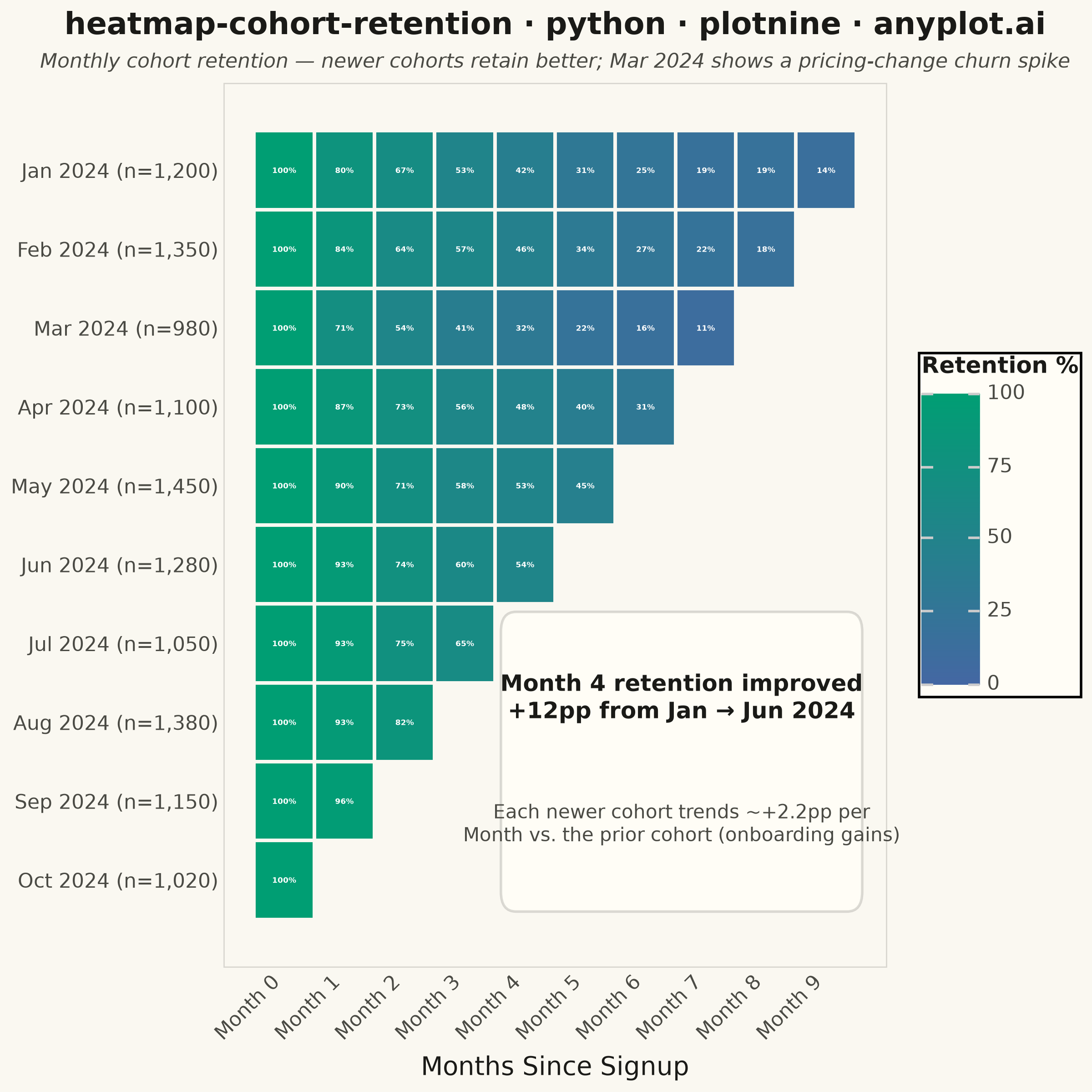
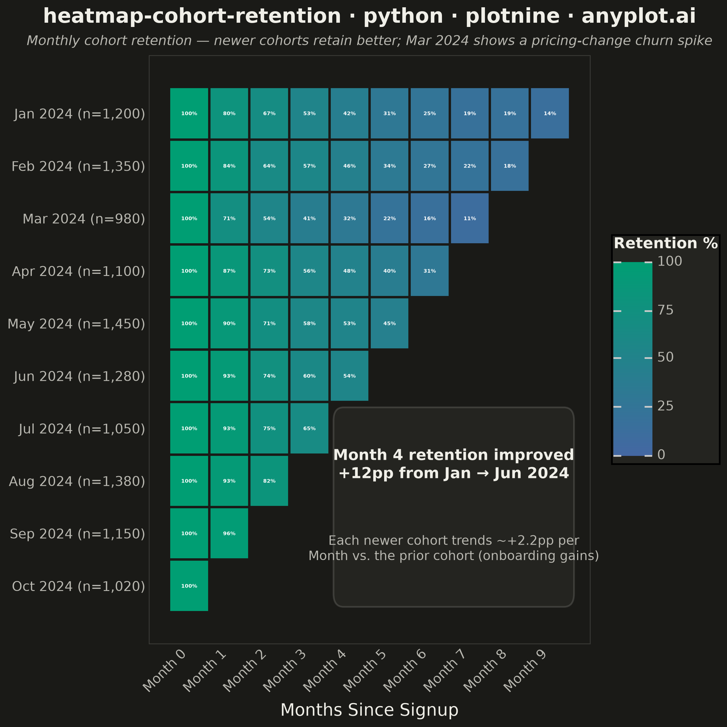
A triangular heatmap displaying user retention rates across signup cohorts and time periods. Each row represents a cohort (e.g., users who signed up in a specific month), each column represents periods since signup, and cell color intensity indicates the retention percentage. The triangular shape naturally emerges because more recent cohorts have fewer elapsed periods. This visualization reveals retention trends, highlights churn patterns, and enables comparison of cohort quality over time.
""" anyplot.ai
heatmap-cohort-retention: Cohort Retention Heatmap
Library: plotnine 0.15.8 | Python 3.13.15
Quality: 95/100 | Updated: 2026-08-17
"""

import os

import numpy as np
import pandas as pd
from matplotlib.patches import FancyBboxPatch
from plotnine import (
    aes,
    element_blank,
    element_rect,
    element_text,
    geom_text,
    geom_tile,
    ggplot,
    labs,
    scale_fill_gradient,
    scale_x_continuous,
    scale_y_discrete,
    theme,
    theme_minimal,
)


# Theme-adaptive chrome
THEME = os.getenv("ANYPLOT_THEME", "light")
PAGE_BG = "#FAF8F1" if THEME == "light" else "#1A1A17"
ELEVATED_BG = "#FFFDF6" if THEME == "light" else "#242420"
INK = "#1A1A17" if THEME == "light" else "#F0EFE8"
INK_SOFT = "#4A4A44" if THEME == "light" else "#B8B7B0"
RULE = (26 / 255, 26 / 255, 23 / 255, 0.15) if THEME == "light" else (240 / 255, 239 / 255, 232 / 255, 0.15)

# Imprint sequential colormap (brand green -> blue) for single-polarity continuous data
# Green (brand) reads as "good" -> high retention; blue anchors low retention
SEQ_HIGH_RETENTION = "#009E73"
SEQ_LOW_RETENTION = "#4467A3"

# Data
np.random.seed(42)
cohorts = [
    "Jan 2024",
    "Feb 2024",
    "Mar 2024",
    "Apr 2024",
    "May 2024",
    "Jun 2024",
    "Jul 2024",
    "Aug 2024",
    "Sep 2024",
    "Oct 2024",
]
n_cohorts = len(cohorts)
cohort_sizes = [1200, 1350, 980, 1100, 1450, 1280, 1050, 1380, 1150, 1020]
# Mar 2024 (index 2) suffered a pricing-change churn spike -> visibly worse retention
churn_event_idx = 2

rows = []
for i, cohort in enumerate(cohorts):
    max_periods = n_cohorts - i
    for period in range(max_periods):
        if period == 0:
            retention = 100.0
        else:
            base_decay = 100 * np.exp(-0.22 * period)
            noise = np.random.uniform(-3, 3)
            trend_bonus = i * 2.2  # onboarding steadily improves for later cohorts
            churn_penalty = 14 if i == churn_event_idx else 0
            retention = np.clip(base_decay + noise + trend_bonus - churn_penalty, 5, 100)
        rows.append(
            {"cohort": cohort, "period": period, "retention_rate": round(retention, 1), "cohort_size": cohort_sizes[i]}
        )

df = pd.DataFrame(rows)

# Y-axis labels carry cohort size; reversed order puts Jan 2024 at the top, Oct 2024 at the bottom
df["cohort_label"] = df.apply(lambda r: f"{r['cohort']} (n={r['cohort_size']:,})", axis=1)
cohort_labels = [f"{c} (n={s:,})" for c, s in zip(cohorts, cohort_sizes, strict=True)]
df["cohort_label"] = pd.Categorical(df["cohort_label"], categories=cohort_labels[::-1], ordered=True)

df["label"] = df["retention_rate"].apply(lambda v: f"{v:.0f}%")

# Compare an early vs. a later cohort at the same period for storytelling
compare_period = 4
early_val = df[(df["cohort"] == "Jan 2024") & (df["period"] == compare_period)]["retention_rate"].values[0]
later_val = df[(df["cohort"] == "Jun 2024") & (df["period"] == compare_period)]["retention_rate"].values[0]
improvement = later_val - early_val
cohort_trend_pp = 2.2  # per-cohort onboarding bonus baked into the synthetic retention formula above

# Plot
plot = (
    ggplot(df, aes(x="period", y="cohort_label", fill="retention_rate"))
    + geom_tile(color=PAGE_BG, size=0.8)
    + geom_text(aes(label="label"), size=3.1, color="#FFFFFF", fontweight="bold")
    + scale_fill_gradient(low=SEQ_LOW_RETENTION, high=SEQ_HIGH_RETENTION, limits=(0, 100), name="Retention %")
    + scale_x_continuous(breaks=range(n_cohorts), labels=[f"Month {i}" for i in range(n_cohorts)])
    + scale_y_discrete(expand=(0.06, 0))
    + labs(
        x="Months Since Signup",
        y="",
        title="heatmap-cohort-retention · python · plotnine · anyplot.ai",
        subtitle="Monthly cohort retention — newer cohorts retain better; Mar 2024 shows a pricing-change churn spike",
    )
    + theme_minimal()
    + theme(
        figure_size=(6, 6),
        plot_title=element_text(size=12, ha="center", weight="bold", color=INK),
        plot_subtitle=element_text(size=8, ha="center", color=INK_SOFT, style="italic"),
        axis_title_x=element_text(size=10, color=INK),
        axis_text_x=element_text(size=8, color=INK_SOFT, angle=45, ha="right"),
        axis_text_y=element_text(size=8, color=INK_SOFT),
        legend_title=element_text(size=9, weight="bold", color=INK),
        legend_text=element_text(size=8, color=INK_SOFT),
        legend_background=element_rect(fill=ELEVATED_BG, color=None),
        panel_grid_major=element_blank(),
        panel_grid_minor=element_blank(),
        panel_border=element_rect(color=RULE, fill=None, size=0.5),
        plot_background=element_rect(fill=PAGE_BG, color=PAGE_BG),
        panel_background=element_rect(fill=PAGE_BG, color=PAGE_BG),
    )
)

# Render, then drop into the underlying matplotlib Figure/Axes (a capability
# unique to plotnine's matplotlib backend, unlike R ggplot2's grid graphics) to
# draw a rounded-corner callout that fills the empty triangle beneath the data
# and carries two data-backed insights instead of leaving that panel space bare.
fig = plot.draw()
ax = fig.axes[0]
callout_box = FancyBboxPatch(
    (3.6, 0.6),
    9.6 - 3.6,
    4.4 - 0.6,
    transform=ax.transData,
    boxstyle="round,pad=0,rounding_size=0.25",
    facecolor=ELEVATED_BG,
    edgecolor=RULE,
    linewidth=1.0,
    zorder=5,
)
ax.add_patch(callout_box)
ax.text(
    6.6,
    3.3,
    f"Month {compare_period} retention improved\n+{improvement:.0f}pp from Jan → Jun 2024",
    transform=ax.transData,
    ha="center",
    va="center",
    fontsize=9,
    color=INK,
    fontweight="bold",
    zorder=6,
)
ax.text(
    6.6,
    1.7,
    f"Each newer cohort trends ~+{cohort_trend_pp:.1f}pp per\nMonth vs. the prior cohort (onboarding gains)",
    transform=ax.transData,
    ha="center",
    va="center",
    fontsize=7.5,
    color=INK_SOFT,
    zorder=6,
)

# Save
fig.savefig(f"plot-{THEME}.png", dpi=400)
Runnable source as JSON, for any HTTP client: https://api.anyplot.ai/specs/heatmap-cohort-retention/plotnine/code. Any spec id and library id listed in llms-full.txt fit the same URL shape; every URL below is complete and callable.
{
  "spec_id": "heatmap-cohort-retention",
  "language": "python",
  "library": "plotnine",
  "page": "https://anyplot.ai/heatmap-cohort-retention/python/plotnine",
  "hub": "https://anyplot.ai/heatmap-cohort-retention",
  "code_json": "https://api.anyplot.ai/specs/heatmap-cohort-retention/plotnine/code",
  "spec_json": "https://api.anyplot.ai/specs/heatmap-cohort-retention",
  "render_light_png": "https://storage.googleapis.com/anyplot-images/plots/heatmap-cohort-retention/python/plotnine/plot-light.png",
  "render_dark_png": "https://storage.googleapis.com/anyplot-images/plots/heatmap-cohort-retention/python/plotnine/plot-dark.png",
  "quality_score": 95.0,
  "license": "MIT",
  "guide": "https://anyplot.ai/llms.txt"
}
Part of Cohort Retention Heatmap on anyplot.ai.