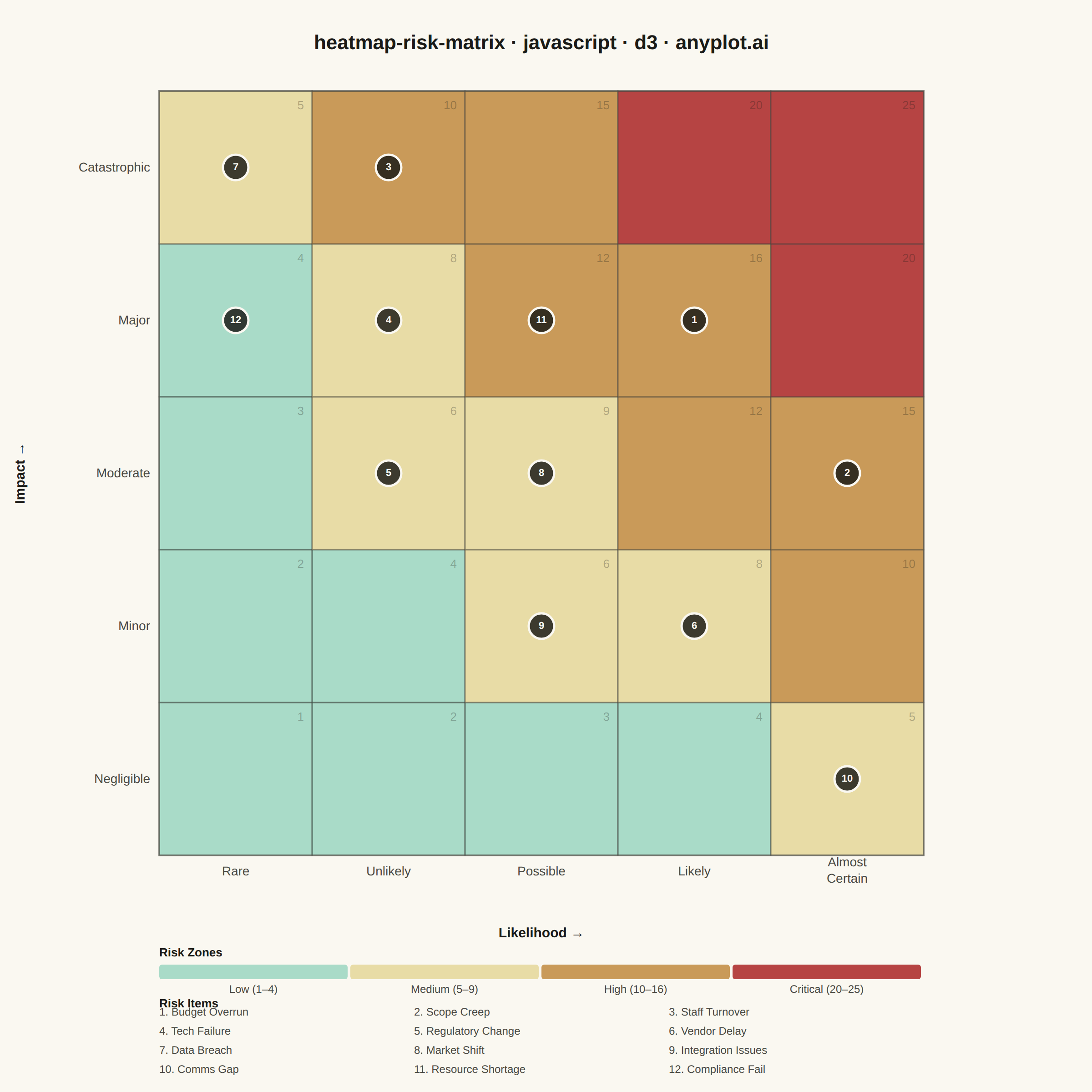
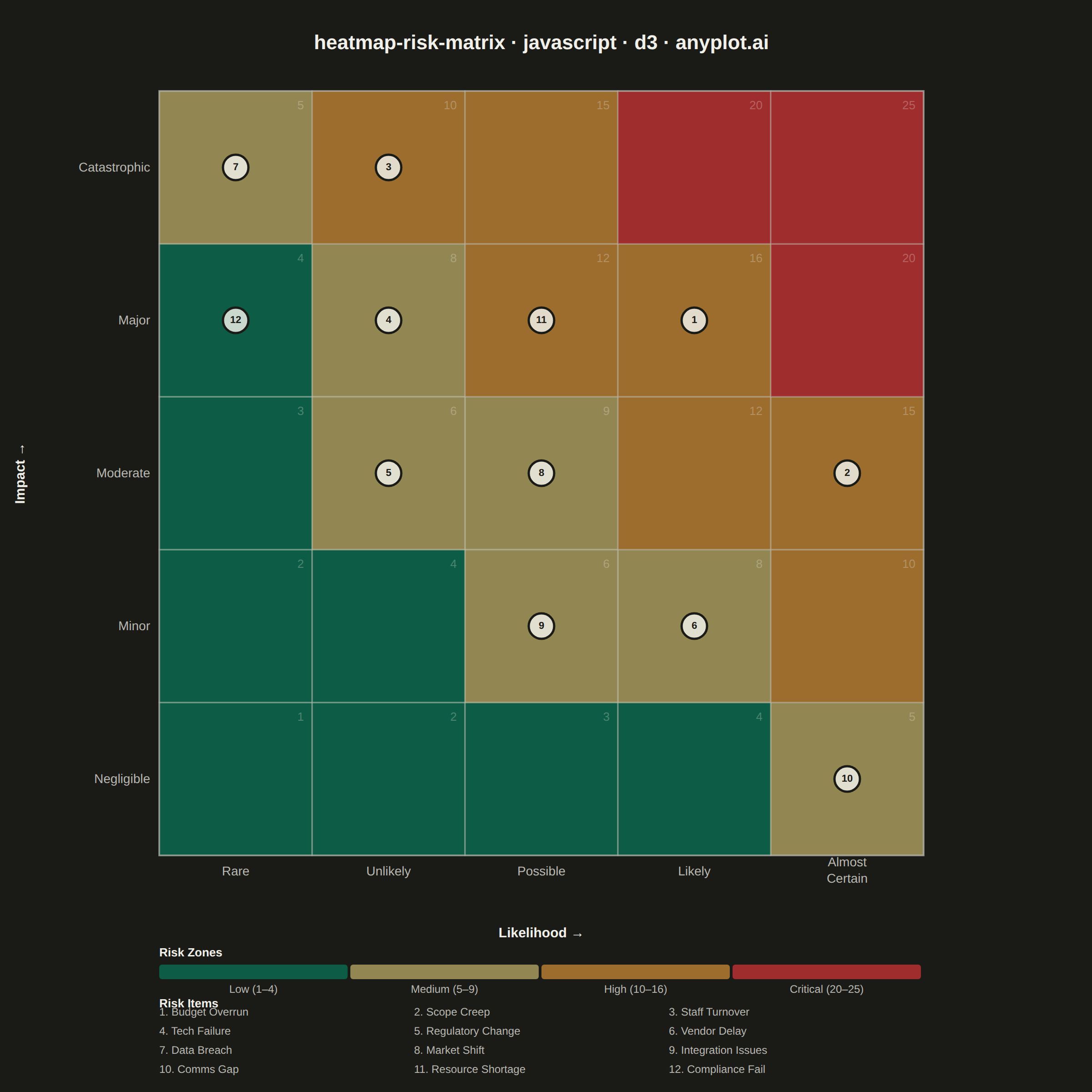
A 5x5 grid heatmap plotting risk likelihood against consequence severity, used to visualize and prioritize risks in project and enterprise risk management. Cells are color-coded from green (low risk) through yellow and orange to red (critical risk), with individual risk items plotted as labeled markers. The risk score for each cell is the product of likelihood and impact, and zones are labeled to indicate risk severity levels (Low, Medium, High, Critical).
// anyplot.ai
// heatmap-risk-matrix: Risk Assessment Matrix (Probability vs Impact)
// Library: d3 7.9.0 | JavaScript 22.22.3
// Quality: 87/100 | Created: 2026-06-20
//# anyplot-orientation: square

const t = window.ANYPLOT_TOKENS;
const { width, height } = window.ANYPLOT_SIZE;
const isDark = window.ANYPLOT_THEME === "dark";

const margin = { top: 100, right: 40, bottom: 260, left: 175 };
const iw = width - margin.left - margin.right;
const ih = height - margin.top - margin.bottom;
const cellSize = Math.floor(Math.min(iw, ih) / 5);
const gridSide = cellSize * 5;

// Semantic risk zone colors — traffic-light domain convention (semantic exception)
const ZONE = [
  { color: "#009E73", label: "Low (1–4)",        opacity: 0.32, opacityDark: 0.50 },
  { color: "#DDCC77", label: "Medium (5–9)",     opacity: 0.62, opacityDark: 0.62 },
  { color: "#BD8233", label: "High (10–16)",     opacity: 0.80, opacityDark: 0.80 },
  { color: "#AE3030", label: "Critical (20–25)", opacity: 0.90, opacityDark: 0.90 },
];

function zoneIdx(l, i) {
  const s = l * i;
  return s <= 4 ? 0 : s <= 9 ? 1 : s <= 16 ? 2 : 3;
}

// Project management risk register — 12 items, all in distinct cells
const risks = [
  { name: "Budget Overrun",     l: 4, i: 4 },
  { name: "Scope Creep",        l: 5, i: 3 },
  { name: "Staff Turnover",     l: 2, i: 5 },
  { name: "Tech Failure",       l: 2, i: 4 },
  { name: "Regulatory Change",  l: 2, i: 3 },
  { name: "Vendor Delay",       l: 4, i: 2 },
  { name: "Data Breach",        l: 1, i: 5 },
  { name: "Market Shift",       l: 3, i: 3 },
  { name: "Integration Issues", l: 3, i: 2 },
  { name: "Comms Gap",          l: 5, i: 1 },
  { name: "Resource Shortage",  l: 3, i: 4 },
  { name: "Compliance Fail",    l: 1, i: 4 },
];

const xLabels = ["Rare", "Unlikely", "Possible", "Likely", "Almost Certain"];
const yLabels = ["Negligible", "Minor", "Moderate", "Major", "Catastrophic"];

// SVG mount
const svg = d3.select("#container").append("svg")
  .attr("width", width).attr("height", height);
const g = svg.append("g")
  .attr("transform", `translate(${margin.left},${margin.top})`);

// D3 scaleBand for grid positioning — band scale centers ticks automatically
const x = d3.scaleBand()
  .domain(d3.range(1, 6))
  .range([0, gridSide])
  .paddingInner(0);

// Descending domain so impact=5 (Catastrophic) maps to top of grid
const y = d3.scaleBand()
  .domain(d3.range(5, 0, -1))
  .range([0, gridSide])
  .paddingInner(0);

// Generate all 25 grid cells with d3.cross (idiomatic D3)
const cells = d3.cross(d3.range(1, 6), d3.range(1, 6), (l, i) => ({
  l, i, score: l * i, zi: zoneIdx(l, i),
}));

// Draw cells with .data().join()
g.selectAll("rect.cell")
  .data(cells)
  .join("rect")
  .attr("class", "cell")
  .attr("x", d => x(d.l))
  .attr("y", d => y(d.i))
  .attr("width", x.bandwidth())
  .attr("height", y.bandwidth())
  .attr("fill", d => ZONE[d.zi].color)
  .attr("fill-opacity", d => isDark ? ZONE[d.zi].opacityDark : ZONE[d.zi].opacity)
  .attr("stroke", t.inkSoft)
  .attr("stroke-width", 1.5)
  .attr("stroke-opacity", 0.45);

// Score watermarks (top-right corner of each cell)
g.selectAll("text.score")
  .data(cells)
  .join("text")
  .attr("class", "score")
  .attr("x", d => x(d.l) + x.bandwidth() - 9)
  .attr("y", d => y(d.i) + 20)
  .attr("text-anchor", "end")
  .attr("fill", t.ink)
  .attr("fill-opacity", 0.28)
  .style("font-size", "13px")
  .text(d => d.score);

// Outer grid border
g.append("rect")
  .attr("width", gridSide).attr("height", gridSide)
  .attr("fill", "none")
  .attr("stroke", t.inkSoft)
  .attr("stroke-width", 2)
  .attr("stroke-opacity", 0.55);

// X-axis — d3.axisBottom with scaleBand (auto-centers ticks at band midpoints)
const xAxisG = g.append("g")
  .attr("transform", `translate(0,${gridSide})`)
  .call(
    d3.axisBottom(x)
      .tickFormat(d => xLabels[d - 1])
      .tickSize(0)
      .tickPadding(12)
  );

// "Almost Certain" (d=5): split into two tspan lines
xAxisG.selectAll(".tick")
  .filter(d => d === 5)
  .select("text")
  .each(function() {
    const el = d3.select(this);
    el.text("");
    el.append("tspan").attr("x", 0).attr("dy", 0).text("Almost");
    el.append("tspan").attr("x", 0).attr("dy", 18).text("Certain");
  });

xAxisG.selectAll(".tick text").attr("fill", t.inkSoft).style("font-size", "14px");
xAxisG.select(".domain").remove();

// X-axis title
g.append("text")
  .attr("x", gridSide / 2).attr("y", gridSide + 90)
  .attr("text-anchor", "middle")
  .attr("fill", t.ink).style("font-size", "15px").style("font-weight", "600")
  .text("Likelihood →");

// Y-axis — d3.axisLeft with scaleBand (auto-centers ticks at band midpoints)
const yAxisG = g.append("g").call(
  d3.axisLeft(y)
    .tickFormat(d => yLabels[d - 1])
    .tickSize(0)
    .tickPadding(10)
);

yAxisG.selectAll(".tick text").attr("fill", t.inkSoft).style("font-size", "14px");
yAxisG.select(".domain").remove();

// Y-axis title
g.append("text")
  .attr("transform", `translate(${-148},${gridSide / 2}) rotate(-90)`)
  .attr("text-anchor", "middle")
  .attr("fill", t.ink).style("font-size", "15px").style("font-weight", "600")
  .text("Impact →");

// Risk markers — Critical zone (score ≥ 20) gets larger circles for visual emphasis
const markerData = risks.map((r, idx) => ({ ...r, idx, score: r.l * r.i }));

g.selectAll("circle.marker")
  .data(markerData)
  .join("circle")
  .attr("class", "marker")
  .attr("cx", d => x(d.l) + x.bandwidth() / 2)
  .attr("cy", d => y(d.i) + y.bandwidth() / 2)
  .attr("r", d => d.score >= 20 ? 17 : 14)
  .attr("fill", t.ink)
  .attr("fill-opacity", 0.84)
  .attr("stroke", t.pageBg)
  .attr("stroke-width", 2.5);

g.selectAll("text.marker-num")
  .data(markerData)
  .join("text")
  .attr("class", "marker-num")
  .attr("x", d => x(d.l) + x.bandwidth() / 2)
  .attr("y", d => y(d.i) + y.bandwidth() / 2)
  .attr("text-anchor", "middle")
  .attr("dominant-baseline", "central")
  .attr("fill", t.pageBg)
  .style("font-size", d => d.score >= 20 ? "12px" : "11px")
  .style("font-weight", "700")
  .text(d => d.idx + 1);

// Zone legend strip
const zoneY = gridSide + 120;
const zoneBoxW = Math.floor((gridSide - 9) / 4);

g.append("text")
  .attr("x", 0).attr("y", zoneY - 9)
  .attr("fill", t.ink).style("font-size", "13px").style("font-weight", "600")
  .text("Risk Zones");

g.selectAll("rect.zone-box")
  .data(ZONE)
  .join("rect")
  .attr("class", "zone-box")
  .attr("x", (d, i) => i * (zoneBoxW + 3))
  .attr("y", zoneY)
  .attr("width", zoneBoxW)
  .attr("height", 16)
  .attr("fill", d => d.color)
  .attr("fill-opacity", d => isDark ? d.opacityDark : d.opacity)
  .attr("rx", 3);

g.selectAll("text.zone-label")
  .data(ZONE)
  .join("text")
  .attr("class", "zone-label")
  .attr("x", (d, i) => i * (zoneBoxW + 3) + zoneBoxW / 2)
  .attr("y", zoneY + 31)
  .attr("text-anchor", "middle")
  .attr("fill", t.inkSoft)
  .style("font-size", "12px")
  .text(d => d.label);

// Risk item index (3-column layout)
const itemY = zoneY + 56;

g.append("text")
  .attr("x", 0).attr("y", itemY - 9)
  .attr("fill", t.ink).style("font-size", "13px").style("font-weight", "600")
  .text("Risk Items");

const colW = Math.floor(gridSide / 3);

g.selectAll("text.risk-item")
  .data(risks)
  .join("text")
  .attr("class", "risk-item")
  .attr("x", (d, i) => (i % 3) * colW)
  .attr("y", (d, i) => itemY + Math.floor(i / 3) * 21)
  .attr("fill", t.inkSoft)
  .style("font-size", "12px")
  .text((d, i) => `${i + 1}. ${d.name}`);

// Title
svg.append("text")
  .attr("x", margin.left + gridSide / 2).attr("y", 54)
  .attr("text-anchor", "middle")
  .attr("fill", t.ink).style("font-size", "22px").style("font-weight", "600")
  .text("heatmap-risk-matrix · javascript · d3 · anyplot.ai");
Runnable source as JSON, for any HTTP client: https://api.anyplot.ai/specs/heatmap-risk-matrix/d3/code. Any spec id and library id listed in llms-full.txt fit the same URL shape; every URL below is complete and callable.
{
  "spec_id": "heatmap-risk-matrix",
  "language": "javascript",
  "library": "d3",
  "page": "https://anyplot.ai/heatmap-risk-matrix/javascript/d3",
  "hub": "https://anyplot.ai/heatmap-risk-matrix",
  "code_json": "https://api.anyplot.ai/specs/heatmap-risk-matrix/d3/code",
  "spec_json": "https://api.anyplot.ai/specs/heatmap-risk-matrix",
  "render_light_png": "https://storage.googleapis.com/anyplot-images/plots/heatmap-risk-matrix/javascript/d3/plot-light.png",
  "render_dark_png": "https://storage.googleapis.com/anyplot-images/plots/heatmap-risk-matrix/javascript/d3/plot-dark.png",
  "interactive_light_html": "https://storage.googleapis.com/anyplot-images/plots/heatmap-risk-matrix/javascript/d3/plot-light.html",
  "interactive_dark_html": "https://storage.googleapis.com/anyplot-images/plots/heatmap-risk-matrix/javascript/d3/plot-dark.html",
  "quality_score": 87.0,
  "license": "MIT",
  "guide": "https://anyplot.ai/llms.txt"
}
Part of Risk Assessment Matrix (Probability vs Impact) on anyplot.ai.