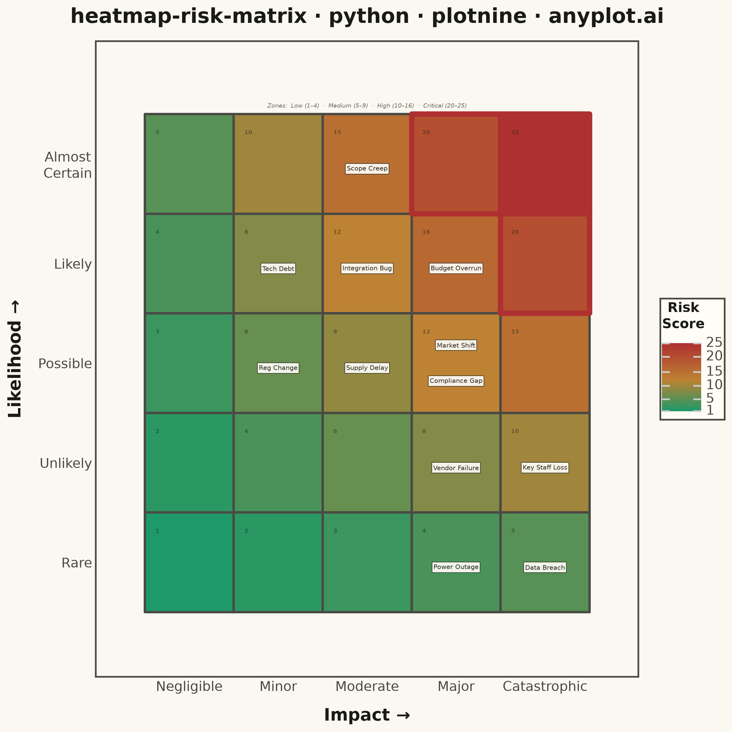
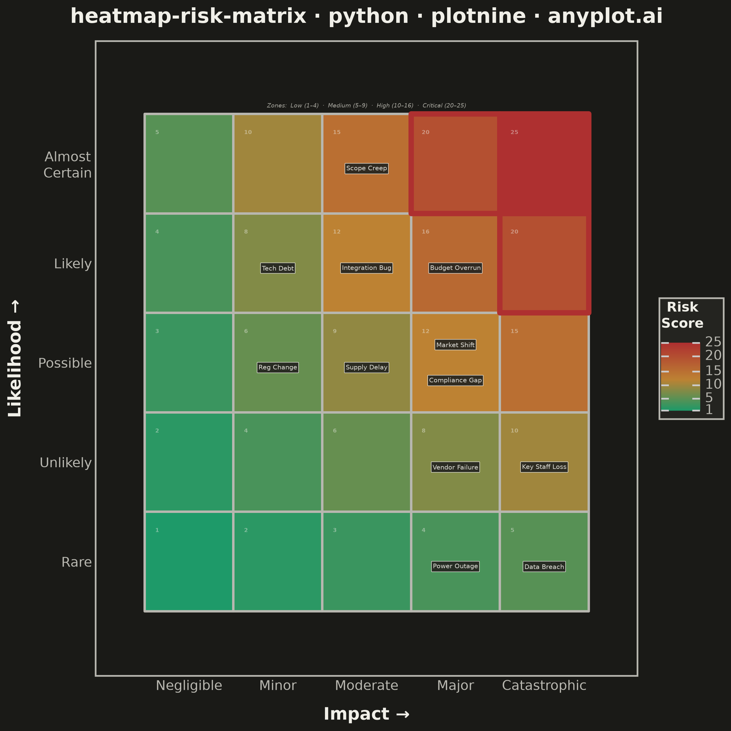
A 5x5 grid heatmap plotting risk likelihood against consequence severity, used to visualize and prioritize risks in project and enterprise risk management. Cells are color-coded from green (low risk) through yellow and orange to red (critical risk), with individual risk items plotted as labeled markers. The risk score for each cell is the product of likelihood and impact, and zones are labeled to indicate risk severity levels (Low, Medium, High, Critical).
""" anyplot.ai
heatmap-risk-matrix: Risk Assessment Matrix (Probability vs Impact)
Library: plotnine 0.15.7 | Python 3.13.14
Quality: 89/100 | Updated: 2026-06-20
"""

import os
import sys


# Remove script's own directory from sys.path so 'plotnine' resolves to the library, not this file
_here = os.path.dirname(os.path.realpath(__file__))
sys.path = [p for p in sys.path if p and os.path.realpath(p) != _here]

import numpy as np
import pandas as pd
from plotnine import (
    aes,
    annotate,
    element_blank,
    element_rect,
    element_text,
    geom_label,
    geom_text,
    geom_tile,
    ggplot,
    labs,
    scale_fill_gradient2,
    scale_x_continuous,
    scale_y_continuous,
    theme,
    theme_minimal,
)


# Theme tokens
THEME = os.getenv("ANYPLOT_THEME", "light")
PAGE_BG = "#FAF8F1" if THEME == "light" else "#1A1A17"
ELEVATED_BG = "#FFFDF6" if THEME == "light" else "#242420"
INK = "#1A1A17" if THEME == "light" else "#F0EFE8"
INK_SOFT = "#4A4A44" if THEME == "light" else "#B8B7B0"
INK_MUTED = "#6B6A63" if THEME == "light" else "#A8A79F"

# Data: 5×5 background grid
likelihood_levels = [1, 2, 3, 4, 5]
impact_levels = [1, 2, 3, 4, 5]

grid_rows = []
for li in likelihood_levels:
    for imp in impact_levels:
        score = li * imp
        if score <= 4:
            zone = "Low"
        elif score <= 9:
            zone = "Medium"
        elif score <= 16:
            zone = "High"
        else:
            zone = "Critical"
        grid_rows.append({"likelihood": li, "impact": imp, "risk_score": score, "zone": zone})

grid_df = pd.DataFrame(grid_rows)

# Critical-zone cells for emphasis overlay (risk_score > 16)
critical_df = grid_df[grid_df["risk_score"] > 16].copy()

# Score number position: top-left corner of each cell
grid_df["score_x"] = grid_df["impact"] - 0.38
grid_df["score_y"] = grid_df["likelihood"] + 0.35

# Risk items
np.random.seed(42)
risks = pd.DataFrame(
    {
        "risk_name": [
            "Supply Delay",
            "Budget Overrun",
            "Key Staff Loss",
            "Scope Creep",
            "Vendor Failure",
            "Reg Change",
            "Data Breach",
            "Tech Debt",
            "Market Shift",
            "Integration Bug",
            "Power Outage",
            "Compliance Gap",
        ],
        "likelihood": [3, 4, 2, 5, 2, 3, 1, 4, 3, 4, 1, 3],
        "impact": [3, 4, 5, 3, 4, 2, 5, 2, 4, 3, 4, 4],
    }
)

# Smart label positioning: offset risks sharing the same cell
cell_counts = risks.groupby(["likelihood", "impact"]).cumcount()
cell_totals = risks.groupby(["likelihood", "impact"])["risk_name"].transform("count")

label_offsets = []
for idx in range(len(risks)):
    count = cell_counts.iloc[idx]
    total = cell_totals.iloc[idx]
    if total > 1:
        offset = 0.18 if count == 0 else -0.18
    else:
        offset = -0.05
    label_offsets.append(offset)

risks["label_y"] = risks["likelihood"] + label_offsets
risks["label_x"] = risks["impact"].astype(float)

# Axis labels
likelihood_labels = {1: "Rare", 2: "Unlikely", 3: "Possible", 4: "Likely", 5: "Almost\nCertain"}
impact_labels = {1: "Negligible", 2: "Minor", 3: "Moderate", 4: "Major", 5: "Catastrophic"}

title = "heatmap-risk-matrix · python · plotnine · anyplot.ai"

# Plot
plot = (
    ggplot()
    # Background heatmap tiles with Imprint-derived green→ochre→red gradient
    + geom_tile(data=grid_df, mapping=aes(x="impact", y="likelihood", fill="risk_score"), color=INK_SOFT, size=0.8)
    + scale_fill_gradient2(
        low="#009E73",
        mid="#BD8233",
        high="#AE3030",
        midpoint=12,
        limits=(1, 25),
        name="Risk\nScore",
        breaks=[1, 5, 10, 15, 20, 25],
    )
    # Critical-zone emphasis: thicker matte-red border on highest-risk cells
    + geom_tile(data=critical_df, mapping=aes(x="impact", y="likelihood"), fill="none", color="#AE3030", size=1.8)
    # Risk score numbers in top-left corners (semi-transparent to stay secondary)
    + geom_text(
        data=grid_df,
        mapping=aes(x="score_x", y="score_y", label="risk_score"),
        color=INK,
        alpha=0.45,
        size=3.2,
        fontweight="bold",
        ha="left",
        va="top",
    )
    # Risk item labels — theme-adaptive fill and text
    + geom_label(
        data=risks,
        mapping=aes(x="label_x", y="label_y", label="risk_name"),
        color=INK,
        fill=ELEVATED_BG,
        size=3.8,
        alpha=0.92,
        label_padding=0.22,
        label_size=0.3,
        label_r=0.08,
    )
    # Zone annotation above the matrix
    + annotate(
        "text",
        x=3,
        y=5.58,
        label="Zones:  Low (1–4)  ·  Medium (5–9)  ·  High (10–16)  ·  Critical (20–25)",
        size=3.5,
        color=INK_MUTED,
        fontstyle="italic",
    )
    + scale_x_continuous(breaks=impact_levels, labels=[impact_labels[i] for i in impact_levels], expand=(0, 0.55))
    + scale_y_continuous(
        breaks=likelihood_levels, labels=[likelihood_labels[i] for i in likelihood_levels], expand=(0, 0.65)
    )
    + labs(x="Impact →", y="Likelihood →", title=title)
    + theme_minimal()
    + theme(
        figure_size=(6, 6),
        plot_title=element_text(size=12, ha="center", weight="bold", margin={"b": 8}, color=INK),
        axis_title_x=element_text(size=10, weight="bold", margin={"t": 8}, color=INK),
        axis_title_y=element_text(size=10, weight="bold", margin={"r": 8}, color=INK),
        axis_text_x=element_text(size=8, color=INK_SOFT),
        axis_text_y=element_text(size=8, color=INK_SOFT),
        legend_title=element_text(size=8, weight="bold", color=INK),
        legend_text=element_text(size=8, color=INK_SOFT),
        legend_key_height=40,
        panel_grid_major=element_blank(),
        panel_grid_minor=element_blank(),
        plot_background=element_rect(fill=PAGE_BG, color=PAGE_BG),
        panel_background=element_rect(fill=PAGE_BG),
        panel_border=element_rect(color=INK_SOFT, fill=None),
        legend_background=element_rect(fill=ELEVATED_BG, color=INK_SOFT),
    )
)

# Save
plot.save(f"plot-{THEME}.png", dpi=400, width=6, height=6, units="in")
Runnable source as JSON, for any HTTP client: https://api.anyplot.ai/specs/heatmap-risk-matrix/plotnine/code. Any spec id and library id listed in llms-full.txt fit the same URL shape; every URL below is complete and callable.
{
  "spec_id": "heatmap-risk-matrix",
  "language": "python",
  "library": "plotnine",
  "page": "https://anyplot.ai/heatmap-risk-matrix/python/plotnine",
  "hub": "https://anyplot.ai/heatmap-risk-matrix",
  "code_json": "https://api.anyplot.ai/specs/heatmap-risk-matrix/plotnine/code",
  "spec_json": "https://api.anyplot.ai/specs/heatmap-risk-matrix",
  "render_light_png": "https://storage.googleapis.com/anyplot-images/plots/heatmap-risk-matrix/python/plotnine/plot-light.png",
  "render_dark_png": "https://storage.googleapis.com/anyplot-images/plots/heatmap-risk-matrix/python/plotnine/plot-dark.png",
  "quality_score": 89.0,
  "license": "MIT",
  "guide": "https://anyplot.ai/llms.txt"
}
Part of Risk Assessment Matrix (Probability vs Impact) on anyplot.ai.