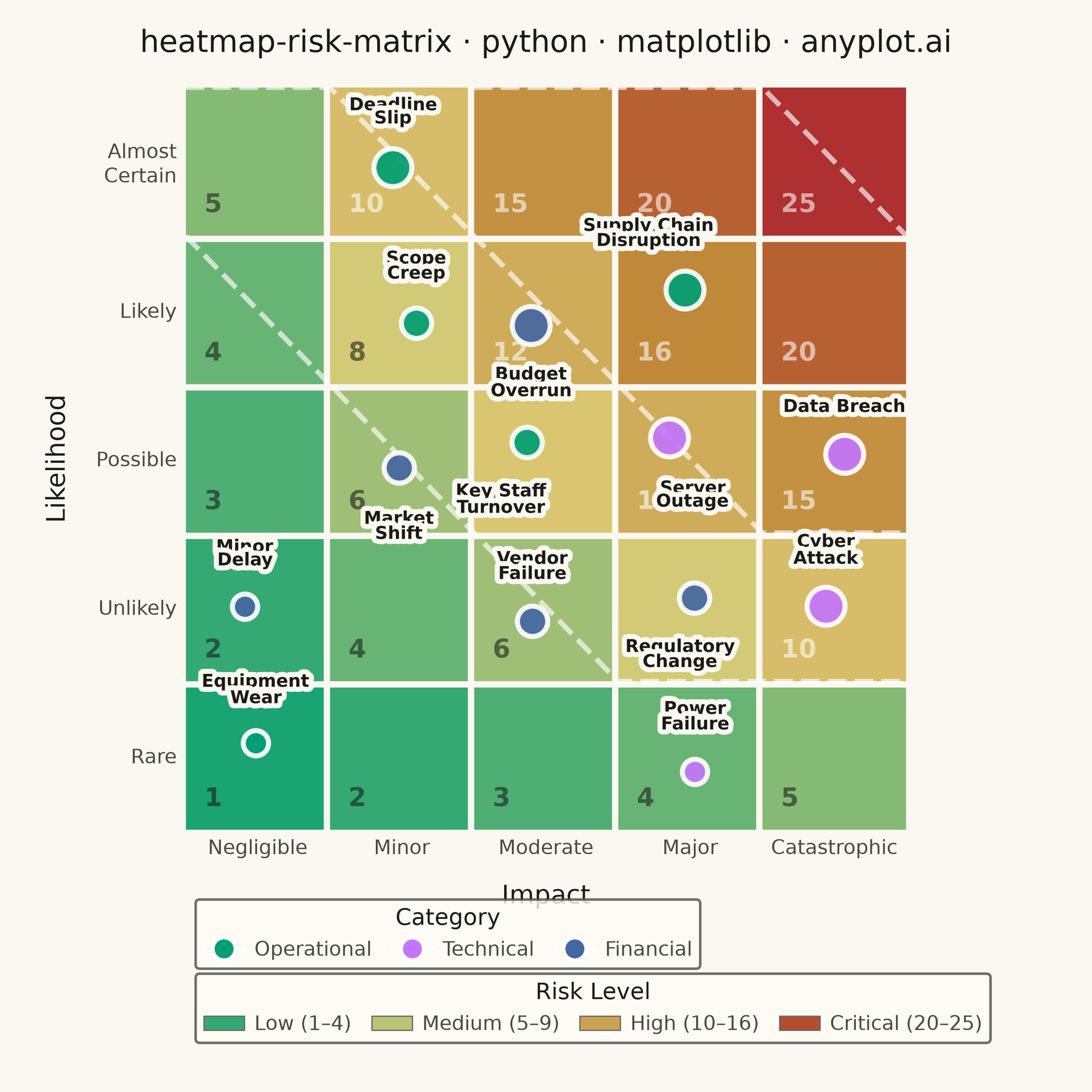
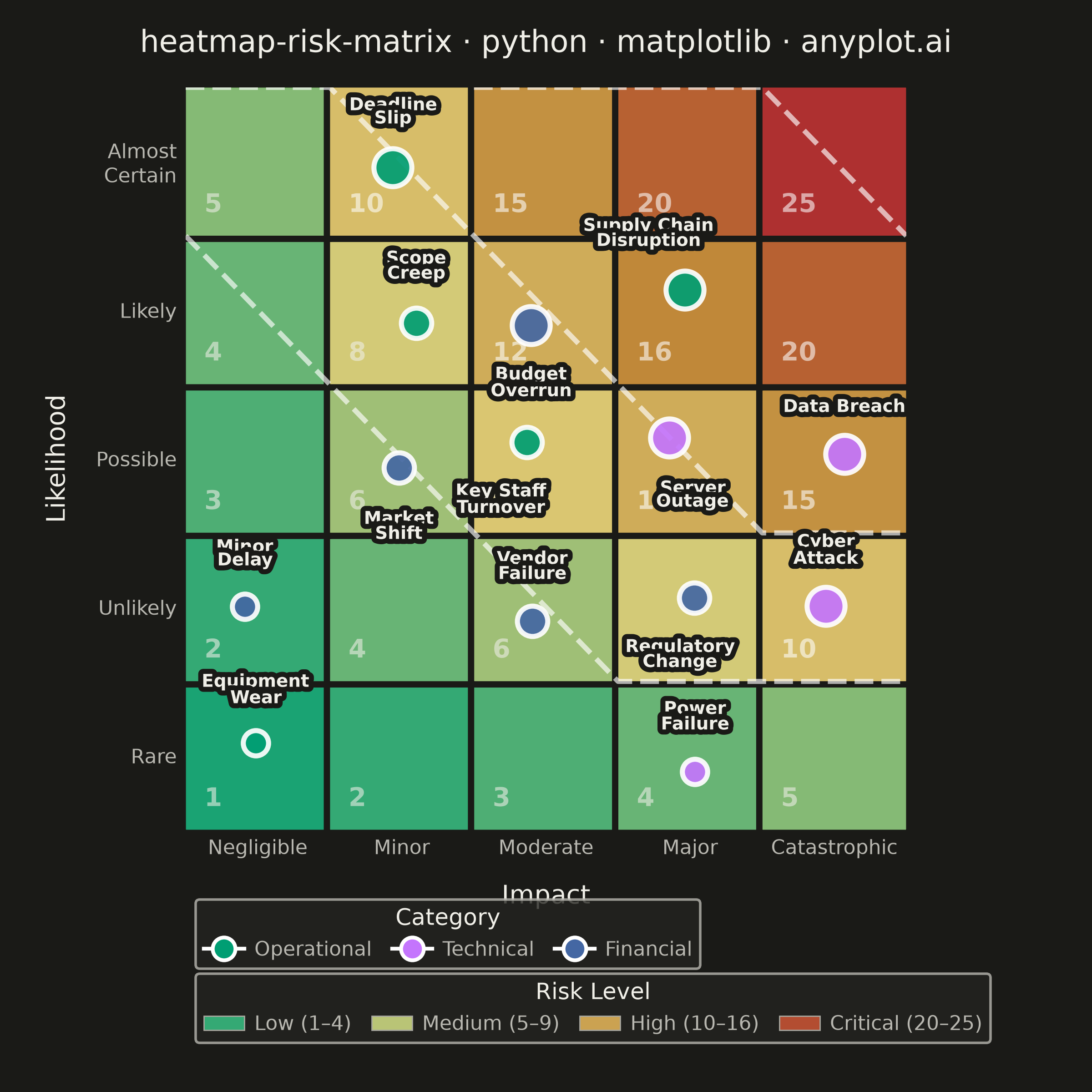
A 5x5 grid heatmap plotting risk likelihood against consequence severity, used to visualize and prioritize risks in project and enterprise risk management. Cells are color-coded from green (low risk) through yellow and orange to red (critical risk), with individual risk items plotted as labeled markers. The risk score for each cell is the product of likelihood and impact, and zones are labeled to indicate risk severity levels (Low, Medium, High, Critical).
""" anyplot.ai
heatmap-risk-matrix: Risk Assessment Matrix (Probability vs Impact)
Library: matplotlib 3.11.0 | Python 3.13.14
Quality: 83/100 | Updated: 2026-06-20
"""

import os
import sys


# Prevent this file (matplotlib.py) from shadowing the matplotlib package
_d = os.path.dirname(os.path.abspath(__file__))
while _d in sys.path:
    sys.path.remove(_d)

import matplotlib.patches as mpatches
import matplotlib.patheffects as pe
import matplotlib.pyplot as plt
import numpy as np
from matplotlib.colors import LinearSegmentedColormap
from matplotlib.lines import Line2D


# Theme
THEME = os.getenv("ANYPLOT_THEME", "light")
PAGE_BG = "#FAF8F1" if THEME == "light" else "#1A1A17"
ELEVATED_BG = "#FFFDF6" if THEME == "light" else "#242420"
INK = "#1A1A17" if THEME == "light" else "#F0EFE8"
INK_SOFT = "#4A4A44" if THEME == "light" else "#B8B7B0"
INK_MUTED = "#6B6A63" if THEME == "light" else "#A8A79F"

# Imprint palette — 8 hues, theme-independent, hybrid-v3 sort
IMPRINT_PALETTE = ["#009E73", "#C475FD", "#4467A3", "#BD8233", "#AE3030", "#2ABCCD", "#954477", "#99B314"]
ANYPLOT_AMBER = "#DDCC77"  # warning / caution semantic anchor

# Data
np.random.seed(42)

likelihood_labels = ["Rare", "Unlikely", "Possible", "Likely", "Almost\nCertain"]
impact_labels = ["Negligible", "Minor", "Moderate", "Major", "Catastrophic"]

risk_scores = np.array([[1, 2, 3, 4, 5], [2, 4, 6, 8, 10], [3, 6, 9, 12, 15], [4, 8, 12, 16, 20], [5, 10, 15, 20, 25]])

risks = [
    ("Supply Chain\nDisruption", 4, 4, "Operational"),
    ("Data Breach", 3, 5, "Technical"),
    ("Budget\nOverrun", 4, 3, "Financial"),
    ("Key Staff\nTurnover", 3, 3, "Operational"),
    ("Regulatory\nChange", 2, 4, "Financial"),
    ("Server\nOutage", 3, 4, "Technical"),
    ("Scope\nCreep", 4, 2, "Operational"),
    ("Vendor\nFailure", 2, 3, "Financial"),
    ("Cyber\nAttack", 2, 5, "Technical"),
    ("Market\nShift", 3, 2, "Financial"),
    ("Power\nFailure", 1, 4, "Technical"),
    ("Deadline\nSlip", 5, 2, "Operational"),
    ("Equipment\nWear", 1, 1, "Operational"),
    ("Minor\nDelay", 2, 1, "Financial"),
]

# Risk colormap: Imprint green (low) → amber → ochre → matte red (critical)
cmap = LinearSegmentedColormap.from_list("risk_matrix", ["#009E73", ANYPLOT_AMBER, "#BD8233", "#AE3030"], N=256)

# Category colors — Imprint palette positions 1→3 in first-appearance order
category_order = ["Operational", "Technical", "Financial"]
category_colors = {
    "Operational": IMPRINT_PALETTE[0],  # #009E73 green
    "Technical": IMPRINT_PALETTE[1],  # #C475FD lavender
    "Financial": IMPRINT_PALETTE[2],  # #4467A3 blue
}

# Plot — square canvas (2400×2400 px)
fig, ax = plt.subplots(figsize=(6, 6), dpi=400, facecolor=PAGE_BG)
ax.set_facecolor(PAGE_BG)
fig.subplots_adjust(left=0.17, right=0.83, top=0.92, bottom=0.24)

# Draw cells with rounded rectangles; score in bottom-left corner to reduce crowding
for i in range(5):
    for j in range(5):
        score = risk_scores[i, j]
        color = cmap(score / 25.0)
        rect = mpatches.FancyBboxPatch(
            (j, i), 1, 1, boxstyle="round,pad=0.02", facecolor=color, edgecolor=PAGE_BG, linewidth=2.5
        )
        ax.add_patch(rect)
        score_color = INK if score < 10 else "white"
        ax.text(
            j + 0.13,
            i + 0.12,
            str(score),
            ha="left",
            va="bottom",
            fontsize=10,
            fontweight="bold",
            color=score_color,
            alpha=0.58,
            zorder=3,
        )

# Zone boundary dashed lines
zone_boundaries = [
    ([0, 1, 2, 3, 4, 5], [4, 3, 2, 1, 1, 1]),
    ([0, 1, 2, 3, 4, 5], [5, 5, 4, 3, 2, 2]),
    ([2, 3, 4, 5], [5, 5, 5, 4]),
]
for xs, ys in zone_boundaries:
    ax.plot(xs, ys, color="white", linewidth=2.0, linestyle="--", alpha=0.65, zorder=3)

# Risk markers with jitter
jitter_offsets = np.random.uniform(-0.15, 0.15, (len(risks), 2))

label_offsets = {
    # Likely row × Minor col: above (no one else above here)
    "Scope\nCreep": (0.0, 0.28, "bottom"),
    # Likely row × Moderate col: below (avoids Supply Chain above at right)
    "Budget\nOverrun": (0.0, -0.28, "top"),
    # Likely row × Major col: above-left, stays within Major column
    "Supply Chain\nDisruption": (-0.25, 0.28, "bottom"),
    # Possible row × Minor col: below (avoids Scope Creep above in same column)
    "Market\nShift": (0.0, -0.28, "top"),
    # Possible row × Moderate col: below-left (away from Market Shift at x=1.5)
    "Key Staff\nTurnover": (-0.18, -0.28, "top"),
    # Possible row × Major col: below-right
    "Server\nOutage": (0.16, -0.28, "top"),
    # Unlikely row × Major col: below-left
    "Regulatory\nChange": (-0.10, -0.28, "top"),
    "Equipment\nWear": (0.0, 0.26, "bottom"),
    "Minor\nDelay": (0.0, 0.26, "bottom"),
}

for idx, (name, lik, imp, cat) in enumerate(risks):
    x = (imp - 1) + 0.5 + jitter_offsets[idx, 0]
    y = (lik - 1) + 0.5 + jitter_offsets[idx, 1]
    score = lik * imp
    msize = 18 if score >= 20 else (15 if score >= 10 else (12 if score >= 5 else 10))

    ax.plot(
        x,
        y,
        "o",
        markersize=msize,
        color=category_colors[cat],
        markeredgecolor="white",
        markeredgewidth=2.0,
        zorder=5,
        alpha=0.92,
    )

    if name in label_offsets:
        dx, dy, va = label_offsets[name]
        lx, ly = x + dx, y + dy
    else:
        lx, ly, va = x, y + 0.28, "bottom"

    label = ax.text(
        lx, ly, name, ha="center", va=va, fontsize=7, fontweight="bold", color=INK, zorder=6, linespacing=0.85
    )
    label.set_path_effects([pe.withStroke(linewidth=4.0, foreground=PAGE_BG)])

# Style
ax.set_xlim(0, 5)
ax.set_ylim(0, 5)
ax.set_xticks([0.5, 1.5, 2.5, 3.5, 4.5])
ax.set_xticklabels(impact_labels, fontsize=8, color=INK_SOFT)
ax.set_yticks([0.5, 1.5, 2.5, 3.5, 4.5])
ax.set_yticklabels(likelihood_labels, fontsize=8, color=INK_SOFT)
ax.set_xlabel("Impact", fontsize=10, labelpad=10, color=INK)
ax.set_ylabel("Likelihood", fontsize=10, labelpad=10, color=INK)
ax.tick_params(axis="both", length=0, colors=INK_SOFT)

title = "heatmap-risk-matrix · python · matplotlib · anyplot.ai"
title_n = len(title)
title_fontsize = max(8, round(12 * 67 / title_n)) if title_n > 67 else 12
ax.set_title(title, fontsize=title_fontsize, fontweight="medium", color=INK, pad=14)

for spine in ax.spines.values():
    spine.set_visible(False)

# Legends — placed horizontally below the matrix
cat_handles = [
    Line2D(
        [0],
        [0],
        marker="o",
        color="w",
        markerfacecolor=category_colors[cat],
        markersize=9,
        markeredgecolor="white",
        markeredgewidth=1.5,
        label=cat,
    )
    for cat in category_order
]
zone_info = [
    ("Low (1–4)", cmap(2 / 25.0)),
    ("Medium (5–9)", cmap(7 / 25.0)),
    ("High (10–16)", cmap(13 / 25.0)),
    ("Critical (20–25)", cmap(22 / 25.0)),
]
zone_handles = [
    mpatches.Patch(facecolor=color, edgecolor=INK_MUTED, linewidth=0.5, label=label) for label, color in zone_info
]

leg1 = ax.legend(
    handles=cat_handles,
    title="Category",
    fontsize=8,
    title_fontsize=9,
    loc="upper left",
    bbox_to_anchor=(0.0, -0.08),
    ncols=3,
    frameon=True,
    handletextpad=0.5,
    columnspacing=1.0,
)
leg1.get_frame().set_facecolor(ELEVATED_BG)
leg1.get_frame().set_edgecolor(INK_SOFT)
plt.setp(leg1.get_texts(), color=INK_SOFT)
leg1.get_title().set_color(INK)
ax.add_artist(leg1)

leg2 = ax.legend(
    handles=zone_handles,
    title="Risk Level",
    fontsize=8,
    title_fontsize=9,
    loc="upper left",
    bbox_to_anchor=(0.0, -0.18),
    ncols=4,
    frameon=True,
    handletextpad=0.5,
    columnspacing=1.0,
)
leg2.get_frame().set_facecolor(ELEVATED_BG)
leg2.get_frame().set_edgecolor(INK_SOFT)
plt.setp(leg2.get_texts(), color=INK_SOFT)
leg2.get_title().set_color(INK)

# Save
plt.savefig(f"plot-{THEME}.png", dpi=400, facecolor=PAGE_BG)
Runnable source as JSON, for any HTTP client: https://api.anyplot.ai/specs/heatmap-risk-matrix/matplotlib/code. Any spec id and library id listed in llms-full.txt fit the same URL shape; every URL below is complete and callable.
{
  "spec_id": "heatmap-risk-matrix",
  "language": "python",
  "library": "matplotlib",
  "page": "https://anyplot.ai/heatmap-risk-matrix/python/matplotlib",
  "hub": "https://anyplot.ai/heatmap-risk-matrix",
  "code_json": "https://api.anyplot.ai/specs/heatmap-risk-matrix/matplotlib/code",
  "spec_json": "https://api.anyplot.ai/specs/heatmap-risk-matrix",
  "render_light_png": "https://storage.googleapis.com/anyplot-images/plots/heatmap-risk-matrix/python/matplotlib/plot-light.png",
  "render_dark_png": "https://storage.googleapis.com/anyplot-images/plots/heatmap-risk-matrix/python/matplotlib/plot-dark.png",
  "quality_score": 83.0,
  "license": "MIT",
  "guide": "https://anyplot.ai/llms.txt"
}
Part of Risk Assessment Matrix (Probability vs Impact) on anyplot.ai.