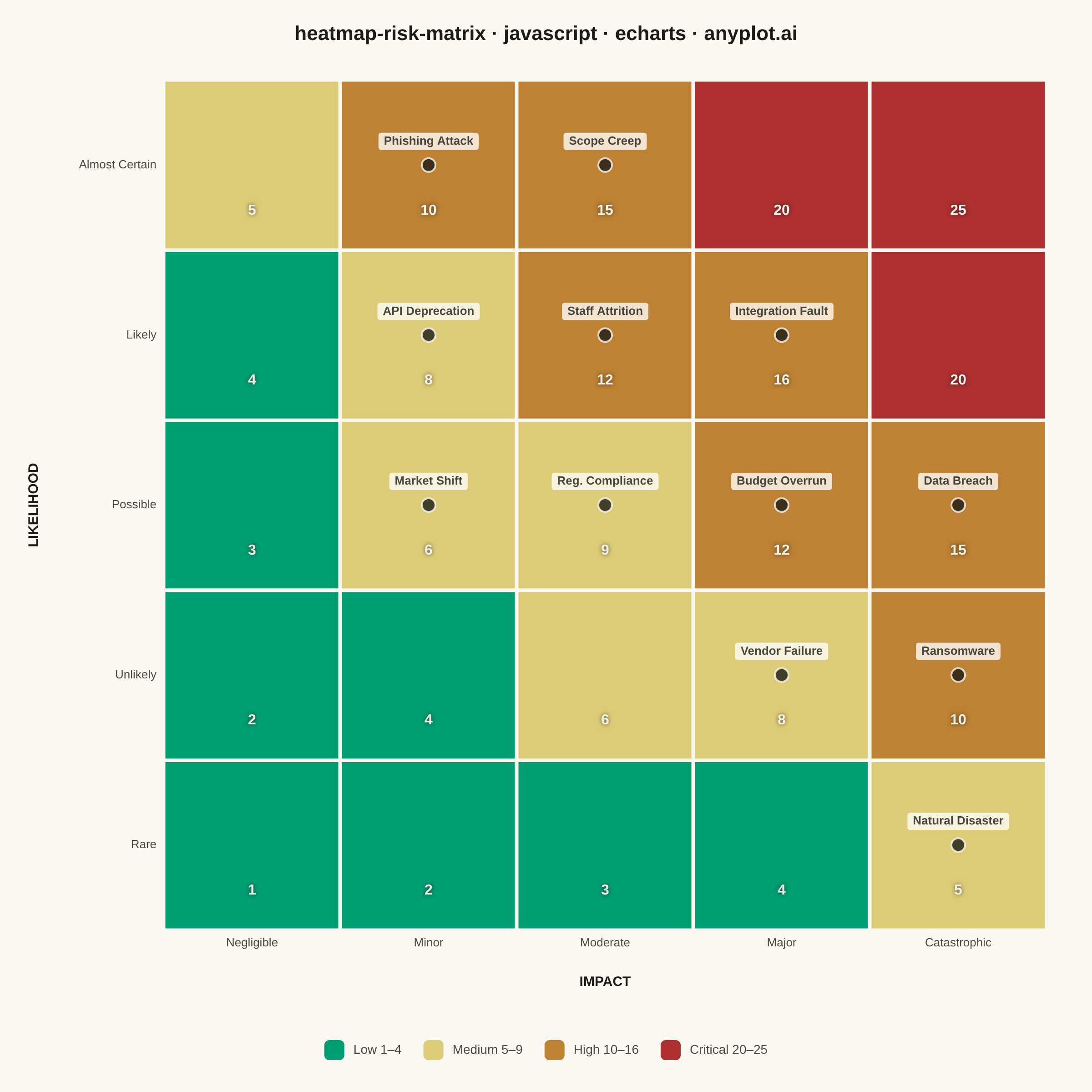
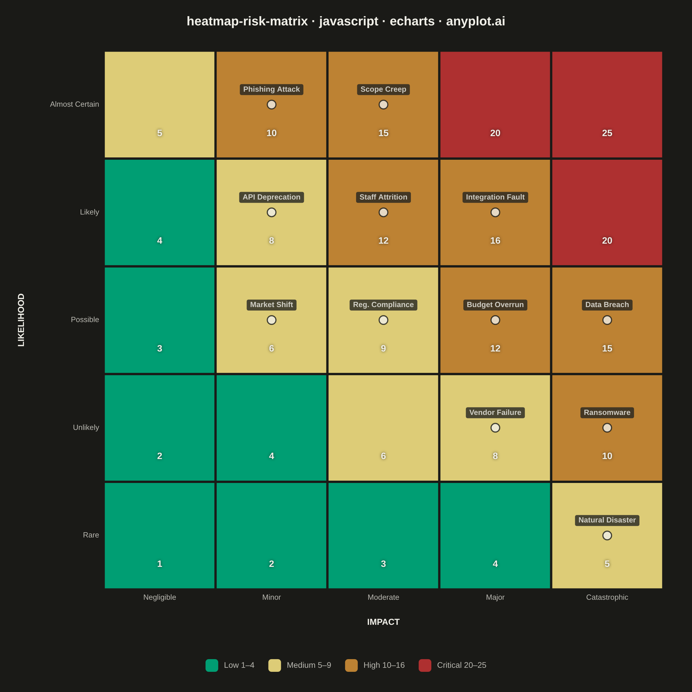
A 5x5 grid heatmap plotting risk likelihood against consequence severity, used to visualize and prioritize risks in project and enterprise risk management. Cells are color-coded from green (low risk) through yellow and orange to red (critical risk), with individual risk items plotted as labeled markers. The risk score for each cell is the product of likelihood and impact, and zones are labeled to indicate risk severity levels (Low, Medium, High, Critical).
// anyplot.ai
// heatmap-risk-matrix: Risk Assessment Matrix (Probability vs Impact)
// Library: echarts 5.5.1 | JavaScript 22.22.3
// Quality: 86/100 | Created: 2026-06-20
//# anyplot-orientation: square

const t = window.ANYPLOT_TOKENS;

// --- Data ---

const impactLabels     = ["Negligible", "Minor", "Moderate", "Major", "Catastrophic"];
const likelihoodLabels = ["Rare", "Unlikely", "Possible", "Likely", "Almost Certain"];

// 5×5 background risk-score grid: [impact_idx, likelihood_idx, score]
const heatmapData = [];
for (let l = 0; l < 5; l++) {
  for (let i = 0; i < 5; i++) {
    heatmapData.push([i, l, (i + 1) * (l + 1)]);
  }
}

// IT infrastructure project — 12 identified risks
const risks = [
  { name: "Data Breach",       likelihood: 3, impact: 5 },
  { name: "Staff Attrition",   likelihood: 4, impact: 3 },
  { name: "Budget Overrun",    likelihood: 3, impact: 4 },
  { name: "Scope Creep",       likelihood: 5, impact: 3 },
  { name: "Vendor Failure",    likelihood: 2, impact: 4 },
  { name: "Ransomware",        likelihood: 2, impact: 5 },
  { name: "Reg. Compliance",   likelihood: 3, impact: 3 },
  { name: "Integration Fault", likelihood: 4, impact: 4 },
  { name: "Natural Disaster",  likelihood: 1, impact: 5 },
  { name: "API Deprecation",   likelihood: 4, impact: 2 },
  { name: "Market Shift",      likelihood: 3, impact: 2 },
  { name: "Phishing Attack",   likelihood: 5, impact: 2 },
];

// Jitter offsets to separate risks sharing the same cell
const jitterPatterns = {
  1: [[0, 0]],
  2: [[-0.22, 0], [0.22, 0]],
  3: [[-0.22, -0.18], [0.22, -0.18], [0, 0.22]],
  4: [[-0.2, -0.2], [0.2, -0.2], [-0.2, 0.2], [0.2, 0.2]],
};

const cellGroups = {};
risks.forEach(r => {
  const key = `${r.impact - 1},${r.likelihood - 1}`;
  if (!cellGroups[key]) cellGroups[key] = [];
  cellGroups[key].push(r);
});

const scatterData = risks.map(r => {
  const key   = `${r.impact - 1},${r.likelihood - 1}`;
  const group = cellGroups[key];
  const idx   = group.indexOf(r);
  const count = Math.min(group.length, 4);
  const [jx, jy] = jitterPatterns[count][idx] || [0, 0];
  return { value: [r.impact - 1 + jx, r.likelihood - 1 + jy], name: r.name };
});

// Zone colors — Imprint semantic palette: green=low → amber=medium → ochre=high → red=critical
const ZONE_COLORS = ["#009E73", "#DDCC77", "#BD8233", "#AE3030"];

// --- Init ---
const chart = echarts.init(document.getElementById("container"));

// --- Option ---
chart.setOption({
  animation: false,
  backgroundColor: "transparent",

  title: {
    text: "heatmap-risk-matrix · javascript · echarts · anyplot.ai",
    left: "center",
    top: 22,
    textStyle: { color: t.ink, fontSize: 22, fontWeight: "600" },
  },

  visualMap: {
    type: "piecewise",
    seriesIndex: [0],
    pieces: [
      { min: 1,  max: 4,  label: "Low 1–4",        color: ZONE_COLORS[0] },
      { min: 5,  max: 9,  label: "Medium 5–9",      color: ZONE_COLORS[1] },
      { min: 10, max: 19, label: "High 10–16",      color: ZONE_COLORS[2] },
      { min: 20, max: 25, label: "Critical 20–25",  color: ZONE_COLORS[3] },
    ],
    orient: "horizontal",
    left: "center",
    bottom: 30,
    textStyle: { color: t.inkSoft, fontSize: 14 },
    itemWidth: 22,
    itemHeight: 22,
    itemGap: 24,
  },

  grid: {
    left: 180,
    right: 50,
    top: 88,
    bottom: 178,
    containLabel: false,
  },

  xAxis: {
    type: "category",
    data: impactLabels,
    name: "IMPACT",
    nameLocation: "middle",
    nameGap: 50,
    nameTextStyle: { color: t.ink, fontSize: 15, fontWeight: "700" },
    axisLabel: { color: t.inkSoft, fontSize: 13 },
    axisLine: { lineStyle: { color: t.inkSoft } },
    splitLine: { show: false },
    axisTick: { show: false },
  },

  yAxis: {
    type: "category",
    data: likelihoodLabels,
    name: "LIKELIHOOD",
    nameLocation: "middle",
    nameGap: 135,
    nameTextStyle: { color: t.ink, fontSize: 15, fontWeight: "700" },
    axisLabel: { color: t.inkSoft, fontSize: 13 },
    axisLine: { lineStyle: { color: t.inkSoft } },
    splitLine: { show: false },
    axisTick: { show: false },
  },

  series: [
    {
      name: "Risk Score",
      type: "heatmap",
      data: heatmapData,
      itemStyle: {
        borderWidth: 4,
        borderColor: t.pageBg,
      },
      emphasis: { disabled: true },
      label: {
        show: true,
        formatter: params => params.value[2],
        fontSize: 16,
        fontWeight: "700",
        color: "#F0EFE8",
        textShadowColor: "rgba(26,26,23,0.7)",
        textShadowBlur: 5,
        offset: [0, 50],
      },
    },
    {
      name: "Risks",
      type: "scatter",
      data: scatterData,
      symbolSize: 15,
      itemStyle: {
        color: t.ink,
        borderColor: t.pageBg,
        borderWidth: 2,
      },
      label: {
        show: true,
        formatter: params => params.name,
        position: "top",
        distance: 8,
        color: t.ink,
        fontSize: 13,
        fontWeight: "600",
        backgroundColor: t.elevatedBg,
        padding: [3, 6, 3, 6],
        borderRadius: 3,
      },
      emphasis: { disabled: true },
    },
  ],
});
Runnable source as JSON, for any HTTP client: https://api.anyplot.ai/specs/heatmap-risk-matrix/echarts/code. Any spec id and library id listed in llms-full.txt fit the same URL shape; every URL below is complete and callable.
{
  "spec_id": "heatmap-risk-matrix",
  "language": "javascript",
  "library": "echarts",
  "page": "https://anyplot.ai/heatmap-risk-matrix/javascript/echarts",
  "hub": "https://anyplot.ai/heatmap-risk-matrix",
  "code_json": "https://api.anyplot.ai/specs/heatmap-risk-matrix/echarts/code",
  "spec_json": "https://api.anyplot.ai/specs/heatmap-risk-matrix",
  "render_light_png": "https://storage.googleapis.com/anyplot-images/plots/heatmap-risk-matrix/javascript/echarts/plot-light.png",
  "render_dark_png": "https://storage.googleapis.com/anyplot-images/plots/heatmap-risk-matrix/javascript/echarts/plot-dark.png",
  "interactive_light_html": "https://storage.googleapis.com/anyplot-images/plots/heatmap-risk-matrix/javascript/echarts/plot-light.html",
  "interactive_dark_html": "https://storage.googleapis.com/anyplot-images/plots/heatmap-risk-matrix/javascript/echarts/plot-dark.html",
  "quality_score": 86.0,
  "license": "MIT",
  "guide": "https://anyplot.ai/llms.txt"
}
Part of Risk Assessment Matrix (Probability vs Impact) on anyplot.ai.