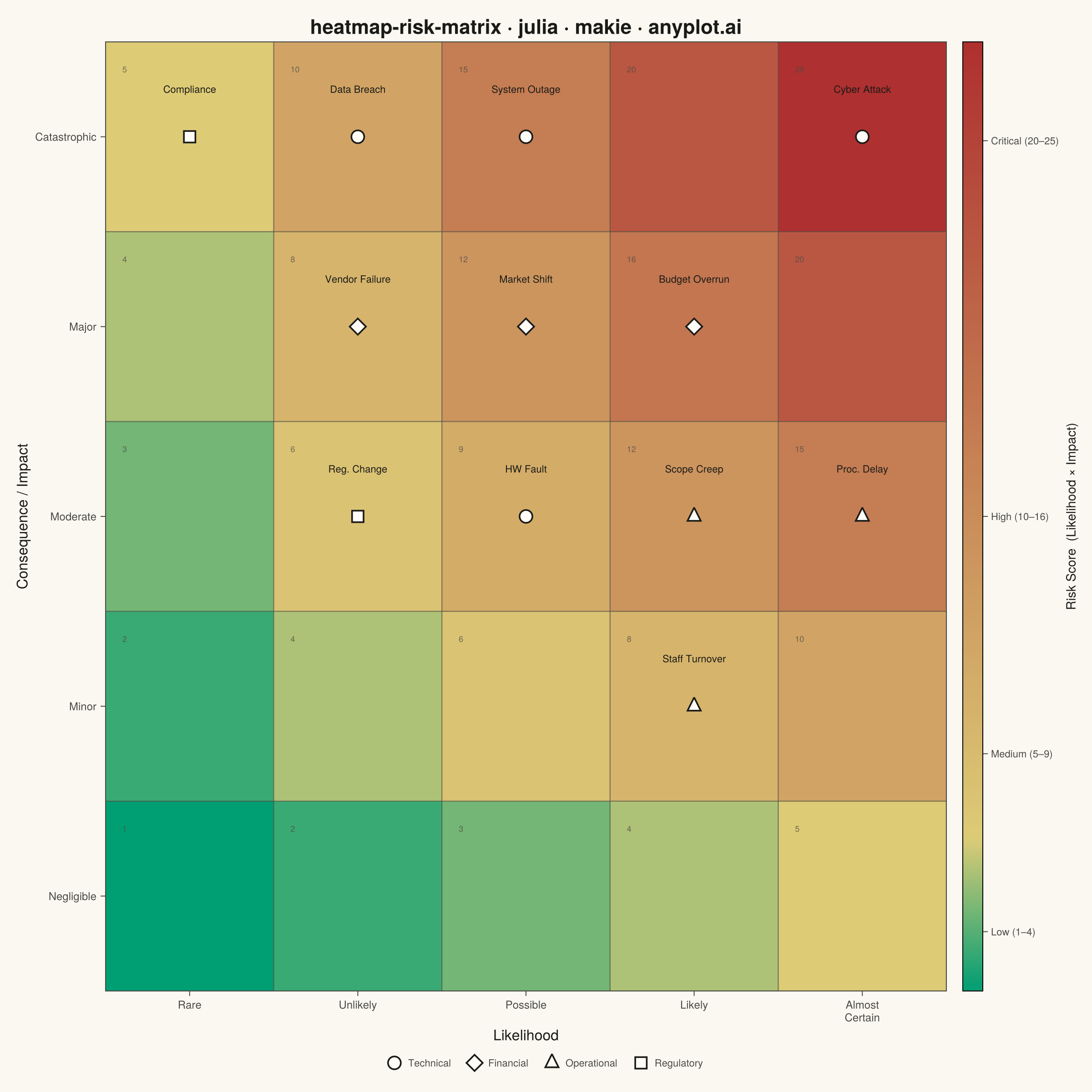
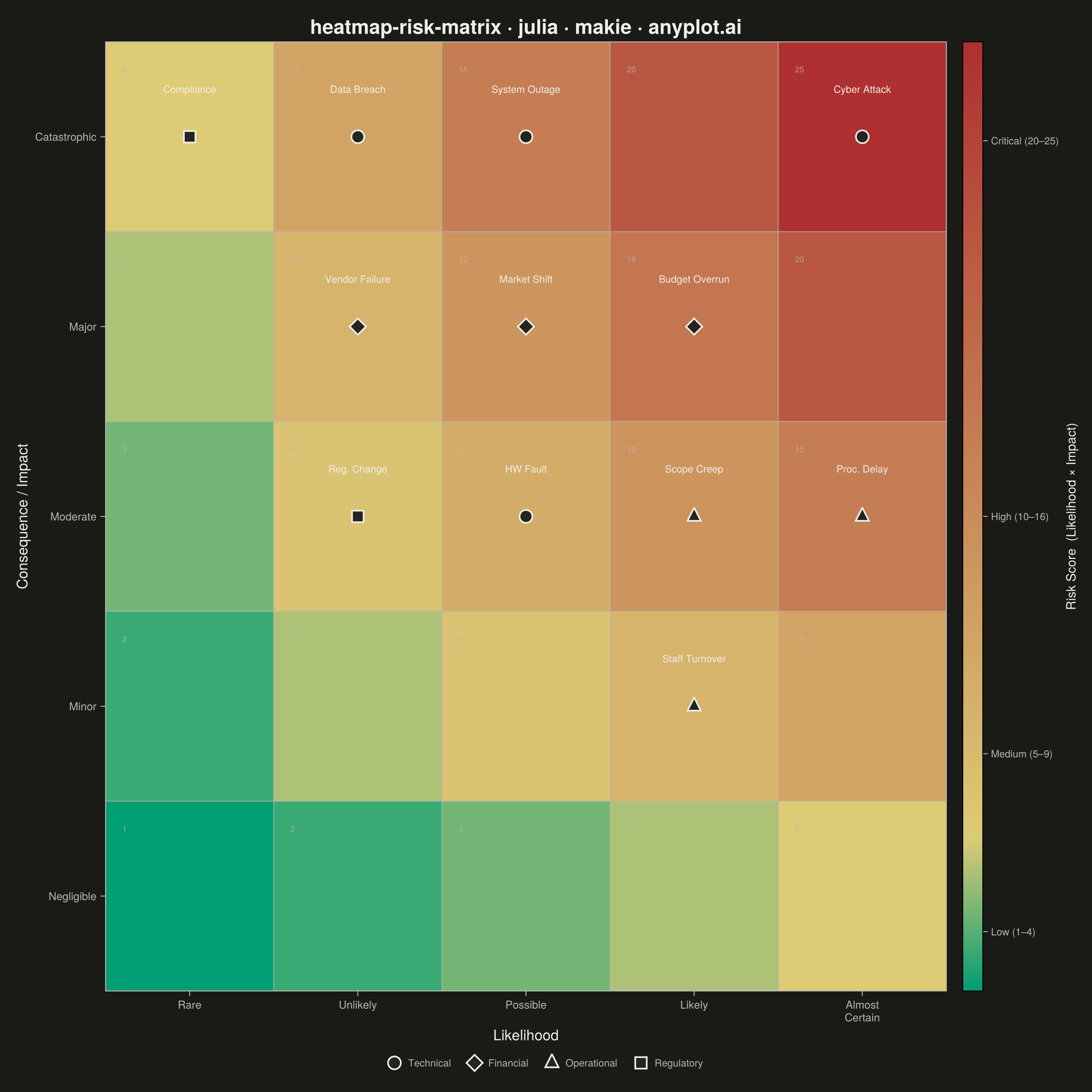
A 5x5 grid heatmap plotting risk likelihood against consequence severity, used to visualize and prioritize risks in project and enterprise risk management. Cells are color-coded from green (low risk) through yellow and orange to red (critical risk), with individual risk items plotted as labeled markers. The risk score for each cell is the product of likelihood and impact, and zones are labeled to indicate risk severity levels (Low, Medium, High, Critical).
# anyplot.ai
# heatmap-risk-matrix: Risk Assessment Matrix (Probability vs Impact)
# Library: makie 0.22.10 | Julia 1.11.9
# Quality: 88/100 | Created: 2026-06-20

using CairoMakie
using Colors
using Random

Random.seed!(42)

const THEME       = get(ENV, "ANYPLOT_THEME", "light")
const PAGE_BG     = THEME == "light" ? colorant"#FAF8F1" : colorant"#1A1A17"
const ELEVATED_BG = THEME == "light" ? colorant"#FFFDF6" : colorant"#242420"
const INK         = THEME == "light" ? colorant"#1A1A17" : colorant"#F0EFE8"
const INK_SOFT    = THEME == "light" ? colorant"#4A4A44" : colorant"#B8B7B0"
const INK_MUTED   = THEME == "light" ? colorant"#6B6A63" : colorant"#A8A79F"

# Risk colormap: Imprint green (Low) → amber (caution) → matte red (Critical)
const RISK_CMAP = cgrad(
    [colorant"#009E73", colorant"#DDCC77", colorant"#AE3030"],
    [0.0, 0.16, 1.0],
)

# 5×5 risk score matrix (likelihood × impact)
risk_matrix = Float64[i * j for i in 1:5, j in 1:5]

likelihood_labels = ["Rare", "Unlikely", "Possible", "Likely", "Almost\nCertain"]
impact_labels     = ["Negligible", "Minor", "Moderate", "Major", "Catastrophic"]

# Risk register: (name, likelihood 1–5, impact 1–5, category)
risks = [
    ("Data Breach",    2, 5, "Technical"),
    ("Budget Overrun", 4, 4, "Financial"),
    ("Scope Creep",    4, 3, "Operational"),
    ("Vendor Failure", 2, 4, "Financial"),
    ("System Outage",  3, 5, "Technical"),
    ("Staff Turnover", 4, 2, "Operational"),
    ("Compliance",     1, 5, "Regulatory"),
    ("HW Fault",       3, 3, "Technical"),
    ("Market Shift",   3, 4, "Financial"),
    ("Cyber Attack",   5, 5, "Technical"),
    ("Proc. Delay",    5, 3, "Operational"),
    ("Reg. Change",    2, 3, "Regulatory"),
]

risk_names = [r[1] for r in risks]
risk_lk    = [r[2] for r in risks]   # likelihood (x-axis)
risk_imp   = [r[3] for r in risks]   # impact (y-axis)
risk_cats  = [r[4] for r in risks]   # category for shape encoding

# Secondary CVD cue: distinct marker shape per risk category
cat_markers = Dict(
    "Technical"   => :circle,
    "Financial"   => :diamond,
    "Operational" => :utriangle,
    "Regulatory"  => :rect,
)

# Jitter: deterministically offset risk items that share the same grid cell
function apply_jitter(xs, ys)
    cell_items = Dict{Tuple{Int,Int}, Vector{Int}}()
    for i in eachindex(xs)
        key = (xs[i], ys[i])
        push!(get!(cell_items, key, Int[]), i)
    end
    xj = float.(copy(xs))
    yj = float.(copy(ys))
    for (_, idxs) in cell_items
        n = length(idxs)
        n == 1 && continue
        for (k, i) in enumerate(idxs)
            θ = 2π * (k - 1) / n - π / 2
            xj[i] += 0.2 * cos(θ)
            yj[i] += 0.2 * sin(θ)
        end
    end
    return xj, yj
end

risk_x, risk_y = apply_jitter(risk_lk, risk_imp)

# ── Figure ───────────────────────────────────────────────────────────────────
fig = Figure(
    size            = (1200, 1200),
    fontsize        = 14,
    backgroundcolor = PAGE_BG,
)

ax = Axis(
    fig[1, 1];
    title              = "heatmap-risk-matrix · julia · makie · anyplot.ai",
    titlesize          = 22,
    titlecolor         = INK,
    xlabel             = "Likelihood",
    ylabel             = "Consequence / Impact",
    xlabelsize         = 16,
    ylabelsize         = 16,
    xlabelcolor        = INK,
    ylabelcolor        = INK,
    xticklabelsize     = 12,
    yticklabelsize     = 12,
    xticklabelcolor    = INK_SOFT,
    yticklabelcolor    = INK_SOFT,
    xtickcolor         = INK_SOFT,
    ytickcolor         = INK_SOFT,
    backgroundcolor    = PAGE_BG,
    topspinevisible    = true,
    rightspinevisible  = true,
    leftspinevisible   = true,
    bottomspinevisible = true,
    leftspinecolor     = INK_SOFT,
    bottomspinecolor   = INK_SOFT,
    topspinecolor      = INK_SOFT,
    rightspinecolor    = INK_SOFT,
    xgridvisible       = false,
    ygridvisible       = false,
    xticks             = (1:5, likelihood_labels),
    yticks             = (1:5, impact_labels),
)

# Background heatmap
hm = heatmap!(ax, 1:5, 1:5, risk_matrix;
    colormap   = RISK_CMAP,
    colorrange = (1.0, 25.0),
)

# Cell grid lines
for k in 0.5:1.0:5.5
    hlines!(ax, k; color = (INK_SOFT, 0.6), linewidth = 1.2)
    vlines!(ax, k; color = (INK_SOFT, 0.6), linewidth = 1.2)
end

# Risk score annotation in each cell — Makie text! with sub-cell alignment control
for lk in 1:5, imp in 1:5
    text!(ax, lk - 0.4, imp + 0.38;
          text     = string(lk * imp),
          align    = (:left, :top),
          fontsize = 9,
          color    = (INK_SOFT, 0.75),
    )
end

# Category-shaped markers — label attribute feeds the Makie Legend below
for cat in unique(risk_cats)
    idxs = findall(==(cat), risk_cats)
    scatter!(ax, risk_x[idxs], risk_y[idxs];
        color       = ELEVATED_BG,
        marker      = cat_markers[cat],
        markersize  = 20,
        strokecolor = INK,
        strokewidth = 1.8,
        label       = cat,
    )
end

# Risk item labels — increased fontsize for desktop and mobile readability
for i in eachindex(risk_names)
    text!(ax, risk_x[i], risk_y[i] + 0.22;
          text     = risk_names[i],
          align    = (:center, :bottom),
          fontsize = 11,
          color    = INK,
    )
end

xlims!(ax, 0.5, 5.5)
ylims!(ax, 0.5, 5.5)

# Colorbar with zone labels at zone midpoints
Colorbar(fig[1, 2], hm;
    label          = "Risk Score  (Likelihood × Impact)",
    labelsize      = 14,
    labelcolor     = INK,
    ticklabelsize  = 11,
    ticklabelcolor = INK_SOFT,
    tickcolor      = INK_SOFT,
    ticks          = (
        [2.5, 7.0, 13.0, 22.5],
        ["Low (1–4)", "Medium (5–9)", "High (10–16)", "Critical (20–25)"],
    ),
    width          = 22,
)

# Makie composable layout: category Legend in a dedicated row below the heatmap.
# Legend(position, ax) extracts labeled scatter! plots — a layout feature
# not available in matplotlib's Figure/Axes model.
Legend(fig[2, 1:2], ax;
    orientation  = :horizontal,
    tellwidth    = false,
    framevisible = false,
    labelcolor   = INK_SOFT,
    labelsize    = 11,
)

rowgap!(fig.layout, 1, 6)

save("plot-$(THEME).png", fig; px_per_unit = 2)
Runnable source as JSON, for any HTTP client: https://api.anyplot.ai/specs/heatmap-risk-matrix/makie/code. Any spec id and library id listed in llms-full.txt fit the same URL shape; every URL below is complete and callable.
{
  "spec_id": "heatmap-risk-matrix",
  "language": "julia",
  "library": "makie",
  "page": "https://anyplot.ai/heatmap-risk-matrix/julia/makie",
  "hub": "https://anyplot.ai/heatmap-risk-matrix",
  "code_json": "https://api.anyplot.ai/specs/heatmap-risk-matrix/makie/code",
  "spec_json": "https://api.anyplot.ai/specs/heatmap-risk-matrix",
  "render_light_png": "https://storage.googleapis.com/anyplot-images/plots/heatmap-risk-matrix/julia/makie/plot-light.png",
  "render_dark_png": "https://storage.googleapis.com/anyplot-images/plots/heatmap-risk-matrix/julia/makie/plot-dark.png",
  "quality_score": 88.0,
  "license": "MIT",
  "guide": "https://anyplot.ai/llms.txt"
}
Part of Risk Assessment Matrix (Probability vs Impact) on anyplot.ai.