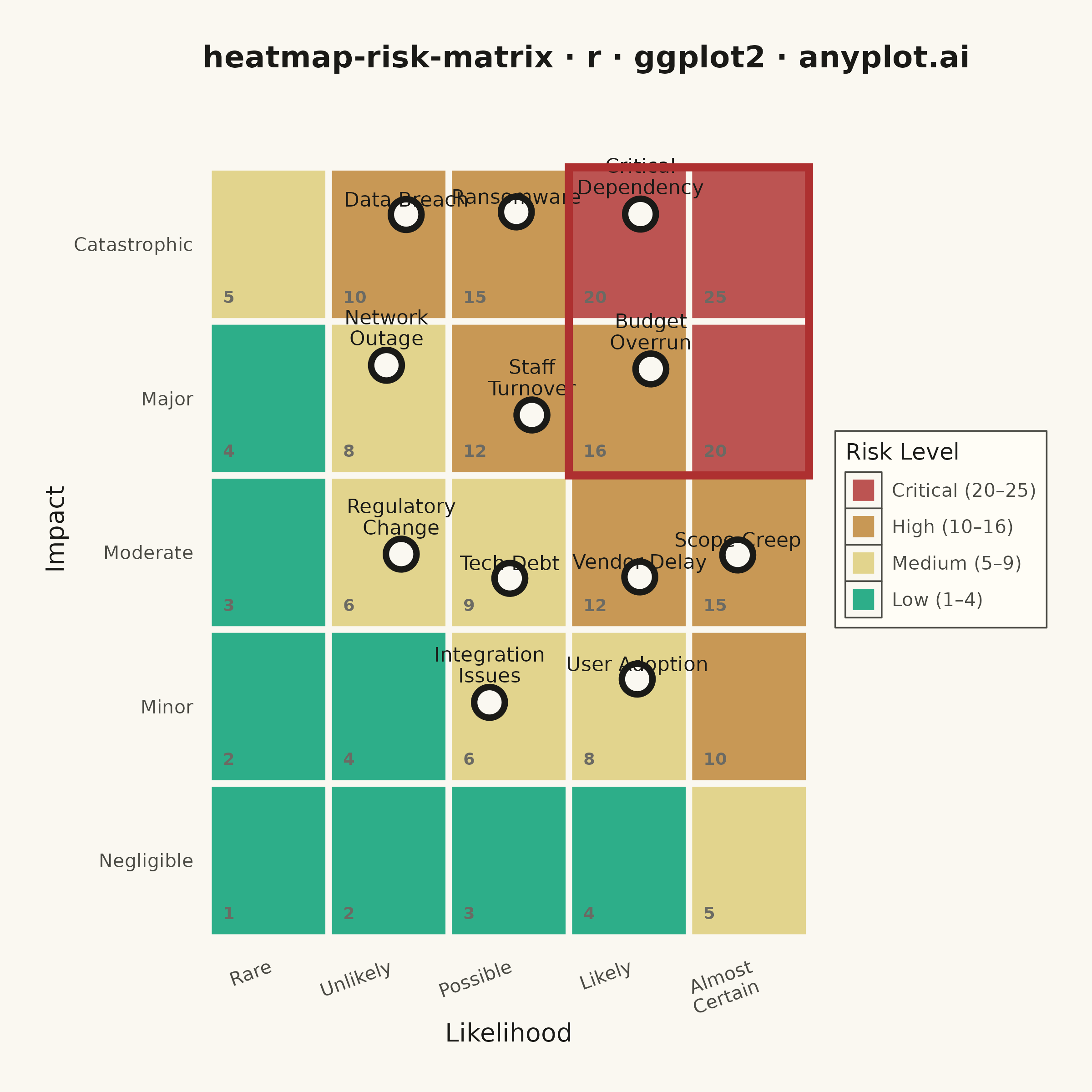
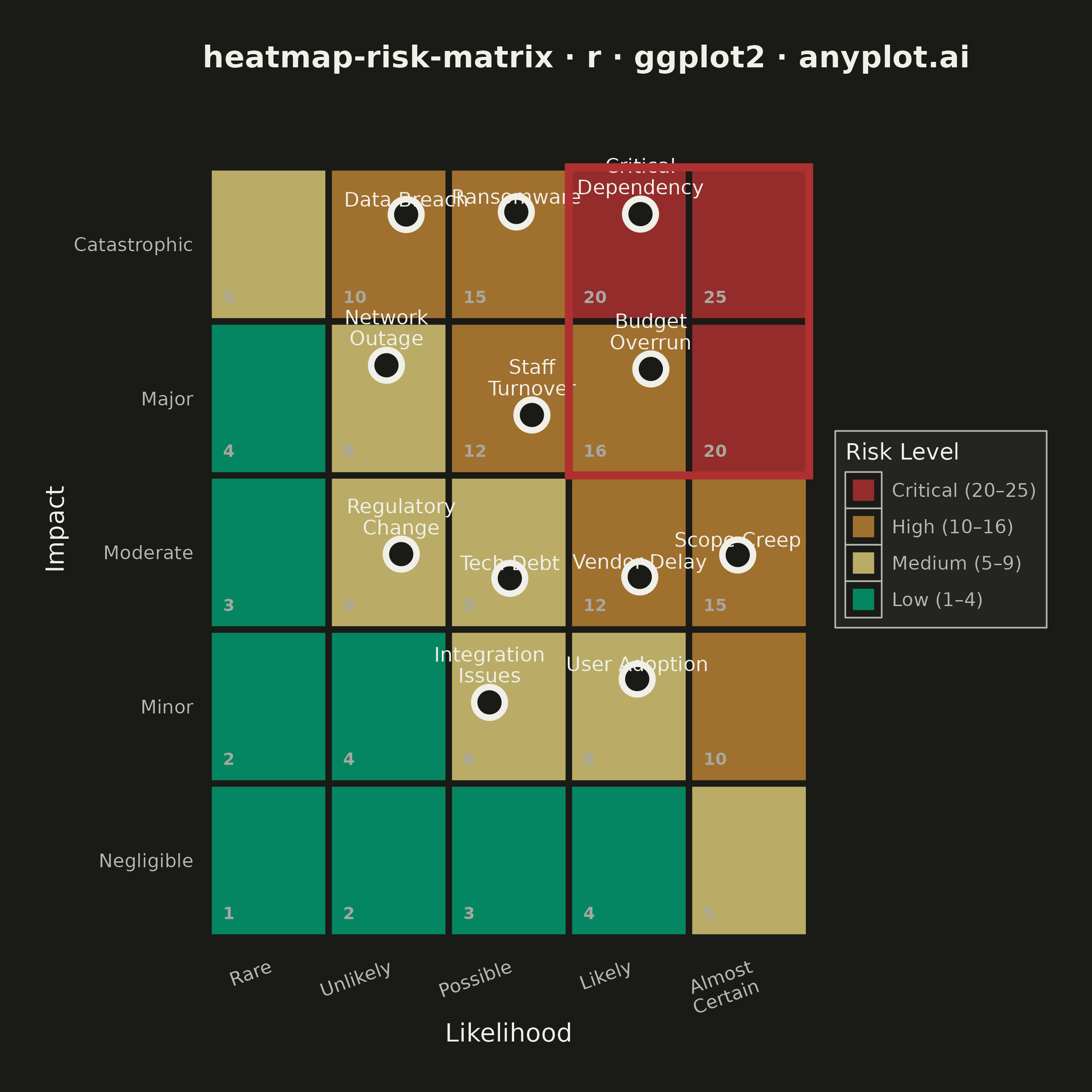
A 5x5 grid heatmap plotting risk likelihood against consequence severity, used to visualize and prioritize risks in project and enterprise risk management. Cells are color-coded from green (low risk) through yellow and orange to red (critical risk), with individual risk items plotted as labeled markers. The risk score for each cell is the product of likelihood and impact, and zones are labeled to indicate risk severity levels (Low, Medium, High, Critical).
#' anyplot.ai
#' heatmap-risk-matrix: Risk Assessment Matrix (Probability vs Impact)
#' Library: ggplot2 3.5.1 | R 4.4.1
#' Quality: 84/100 | Created: 2026-06-20

library(ggplot2)
library(dplyr)
library(ragg)

set.seed(42)

# Theme tokens
THEME       <- Sys.getenv("ANYPLOT_THEME", "light")
PAGE_BG     <- if (THEME == "light") "#FAF8F1" else "#1A1A17"
ELEVATED_BG <- if (THEME == "light") "#FFFDF6" else "#242420"
INK         <- if (THEME == "light") "#1A1A17" else "#F0EFE8"
INK_SOFT    <- if (THEME == "light") "#4A4A44" else "#B8B7B0"
INK_MUTED   <- if (THEME == "light") "#6B6A63" else "#A8A79F"

# Semantic risk zone colors from the Imprint palette
ZONE_COLORS <- c(
  "Low (1–4)"       = "#009E73",  # Imprint green — low risk
  "Medium (5–9)"    = "#DDCC77",  # amber — caution
  "High (10–16)"    = "#BD8233",  # ochre — elevated risk
  "Critical (20–25)" = "#AE3030"  # matte red — critical risk
)

# Axis label text for each level
likelihood_labels <- c("Rare", "Unlikely", "Possible", "Likely", "Almost\nCertain")
impact_labels     <- c("Negligible", "Minor", "Moderate", "Major", "Catastrophic")

# 5x5 risk matrix grid cells
grid_df <- expand.grid(likelihood = 1:5, impact = 1:5) %>%
  mutate(
    score = likelihood * impact,
    zone  = case_when(
      score >= 20 ~ "Critical (20–25)",
      score >= 10 ~ "High (10–16)",
      score >= 5  ~ "Medium (5–9)",
      TRUE        ~ "Low (1–4)"
    ),
    zone = factor(zone, levels = names(ZONE_COLORS))
  )

# Software project risk register — 12 risks placed in distinct cells
risks <- data.frame(
  risk_name  = c(
    "Budget\nOverrun", "Staff\nTurnover", "Scope Creep",
    "Data Breach", "Ransomware", "Tech Debt",
    "Regulatory\nChange", "Integration\nIssues", "User Adoption",
    "Vendor Delay", "Network\nOutage", "Critical\nDependency"
  ),
  likelihood = c(4, 3, 5, 2, 3, 3, 2, 3, 4, 4, 2, 4),
  impact     = c(4, 4, 3, 5, 5, 3, 3, 2, 2, 3, 4, 5)
)

# Small reproducible jitter so markers sit slightly off cell centres
risks$jx <- risks$likelihood + runif(nrow(risks), -0.22, 0.22)
risks$jy <- risks$impact     + runif(nrow(risks), -0.22, 0.22)

plot_title <- "heatmap-risk-matrix · r · ggplot2 · anyplot.ai"

p <- ggplot() +
  # Zone-coloured background cells
  geom_tile(
    data = grid_df,
    aes(x = likelihood, y = impact, fill = zone),
    color = PAGE_BG, linewidth = 1.2, alpha = 0.82
  ) +
  # Risk score in bottom-left corner of each cell (subtle reference)
  geom_text(
    data = grid_df,
    aes(x = likelihood - 0.38, y = impact - 0.38, label = score),
    color = INK_MUTED, size = 2.4, hjust = 0, vjust = 0, fontface = "bold"
  ) +
  # Risk item markers — white-filled circle with ink border
  geom_point(
    data = risks,
    aes(x = jx, y = jy),
    shape = 21, size = 4.5,
    fill = PAGE_BG, color = INK, stroke = 1.8
  ) +
  # Risk item labels (above marker)
  geom_text(
    data = risks,
    aes(x = jx, y = jy, label = risk_name),
    color = INK, size = 2.8, vjust = -0.55, hjust = 0.5, lineheight = 0.88
  ) +
  # Bold border around the Critical zone cells (score ≥ 20)
  annotate(
    "rect",
    xmin = 3.5, xmax = 5.5, ymin = 3.5, ymax = 5.5,
    fill = NA, color = "#AE3030", linewidth = 1.5
  ) +
  # Axis scales
  scale_x_continuous(
    name   = "Likelihood",
    breaks = 1:5,
    labels = likelihood_labels,
    limits = c(0.45, 5.55),
    expand = c(0, 0)
  ) +
  scale_y_continuous(
    name   = "Impact",
    breaks = 1:5,
    labels = impact_labels,
    limits = c(0.42, 5.88),  # extra room above for top-row labels
    expand = c(0, 0)
  ) +
  scale_fill_manual(
    values = ZONE_COLORS,
    name   = "Risk Level",
    guide  = guide_legend(reverse = TRUE)
  ) +
  labs(title = plot_title) +
  theme_minimal(base_size = 8) +
  theme(
    plot.background   = element_rect(fill = PAGE_BG, color = PAGE_BG),
    panel.background  = element_rect(fill = PAGE_BG, color = NA),
    panel.grid.major  = element_blank(),
    panel.grid.minor  = element_blank(),
    panel.border      = element_blank(),
    axis.title        = element_text(color = INK,      size = 10),
    axis.text         = element_text(color = INK_SOFT, size = 7.5),
    axis.text.x       = element_text(angle = 20, hjust = 1),
    plot.title        = element_text(
                          color = INK, size = 12, face = "bold",
                          margin = margin(b = 14)
                        ),
    legend.background = element_rect(fill = ELEVATED_BG, color = INK_SOFT,
                                     linewidth = 0.3),
    legend.text       = element_text(color = INK_SOFT, size = 7.5),
    legend.title      = element_text(color = INK,      size = 9),
    legend.position   = "right",
    legend.key.size   = unit(1.0, "lines"),
    legend.key        = element_rect(color = INK_SOFT, linewidth = 0.3),
    plot.margin       = margin(18, 18, 18, 18)
  )

# Save — square canvas: width=6, height=6, dpi=400 → 2400 x 2400 px
ggsave(
  filename = sprintf("plot-%s.png", THEME),
  plot     = p,
  device   = ragg::agg_png,
  width    = 6,
  height   = 6,
  units    = "in",
  dpi      = 400
)
Runnable source as JSON, for any HTTP client: https://api.anyplot.ai/specs/heatmap-risk-matrix/ggplot2/code. Any spec id and library id listed in llms-full.txt fit the same URL shape; every URL below is complete and callable.
{
  "spec_id": "heatmap-risk-matrix",
  "language": "r",
  "library": "ggplot2",
  "page": "https://anyplot.ai/heatmap-risk-matrix/r/ggplot2",
  "hub": "https://anyplot.ai/heatmap-risk-matrix",
  "code_json": "https://api.anyplot.ai/specs/heatmap-risk-matrix/ggplot2/code",
  "spec_json": "https://api.anyplot.ai/specs/heatmap-risk-matrix",
  "render_light_png": "https://storage.googleapis.com/anyplot-images/plots/heatmap-risk-matrix/r/ggplot2/plot-light.png",
  "render_dark_png": "https://storage.googleapis.com/anyplot-images/plots/heatmap-risk-matrix/r/ggplot2/plot-dark.png",
  "quality_score": 84.0,
  "license": "MIT",
  "guide": "https://anyplot.ai/llms.txt"
}
Part of Risk Assessment Matrix (Probability vs Impact) on anyplot.ai.