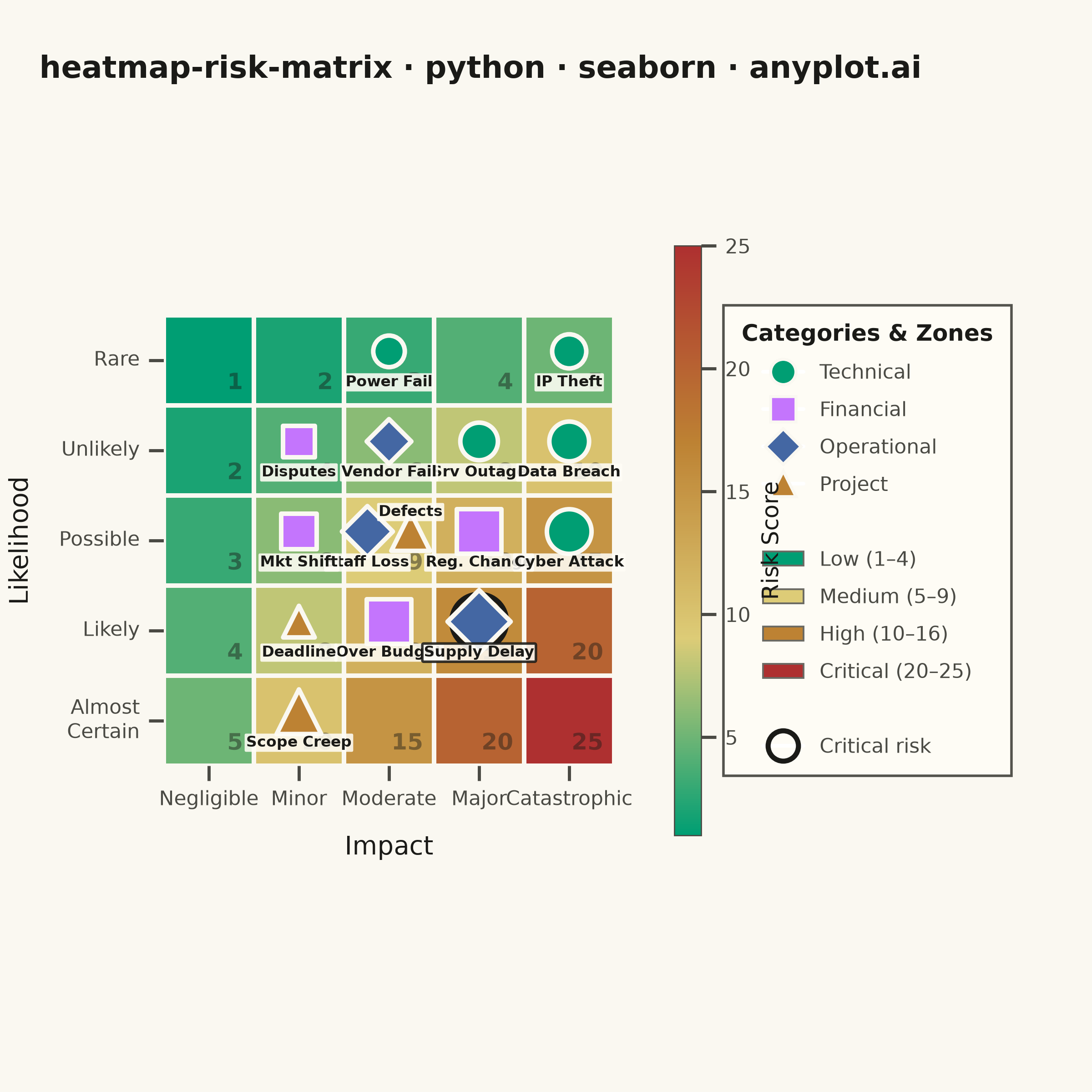
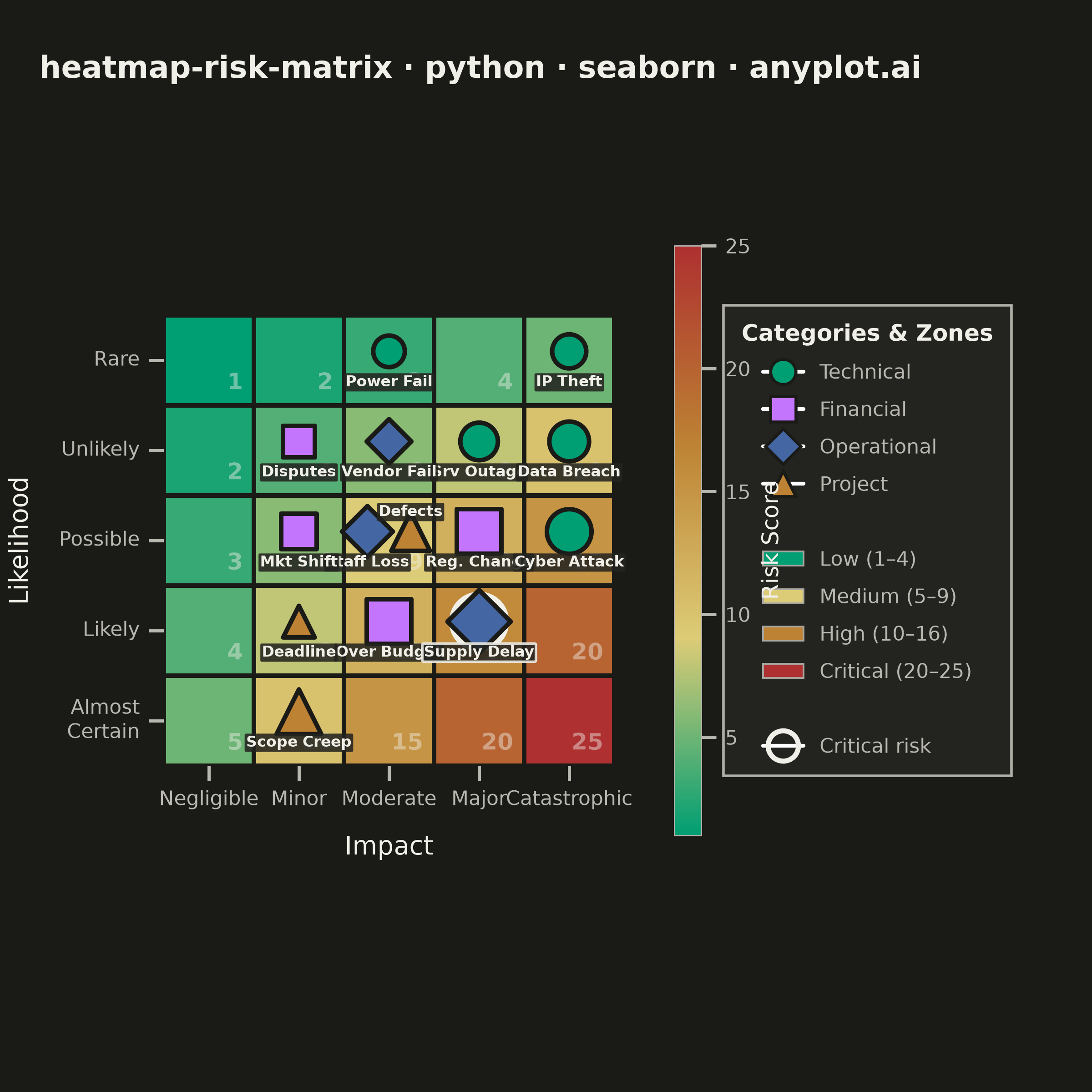
A 5x5 grid heatmap plotting risk likelihood against consequence severity, used to visualize and prioritize risks in project and enterprise risk management. Cells are color-coded from green (low risk) through yellow and orange to red (critical risk), with individual risk items plotted as labeled markers. The risk score for each cell is the product of likelihood and impact, and zones are labeled to indicate risk severity levels (Low, Medium, High, Critical).
""" anyplot.ai
heatmap-risk-matrix: Risk Assessment Matrix (Probability vs Impact)
Library: seaborn 0.13.2 | Python 3.13.14
Quality: 85/100 | Updated: 2026-06-20
"""

import os

import matplotlib.patches as mpatches
import matplotlib.pyplot as plt
import numpy as np
import pandas as pd
import seaborn as sns
from matplotlib.colors import LinearSegmentedColormap


# Theme tokens
THEME = os.getenv("ANYPLOT_THEME", "light")
PAGE_BG = "#FAF8F1" if THEME == "light" else "#1A1A17"
ELEVATED_BG = "#FFFDF6" if THEME == "light" else "#242420"
INK = "#1A1A17" if THEME == "light" else "#F0EFE8"
INK_SOFT = "#4A4A44" if THEME == "light" else "#B8B7B0"
INK_MUTED = "#6B6A63" if THEME == "light" else "#A8A79F"

IMPRINT_PALETTE = ["#009E73", "#C475FD", "#4467A3", "#BD8233", "#AE3030", "#2ABCCD", "#954477", "#99B314"]
ANYPLOT_AMBER = "#DDCC77"

sns.set_theme(
    style="ticks",
    rc={
        "figure.facecolor": PAGE_BG,
        "axes.facecolor": PAGE_BG,
        "axes.edgecolor": INK_SOFT,
        "axes.labelcolor": INK,
        "text.color": INK,
        "xtick.color": INK_SOFT,
        "ytick.color": INK_SOFT,
        "grid.color": INK,
        "grid.alpha": 0.15,
        "legend.facecolor": ELEVATED_BG,
        "legend.edgecolor": INK_SOFT,
    },
)

# Data
np.random.seed(42)

likelihood_labels = ["Rare", "Unlikely", "Possible", "Likely", "Almost\nCertain"]
impact_labels = ["Negligible", "Minor", "Moderate", "Major", "Catastrophic"]

risk_scores = np.array([[1, 2, 3, 4, 5], [2, 4, 6, 8, 10], [3, 6, 9, 12, 15], [4, 8, 12, 16, 20], [5, 10, 15, 20, 25]])

risks = [
    {"name": "Srv Outage", "likelihood": 2, "impact": 4, "category": "Technical"},
    {"name": "Data Breach", "likelihood": 2, "impact": 5, "category": "Technical"},
    {"name": "Over Budget", "likelihood": 4, "impact": 3, "category": "Financial"},
    {"name": "Staff Loss", "likelihood": 3, "impact": 3, "category": "Operational"},
    {"name": "Vendor Fail", "likelihood": 2, "impact": 3, "category": "Operational"},
    {"name": "Scope Creep", "likelihood": 5, "impact": 2, "category": "Project"},
    {"name": "Reg. Change", "likelihood": 3, "impact": 4, "category": "Financial"},
    {"name": "Cyber Attack", "likelihood": 3, "impact": 5, "category": "Technical"},
    {"name": "Supply Delay", "likelihood": 4, "impact": 4, "category": "Operational"},
    {"name": "Mkt Shift", "likelihood": 3, "impact": 2, "category": "Financial"},
    {"name": "Power Fail", "likelihood": 1, "impact": 3, "category": "Technical"},
    {"name": "Disputes", "likelihood": 2, "impact": 2, "category": "Financial"},
    {"name": "Defects", "likelihood": 3, "impact": 3, "category": "Project"},
    {"name": "Deadline", "likelihood": 4, "impact": 2, "category": "Project"},
    {"name": "IP Theft", "likelihood": 1, "impact": 5, "category": "Technical"},
]

# Imprint-derived risk colormap: green (Low) → amber (Medium) → ochre (High) → red (Critical)
cmap = LinearSegmentedColormap.from_list("risk_imprint", ["#009E73", ANYPLOT_AMBER, "#BD8233", "#AE3030"], N=256)

# Plot — square canvas for symmetric 5×5 grid
fig, ax = plt.subplots(figsize=(6, 6), dpi=400)
fig.patch.set_facecolor(PAGE_BG)
fig.subplots_adjust(left=0.15, right=0.70, top=0.88, bottom=0.13)

sns.heatmap(
    risk_scores,
    annot=False,
    cmap=cmap,
    vmin=1,
    vmax=25,
    linewidths=1.8,
    linecolor=PAGE_BG,
    cbar_kws={"shrink": 0.72, "pad": 0.10, "aspect": 22},
    square=True,
    ax=ax,
)

# Score labels in bottom-right corner of each cell
for i in range(5):
    for j in range(5):
        ax.text(
            j + 0.88,
            i + 0.88,
            str(risk_scores[i, j]),
            ha="right",
            va="bottom",
            fontsize=9,
            fontweight="bold",
            color=INK,
            alpha=0.45,
            zorder=2,
        )

# Category markers from Imprint palette positions 1-4
categories = ["Technical", "Financial", "Operational", "Project"]
cat_colors = {cat: IMPRINT_PALETTE[i] for i, cat in enumerate(categories)}
cat_markers = {"Technical": "o", "Financial": "s", "Operational": "D", "Project": "^"}

# Build per-cell item lists for offset positioning
cell_items = {}
for risk in risks:
    key = (risk["likelihood"] - 1, risk["impact"] - 1)
    cell_items.setdefault(key, []).append(risk)

offsets_map = {
    1: [(0.0, 0.0)],
    2: [(-0.24, 0.0), (0.24, 0.0)],
    3: [(-0.24, -0.16), (0.24, -0.16), (0.0, 0.20)],
    4: [(-0.22, -0.16), (0.22, -0.16), (-0.22, 0.20), (0.22, 0.20)],
}

plot_data = []
for _key, items in cell_items.items():
    n = len(items)
    offsets = offsets_map.get(n, offsets_map[3])
    for i, risk in enumerate(items):
        ox, oy = offsets[i] if i < len(offsets) else (0, 0)
        score = risk["likelihood"] * risk["impact"]
        # Alternate labels above/below for multi-item cells to prevent overlap
        label_dy = 0.26 if i % 2 == 0 else -0.30
        plot_data.append(
            {
                "x": risk["impact"] - 1 + 0.5 + ox,
                "y": risk["likelihood"] - 1 + 0.40 + oy,
                "name": risk["name"],
                "category": risk["category"],
                "score": score,
                "size": 120 + score * 12,
                "is_critical": score >= 16,
                "label_dy": label_dy,
            }
        )

df_risks = pd.DataFrame(plot_data)
size_min = df_risks["size"].min()
size_max = df_risks["size"].max()

# Scatter markers per category with consistent size scale
for cat, marker in cat_markers.items():
    cat_df = df_risks[df_risks["category"] == cat]
    if cat_df.empty:
        continue
    sns.scatterplot(
        data=cat_df,
        x="x",
        y="y",
        size="size",
        sizes=(size_min, size_max),
        color=cat_colors[cat],
        marker=marker,
        edgecolor=PAGE_BG,
        linewidth=1.8,
        legend=False,
        ax=ax,
        zorder=5,
    )

# Critical risk emphasis rings
critical_df = df_risks[df_risks["is_critical"]]
for _, row in critical_df.iterrows():
    ax.scatter(row["x"], row["y"], s=row["size"] + 160, facecolors="none", edgecolors=INK, linewidths=2, zorder=4)

# Risk item labels with elevated background boxes
for _, row in df_risks.iterrows():
    ax.text(
        row["x"],
        row["y"] + row["label_dy"],
        row["name"],
        ha="center",
        va="top",
        fontsize=6,
        fontweight="bold",
        color=INK,
        zorder=6,
        clip_on=False,
        bbox={
            "boxstyle": "round,pad=0.10",
            "facecolor": ELEVATED_BG,
            "edgecolor": INK if row["is_critical"] else "none",
            "linewidth": 1.0 if row["is_critical"] else 0,
            "alpha": 0.88,
        },
    )

# Axis styling
ax.set_xticklabels(impact_labels, fontsize=8, fontweight="medium", color=INK_SOFT)
ax.set_yticklabels(likelihood_labels, fontsize=8, rotation=0, fontweight="medium", color=INK_SOFT)
ax.set_xlabel("Impact", fontsize=10, fontweight="medium", labelpad=10, color=INK)
ax.set_ylabel("Likelihood", fontsize=10, fontweight="medium", labelpad=10, color=INK)

title = "heatmap-risk-matrix · python · seaborn · anyplot.ai"
n_chars = len(title)
ratio = 67 / n_chars if n_chars > 67 else 1.0
title_fontsize = max(8, round(12 * ratio))
fig.suptitle(title, fontsize=title_fontsize, fontweight="bold", color=INK, y=0.95, x=0.44)

# Colorbar theming
cbar = ax.collections[0].colorbar
cbar.ax.tick_params(labelsize=8, colors=INK_SOFT)
cbar.ax.set_ylabel("Risk Score", fontsize=9, color=INK)
cbar.ax.yaxis.label.set_color(INK)
cbar.outline.set_linewidth(0.5)
cbar.outline.set_edgecolor(INK_SOFT)

# Legend outside the axes: category markers + zone patches + critical indicator
legend_handles = [
    plt.Line2D(
        [0],
        [0],
        marker=cat_markers[cat],
        color="w",
        markerfacecolor=cat_colors[cat],
        markersize=10,
        markeredgecolor=PAGE_BG,
        markeredgewidth=1.2,
        label=cat,
    )
    for cat in categories
]
legend_handles.append(plt.Line2D([0], [0], color="none", linewidth=0, label=""))

zone_levels = [
    ("Low (1–4)", "#009E73"),
    ("Medium (5–9)", ANYPLOT_AMBER),
    ("High (10–16)", "#BD8233"),
    ("Critical (20–25)", "#AE3030"),
]
for label, color in zone_levels:
    legend_handles.append(mpatches.Patch(facecolor=color, edgecolor=INK_MUTED, linewidth=0.7, label=label))

legend_handles.append(plt.Line2D([0], [0], color="none", linewidth=0, label=""))
legend_handles.append(
    plt.Line2D(
        [0],
        [0],
        marker="o",
        color="w",
        markerfacecolor="none",
        markersize=12,
        markeredgecolor=INK,
        markeredgewidth=2,
        label="Critical risk",
    )
)

leg = ax.legend(
    handles=legend_handles,
    loc="center left",
    bbox_to_anchor=(1.22, 0.5),
    fontsize=8,
    framealpha=0.95,
    facecolor=ELEVATED_BG,
    edgecolor=INK_SOFT,
    fancybox=False,
    shadow=False,
    title="Categories & Zones",
    title_fontsize=9,
    ncol=1,
    borderpad=0.9,
    labelspacing=0.85,
)
leg.get_title().set_fontweight("bold")
leg.get_title().set_color(INK)
for text in leg.get_texts():
    text.set_color(INK_SOFT)

sns.despine(ax=ax, left=True, bottom=True)

# Save — no bbox_inches to preserve exact 2400×2400 canvas
plt.savefig(f"plot-{THEME}.png", dpi=400, facecolor=PAGE_BG)
Runnable source as JSON, for any HTTP client: https://api.anyplot.ai/specs/heatmap-risk-matrix/seaborn/code. Any spec id and library id listed in llms-full.txt fit the same URL shape; every URL below is complete and callable.
{
  "spec_id": "heatmap-risk-matrix",
  "language": "python",
  "library": "seaborn",
  "page": "https://anyplot.ai/heatmap-risk-matrix/python/seaborn",
  "hub": "https://anyplot.ai/heatmap-risk-matrix",
  "code_json": "https://api.anyplot.ai/specs/heatmap-risk-matrix/seaborn/code",
  "spec_json": "https://api.anyplot.ai/specs/heatmap-risk-matrix",
  "render_light_png": "https://storage.googleapis.com/anyplot-images/plots/heatmap-risk-matrix/python/seaborn/plot-light.png",
  "render_dark_png": "https://storage.googleapis.com/anyplot-images/plots/heatmap-risk-matrix/python/seaborn/plot-dark.png",
  "quality_score": 85.0,
  "license": "MIT",
  "guide": "https://anyplot.ai/llms.txt"
}
Part of Risk Assessment Matrix (Probability vs Impact) on anyplot.ai.