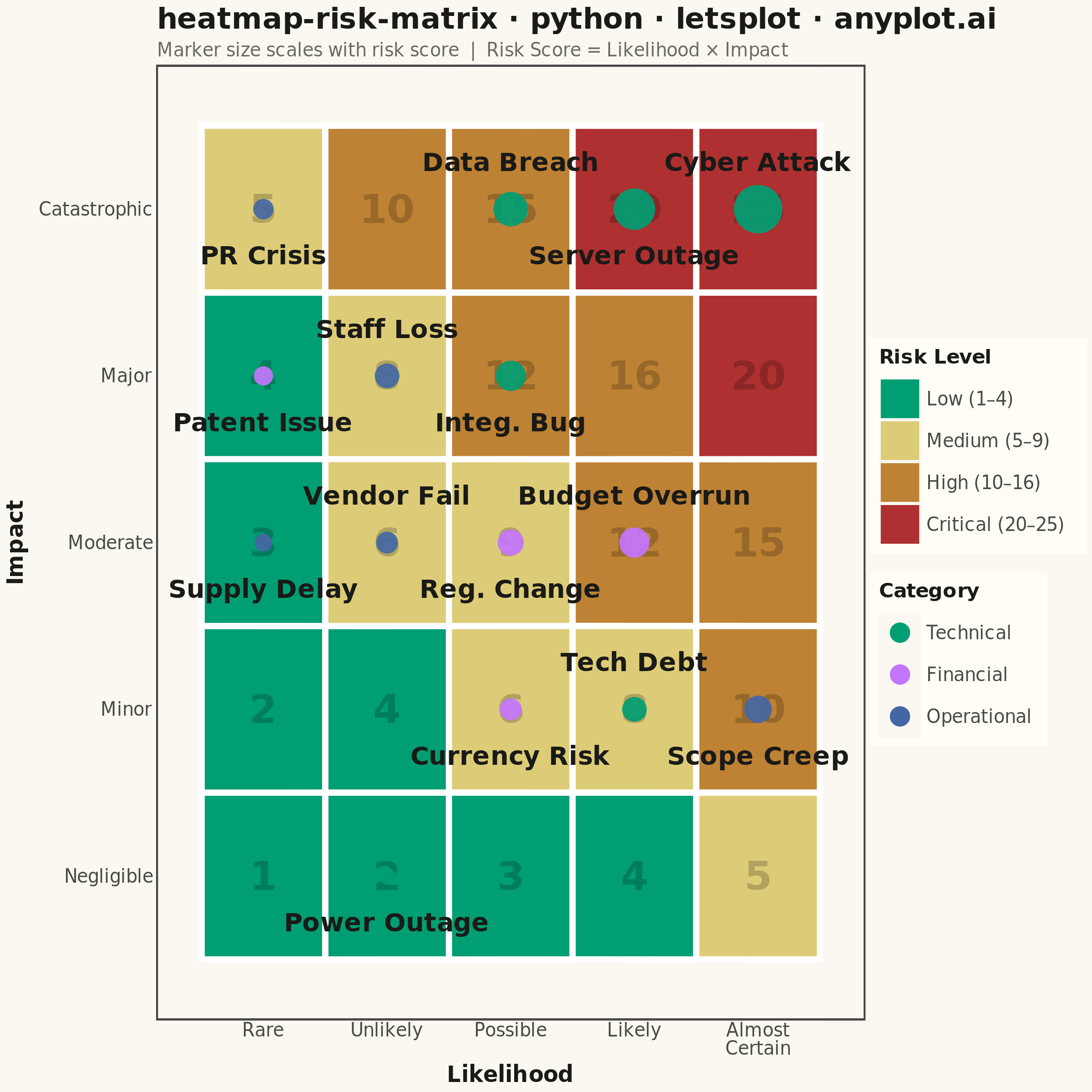
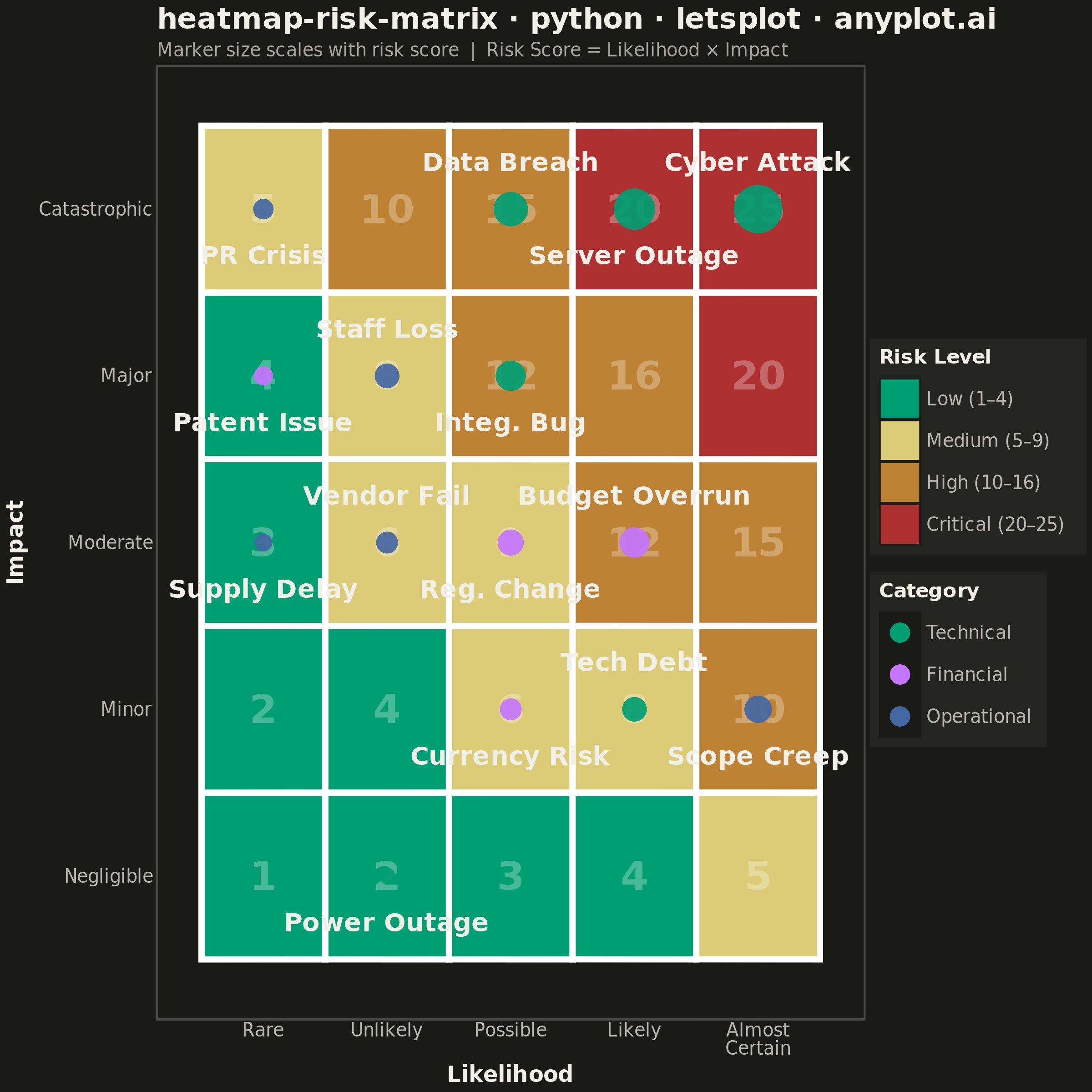
A 5x5 grid heatmap plotting risk likelihood against consequence severity, used to visualize and prioritize risks in project and enterprise risk management. Cells are color-coded from green (low risk) through yellow and orange to red (critical risk), with individual risk items plotted as labeled markers. The risk score for each cell is the product of likelihood and impact, and zones are labeled to indicate risk severity levels (Low, Medium, High, Critical).
""" anyplot.ai
heatmap-risk-matrix: Risk Assessment Matrix (Probability vs Impact)
Library: letsplot 4.10.1 | Python 3.13.14
Quality: 86/100 | Updated: 2026-06-20
"""

import os

import numpy as np
import pandas as pd
from lets_plot import *


LetsPlot.setup_html()

# Theme tokens
THEME = os.getenv("ANYPLOT_THEME", "light")
PAGE_BG = "#FAF8F1" if THEME == "light" else "#1A1A17"
ELEVATED_BG = "#FFFDF6" if THEME == "light" else "#242420"
INK = "#1A1A17" if THEME == "light" else "#F0EFE8"
INK_SOFT = "#4A4A44" if THEME == "light" else "#B8B7B0"
INK_MUTED = "#6B6A63" if THEME == "light" else "#A8A79F"
SCORE_TEXT = "rgba(0,0,0,0.20)" if THEME == "light" else "rgba(255,255,255,0.28)"

# Data
np.random.seed(42)

likelihood_labels = ["Rare", "Unlikely", "Possible", "Likely", "Almost\nCertain"]
impact_labels = ["Negligible", "Minor", "Moderate", "Major", "Catastrophic"]

# 5x5 background grid with risk zones
grid_rows = []
for li in range(1, 6):
    for im in range(1, 6):
        score = li * im
        zone = "Low" if score <= 4 else "Medium" if score <= 9 else "High" if score <= 16 else "Critical"
        grid_rows.append({"likelihood": li, "impact": im, "score": score, "zone": zone, "score_label": str(score)})

grid_df = pd.DataFrame(grid_rows)
grid_df["zone"] = pd.Categorical(grid_df["zone"], categories=["Low", "Medium", "High", "Critical"], ordered=True)

# Risk register — IT project management scenario
risks = pd.DataFrame(
    {
        "risk_name": [
            "Server Outage",
            "Data Breach",
            "Budget Overrun",
            "Staff Loss",
            "Vendor Fail",
            "Scope Creep",
            "Reg. Change",
            "Tech Debt",
            "Integ. Bug",
            "Supply Delay",
            "Currency Risk",
            "PR Crisis",
            "Patent Issue",
            "Power Outage",
            "Cyber Attack",
        ],
        "likelihood": [4, 3, 4, 2, 2, 5, 3, 4, 3, 1, 3, 1, 1, 2, 5],
        "impact": [5, 5, 3, 4, 3, 2, 3, 2, 4, 3, 2, 5, 4, 1, 5],
        "category": [
            "Technical",
            "Technical",
            "Financial",
            "Operational",
            "Operational",
            "Operational",
            "Financial",
            "Technical",
            "Technical",
            "Operational",
            "Financial",
            "Operational",
            "Financial",
            "Technical",
            "Technical",
        ],
    }
)
risks["risk_score"] = risks["likelihood"] * risks["impact"]

# Per-cell jitter to separate co-located risks
cell_counts: dict = {}
offsets_x, offsets_y = [], []
for _, row in risks.iterrows():
    cell = (int(row["likelihood"]), int(row["impact"]))
    idx = cell_counts.get(cell, 0)
    cell_counts[cell] = idx + 1
    patterns = [(0, 0), (0.20, 0.17), (-0.20, 0.17), (0.20, -0.17)]
    ox, oy = patterns[idx % len(patterns)]
    offsets_x.append(ox)
    offsets_y.append(oy)

risks["lk_jitter"] = risks["likelihood"] + np.array(offsets_x)
risks["im_jitter"] = risks["impact"] + np.array(offsets_y)

# Per-impact-row alternating nudge (sorted by likelihood) to reduce horizontal overlap.
# Even rank within each impact row → nudge below point; odd rank → nudge above.
# This staggers labels so adjacent x-positions land on alternating y levels.
risks["_rank"] = risks.groupby("impact")["likelihood"].transform(lambda s: s.rank(method="first").astype(int) - 1)
risks["label_y"] = risks.apply(lambda r: min(r["im_jitter"] + (-0.28 if r["_rank"] % 2 == 0 else 0.28), 5.35), axis=1)
risks = risks.drop(columns="_rank")

# Rich tooltips for interactive HTML
risk_tooltips = (
    layer_tooltips().line("@risk_name").line("Category: @category").line("Score: @risk_score  (likelihood × impact)")
)

# Zone colors — Imprint semantic mapping: green→safe, amber→caution, ochre→elevated, red→critical
zone_colors = {
    "Low": "#009E73",  # Imprint green  — safe
    "Medium": "#DDCC77",  # Imprint amber  — caution
    "High": "#BD8233",  # Imprint ochre  — elevated risk
    "Critical": "#AE3030",  # Imprint red    — critical alert
}

# Category marker colors — Imprint palette: first series must be #009E73
cat_colors = {
    "Technical": "#009E73",  # Imprint green — first series
    "Financial": "#C475FD",  # Imprint lavender
    "Operational": "#4467A3",  # Imprint blue
}

anyplot_theme = theme(
    plot_background=element_rect(fill=PAGE_BG, color=PAGE_BG),
    panel_background=element_rect(fill=PAGE_BG),
    panel_grid=element_blank(),
    axis_title=element_text(color=INK, size=12, face="bold"),
    axis_text=element_text(color=INK_SOFT, size=10),
    axis_line=element_line(color=INK_SOFT, size=0.5),
    axis_ticks=element_blank(),
    plot_title=element_text(color=INK, size=16, face="bold"),
    plot_subtitle=element_text(color=INK_MUTED, size=10),
    legend_background=element_rect(fill=ELEVATED_BG, color=INK_SOFT),
    legend_text=element_text(color=INK_SOFT, size=10),
    legend_title=element_text(color=INK, size=11, face="bold"),
)

title = "heatmap-risk-matrix · python · letsplot · anyplot.ai"

# Plot
plot = (
    ggplot()
    + geom_tile(aes(x="likelihood", y="impact", fill="zone"), data=grid_df, color="white", size=1.5, tooltips="none")
    + geom_text(
        aes(x="likelihood", y="impact", label="score_label"), data=grid_df, size=11, color=SCORE_TEXT, fontface="bold"
    )
    + geom_point(
        aes(x="lk_jitter", y="im_jitter", color="category", size="risk_score"),
        data=risks,
        alpha=0.92,
        tooltips=risk_tooltips,
    )
    + geom_text(aes(x="lk_jitter", y="label_y", label="risk_name"), data=risks, size=7, fontface="bold", color=INK)
    + scale_size(range=[4, 12], name="Risk Score", guide="none")
    + scale_fill_manual(
        values=zone_colors,
        name="Risk Level",
        breaks=["Low", "Medium", "High", "Critical"],
        labels=["Low (1–4)", "Medium (5–9)", "High (10–16)", "Critical (20–25)"],
    )
    + scale_color_manual(values=cat_colors, name="Category")
    + scale_x_continuous(breaks=[1, 2, 3, 4, 5], labels=likelihood_labels, limits=[0.4, 5.6])
    + scale_y_continuous(breaks=[1, 2, 3, 4, 5], labels=impact_labels, limits=[0.4, 5.6])
    + labs(
        x="Likelihood",
        y="Impact",
        title=title,
        subtitle="Marker size scales with risk score  |  Risk Score = Likelihood × Impact",
    )
    + anyplot_theme
    + ggsize(600, 600)
)

# Save
ggsave(plot, f"plot-{THEME}.png", path=".", scale=4)
ggsave(plot, f"plot-{THEME}.html", path=".")
Runnable source as JSON, for any HTTP client: https://api.anyplot.ai/specs/heatmap-risk-matrix/letsplot/code. Any spec id and library id listed in llms-full.txt fit the same URL shape; every URL below is complete and callable.
{
  "spec_id": "heatmap-risk-matrix",
  "language": "python",
  "library": "letsplot",
  "page": "https://anyplot.ai/heatmap-risk-matrix/python/letsplot",
  "hub": "https://anyplot.ai/heatmap-risk-matrix",
  "code_json": "https://api.anyplot.ai/specs/heatmap-risk-matrix/letsplot/code",
  "spec_json": "https://api.anyplot.ai/specs/heatmap-risk-matrix",
  "render_light_png": "https://storage.googleapis.com/anyplot-images/plots/heatmap-risk-matrix/python/letsplot/plot-light.png",
  "render_dark_png": "https://storage.googleapis.com/anyplot-images/plots/heatmap-risk-matrix/python/letsplot/plot-dark.png",
  "interactive_light_html": "https://storage.googleapis.com/anyplot-images/plots/heatmap-risk-matrix/python/letsplot/plot-light.html",
  "interactive_dark_html": "https://storage.googleapis.com/anyplot-images/plots/heatmap-risk-matrix/python/letsplot/plot-dark.html",
  "quality_score": 86.0,
  "license": "MIT",
  "guide": "https://anyplot.ai/llms.txt"
}
Part of Risk Assessment Matrix (Probability vs Impact) on anyplot.ai.