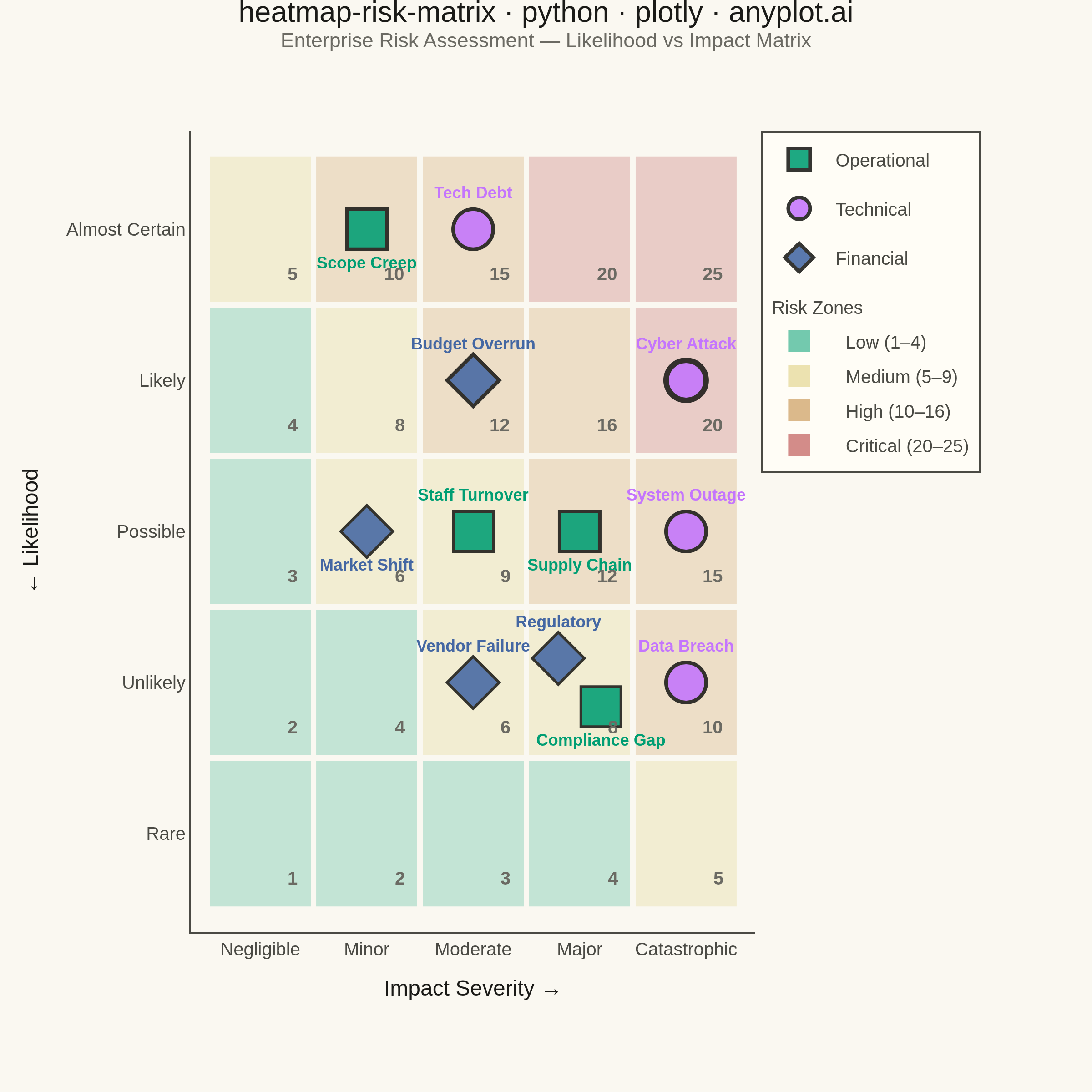
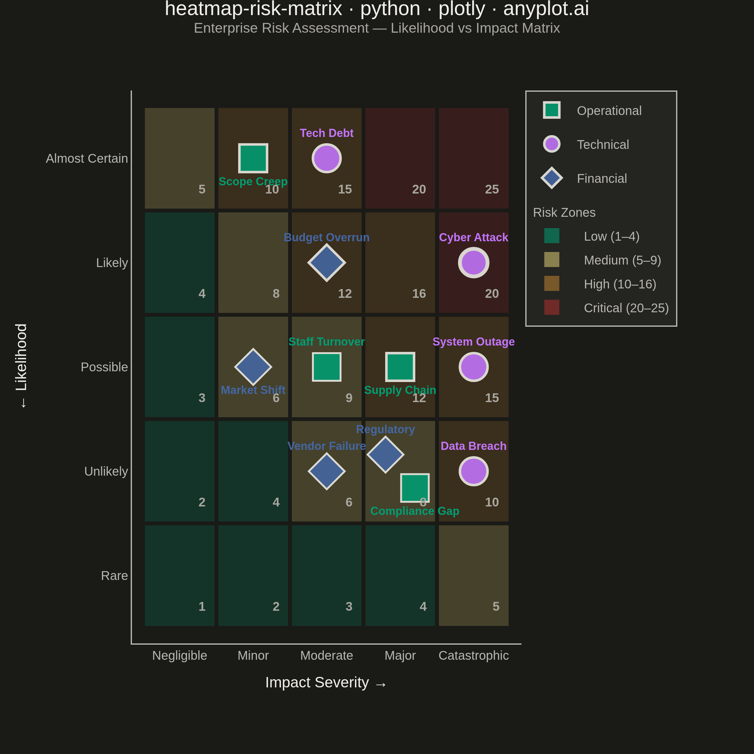
A 5x5 grid heatmap plotting risk likelihood against consequence severity, used to visualize and prioritize risks in project and enterprise risk management. Cells are color-coded from green (low risk) through yellow and orange to red (critical risk), with individual risk items plotted as labeled markers. The risk score for each cell is the product of likelihood and impact, and zones are labeled to indicate risk severity levels (Low, Medium, High, Critical).
""" anyplot.ai
heatmap-risk-matrix: Risk Assessment Matrix (Probability vs Impact)
Library: plotly 6.8.0 | Python 3.13.14
Quality: 90/100 | Updated: 2026-06-20
"""

import os

import numpy as np
import plotly.graph_objects as go


# Theme tokens
THEME = os.getenv("ANYPLOT_THEME", "light")
PAGE_BG = "#FAF8F1" if THEME == "light" else "#1A1A17"
ELEVATED_BG = "#FFFDF6" if THEME == "light" else "#242420"
INK = "#1A1A17" if THEME == "light" else "#F0EFE8"
INK_SOFT = "#4A4A44" if THEME == "light" else "#B8B7B0"
INK_MUTED = "#6B6A63" if THEME == "light" else "#A8A79F"

# Data
np.random.seed(42)

likelihood_labels = ["Rare", "Unlikely", "Possible", "Likely", "Almost Certain"]
impact_labels = ["Negligible", "Minor", "Moderate", "Major", "Catastrophic"]

risk_scores = np.array([[1, 2, 3, 4, 5], [2, 4, 6, 8, 10], [3, 6, 9, 12, 15], [4, 8, 12, 16, 20], [5, 10, 15, 20, 25]])

# Semantic risk-zone colors: green → amber → ochre → red (Imprint palette members)
zone_thresholds = [(4, "Low"), (9, "Medium"), (16, "High"), (25, "Critical")]
zone_colors = {
    "Low": "#009E73",  # Imprint brand green
    "Medium": "#DDCC77",  # Imprint amber anchor
    "High": "#BD8233",  # Imprint ochre — closest Imprint member to orange
    "Critical": "#AE3030",  # Imprint matte red
}
zone_bg = {
    "Low": "rgba(0,158,115,0.22)" if THEME == "light" else "rgba(0,158,115,0.20)",
    "Medium": "rgba(221,204,119,0.25)" if THEME == "light" else "rgba(221,204,119,0.22)",
    "High": "rgba(189,130,51,0.22)" if THEME == "light" else "rgba(189,130,51,0.20)",
    "Critical": "rgba(174,48,48,0.22)" if THEME == "light" else "rgba(174,48,48,0.20)",
}
# Zone severity → marker border width (consistent marker size per change request)
zone_border = {"Critical": 3.0, "High": 2.0, "Medium": 1.5, "Low": 1.0}

# Imprint categorical palette for risk categories (canonical order)
category_colors = {
    "Operational": "#009E73",  # Imprint position 1 — brand green
    "Technical": "#C475FD",  # Imprint position 2 — lavender
    "Financial": "#4467A3",  # Imprint position 3 — blue
}
category_symbols = {"Operational": "square", "Technical": "circle", "Financial": "diamond"}

# Risk items
risks = [
    {"name": "Supply Chain", "likelihood": 3, "impact": 4, "category": "Operational"},
    {"name": "Data Breach", "likelihood": 2, "impact": 5, "category": "Technical"},
    {"name": "Budget Overrun", "likelihood": 4, "impact": 3, "category": "Financial"},
    {"name": "Staff Turnover", "likelihood": 3, "impact": 3, "category": "Operational"},
    {"name": "Regulatory", "likelihood": 2, "impact": 4, "category": "Financial"},
    {"name": "System Outage", "likelihood": 3, "impact": 5, "category": "Technical"},
    {"name": "Scope Creep", "likelihood": 5, "impact": 2, "category": "Operational"},
    {"name": "Vendor Failure", "likelihood": 2, "impact": 3, "category": "Financial"},
    {"name": "Cyber Attack", "likelihood": 4, "impact": 5, "category": "Technical"},
    {"name": "Market Shift", "likelihood": 3, "impact": 2, "category": "Financial"},
    {"name": "Tech Debt", "likelihood": 5, "impact": 3, "category": "Technical"},
    {"name": "Compliance Gap", "likelihood": 2, "impact": 4, "category": "Operational"},
]

# Pre-compute cell occupancy for jitter
cell_items = {}
for risk in risks:
    key = (risk["likelihood"], risk["impact"])
    cell_items.setdefault(key, []).append(risk)

jitter_offsets = {
    1: [(0, 0)],
    2: [(-0.20, 0.16), (0.20, -0.16)],
    3: [(-0.22, 0.16), (0.22, 0.16), (0, -0.18)],
    4: [(-0.20, 0.16), (0.20, 0.16), (-0.20, -0.16), (0.20, -0.16)],
}

# Plot
fig = go.Figure()

# Colored cell backgrounds with theme-adaptive borders
for i in range(5):
    for j in range(5):
        score = risk_scores[i][j]
        zone = next(name for threshold, name in zone_thresholds if score <= threshold)
        fig.add_shape(
            type="rect",
            x0=j + 0.5,
            x1=j + 1.5,
            y0=i + 0.5,
            y1=i + 1.5,
            fillcolor=zone_bg[zone],
            line={"color": PAGE_BG, "width": 3},
            layer="below",
        )
        # Score label at bottom-right of each cell
        fig.add_annotation(
            x=j + 1.40,
            y=i + 0.62,
            text=f"<b>{score}</b>",
            showarrow=False,
            font={"size": 10, "color": INK_MUTED, "family": "Arial"},
            xanchor="right",
            yanchor="bottom",
        )

# Risk markers — consistent size (22px), border width encodes zone severity
seen_categories = set()
for risk in risks:
    key = (risk["likelihood"], risk["impact"])
    items = cell_items[key]
    idx = items.index(risk)
    n = len(items)

    jx, jy = jitter_offsets[min(n, 4)][idx % min(n, 4)]
    cat = risk["category"]
    score = risk["likelihood"] * risk["impact"]
    zone = next(name for threshold, name in zone_thresholds if score <= threshold)

    # Text position: alternate top/bottom by impact parity for n=1 to break row-wide crowding;
    # jitter-relative positioning for shared cells
    if n == 1:
        tpos = "top center" if risk["impact"] % 2 == 1 else "bottom center"
    elif n == 2:
        tpos = "top center" if jy > 0 else "bottom center"
    elif n == 3:
        tpos = "bottom center" if idx == 2 else ("top right" if jx < 0 else "top left")
    else:
        tpos = "top center" if jy > 0 else "bottom center"

    show_legend = cat not in seen_categories
    seen_categories.add(cat)

    fig.add_trace(
        go.Scatter(
            x=[risk["impact"] + jx],
            y=[risk["likelihood"] + jy],
            mode="markers+text",
            marker={
                "size": 22,
                "color": category_colors[cat],
                "line": {"color": INK, "width": zone_border[zone]},
                "symbol": category_symbols[cat],
                "opacity": 0.88,
            },
            text=f"<b>{risk['name']}</b>",
            textposition=tpos,
            textfont={"size": 9, "color": category_colors[cat], "family": "Arial"},
            name=cat,
            legendgroup=cat,
            showlegend=show_legend,
            hovertemplate=(
                f"<b>{risk['name']}</b><br>"
                f"Likelihood: {likelihood_labels[risk['likelihood'] - 1]}<br>"
                f"Impact: {impact_labels[risk['impact'] - 1]}<br>"
                f"Risk Score: {score} ({zone})<br>"
                f"Category: {cat}<extra></extra>"
            ),
        )
    )

# Zone legend entries
zone_ranges = {"Low": "1–4", "Medium": "5–9", "High": "10–16", "Critical": "20–25"}
for zone_name, color in zone_colors.items():
    fig.add_trace(
        go.Scatter(
            x=[None],
            y=[None],
            mode="markers",
            marker={"size": 16, "color": color, "symbol": "square", "opacity": 0.55},
            name=f"  {zone_name} ({zone_ranges[zone_name]})",
            legendgroup="zones",
            legendgrouptitle={"text": "Risk Zones", "font": {"size": 10, "color": INK_SOFT}},
        )
    )

# Layout — square canvas (2400×2400): 600×600 logical × scale 4
title_text = "heatmap-risk-matrix · python · plotly · anyplot.ai"
fig.update_layout(
    autosize=False,
    title={
        "text": (
            f"{title_text}<br>"
            f"<sup style='color:{INK_MUTED};font-weight:normal'>"
            f"Enterprise Risk Assessment — Likelihood vs Impact Matrix</sup>"
        ),
        "font": {"size": 16, "color": INK, "family": "Arial"},
        "x": 0.5,
        "xanchor": "center",
        "y": 0.98,
    },
    xaxis={
        "title": {"text": "Impact Severity →", "font": {"size": 12, "color": INK}, "standoff": 12},
        "tickvals": [1, 2, 3, 4, 5],
        "ticktext": impact_labels,
        "tickfont": {"size": 10, "color": INK_SOFT, "family": "Arial"},
        "range": [0.35, 5.65],
        "showgrid": False,
        "zeroline": False,
        "fixedrange": True,
        "linecolor": INK_SOFT,
    },
    yaxis={
        "title": {"text": "← Likelihood", "font": {"size": 12, "color": INK}, "standoff": 12},
        "tickvals": [1, 2, 3, 4, 5],
        "ticktext": likelihood_labels,
        "tickfont": {"size": 10, "color": INK_SOFT, "family": "Arial"},
        "range": [0.35, 5.65],
        "showgrid": False,
        "zeroline": False,
        "fixedrange": True,
        "linecolor": INK_SOFT,
    },
    paper_bgcolor=PAGE_BG,
    plot_bgcolor=PAGE_BG,
    font={"color": INK, "family": "Arial"},
    legend={
        "font": {"size": 10, "color": INK_SOFT},
        "x": 1.01,
        "y": 1,
        "xanchor": "left",
        "yanchor": "top",
        "bgcolor": ELEVATED_BG,
        "bordercolor": INK_SOFT,
        "borderwidth": 1,
        "tracegroupgap": 8,
        "itemsizing": "constant",
    },
    margin={"l": 105, "r": 185, "t": 72, "b": 88},
    hoverlabel={"bgcolor": ELEVATED_BG, "bordercolor": INK_SOFT, "font": {"size": 11, "family": "Arial", "color": INK}},
)

# Save — square canvas: 2400×2400 (600×600 logical × scale 4)
fig.write_image(f"plot-{THEME}.png", width=600, height=600, scale=4)
fig.write_html(f"plot-{THEME}.html", include_plotlyjs="cdn")
Runnable source as JSON, for any HTTP client: https://api.anyplot.ai/specs/heatmap-risk-matrix/plotly/code. Any spec id and library id listed in llms-full.txt fit the same URL shape; every URL below is complete and callable.
{
  "spec_id": "heatmap-risk-matrix",
  "language": "python",
  "library": "plotly",
  "page": "https://anyplot.ai/heatmap-risk-matrix/python/plotly",
  "hub": "https://anyplot.ai/heatmap-risk-matrix",
  "code_json": "https://api.anyplot.ai/specs/heatmap-risk-matrix/plotly/code",
  "spec_json": "https://api.anyplot.ai/specs/heatmap-risk-matrix",
  "render_light_png": "https://storage.googleapis.com/anyplot-images/plots/heatmap-risk-matrix/python/plotly/plot-light.png",
  "render_dark_png": "https://storage.googleapis.com/anyplot-images/plots/heatmap-risk-matrix/python/plotly/plot-dark.png",
  "interactive_light_html": "https://storage.googleapis.com/anyplot-images/plots/heatmap-risk-matrix/python/plotly/plot-light.html",
  "interactive_dark_html": "https://storage.googleapis.com/anyplot-images/plots/heatmap-risk-matrix/python/plotly/plot-dark.html",
  "quality_score": 90.0,
  "license": "MIT",
  "guide": "https://anyplot.ai/llms.txt"
}
Part of Risk Assessment Matrix (Probability vs Impact) on anyplot.ai.