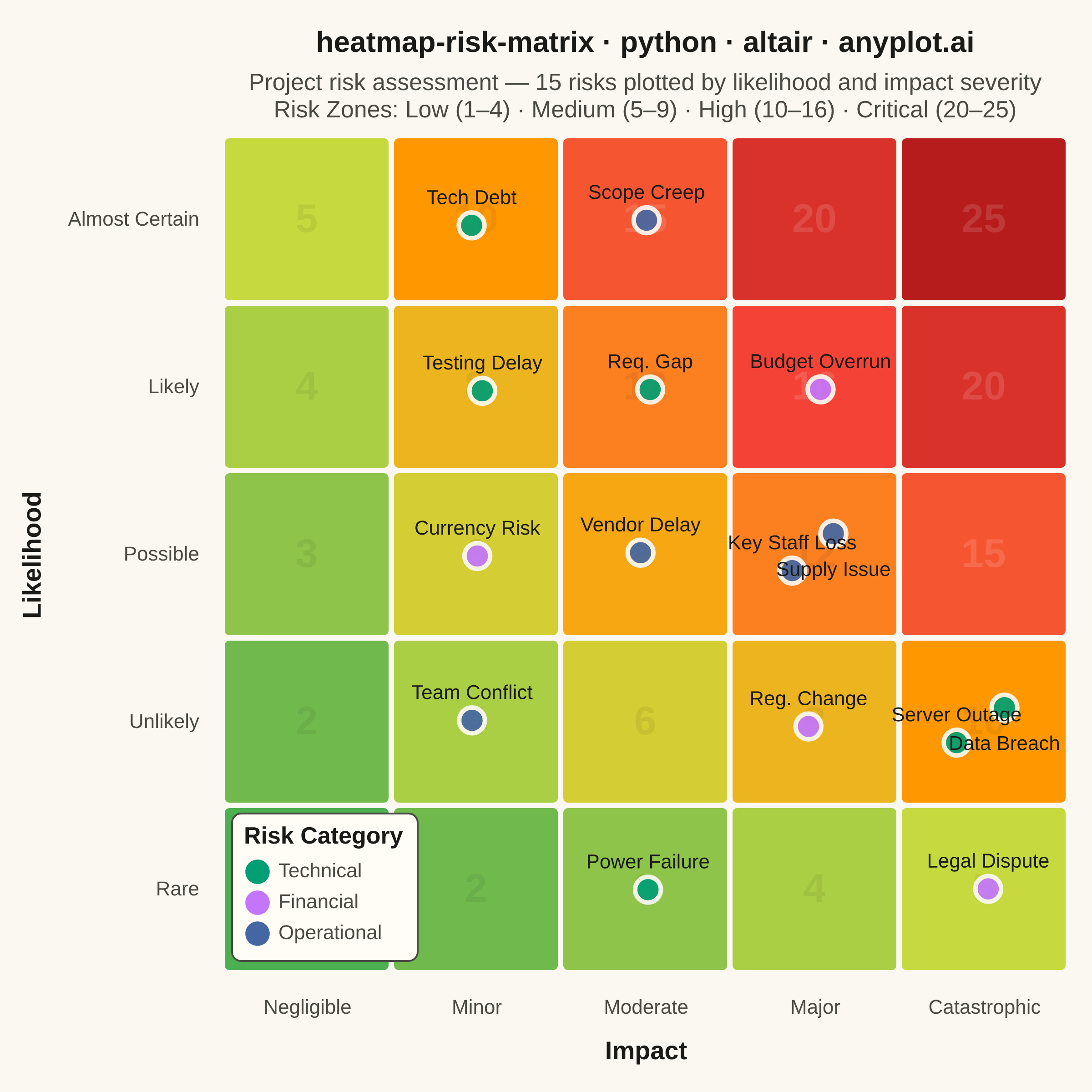
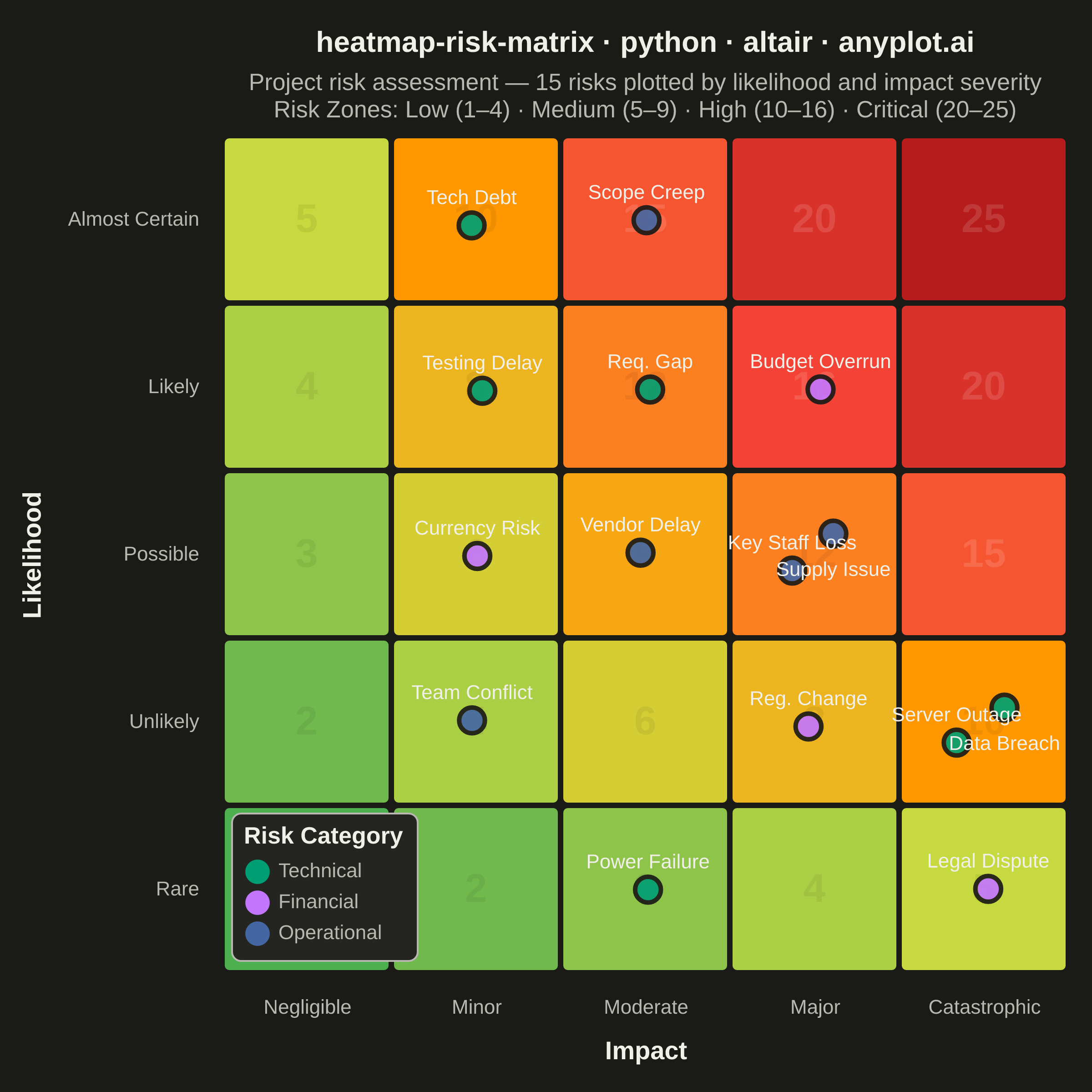
A 5x5 grid heatmap plotting risk likelihood against consequence severity, used to visualize and prioritize risks in project and enterprise risk management. Cells are color-coded from green (low risk) through yellow and orange to red (critical risk), with individual risk items plotted as labeled markers. The risk score for each cell is the product of likelihood and impact, and zones are labeled to indicate risk severity levels (Low, Medium, High, Critical).
""" anyplot.ai
heatmap-risk-matrix: Risk Assessment Matrix (Probability vs Impact)
Library: altair 6.2.1 | Python 3.13.14
Quality: 85/100 | Updated: 2026-06-20
"""

import importlib
import os
import sys


# Drop script directory from sys.path so `altair` resolves to the installed package, not this file
sys.path[:] = [p for p in sys.path if os.path.abspath(p or ".") != os.path.dirname(os.path.abspath(__file__))]
alt = importlib.import_module("altair")
np = importlib.import_module("numpy")
pd = importlib.import_module("pandas")
Image = importlib.import_module("PIL.Image")

# Theme tokens — Imprint palette, theme-adaptive chrome
THEME = os.getenv("ANYPLOT_THEME", "light")
PAGE_BG = "#FAF8F1" if THEME == "light" else "#1A1A17"
ELEVATED_BG = "#FFFDF6" if THEME == "light" else "#242420"
INK = "#1A1A17" if THEME == "light" else "#F0EFE8"
INK_SOFT = "#4A4A44" if THEME == "light" else "#B8B7B0"

# Imprint categorical palette — first 3 positions for risk categories
IMPRINT_PALETTE = ["#009E73", "#C475FD", "#4467A3", "#BD8233", "#AE3030", "#2ABCCD", "#954477", "#99B314"]

# Data
np.random.seed(42)

likelihood_labels = ["Rare", "Unlikely", "Possible", "Likely", "Almost Certain"]
impact_labels = ["Negligible", "Minor", "Moderate", "Major", "Catastrophic"]

likelihood_map = {lbl: i + 1 for i, lbl in enumerate(likelihood_labels)}
impact_map = {lbl: i + 1 for i, lbl in enumerate(impact_labels)}

# Background grid — 25 cells with risk scores (likelihood × impact)
grid_rows = []
for li in range(1, 6):
    for im in range(1, 6):
        grid_rows.append(
            {"li": li, "im": im, "risk_score": li * im, "x1": im - 0.5, "x2": im + 0.5, "y1": li - 0.5, "y2": li + 0.5}
        )

grid_df = pd.DataFrame(grid_rows)

# Risk items — project risk management scenario
risk_items = [
    {"risk_name": "Server Outage", "likelihood": "Unlikely", "impact": "Catastrophic", "category": "Technical"},
    {"risk_name": "Budget Overrun", "likelihood": "Likely", "impact": "Major", "category": "Financial"},
    {"risk_name": "Key Staff Loss", "likelihood": "Possible", "impact": "Major", "category": "Operational"},
    {"risk_name": "Scope Creep", "likelihood": "Almost Certain", "impact": "Moderate", "category": "Operational"},
    {"risk_name": "Data Breach", "likelihood": "Unlikely", "impact": "Catastrophic", "category": "Technical"},
    {"risk_name": "Vendor Delay", "likelihood": "Possible", "impact": "Moderate", "category": "Operational"},
    {"risk_name": "Reg. Change", "likelihood": "Unlikely", "impact": "Major", "category": "Financial"},
    {"risk_name": "Req. Gap", "likelihood": "Likely", "impact": "Moderate", "category": "Technical"},
    {"risk_name": "Currency Risk", "likelihood": "Possible", "impact": "Minor", "category": "Financial"},
    {"risk_name": "Power Failure", "likelihood": "Rare", "impact": "Moderate", "category": "Technical"},
    {"risk_name": "Supply Issue", "likelihood": "Possible", "impact": "Major", "category": "Operational"},
    {"risk_name": "Testing Delay", "likelihood": "Likely", "impact": "Minor", "category": "Technical"},
    {"risk_name": "Legal Dispute", "likelihood": "Rare", "impact": "Catastrophic", "category": "Financial"},
    {"risk_name": "Team Conflict", "likelihood": "Unlikely", "impact": "Minor", "category": "Operational"},
    {"risk_name": "Tech Debt", "likelihood": "Almost Certain", "impact": "Minor", "category": "Technical"},
]

risk_df = pd.DataFrame(risk_items)
risk_df["li"] = risk_df["likelihood"].map(likelihood_map)
risk_df["im"] = risk_df["impact"].map(impact_map)

# Smart jitter — spread items sharing the same cell to avoid overlap
cell_key = risk_df["likelihood"] + "|" + risk_df["impact"]
cell_counts = cell_key.map(cell_key.value_counts())
cell_idx = cell_key.groupby(cell_key).cumcount()

risk_df["x"] = (
    risk_df["im"]
    + np.where(cell_counts > 1, (cell_idx - (cell_counts - 1) / 2) * 0.30, 0)
    + np.random.uniform(-0.04, 0.04, len(risk_df))
)
risk_df["y"] = (
    risk_df["li"]
    + np.where(cell_counts > 1, (cell_idx - (cell_counts - 1) / 2) * 0.20, 0)
    + np.random.uniform(-0.04, 0.04, len(risk_df))
)

# Label y-positions: alternate above/below for same-cell items to prevent overlap
# Chart height 460px for 5 data units → 0.16 units ≈ 15px above, -0.22 ≈ 20px below
risk_df["label_y"] = risk_df["y"] + np.where(cell_counts == 1, 0.16, np.where(cell_idx % 2 == 0, 0.16, -0.22))

# Color scales
# Heatmap background: spec-mandated green→yellow→orange→red risk gradient
color_scale = alt.Scale(
    domain=[1, 5, 10, 16, 25], range=["#4caf50", "#c6d93e", "#ff9800", "#f44336", "#b71c1c"], interpolate="lab"
)

# Category markers: Imprint palette positions 1–3
category_scale = alt.Scale(
    domain=["Technical", "Financial", "Operational"], range=[IMPRINT_PALETTE[0], IMPRINT_PALETTE[1], IMPRINT_PALETTE[2]]
)

# Axis label expressions — map numeric ticks to descriptive domain terms
x_label_expr = " : ".join(f"datum.value === {i + 1} ? '{lbl}'" for i, lbl in enumerate(impact_labels)) + " : ''"
y_label_expr = " : ".join(f"datum.value === {i + 1} ? '{lbl}'" for i, lbl in enumerate(likelihood_labels)) + " : ''"

x_axis = alt.Axis(
    values=[1, 2, 3, 4, 5],
    labelExpr=x_label_expr,
    labelFontSize=11,
    titleFontSize=14,
    titleFontWeight="bold",
    labelAngle=0,
    domainWidth=0,
    tickWidth=0,
    titlePadding=12,
    labelPadding=8,
    labelColor=INK_SOFT,
    titleColor=INK,
)
y_axis = alt.Axis(
    values=[1, 2, 3, 4, 5],
    labelExpr=y_label_expr,
    labelFontSize=11,
    titleFontSize=14,
    titleFontWeight="bold",
    domainWidth=0,
    tickWidth=0,
    titlePadding=12,
    labelPadding=8,
    labelColor=INK_SOFT,
    titleColor=INK,
)

x_scale = alt.Scale(domain=[0.5, 5.5])
y_scale = alt.Scale(domain=[0.5, 5.5])

# Layer 1: Heatmap background cells
heatmap = (
    alt.Chart(grid_df)
    .mark_rect(stroke=PAGE_BG, strokeWidth=3, cornerRadius=4)
    .encode(
        x=alt.X("x1:Q", scale=x_scale, axis=None),
        x2="x2:Q",
        y=alt.Y("y1:Q", scale=y_scale, axis=None),
        y2="y2:Q",
        color=alt.Color("risk_score:Q", scale=color_scale, legend=None),
    )
)

# Layer 2: Risk score watermarks (subtle numbers in each cell)
score_text = (
    alt.Chart(grid_df)
    .mark_text(fontSize=22, fontWeight="bold", opacity=0.18)
    .encode(
        x=alt.X("im:Q", scale=x_scale, axis=None),
        y=alt.Y("li:Q", scale=y_scale, axis=None),
        text=alt.Text("risk_score:Q"),
        color=alt.condition(
            alt.datum.risk_score > 12, alt.value("rgba(255,255,255,0.7)"), alt.value("rgba(0,0,0,0.35)")
        ),
    )
)

# Layer 3: Risk item markers — Imprint palette positions 1–3 for categories
markers = (
    alt.Chart(risk_df)
    .mark_circle(size=200, stroke=PAGE_BG, strokeWidth=2.5, opacity=0.92)
    .encode(
        x=alt.X("x:Q", scale=x_scale, title="Impact", axis=x_axis),
        y=alt.Y("y:Q", scale=y_scale, title="Likelihood", axis=y_axis),
        color=alt.Color("category:N", scale=category_scale, legend=None),
        tooltip=[
            alt.Tooltip("risk_name:N", title="Risk"),
            alt.Tooltip("category:N", title="Category"),
            alt.Tooltip("likelihood:N", title="Likelihood"),
            alt.Tooltip("impact:N", title="Impact"),
        ],
    )
)

# Layer 4: Risk item labels — 11px normal weight, positioned above/below per item
labels = (
    alt.Chart(risk_df)
    .mark_text(fontSize=11, align="center", baseline="middle")
    .encode(
        x=alt.X("x:Q", scale=x_scale, axis=None),
        y=alt.Y("label_y:Q", scale=y_scale, axis=None),
        text=alt.Text("risk_name:N"),
        color=alt.value(INK),
    )
)

# Layer 5: Invisible marks to carry the category legend
legend_source = pd.DataFrame({"category": ["Technical", "Financial", "Operational"], "x": [1] * 3, "y": [1] * 3})
legend_layer = (
    alt.Chart(legend_source)
    .mark_circle(size=0, opacity=0)
    .encode(
        x=alt.X("x:Q", scale=x_scale, axis=None),
        y=alt.Y("y:Q", scale=y_scale, axis=None),
        color=alt.Color(
            "category:N",
            scale=category_scale,
            legend=alt.Legend(
                title="Risk Category",
                titleFontSize=13,
                titleFontWeight="bold",
                labelFontSize=11,
                symbolSize=180,
                orient="none",
                legendX=5,
                legendY=372,
                direction="vertical",
                fillColor=ELEVATED_BG,
                strokeColor=INK_SOFT,
                padding=7,
                cornerRadius=5,
                titleColor=INK,
                labelColor=INK_SOFT,
            ),
        ),
    )
)

# Compose chart — square canvas: width=500, height=460 → pads to 2400×2400
chart = (
    alt.layer(heatmap, score_text, markers, labels, legend_layer)
    .properties(
        width=465,
        height=460,
        background=PAGE_BG,
        title=alt.Title(
            "heatmap-risk-matrix · python · altair · anyplot.ai",
            fontSize=16,
            fontWeight="bold",
            anchor="middle",
            color=INK,
            subtitle=[
                "Project risk assessment — 15 risks plotted by likelihood and impact severity",
                "Risk Zones:  Low (1–4)  ·  Medium (5–9)  ·  High (10–16)  ·  Critical (20–25)",
            ],
            subtitleFontSize=13,
            subtitleColor=INK_SOFT,
            subtitlePadding=8,
        ),
    )
    .resolve_axis(x="independent", y="independent")
    .configure_view(strokeWidth=0, fill=PAGE_BG)
    .configure_axis(labelColor=INK_SOFT, titleColor=INK, domainColor=INK_SOFT, tickColor=INK_SOFT, gridOpacity=0)
    .configure_title(color=INK)
    .configure_legend(fillColor=ELEVATED_BG, strokeColor=INK_SOFT, labelColor=INK_SOFT, titleColor=INK)
)

# Save PNG then pad to exact 2400×2400 square target
TW, TH = 2400, 2400
chart.save(f"plot-{THEME}.png", scale_factor=4.0)
_img = Image.open(f"plot-{THEME}.png").convert("RGB")
_w, _h = _img.size
if _w > TW or _h > TH:
    raise SystemExit(
        f"altair vl-convert produced {_w}×{_h}, exceeds target {TW}×{TH}. "
        "Shrink chart .properties(width=, height=) and re-render."
    )
if _w < TW or _h < TH:
    _canvas = Image.new("RGB", (TW, TH), PAGE_BG)
    _canvas.paste(_img, ((TW - _w) // 2, (TH - _h) // 2))
    _canvas.save(f"plot-{THEME}.png")

# Save interactive HTML
chart.save(f"plot-{THEME}.html")
Runnable source as JSON, for any HTTP client: https://api.anyplot.ai/specs/heatmap-risk-matrix/altair/code. Any spec id and library id listed in llms-full.txt fit the same URL shape; every URL below is complete and callable.
{
  "spec_id": "heatmap-risk-matrix",
  "language": "python",
  "library": "altair",
  "page": "https://anyplot.ai/heatmap-risk-matrix/python/altair",
  "hub": "https://anyplot.ai/heatmap-risk-matrix",
  "code_json": "https://api.anyplot.ai/specs/heatmap-risk-matrix/altair/code",
  "spec_json": "https://api.anyplot.ai/specs/heatmap-risk-matrix",
  "render_light_png": "https://storage.googleapis.com/anyplot-images/plots/heatmap-risk-matrix/python/altair/plot-light.png",
  "render_dark_png": "https://storage.googleapis.com/anyplot-images/plots/heatmap-risk-matrix/python/altair/plot-dark.png",
  "interactive_light_html": "https://storage.googleapis.com/anyplot-images/plots/heatmap-risk-matrix/python/altair/plot-light.html",
  "interactive_dark_html": "https://storage.googleapis.com/anyplot-images/plots/heatmap-risk-matrix/python/altair/plot-dark.html",
  "quality_score": 85.0,
  "license": "MIT",
  "guide": "https://anyplot.ai/llms.txt"
}
Part of Risk Assessment Matrix (Probability vs Impact) on anyplot.ai.