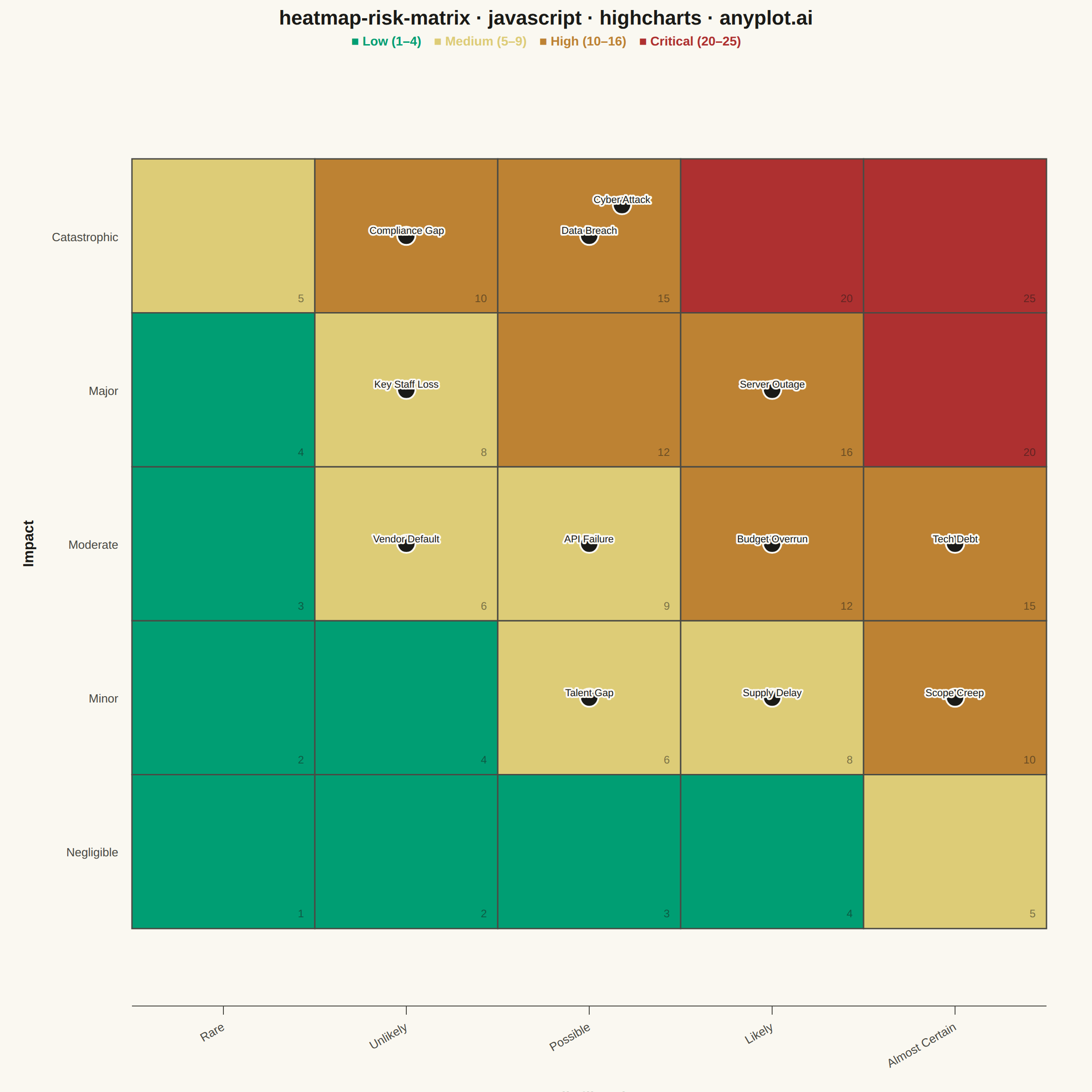
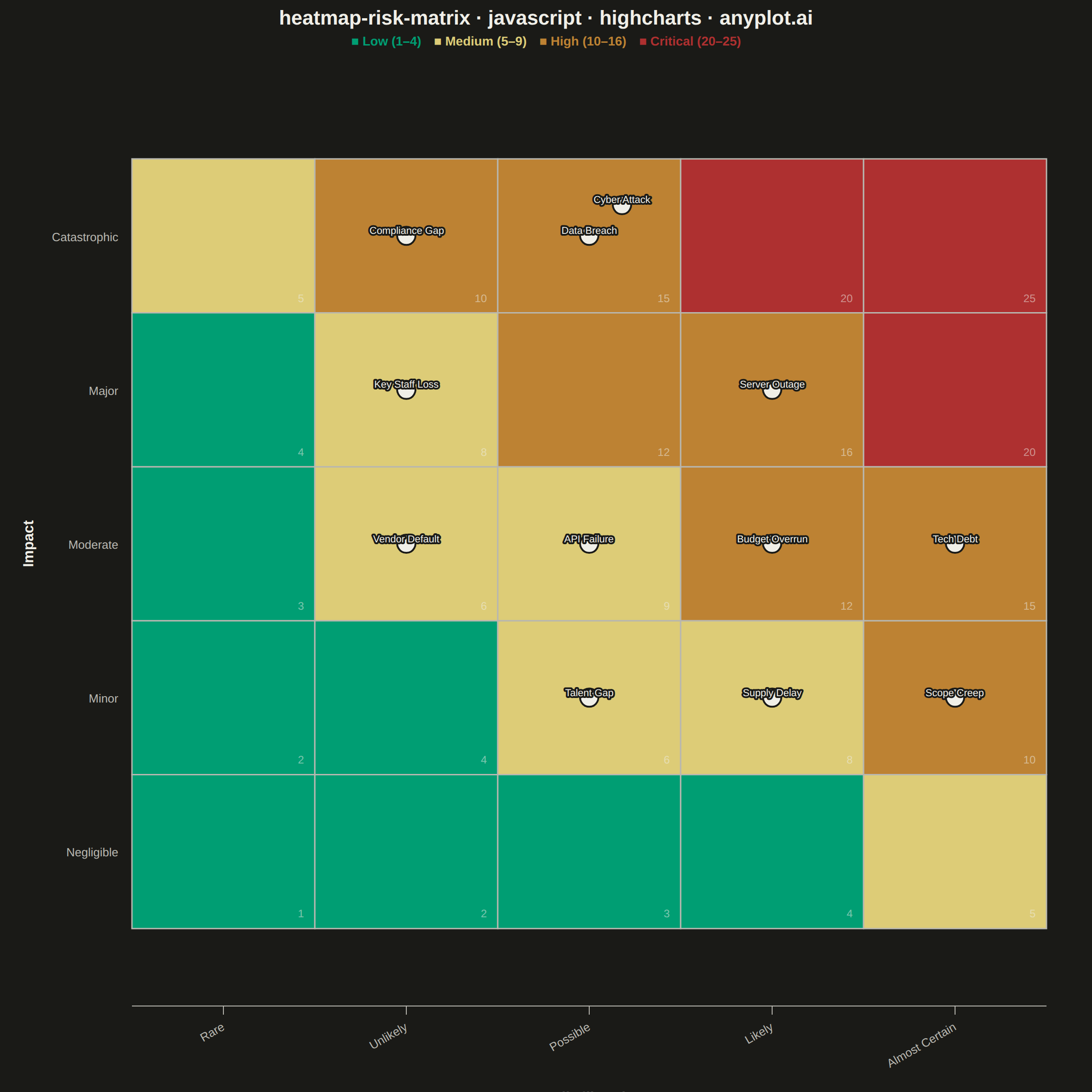
A 5x5 grid heatmap plotting risk likelihood against consequence severity, used to visualize and prioritize risks in project and enterprise risk management. Cells are color-coded from green (low risk) through yellow and orange to red (critical risk), with individual risk items plotted as labeled markers. The risk score for each cell is the product of likelihood and impact, and zones are labeled to indicate risk severity levels (Low, Medium, High, Critical).
// anyplot.ai
// heatmap-risk-matrix: Risk Assessment Matrix (Probability vs Impact)
// Library: highcharts 12.6.0 | JavaScript 22.22.3
// Quality: 84/100 | Created: 2026-06-20
//# anyplot-orientation: square
const t = window.ANYPLOT_TOKENS;
// Risk zone colors — Imprint semantic palette (green=safe, amber=caution, ochre=warning, red=critical)
function riskColor(score) {
if (score <= 4) return "#009E73"; // Low — Imprint brand green
if (score <= 9) return "#DDCC77"; // Medium — Imprint amber (warning anchor)
if (score <= 16) return "#BD8233"; // High — Imprint ochre
return "#AE3030"; // Critical — Imprint matte red
}
// IT security risk register — 12 risks spanning all four risk zones
const risks = [
{ name: "Data Breach", likelihood: 3, impact: 5 },
{ name: "Cyber Attack", likelihood: 3, impact: 5 },
{ name: "Server Outage", likelihood: 4, impact: 4 },
{ name: "Compliance Gap", likelihood: 2, impact: 5 },
{ name: "Key Staff Loss", likelihood: 2, impact: 4 },
{ name: "Budget Overrun", likelihood: 4, impact: 3 },
{ name: "Tech Debt", likelihood: 5, impact: 3 },
{ name: "Vendor Default", likelihood: 2, impact: 3 },
{ name: "API Failure", likelihood: 3, impact: 3 },
{ name: "Scope Creep", likelihood: 5, impact: 2 },
{ name: "Supply Delay", likelihood: 4, impact: 2 },
{ name: "Talent Gap", likelihood: 3, impact: 2 },
];
// Deterministic jitter so overlapping risks in the same cell don't stack
const JX = [0, 0.18, -0.18, 0.09, -0.09];
const JY = [0, 0.20, -0.20, 0.18, -0.18];
const cellIdx = {};
const scatterData = risks.map(function (r) {
var key = r.likelihood + "," + r.impact;
var i = cellIdx[key] = (cellIdx[key] !== undefined ? cellIdx[key] : 0);
cellIdx[key]++;
return { x: r.likelihood + (JX[i] || 0), y: r.impact + (JY[i] || 0), name: r.name };
});
// Draw colored background cells and score labels via SVG renderer
function drawCells(chart) {
if (chart._riskGroup) chart._riskGroup.destroy();
var group = chart.renderer.g("risk-cells").attr({ zIndex: 1 }).add();
chart._riskGroup = group;
var xa = chart.xAxis[0];
var ya = chart.yAxis[0];
for (var lk = 1; lk <= 5; lk++) {
for (var im = 1; im <= 5; im++) {
var score = lk * im;
var px1 = xa.toPixels(lk - 0.5);
var px2 = xa.toPixels(lk + 0.5);
var py1 = ya.toPixels(im - 0.5);
var py2 = ya.toPixels(im + 0.5);
var rx = Math.min(px1, px2);
var ry = Math.min(py1, py2);
var rw = Math.abs(px2 - px1);
var rh = Math.abs(py2 - py1);
chart.renderer.rect(rx, ry, rw, rh)
.attr({
fill: riskColor(score),
stroke: t.inkSoft,
"stroke-width": 1.5,
zIndex: 1,
})
.add(group);
// Score label in bottom-right corner of cell
chart.renderer.text(String(score), rx + rw - 12, ry + rh - 12)
.attr({ align: "right", zIndex: 2 })
.css({ color: t.ink, fontSize: "12px", opacity: "0.5" })
.add(group);
}
}
}
var TITLE = "heatmap-risk-matrix · javascript · highcharts · anyplot.ai";
Highcharts.chart("container", {
chart: {
type: "scatter",
backgroundColor: "transparent",
animation: false,
style: { fontFamily: "inherit" },
marginTop: 90,
marginBottom: 95,
marginLeft: 145,
marginRight: 50,
events: {
render: function () { drawCells(this); },
},
},
credits: { enabled: false },
colors: t.palette,
title: {
text: TITLE,
style: { color: t.ink, fontSize: "22px", fontWeight: "600" },
},
subtitle: {
useHTML: true,
text:
"<span style=\"color:#009E73;font-weight:600\">■ Low (1–4)</span>" +
"  " +
"<span style=\"color:#DDCC77;font-weight:600\">■ Medium (5–9)</span>" +
"  " +
"<span style=\"color:#BD8233;font-weight:600\">■ High (10–16)</span>" +
"  " +
"<span style=\"color:#AE3030;font-weight:600\">■ Critical (20–25)</span>",
style: { fontSize: "14px" },
},
xAxis: {
min: 0.5,
max: 5.5,
tickInterval: 1,
lineColor: t.inkSoft,
tickColor: t.inkSoft,
gridLineWidth: 0,
labels: {
rotation: -30,
style: { color: t.inkSoft, fontSize: "13px" },
formatter: function () {
var map = { 1: "Rare", 2: "Unlikely", 3: "Possible", 4: "Likely", 5: "Almost Certain" };
return map[this.value] || "";
},
},
title: {
text: "Likelihood",
style: { color: t.ink, fontSize: "16px", fontWeight: "600" },
margin: 20,
},
},
yAxis: {
min: 0.5,
max: 5.5,
tickInterval: 1,
lineColor: t.inkSoft,
tickColor: t.inkSoft,
gridLineWidth: 0,
labels: {
style: { color: t.inkSoft, fontSize: "13px" },
formatter: function () {
var map = { 1: "Negligible", 2: "Minor", 3: "Moderate", 4: "Major", 5: "Catastrophic" };
return map[this.value] || "";
},
},
title: {
text: "Impact",
style: { color: t.ink, fontSize: "16px", fontWeight: "600" },
margin: 20,
},
},
legend: { enabled: false },
tooltip: {
formatter: function () {
var lk = Math.round(this.x);
var im = Math.round(this.y);
return "<b>" + this.point.name + "</b><br/>Score: " + (lk * im);
},
backgroundColor: t.elevatedBg,
borderColor: t.grid,
style: { color: t.ink, fontSize: "13px" },
},
plotOptions: {
series: { animation: false },
scatter: {
zIndex: 5,
marker: {
symbol: "circle",
radius: 10,
fillColor: t.ink,
lineColor: t.pageBg,
lineWidth: 2,
},
dataLabels: {
enabled: true,
allowOverlap: true,
formatter: function () { return this.point.name; },
style: {
color: t.ink,
fontSize: "11px",
fontWeight: "500",
textOutline: "2px " + t.pageBg,
},
verticalAlign: "top",
y: -18,
align: "center",
},
},
},
series: [{
name: "Risks",
data: scatterData,
zIndex: 5,
}],
});
Runnable source as JSON, for any HTTP client: https://api.anyplot.ai/specs/heatmap-risk-matrix/highcharts/code. Any spec id and library id listed in llms-full.txt fit the same URL shape; every URL below is complete and callable.
{
  "spec_id": "heatmap-risk-matrix",
  "language": "javascript",
  "library": "highcharts",
  "page": "https://anyplot.ai/heatmap-risk-matrix/javascript/highcharts",
  "hub": "https://anyplot.ai/heatmap-risk-matrix",
  "code_json": "https://api.anyplot.ai/specs/heatmap-risk-matrix/highcharts/code",
  "spec_json": "https://api.anyplot.ai/specs/heatmap-risk-matrix",
  "render_light_png": "https://storage.googleapis.com/anyplot-images/plots/heatmap-risk-matrix/javascript/highcharts/plot-light.png",
  "render_dark_png": "https://storage.googleapis.com/anyplot-images/plots/heatmap-risk-matrix/javascript/highcharts/plot-dark.png",
  "interactive_light_html": "https://storage.googleapis.com/anyplot-images/plots/heatmap-risk-matrix/javascript/highcharts/plot-light.html",
  "interactive_dark_html": "https://storage.googleapis.com/anyplot-images/plots/heatmap-risk-matrix/javascript/highcharts/plot-dark.html",
  "quality_score": 84.0,
  "license": "MIT",
  "guide": "https://anyplot.ai/llms.txt"
}
Part of Risk Assessment Matrix (Probability vs Impact) on anyplot.ai.