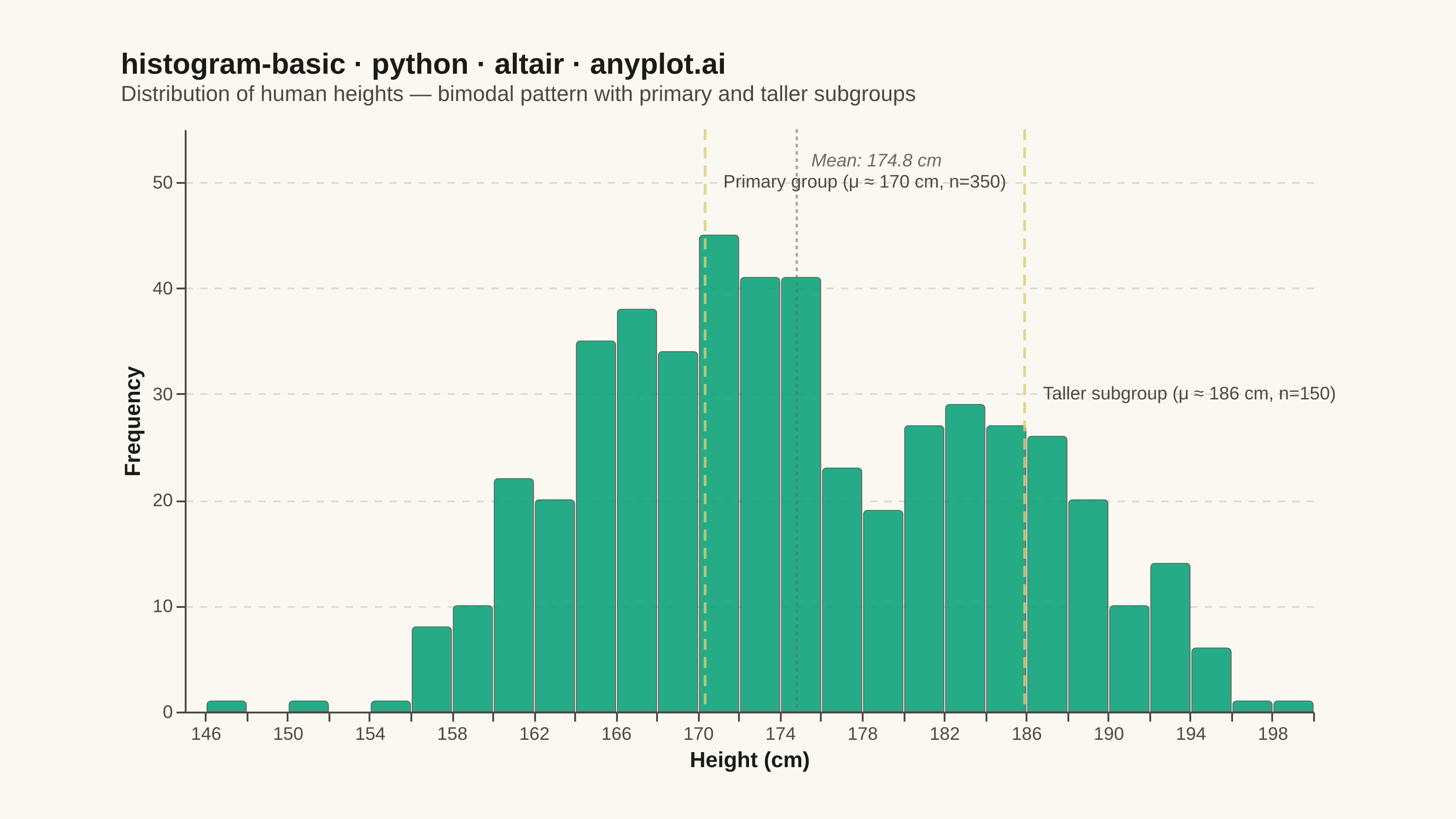
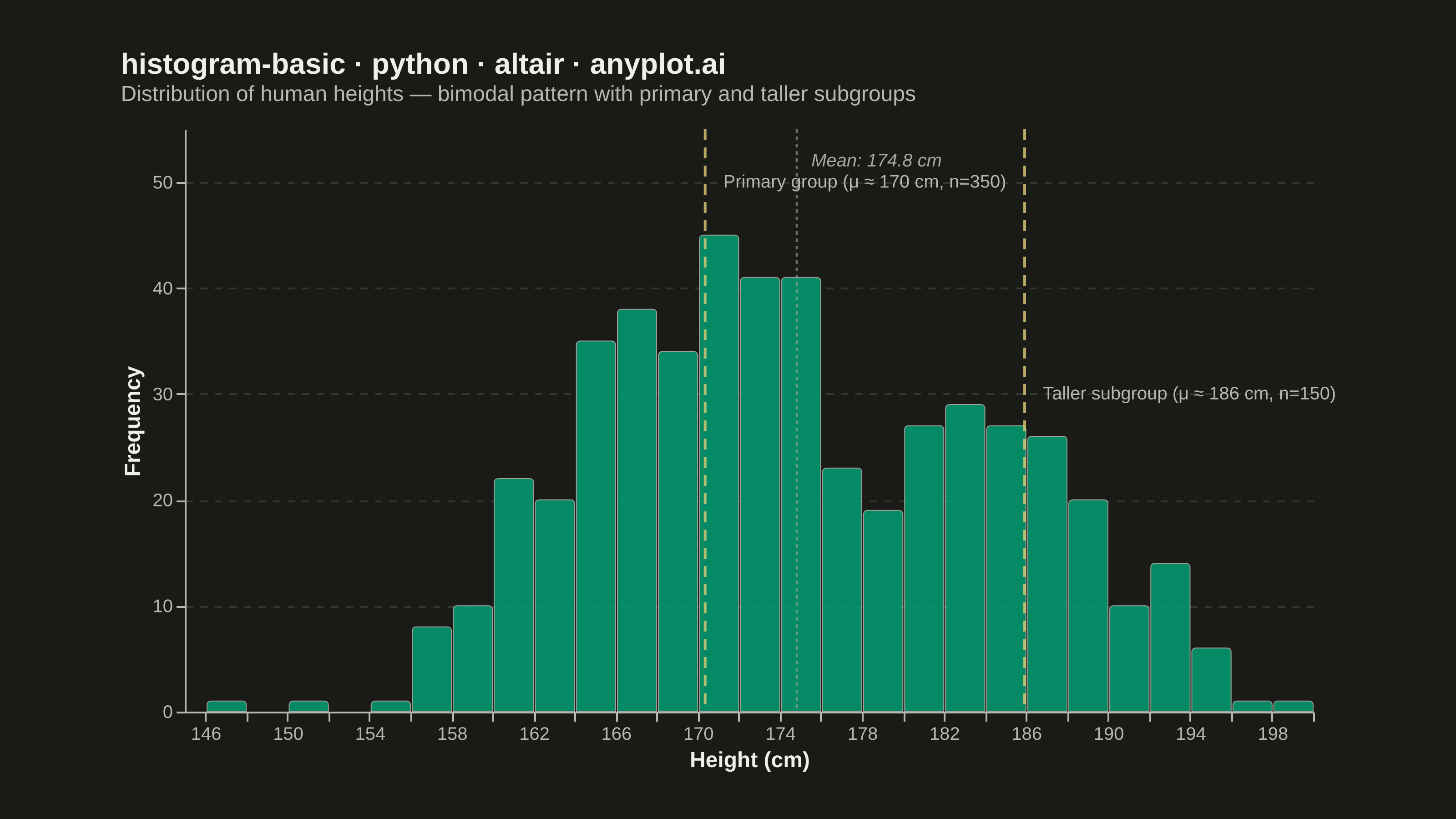
A histogram displays the distribution of a single continuous variable by dividing the data range into bins and showing the frequency (count) of observations in each bin. It reveals the shape of the data distribution, including central tendency, spread, and presence of outliers or multiple modes.
""" anyplot.ai
histogram-basic: Basic Histogram
Library: altair 6.1.0 | Python 3.13.13
Quality: 88/100 | Updated: 2026-05-28
"""

import os

import altair as alt
import numpy as np
import pandas as pd
from PIL import Image


# Theme
THEME = os.getenv("ANYPLOT_THEME", "light")
PAGE_BG = "#FAF8F1" if THEME == "light" else "#1A1A17"
ELEVATED_BG = "#FFFDF6" if THEME == "light" else "#242420"
INK = "#1A1A17" if THEME == "light" else "#F0EFE8"
INK_SOFT = "#4A4A44" if THEME == "light" else "#B8B7B0"
INK_MUTED = "#6B6A63" if THEME == "light" else "#A8A79F"
BRAND = "#009E73"

# Data
np.random.seed(42)
primary = np.random.normal(loc=170, scale=7, size=350)
taller = np.random.normal(loc=186, scale=4.5, size=150)
values = np.concatenate([primary, taller])

df = pd.DataFrame({"height": values})

primary_peak = np.median(primary)
taller_peak = np.median(taller)
mean_val = df["height"].mean()

# Histogram bars
bars = (
    alt.Chart(df)
    .mark_bar(
        color=BRAND, stroke=INK_SOFT, strokeWidth=0.5, cornerRadiusTopLeft=2, cornerRadiusTopRight=2, opacity=0.85
    )
    .encode(
        alt.X("height:Q", bin=alt.Bin(maxbins=30), title="Height (cm)"),
        alt.Y("count()", title="Frequency"),
        tooltip=[
            alt.Tooltip("height:Q", bin=alt.Bin(maxbins=30), title="Height Range"),
            alt.Tooltip("count()", title="Count"),
        ],
    )
)

# Annotation data for the two peaks
peaks_df = pd.DataFrame(
    {
        "x": [primary_peak, taller_peak],
        "label": [
            f"Primary group (μ ≈ {primary_peak:.0f} cm, n=350)",
            f"Taller subgroup (μ ≈ {taller_peak:.0f} cm, n=150)",
        ],
        "y_offset": [50, 30],
    }
)

# Vertical rule lines at peak locations
rules = (
    alt.Chart(peaks_df)
    .mark_rule(strokeDash=[6, 4], strokeWidth=1.5, opacity=0.8)
    .encode(x="x:Q", color=alt.value("#DDCC77"))
)

# Peak labels — primary on left side, taller on right side
primary_label = (
    alt.Chart(peaks_df.iloc[[0]])
    .mark_text(align="left", dx=10, fontSize=10, fontWeight="normal")
    .encode(x="x:Q", y="y_offset:Q", text="label:N", color=alt.value(INK_SOFT))
)

taller_label = (
    alt.Chart(peaks_df.iloc[[1]])
    .mark_text(align="left", dx=10, fontSize=10, fontWeight="normal")
    .encode(x="x:Q", y="y_offset:Q", text="label:N", color=alt.value(INK_SOFT))
)

# Mean line
mean_df = pd.DataFrame({"x": [mean_val], "label": [f"Mean: {mean_val:.1f} cm"]})

mean_rule = (
    alt.Chart(mean_df)
    .mark_rule(strokeDash=[2, 2], strokeWidth=1.2, opacity=0.6)
    .encode(x="x:Q", color=alt.value(INK_MUTED))
)

mean_label = (
    alt.Chart(mean_df)
    .mark_text(align="left", dx=8, fontSize=10, fontStyle="italic")
    .encode(x="x:Q", y=alt.datum(52), text="label:N", color=alt.value(INK_MUTED))
)

# Layer all elements
chart = (
    (bars + rules + primary_label + taller_label + mean_rule + mean_label)
    .properties(
        width=620,
        height=320,
        background=PAGE_BG,
        title=alt.Title(
            "histogram-basic · python · altair · anyplot.ai",
            fontSize=16,
            subtitle="Distribution of human heights — bimodal pattern with primary and taller subgroups",
            subtitleFontSize=12,
            subtitleColor=INK_SOFT,
            anchor="start",
            offset=12,
            color=INK,
        ),
    )
    .configure_view(fill=PAGE_BG, strokeWidth=0)
    .configure_axis(
        labelFontSize=10,
        titleFontSize=12,
        titleColor=INK,
        labelColor=INK_SOFT,
        domainColor=INK_SOFT,
        tickColor=INK_SOFT,
        grid=False,
    )
    .configure_axisY(grid=True, gridColor=INK, gridOpacity=0.12, gridDash=[4, 4], tickCount=6)
)

# Save PNG
chart.save(f"plot-{THEME}.png", scale_factor=4.0)

# Pad to exact canvas target 3200 × 1800
TW, TH = 3200, 1800
_img = Image.open(f"plot-{THEME}.png").convert("RGB")
_w, _h = _img.size
if _w > TW or _h > TH:
    raise SystemExit(
        f"altair vl-convert produced {_w}×{_h}, exceeds target {TW}×{TH}. "
        f"Shrink chart .properties(width=, height=) values and re-render."
    )
if _w < TW or _h < TH:
    _canvas = Image.new("RGB", (TW, TH), PAGE_BG)
    _canvas.paste(_img, ((TW - _w) // 2, (TH - _h) // 2))
    _canvas.save(f"plot-{THEME}.png")

# Save HTML
chart.save(f"plot-{THEME}.html")
Runnable source as JSON, for any HTTP client: https://api.anyplot.ai/specs/histogram-basic/altair/code. Any spec id and library id listed in llms-full.txt fit the same URL shape; every URL below is complete and callable.
{
  "spec_id": "histogram-basic",
  "language": "python",
  "library": "altair",
  "page": "https://anyplot.ai/histogram-basic/python/altair",
  "hub": "https://anyplot.ai/histogram-basic",
  "code_json": "https://api.anyplot.ai/specs/histogram-basic/altair/code",
  "spec_json": "https://api.anyplot.ai/specs/histogram-basic",
  "render_light_png": "https://storage.googleapis.com/anyplot-images/plots/histogram-basic/python/altair/plot-light.png",
  "render_dark_png": "https://storage.googleapis.com/anyplot-images/plots/histogram-basic/python/altair/plot-dark.png",
  "interactive_light_html": "https://storage.googleapis.com/anyplot-images/plots/histogram-basic/python/altair/plot-light.html",
  "interactive_dark_html": "https://storage.googleapis.com/anyplot-images/plots/histogram-basic/python/altair/plot-dark.html",
  "quality_score": 88.0,
  "license": "MIT",
  "guide": "https://anyplot.ai/llms.txt"
}
Part of Basic Histogram on anyplot.ai.