The same plot in 14 other libraries — Python: Altair, Bokeh, lets-plot, Matplotlib, Plotly, plotnine, Pygal, Seaborn; Julia: Makie.jl; JavaScript: Chart.js, D3.js, Apache ECharts, Highcharts, MUI X Charts. Compare all 15 side by side: Basic Histogram in Python, R, Julia and JavaScript.
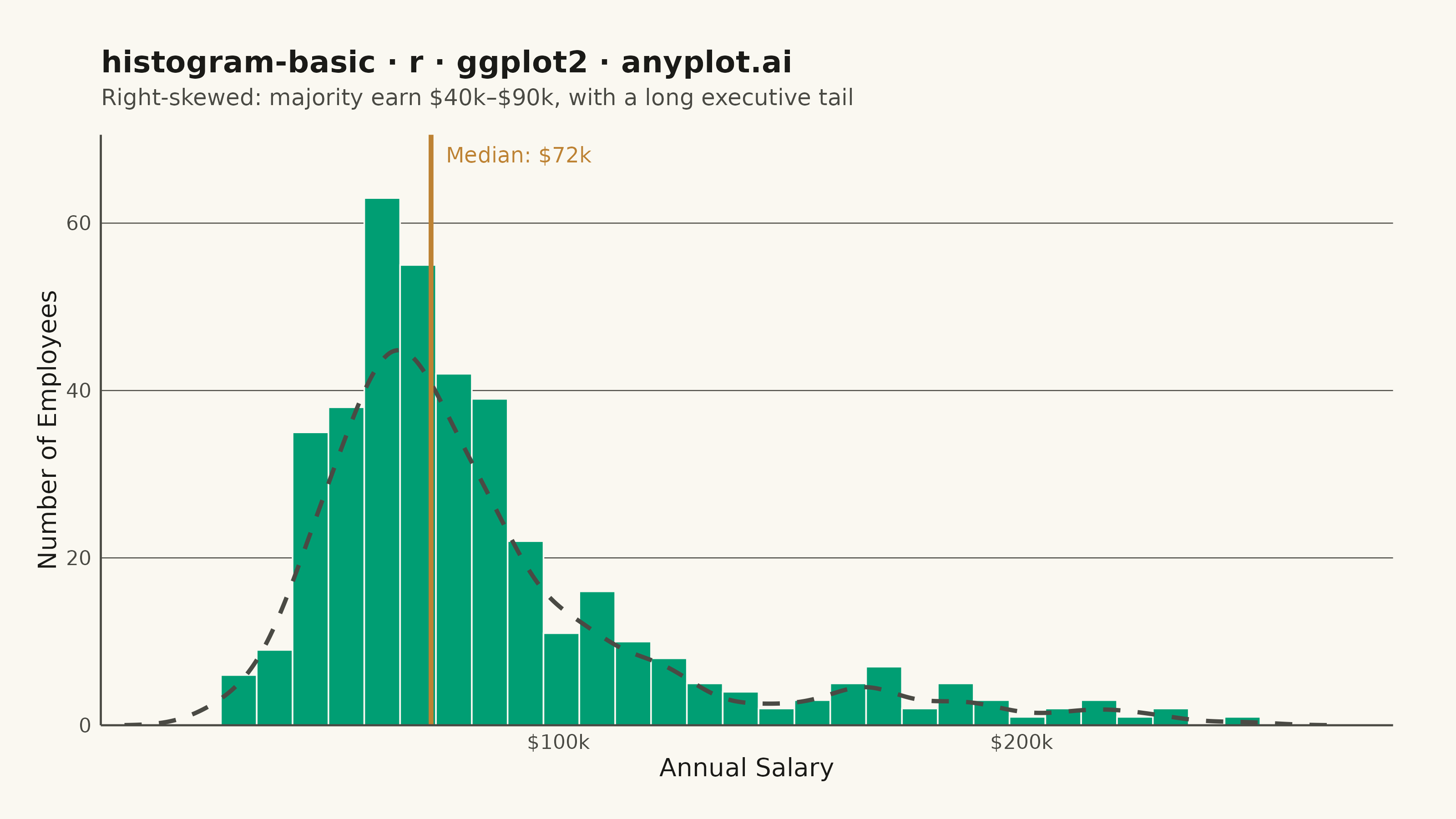
A histogram displays the distribution of a single continuous variable by dividing the data range into bins and showing the frequency (count) of observations in each bin. It reveals the shape of the data distribution, including central tendency, spread, and presence of outliers or multiple modes.
#' anyplot.ai
#' histogram-basic: Basic Histogram
#' Library: ggplot2 3.5.1 | R 4.4.1
#' Quality: 88/100 | Created: 2026-05-28

library(ggplot2)
library(scales)
library(ragg)

set.seed(42)

# Theme tokens
THEME       <- Sys.getenv("ANYPLOT_THEME", "light")
PAGE_BG     <- if (THEME == "light") "#FAF8F1" else "#1A1A17"
INK         <- if (THEME == "light") "#1A1A17" else "#F0EFE8"
INK_SOFT    <- if (THEME == "light") "#4A4A44" else "#B8B7B0"
IMPRINT_PALETTE <- c("#009E73", "#C475FD", "#4467A3", "#BD8233",
                     "#AE3030", "#2ABCCD", "#954477", "#99B314")

# Data: Employee annual salaries — right-skewed distribution
n <- 400
salaries <- c(
  rnorm(round(n * 0.70), mean = 65000,  sd = 15000),
  rnorm(round(n * 0.20), mean = 105000, sd = 20000),
  rnorm(round(n * 0.10), mean = 175000, sd = 30000)
)
salaries <- pmax(salaries, 28000)
df <- data.frame(salary = salaries)
med_salary <- median(df$salary)

# Density line scaled to histogram count — ggplot2 idiomatic custom data layer
# binwidth × n × density = expected count per bin
n_bins   <- 35
bin_w    <- diff(range(df$salary)) / n_bins
dens_obj <- density(df$salary)
dens_df  <- data.frame(
  x = dens_obj$x,
  y = dens_obj$y * nrow(df) * bin_w
)

# Plot
p <- ggplot(df, aes(x = salary)) +
  geom_histogram(
    bins      = n_bins,
    fill      = IMPRINT_PALETTE[1],
    color     = PAGE_BG,
    linewidth = 0.3
  ) +
  # Smooth density envelope scaled to count — distinctive ggplot2 multi-layer idiom
  geom_line(
    data      = dens_df,
    aes(x = x, y = y),
    color     = INK_SOFT,
    linewidth = 0.8,
    linetype  = "dashed"
  ) +
  # Median reference line as visual focal point
  geom_vline(
    xintercept = med_salary,
    color      = IMPRINT_PALETTE[4],
    linewidth  = 0.9
  ) +
  annotate(
    "text",
    x     = med_salary,
    y     = Inf,
    label = sprintf("Median: $%.0fk", med_salary / 1000),
    color = IMPRINT_PALETTE[4],
    hjust = -0.1,
    vjust = 1.8,
    size  = 3
  ) +
  scale_x_continuous(
    labels = label_dollar(scale = 1e-3, suffix = "k"),
    expand = expansion(mult = c(0.01, 0.02))
  ) +
  scale_y_continuous(expand = expansion(mult = c(0, 0.12))) +
  labs(
    title    = "histogram-basic · r · ggplot2 · anyplot.ai",
    subtitle = "Right-skewed: majority earn $40k–$90k, with a long executive tail",
    x        = "Annual Salary",
    y        = "Number of Employees"
  ) +
  theme_minimal(base_size = 8) +
  theme(
    plot.background    = element_rect(fill = PAGE_BG, color = PAGE_BG),
    panel.background   = element_rect(fill = PAGE_BG, color = NA),
    panel.grid.major.x = element_blank(),
    panel.grid.major.y = element_line(color = INK_SOFT, linewidth = 0.2),
    panel.grid.minor   = element_blank(),
    axis.title         = element_text(color = INK,      size = 10),
    axis.text          = element_text(color = INK_SOFT, size = 8),
    axis.line          = element_line(color = INK_SOFT, linewidth = 0.4),
    axis.ticks         = element_blank(),
    plot.title         = element_text(color = INK,      size = 12, face = "bold",
                                      margin = margin(b = 4)),
    plot.subtitle      = element_text(color = INK_SOFT, size = 9,
                                      margin = margin(b = 10)),
    plot.margin        = margin(20, 25, 15, 15)
  )

# Save
ggsave(
  filename = sprintf("plot-%s.png", THEME),
  plot     = p,
  device   = ragg::agg_png,
  width    = 8,
  height   = 4.5,
  units    = "in",
  dpi      = 400
)
Runnable source as JSON, for any HTTP client: https://api.anyplot.ai/specs/histogram-basic/ggplot2/code. Any spec id and library id listed in llms-full.txt fit the same URL shape; every URL below is complete and callable.
{
  "spec_id": "histogram-basic",
  "language": "r",
  "library": "ggplot2",
  "page": "https://anyplot.ai/histogram-basic/r/ggplot2",
  "hub": "https://anyplot.ai/histogram-basic",
  "code_json": "https://api.anyplot.ai/specs/histogram-basic/ggplot2/code",
  "spec_json": "https://api.anyplot.ai/specs/histogram-basic",
  "render_light_png": "https://storage.googleapis.com/anyplot-images/plots/histogram-basic/r/ggplot2/plot-light.png",
  "render_dark_png": "https://storage.googleapis.com/anyplot-images/plots/histogram-basic/r/ggplot2/plot-dark.png",
  "quality_score": 88.0,
  "license": "MIT",
  "guide": "https://anyplot.ai/llms.txt"
}
Part of Basic Histogram on anyplot.ai.