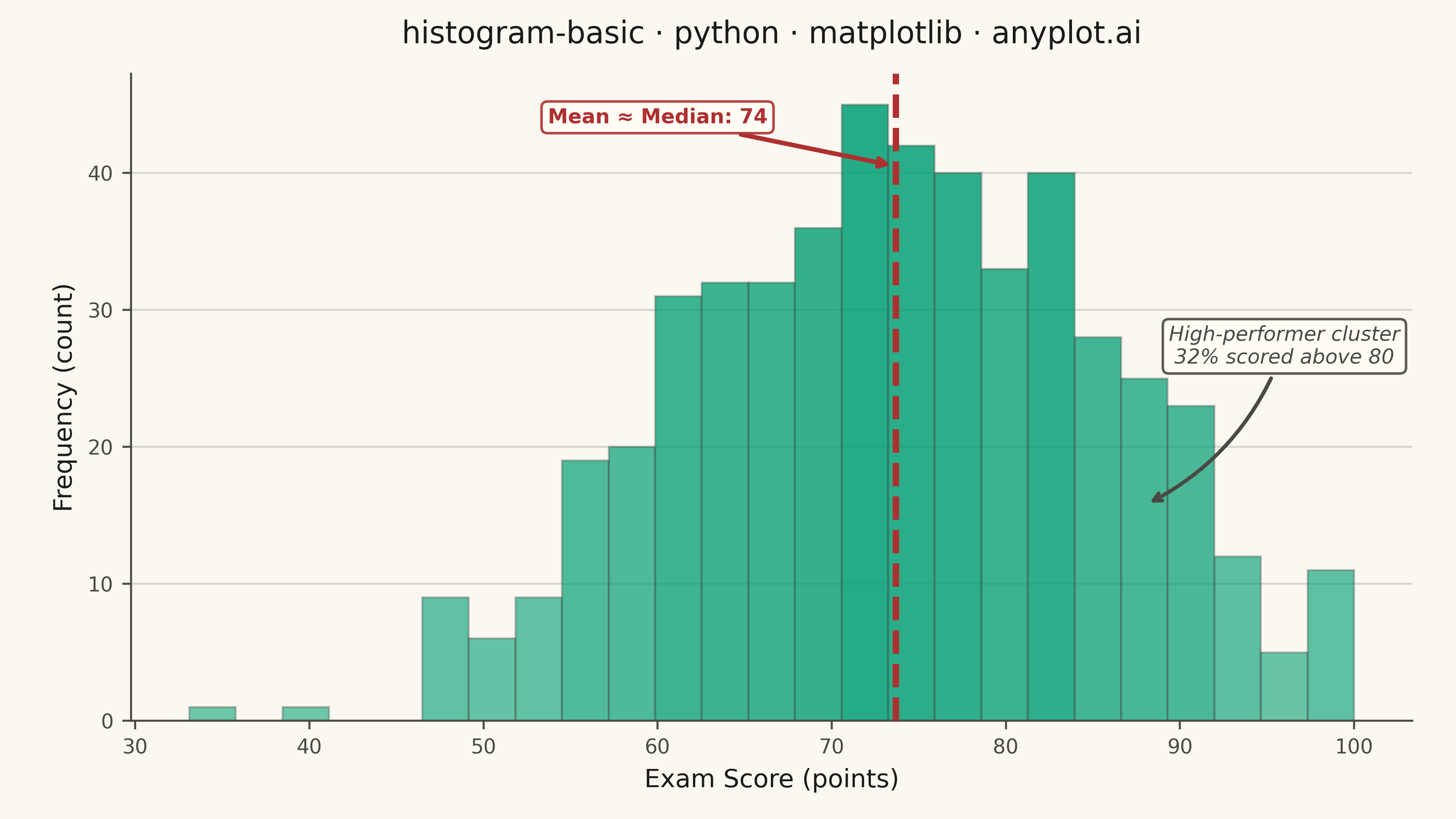
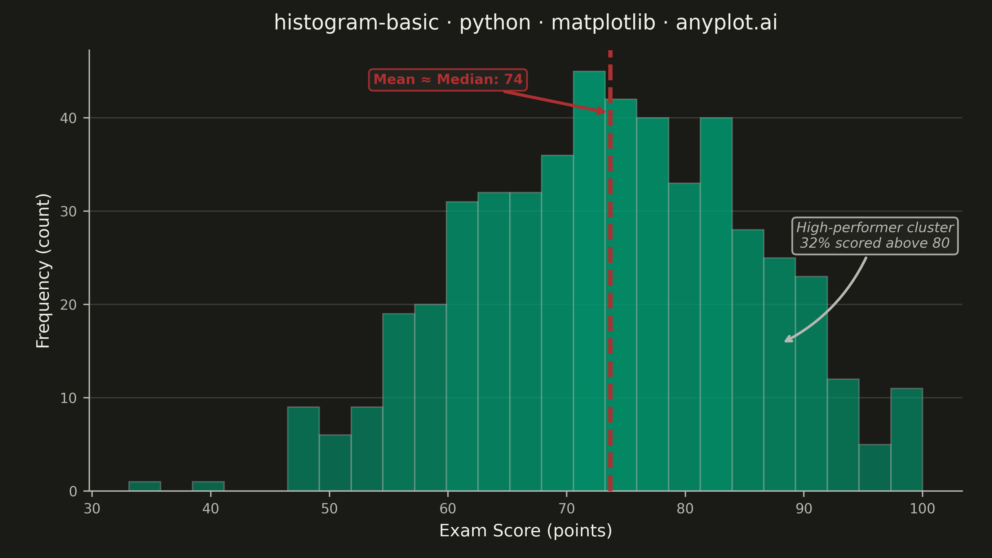
A histogram displays the distribution of a single continuous variable by dividing the data range into bins and showing the frequency (count) of observations in each bin. It reveals the shape of the data distribution, including central tendency, spread, and presence of outliers or multiple modes.
""" anyplot.ai
histogram-basic: Basic Histogram
Library: matplotlib 3.10.9 | Python 3.13.13
Quality: 93/100 | Updated: 2026-05-28
"""

import os

import matplotlib.pyplot as plt
import numpy as np
from matplotlib.colors import to_rgba


# Theme tokens
THEME = os.getenv("ANYPLOT_THEME", "light")
PAGE_BG = "#FAF8F1" if THEME == "light" else "#1A1A17"
ELEVATED_BG = "#FFFDF6" if THEME == "light" else "#242420"
INK = "#1A1A17" if THEME == "light" else "#F0EFE8"
INK_SOFT = "#4A4A44" if THEME == "light" else "#B8B7B0"
BRAND = "#009E73"  # Imprint palette position 1 — ALWAYS first series
MEAN_COLOR = "#AE3030"  # matte red — semantic anchor for reference/alert

# Data - exam scores with slight left skew and high-performer cluster
np.random.seed(42)
base = np.random.normal(loc=72, scale=12, size=450)
high_cluster = np.random.normal(loc=88, scale=4, size=50)
scores = np.clip(np.concatenate([base, high_cluster]), 0, 100)

# Title
title = "histogram-basic · python · matplotlib · anyplot.ai"
title_fontsize = max(8, round(12 * 67 / len(title))) if len(title) > 67 else 12

# Plot
fig, ax = plt.subplots(figsize=(8, 4.5), dpi=400, facecolor=PAGE_BG)
ax.set_facecolor(PAGE_BG)

n, bins, patches = ax.hist(scores, bins=25, color=BRAND, linewidth=0.8)

# Intensity-graded bar coloring via patch manipulation (matplotlib-distinctive)
max_count = max(n)
base_rgba = to_rgba(BRAND)
for count, patch in zip(n, patches, strict=True):
    intensity = 0.65 + 0.35 * (count / max_count)
    patch.set_facecolor((*base_rgba[:3], intensity * 0.85))
    patch.set_edgecolor(to_rgba(INK_SOFT, alpha=0.35))

# Key statistics
mean_score = np.mean(scores)
y_max = max(n)
pct_above_80 = 100 * np.sum(scores >= 80) / len(scores)

# Combined mean/median line — values nearly equal, indicating symmetric distribution
ax.axvline(mean_score, color=MEAN_COLOR, linewidth=2.5, linestyle="--", zorder=5)
ax.annotate(
    f"Mean ≈ Median: {mean_score:.0f}",
    xy=(mean_score, y_max * 0.90),
    xytext=(mean_score - 20, y_max * 0.97),
    fontsize=8,
    fontweight="bold",
    color=MEAN_COLOR,
    arrowprops={"arrowstyle": "->", "color": MEAN_COLOR, "lw": 1.8},
    bbox={"boxstyle": "round,pad=0.3", "facecolor": ELEVATED_BG, "edgecolor": MEAN_COLOR, "alpha": 0.9},
    zorder=6,
)

# High-performer cluster annotation with percentage insight
ax.annotate(
    f"High-performer cluster\n{pct_above_80:.0f}% scored above 80",
    xy=(88, y_max * 0.35),
    xytext=(96, y_max * 0.58),
    fontsize=8,
    fontstyle="italic",
    color=INK_SOFT,
    ha="center",
    arrowprops={"arrowstyle": "->", "color": INK_SOFT, "lw": 1.5, "connectionstyle": "arc3,rad=-0.2"},
    bbox={"boxstyle": "round,pad=0.3", "facecolor": ELEVATED_BG, "edgecolor": INK_SOFT, "alpha": 0.9},
    zorder=6,
)

# Labels and styling
ax.set_xlabel("Exam Score (points)", fontsize=10, color=INK)
ax.set_ylabel("Frequency (count)", fontsize=10, color=INK)
ax.set_title(title, fontsize=title_fontsize, fontweight="medium", color=INK, pad=12)
ax.tick_params(axis="both", labelsize=8, colors=INK_SOFT)

# Spine removal
ax.spines["top"].set_visible(False)
ax.spines["right"].set_visible(False)
for s in ("left", "bottom"):
    ax.spines[s].set_color(INK_SOFT)

# Subtle y-axis grid
ax.yaxis.grid(True, alpha=0.15, linewidth=0.8, color=INK)
ax.set_axisbelow(True)

# Y-axis starts at zero
ax.set_ylim(bottom=0)

fig.subplots_adjust(left=0.09, right=0.97, top=0.91, bottom=0.12)
plt.savefig(f"plot-{THEME}.png", dpi=400, facecolor=PAGE_BG)
Runnable source as JSON, for any HTTP client: https://api.anyplot.ai/specs/histogram-basic/matplotlib/code. Any spec id and library id listed in llms-full.txt fit the same URL shape; every URL below is complete and callable.
{
  "spec_id": "histogram-basic",
  "language": "python",
  "library": "matplotlib",
  "page": "https://anyplot.ai/histogram-basic/python/matplotlib",
  "hub": "https://anyplot.ai/histogram-basic",
  "code_json": "https://api.anyplot.ai/specs/histogram-basic/matplotlib/code",
  "spec_json": "https://api.anyplot.ai/specs/histogram-basic",
  "render_light_png": "https://storage.googleapis.com/anyplot-images/plots/histogram-basic/python/matplotlib/plot-light.png",
  "render_dark_png": "https://storage.googleapis.com/anyplot-images/plots/histogram-basic/python/matplotlib/plot-dark.png",
  "quality_score": 93.0,
  "license": "MIT",
  "guide": "https://anyplot.ai/llms.txt"
}
Part of Basic Histogram on anyplot.ai.