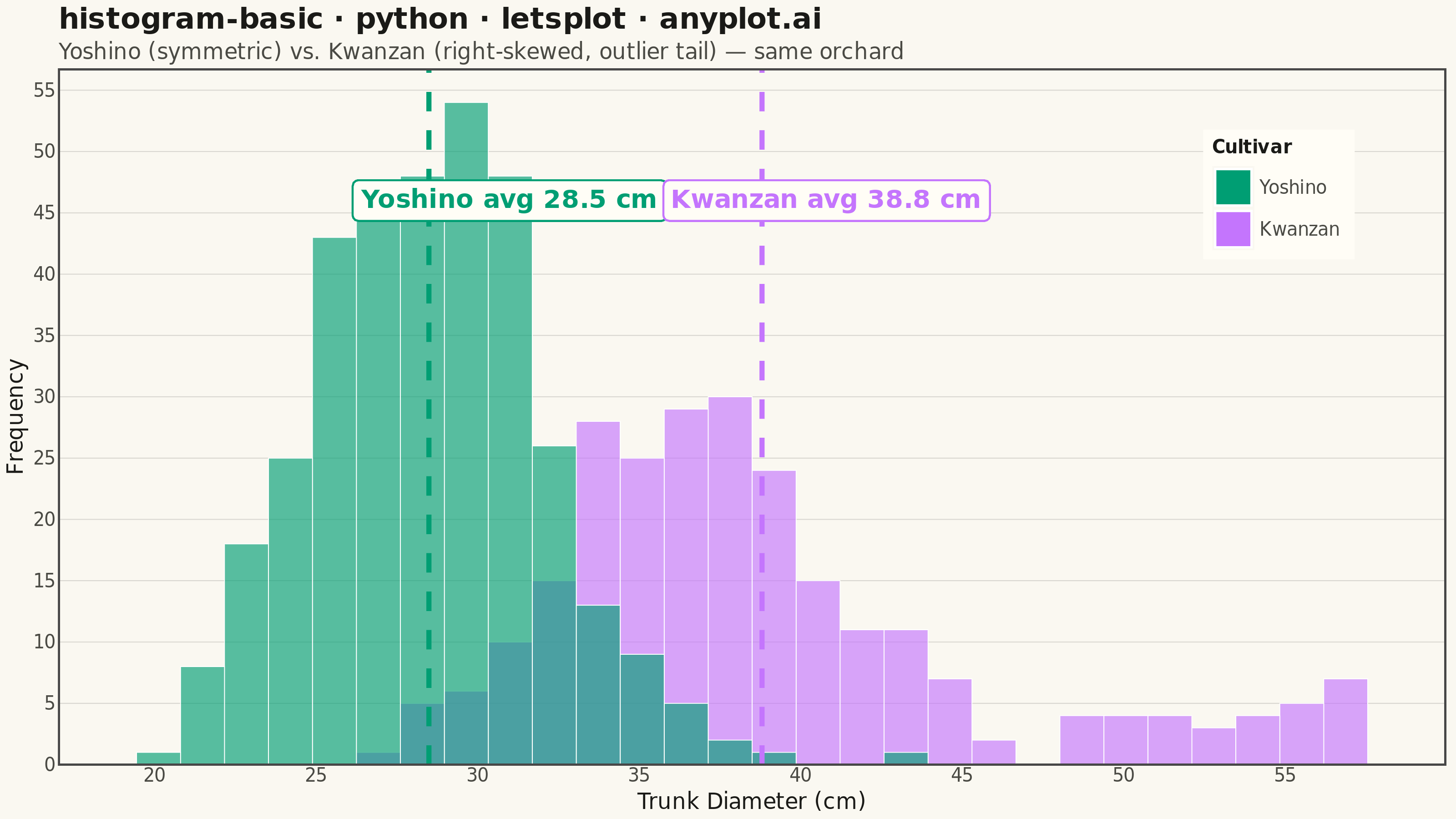
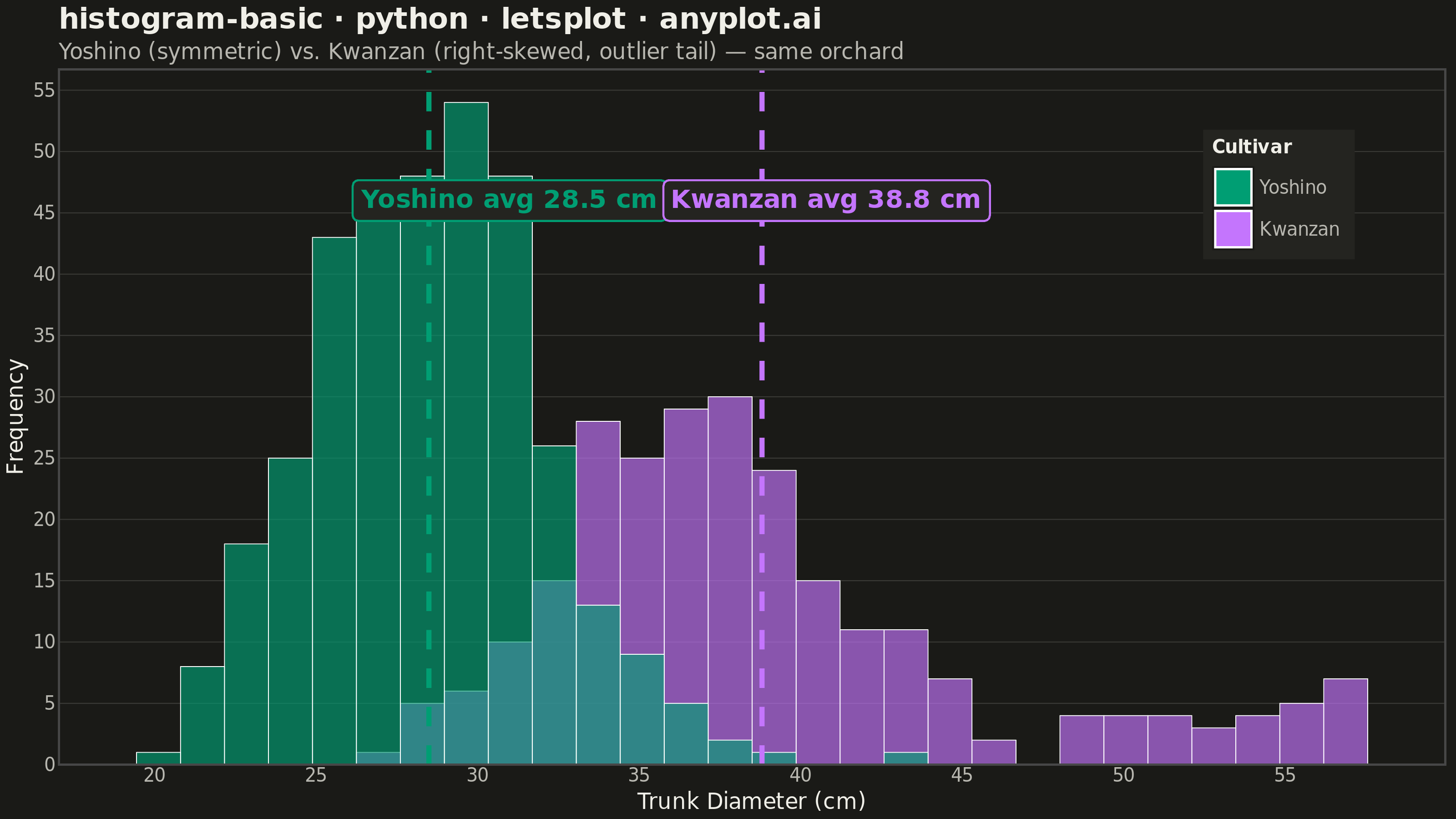
A histogram displays the distribution of a single continuous variable by dividing the data range into bins and showing the frequency (count) of observations in each bin. It reveals the shape of the data distribution, including central tendency, spread, and presence of outliers or multiple modes.
""" anyplot.ai
histogram-basic: Basic Histogram
Library: letsplot 4.10.1 | Python 3.13.13
Quality: 90/100 | Updated: 2026-05-28
"""

import os

import numpy as np
import pandas as pd
from lets_plot import (
    LetsPlot,
    aes,
    element_blank,
    element_line,
    element_rect,
    element_text,
    geom_histogram,
    geom_label,
    geom_vline,
    ggplot,
    ggsize,
    labs,
    layer_tooltips,
    scale_fill_manual,
    scale_x_continuous,
    scale_y_continuous,
    theme,
    theme_minimal,
)
from lets_plot.export import ggsave


LetsPlot.setup_html()

# Theme
THEME = os.getenv("ANYPLOT_THEME", "light")
PAGE_BG = "#FAF8F1" if THEME == "light" else "#1A1A17"
ELEVATED_BG = "#FFFDF6" if THEME == "light" else "#242420"
INK = "#1A1A17" if THEME == "light" else "#F0EFE8"
INK_SOFT = "#4A4A44" if THEME == "light" else "#B8B7B0"
GRID = "rgba(26,26,23,0.15)" if THEME == "light" else "rgba(240,239,232,0.15)"
LEGEND_BORDER = PAGE_BG if THEME == "light" else INK_SOFT

# Imprint palette positions 1 and 2
BRAND = "#009E73"
COLOR_B = "#C475FD"

# Data — two cherry cultivars: Yoshino (symmetric), Kwanzan (right-skewed, outlier tail)
np.random.seed(42)
cultivar_a = np.random.normal(28.5, 3.8, 350)  # Yoshino: symmetric distribution

cultivar_b_main = np.random.normal(37.0, 4.0, 220)  # Kwanzan: main cluster
cultivar_b_tail = np.random.uniform(48.0, 58.0, 30)  # outlier tail — large specimens
cultivar_b = np.concatenate([cultivar_b_main, cultivar_b_tail])

df = pd.DataFrame(
    {"diameter": np.concatenate([cultivar_a, cultivar_b]), "cultivar": ["Yoshino"] * 350 + ["Kwanzan"] * 250}
)

mean_a = float(np.mean(cultivar_a))
mean_b = float(np.mean(cultivar_b))

# Axis limits from percentiles — clips extremes gracefully
all_diameters = np.concatenate([cultivar_a, cultivar_b])
x_min = float(np.floor(np.percentile(all_diameters, 0.5)) - 1)
x_max = float(np.ceil(np.percentile(all_diameters, 99.5)) + 1)

# Annotation y at 93% of peak bar height — above histogram body, clear of bars
counts_a, _ = np.histogram(cultivar_a, bins=30, range=(x_min, x_max))
counts_b, _ = np.histogram(cultivar_b, bins=30, range=(x_min, x_max))
annot_y = round(max(counts_a.max(), counts_b.max()) * 0.93)

annotations_a = pd.DataFrame({"x": [mean_a + 2.5], "y": [annot_y], "label": [f"Yoshino avg {mean_a:.1f} cm"]})
annotations_b = pd.DataFrame({"x": [mean_b + 2.0], "y": [annot_y], "label": [f"Kwanzan avg {mean_b:.1f} cm"]})

# Plot
title = "histogram-basic · python · letsplot · anyplot.ai"

plot = (
    ggplot(df, aes(x="diameter", fill="cultivar"))
    + geom_histogram(
        bins=30,
        alpha=0.65,
        size=0.2,
        color="white",
        position="identity",
        tooltips=layer_tooltips()
        .format("..count..", "d")
        .format("^x", ".1f")
        .line("@|cultivar")
        .line("Count|@..count.."),
    )
    + scale_fill_manual(values={"Yoshino": BRAND, "Kwanzan": COLOR_B}, name="Cultivar")
    + geom_vline(xintercept=mean_a, color=BRAND, size=1.2, linetype="dashed")
    + geom_vline(xintercept=mean_b, color=COLOR_B, size=1.2, linetype="dashed")
    + geom_label(
        data=annotations_a,
        mapping=aes(x="x", y="y", label="label"),
        size=7,
        color=BRAND,
        fill=ELEVATED_BG,
        label_padding=0.3,
        fontface="bold",
        inherit_aes=False,
    )
    + geom_label(
        data=annotations_b,
        mapping=aes(x="x", y="y", label="label"),
        size=7,
        color=COLOR_B,
        fill=ELEVATED_BG,
        label_padding=0.3,
        fontface="bold",
        inherit_aes=False,
    )
    + scale_x_continuous(name="Trunk Diameter (cm)", format=".0f", limits=[x_min, x_max])
    + scale_y_continuous(name="Frequency", format="d")
    + labs(title=title, subtitle="Yoshino (symmetric) vs. Kwanzan (right-skewed, outlier tail) — same orchard")
    + theme_minimal()
    + theme(
        plot_background=element_rect(fill=PAGE_BG, color=PAGE_BG),
        panel_background=element_rect(fill=PAGE_BG),
        plot_title=element_text(size=16, face="bold", color=INK),
        plot_subtitle=element_text(size=12, color=INK_SOFT),
        axis_title=element_text(size=12, color=INK),
        axis_text=element_text(size=10, color=INK_SOFT),
        legend_background=element_rect(fill=ELEVATED_BG, color=LEGEND_BORDER),
        legend_title=element_text(size=10, face="bold", color=INK),
        legend_text=element_text(size=10, color=INK_SOFT),
        legend_position=[0.88, 0.82],
        panel_grid_major_x=element_blank(),
        panel_grid_minor=element_blank(),
        panel_grid_major_y=element_line(color=GRID, size=0.5),
    )
    + ggsize(800, 450)
)

# Save
ggsave(plot, f"plot-{THEME}.png", path=".", scale=4)
ggsave(plot, f"plot-{THEME}.html", path=".")
Runnable source as JSON, for any HTTP client: https://api.anyplot.ai/specs/histogram-basic/letsplot/code. Any spec id and library id listed in llms-full.txt fit the same URL shape; every URL below is complete and callable.
{
  "spec_id": "histogram-basic",
  "language": "python",
  "library": "letsplot",
  "page": "https://anyplot.ai/histogram-basic/python/letsplot",
  "hub": "https://anyplot.ai/histogram-basic",
  "code_json": "https://api.anyplot.ai/specs/histogram-basic/letsplot/code",
  "spec_json": "https://api.anyplot.ai/specs/histogram-basic",
  "render_light_png": "https://storage.googleapis.com/anyplot-images/plots/histogram-basic/python/letsplot/plot-light.png",
  "render_dark_png": "https://storage.googleapis.com/anyplot-images/plots/histogram-basic/python/letsplot/plot-dark.png",
  "interactive_light_html": "https://storage.googleapis.com/anyplot-images/plots/histogram-basic/python/letsplot/plot-light.html",
  "interactive_dark_html": "https://storage.googleapis.com/anyplot-images/plots/histogram-basic/python/letsplot/plot-dark.html",
  "quality_score": 90.0,
  "license": "MIT",
  "guide": "https://anyplot.ai/llms.txt"
}
Part of Basic Histogram on anyplot.ai.