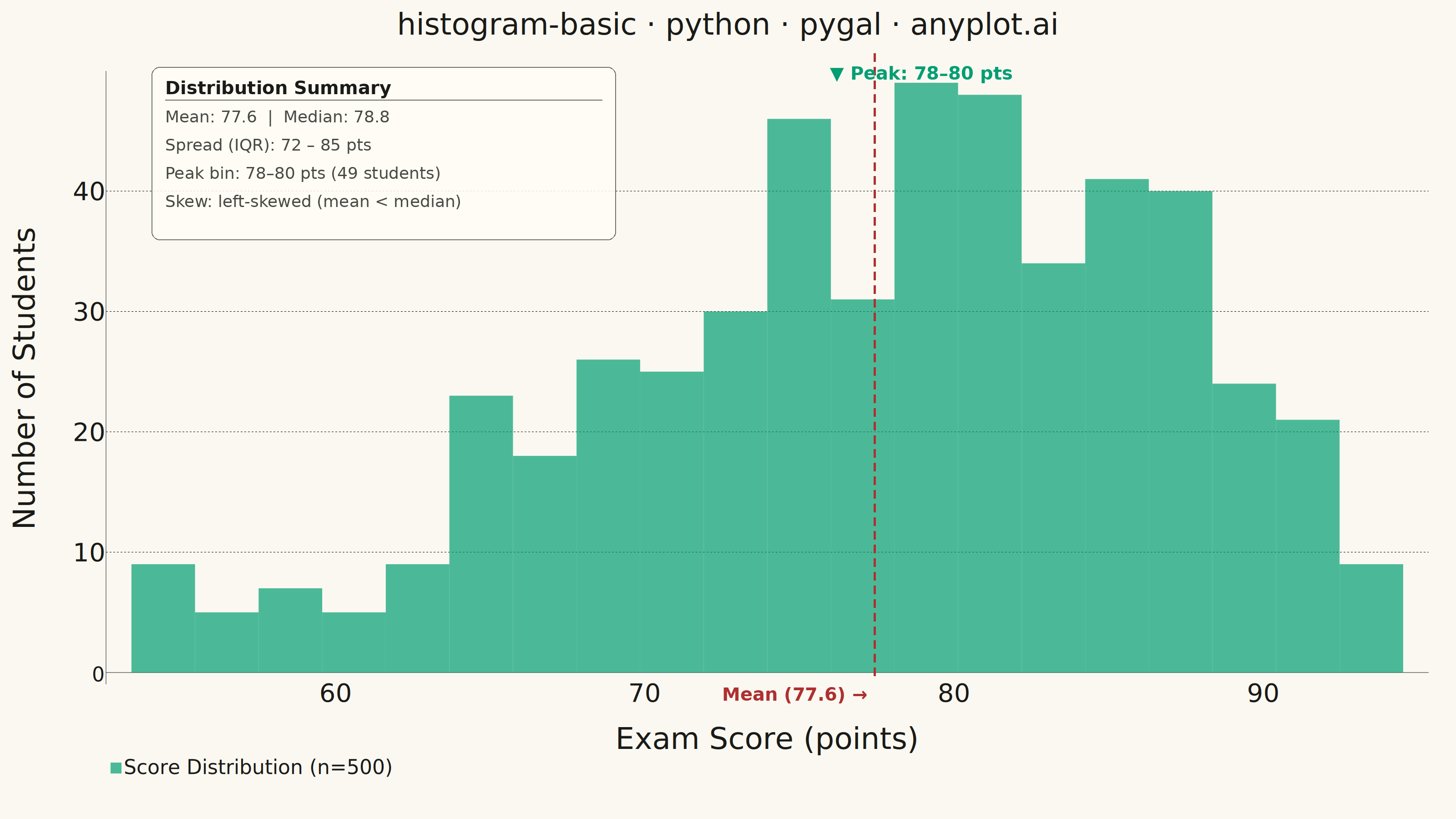
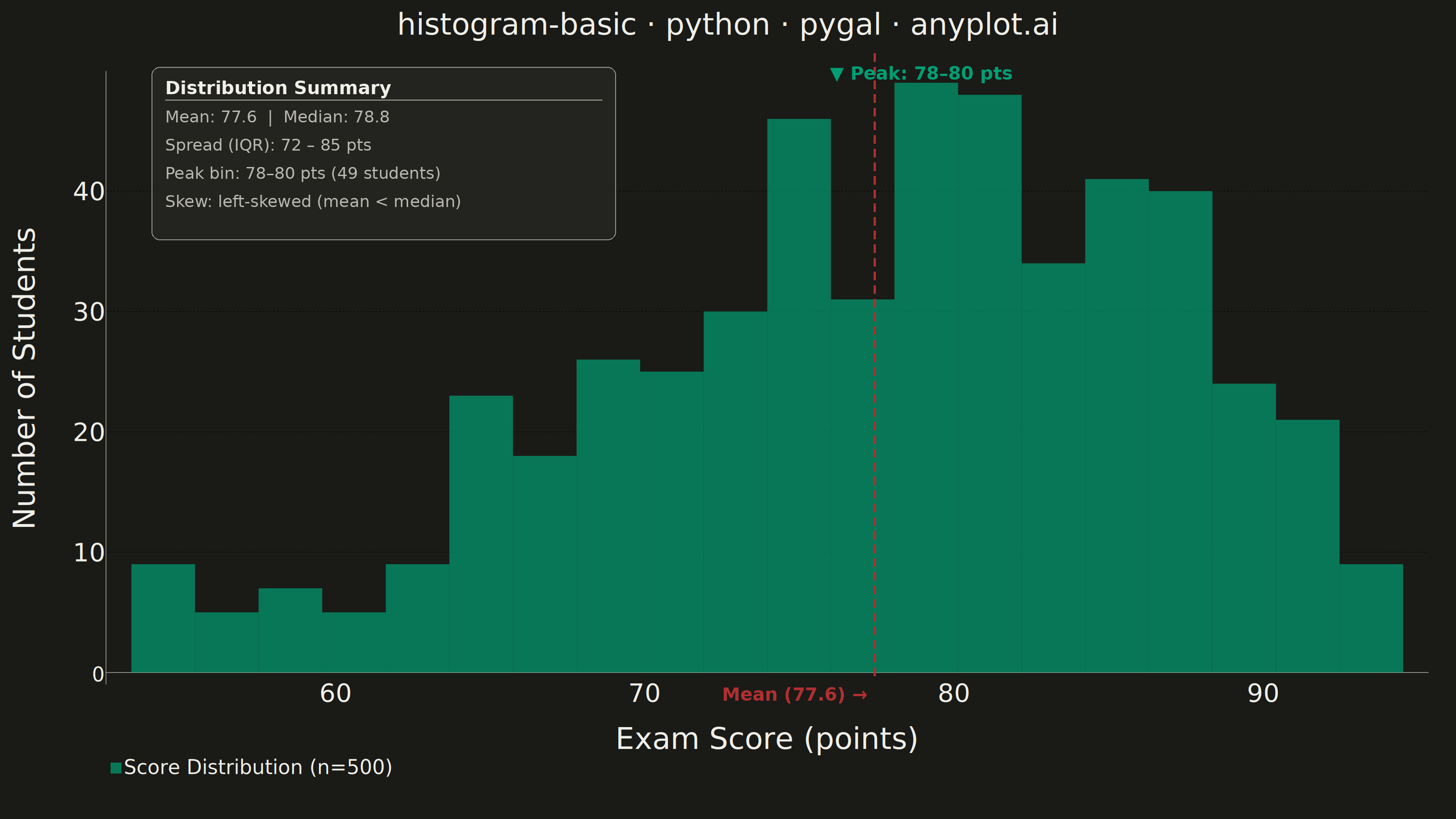
A histogram displays the distribution of a single continuous variable by dividing the data range into bins and showing the frequency (count) of observations in each bin. It reveals the shape of the data distribution, including central tendency, spread, and presence of outliers or multiple modes.
""" anyplot.ai
histogram-basic: Basic Histogram
Library: pygal 3.1.0 | Python 3.13.13
Quality: 88/100 | Updated: 2026-05-28
"""

import sys


# This file is named pygal.py which shadows the installed pygal package.
# Move the script directory to the end so site-packages takes precedence.
_script_dir = sys.path.pop(0) if sys.path else None

import io
import os

import numpy as np
import pygal
from PIL import Image, ImageDraw, ImageFont
from pygal.style import Style


if _script_dir is not None:
    sys.path.append(_script_dir)

# Theme tokens
THEME = os.getenv("ANYPLOT_THEME", "light")
PAGE_BG = "#FAF8F1" if THEME == "light" else "#1A1A17"
ELEVATED_BG = "#FFFDF6" if THEME == "light" else "#242420"
INK = "#1A1A17" if THEME == "light" else "#F0EFE8"
INK_SOFT = "#4A4A44" if THEME == "light" else "#B8B7B0"
INK_MUTED = "#6B6A63" if THEME == "light" else "#A8A79F"

IMPRINT_PALETTE = ("#009E73", "#C475FD", "#4467A3", "#BD8233", "#AE3030", "#2ABCCD", "#954477", "#99B314")
BRAND = IMPRINT_PALETTE[0]

# Data — exam scores with realistic left-skewed beta distribution
np.random.seed(42)
n_samples = 500
raw = np.random.beta(a=5, b=2, size=n_samples)
values = raw * 60 + 35  # Scale to ~35-95 range

# Histogram bins
n_bins = 20
counts, bin_edges = np.histogram(values, bins=n_bins)
hist_data = [(int(count), float(bin_edges[i]), float(bin_edges[i + 1])) for i, count in enumerate(counts)]

# Key statistics
mean_val = float(np.mean(values))
median_val = float(np.median(values))
q1, q3 = float(np.percentile(values, 25)), float(np.percentile(values, 75))
peak_bin = int(np.argmax(counts))
peak_lo = float(bin_edges[peak_bin])
peak_hi = float(bin_edges[peak_bin + 1])

# Chart style — anyplot tokens, canonical sizing for 3200×1800
font = "DejaVu Sans, Helvetica, Arial, sans-serif"
custom_style = Style(
    background=PAGE_BG,
    plot_background=PAGE_BG,
    foreground=INK,
    foreground_strong=INK,
    foreground_subtle=INK_MUTED,
    colors=(BRAND,),
    font_family=font,
    title_font_family=font,
    title_font_size=66,
    label_font_size=56,
    major_label_font_size=44,
    legend_font_size=44,
    value_font_size=36,
    stroke_width=0,
)

# Chart
chart = pygal.Histogram(
    width=3200,
    height=1800,
    style=custom_style,
    title="histogram-basic · python · pygal · anyplot.ai",
    x_title="Exam Score (points)",
    y_title="Number of Students",
    show_legend=True,
    legend_at_bottom=True,
    legend_box_size=24,
    show_y_guides=True,
    show_x_guides=False,
    tooltip_fancy_mode=True,
    print_values=False,
    margin_bottom=100,
    margin_left=80,
    margin_right=60,
    margin_top=80,
)
chart.add("Score Distribution (n=500)", hist_data)

# PIL annotation overlay
chart_bytes = chart.render_to_png()
base_img = Image.open(io.BytesIO(chart_bytes)).convert("RGBA")

img_w, img_h = base_img.size
plot_x0 = int(img_w * 0.073)
plot_x1 = int(img_w * 0.969)
plot_y_top = int(img_h * 0.065)
plot_y_bot = int(img_h * 0.83)
data_min = float(bin_edges[0])
data_max = float(bin_edges[-1])
data_range = data_max - data_min
px_range = plot_x1 - plot_x0

# Semi-transparent stats box — theme-adaptive fill and outline
box_x, box_y, box_w, box_h = plot_x0 + 100, plot_y_top + 30, 1020, 380
box_fill = (255, 253, 246, 220) if THEME == "light" else (36, 36, 32, 220)
box_outline = (74, 74, 68, 200) if THEME == "light" else (184, 183, 176, 200)

overlay = Image.new("RGBA", base_img.size, (0, 0, 0, 0))
overlay_draw = ImageDraw.Draw(overlay)
overlay_draw.rounded_rectangle(
    [(box_x, box_y), (box_x + box_w, box_y + box_h)], radius=18, fill=box_fill, outline=box_outline, width=2
)
img = Image.alpha_composite(base_img, overlay).convert("RGB")
draw = ImageDraw.Draw(img)

try:
    ann_font = ImageFont.truetype("/usr/share/fonts/truetype/dejavu/DejaVuSans.ttf", 36)
    ann_bold = ImageFont.truetype("/usr/share/fonts/truetype/dejavu/DejaVuSans-Bold.ttf", 40)
except OSError:
    ann_font = ImageFont.load_default()
    ann_bold = ann_font

# Mean reference line — dashed, anyplot matte red
mean_px = int(plot_x0 + (mean_val - data_min) / data_range * px_range)
y_pos = plot_y_top
while y_pos < plot_y_bot:
    draw.line([(mean_px, y_pos), (mean_px, min(y_pos + 18, plot_y_bot))], fill="#AE3030", width=5)
    y_pos += 30

# Mean label — bold and prominent (improved from previous)
mean_tag = f"Mean ({mean_val:.1f}) →"
mt_bbox = draw.textbbox((0, 0), mean_tag, font=ann_bold)
draw.text((mean_px - (mt_bbox[2] - mt_bbox[0]) - 16, plot_y_bot + 8), mean_tag, fill="#AE3030", font=ann_bold)

# Stats box text
draw.text((box_x + 30, box_y + 22), "Distribution Summary", fill=INK, font=ann_bold)
draw.line([(box_x + 30, box_y + 72), (box_x + box_w - 30, box_y + 72)], fill=INK_MUTED, width=2)
stats_lines = [
    f"Mean: {mean_val:.1f}  |  Median: {median_val:.1f}",
    f"Spread (IQR): {q1:.0f} – {q3:.0f} pts",
    f"Peak bin: {peak_lo:.0f}–{peak_hi:.0f} pts ({int(counts[peak_bin])} students)",
    "Skew: left-skewed (mean < median)",
]
for i, line in enumerate(stats_lines):
    draw.text((box_x + 30, box_y + 88 + i * 62), line, fill=INK_SOFT, font=ann_font)

# Peak callout above tallest bar
peak_mid = (peak_lo + peak_hi) / 2
peak_px = int(plot_x0 + (peak_mid - data_min) / data_range * px_range)
label_text = f"▼ Peak: {peak_lo:.0f}–{peak_hi:.0f} pts"
lbl_bbox = draw.textbbox((0, 0), label_text, font=ann_bold)
draw.text((peak_px - (lbl_bbox[2] - lbl_bbox[0]) // 2, plot_y_top + 20), label_text, fill=BRAND, font=ann_bold)

# Save
img.save(f"plot-{THEME}.png", "PNG")
with open(f"plot-{THEME}.html", "wb") as f:
    f.write(chart.render())
Runnable source as JSON, for any HTTP client: https://api.anyplot.ai/specs/histogram-basic/pygal/code. Any spec id and library id listed in llms-full.txt fit the same URL shape; every URL below is complete and callable.
{
  "spec_id": "histogram-basic",
  "language": "python",
  "library": "pygal",
  "page": "https://anyplot.ai/histogram-basic/python/pygal",
  "hub": "https://anyplot.ai/histogram-basic",
  "code_json": "https://api.anyplot.ai/specs/histogram-basic/pygal/code",
  "spec_json": "https://api.anyplot.ai/specs/histogram-basic",
  "render_light_png": "https://storage.googleapis.com/anyplot-images/plots/histogram-basic/python/pygal/plot-light.png",
  "render_dark_png": "https://storage.googleapis.com/anyplot-images/plots/histogram-basic/python/pygal/plot-dark.png",
  "interactive_light_html": "https://storage.googleapis.com/anyplot-images/plots/histogram-basic/python/pygal/plot-light.html",
  "interactive_dark_html": "https://storage.googleapis.com/anyplot-images/plots/histogram-basic/python/pygal/plot-dark.html",
  "quality_score": 88.0,
  "license": "MIT",
  "guide": "https://anyplot.ai/llms.txt"
}
Part of Basic Histogram on anyplot.ai.