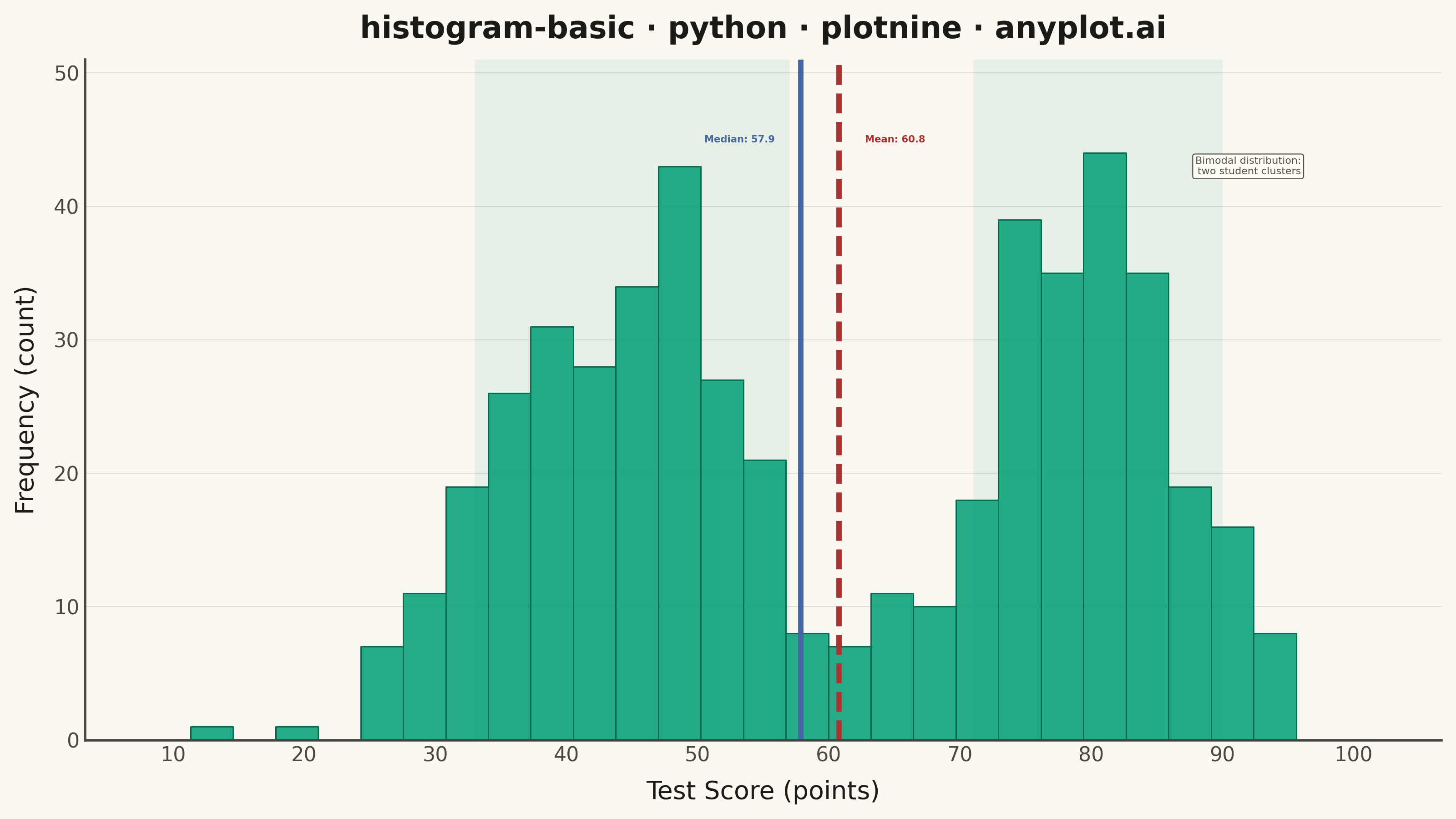
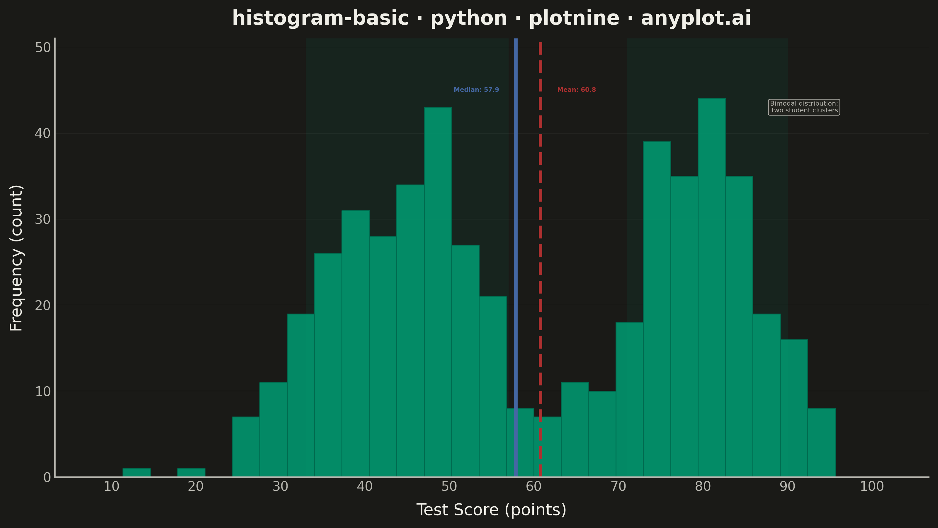
A histogram displays the distribution of a single continuous variable by dividing the data range into bins and showing the frequency (count) of observations in each bin. It reveals the shape of the data distribution, including central tendency, spread, and presence of outliers or multiple modes.
""" anyplot.ai
histogram-basic: Basic Histogram
Library: plotnine 0.15.4 | Python 3.13.13
Quality: 90/100 | Updated: 2026-05-28
"""

import os
import sys


# Remove this file's directory from sys.path to prevent self-import
# (this file is named plotnine.py, same as the library being imported)
_dir = os.path.dirname(os.path.abspath(__file__))
sys.path = [p for p in sys.path if os.path.abspath(p) != _dir]

import numpy as np
import pandas as pd
from plotnine import (
    aes,
    after_stat,
    annotate,
    element_blank,
    element_line,
    element_rect,
    element_text,
    geom_histogram,
    geom_vline,
    ggplot,
    labs,
    scale_x_continuous,
    scale_y_continuous,
    theme,
    theme_minimal,
)


THEME = os.getenv("ANYPLOT_THEME", "light")
PAGE_BG = "#FAF8F1" if THEME == "light" else "#1A1A17"
ELEVATED_BG = "#FFFDF6" if THEME == "light" else "#242420"
INK = "#1A1A17" if THEME == "light" else "#F0EFE8"
INK_SOFT = "#4A4A44" if THEME == "light" else "#B8B7B0"

BRAND = "#009E73"
MEAN_COLOR = "#AE3030"
MEDIAN_COLOR = "#4467A3"

# Data — mixture of two normal distributions for visible bimodality
np.random.seed(42)
n_points = 500
group_a = np.random.normal(loc=45, scale=10, size=int(n_points * 0.55))
group_b = np.random.normal(loc=80, scale=7, size=int(n_points * 0.45))
scores = np.clip(np.concatenate([group_a, group_b]), 0, 100)

df = pd.DataFrame({"score": scores})

mean_score = float(np.mean(scores))
median_score = float(np.median(scores))

# Pre-compute bin heights to anchor annotation positions and peak shading
_bin_counts, _ = np.histogram(scores, bins=30, range=(8, 102))
_max_count = int(_bin_counts.max())
_y_top = int(_max_count * 1.18)  # explicit y ceiling with headroom
_y_label = _max_count + 1  # just above tallest bar

plot = (
    ggplot(df, aes(x="score"))
    # Subtle peak-region shading behind histogram bars
    + annotate("rect", xmin=33, xmax=57, ymin=0, ymax=_y_top, fill=BRAND, alpha=0.08, size=0)
    + annotate("rect", xmin=71, xmax=90, ymin=0, ymax=_y_top, fill=BRAND, alpha=0.08, size=0)
    + geom_histogram(aes(y=after_stat("count")), bins=30, fill=BRAND, color="#006B4F", alpha=0.85, size=0.3)
    + geom_vline(xintercept=mean_score, color=MEAN_COLOR, size=1.2, linetype="dashed")
    + geom_vline(xintercept=median_score, color=MEDIAN_COLOR, size=1.2, linetype="solid")
    + annotate(
        "text",
        x=mean_score + 2,
        y=_y_label,
        label=f"Mean: {mean_score:.1f}",
        color=MEAN_COLOR,
        size=3.8,
        ha="left",
        fontweight="bold",
    )
    + annotate(
        "text",
        x=median_score - 2,
        y=_y_label,
        label=f"Median: {median_score:.1f}",
        color=MEDIAN_COLOR,
        size=3.8,
        ha="right",
        fontweight="bold",
    )
    + annotate(
        "label",
        x=96,
        y=_y_label - 2,
        label="Bimodal distribution:\ntwo student clusters",
        size=4,
        color=INK_SOFT,
        fill=ELEVATED_BG,
        alpha=0.95,
        label_size=0.4,
        ha="right",
    )
    + scale_x_continuous(breaks=range(10, 101, 10), limits=(8, 102))
    + scale_y_continuous(limits=(0, _y_top), expand=(0, 0, 0, 0))
    + labs(x="Test Score (points)", y="Frequency (count)", title="histogram-basic · python · plotnine · anyplot.ai")
    + theme_minimal()
    + theme(
        figure_size=(8, 4.5),
        text=element_text(size=7, color=INK_SOFT),
        axis_title=element_text(size=10, color=INK),
        axis_text=element_text(size=8, color=INK_SOFT),
        plot_title=element_text(size=12, color=INK, weight="bold"),
        panel_grid_major_x=element_blank(),
        panel_grid_minor=element_blank(),
        panel_grid_major_y=element_line(color=INK, size=0.3, alpha=0.15),
        panel_border=element_blank(),
        plot_background=element_rect(fill=PAGE_BG, color=PAGE_BG),
        panel_background=element_rect(fill=PAGE_BG),
        axis_line=element_line(color=INK_SOFT),
    )
)

plot.save(f"plot-{THEME}.png", dpi=400, width=8, height=4.5, units="in", verbose=False)
Runnable source as JSON, for any HTTP client: https://api.anyplot.ai/specs/histogram-basic/plotnine/code. Any spec id and library id listed in llms-full.txt fit the same URL shape; every URL below is complete and callable.
{
  "spec_id": "histogram-basic",
  "language": "python",
  "library": "plotnine",
  "page": "https://anyplot.ai/histogram-basic/python/plotnine",
  "hub": "https://anyplot.ai/histogram-basic",
  "code_json": "https://api.anyplot.ai/specs/histogram-basic/plotnine/code",
  "spec_json": "https://api.anyplot.ai/specs/histogram-basic",
  "render_light_png": "https://storage.googleapis.com/anyplot-images/plots/histogram-basic/python/plotnine/plot-light.png",
  "render_dark_png": "https://storage.googleapis.com/anyplot-images/plots/histogram-basic/python/plotnine/plot-dark.png",
  "quality_score": 90.0,
  "license": "MIT",
  "guide": "https://anyplot.ai/llms.txt"
}
Part of Basic Histogram on anyplot.ai.