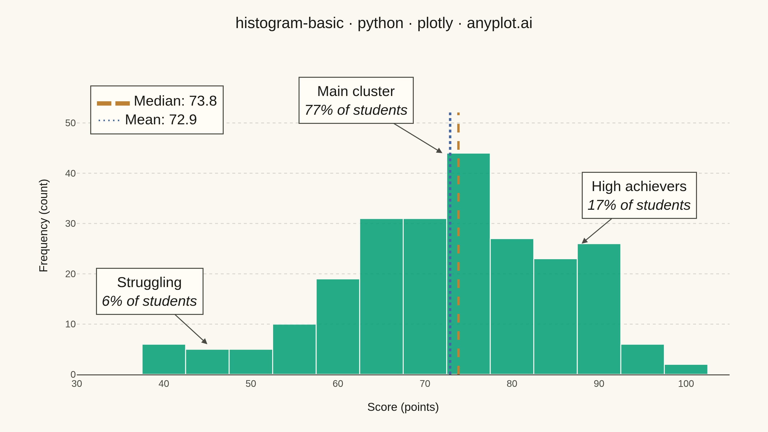
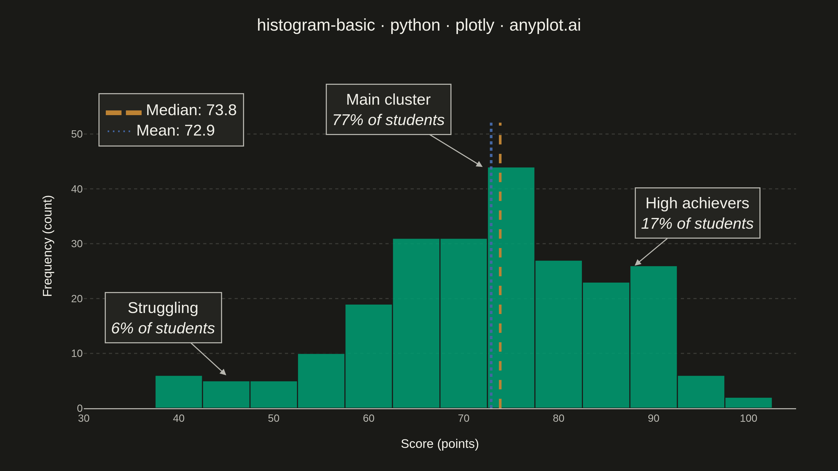
A histogram displays the distribution of a single continuous variable by dividing the data range into bins and showing the frequency (count) of observations in each bin. It reveals the shape of the data distribution, including central tendency, spread, and presence of outliers or multiple modes.
""" anyplot.ai
histogram-basic: Basic Histogram
Library: plotly 6.7.0 | Python 3.13.13
Quality: 94/100 | Updated: 2026-05-28
"""

import os

import numpy as np
import plotly.graph_objects as go


# Theme
THEME = os.getenv("ANYPLOT_THEME", "light")
PAGE_BG = "#FAF8F1" if THEME == "light" else "#1A1A17"
ELEVATED_BG = "#FFFDF6" if THEME == "light" else "#242420"
INK = "#1A1A17" if THEME == "light" else "#F0EFE8"
INK_SOFT = "#4A4A44" if THEME == "light" else "#B8B7B0"
GRID = "rgba(26,26,23,0.15)" if THEME == "light" else "rgba(240,239,232,0.15)"

IMPRINT_PALETTE = ["#009E73", "#C475FD", "#4467A3", "#BD8233", "#AE3030", "#2ABCCD", "#954477", "#99B314"]
BRAND = IMPRINT_PALETTE[0]  # #009E73 — first series (bars)
BLUE = IMPRINT_PALETTE[2]  # #4467A3 — mean reference line
OCHRE = IMPRINT_PALETTE[3]  # #BD8233 — median reference line (colorblind-safe pair)

# Data — exam score distribution with three realistic student groups
np.random.seed(42)
scores_main = np.random.normal(loc=72, scale=10, size=180)
scores_high = np.random.normal(loc=88, scale=5, size=40)
scores_low = np.random.normal(loc=45, scale=4, size=15)
values = np.concatenate([scores_main, scores_high, scores_low])
values = np.clip(values, 0, 100)

mean_val = np.mean(values)
median_val = np.median(values)

# Plot
fig = go.Figure()
fig.add_trace(
    go.Histogram(
        x=values,
        nbinsx=20,
        marker={"color": BRAND, "opacity": 0.85, "line": {"color": PAGE_BG, "width": 1}},
        hovertemplate="Score: %{x:.0f}<br>Count: %{y}<extra></extra>",
    )
)

# Median vertical line (ochre, dashed)
fig.add_shape(
    type="line",
    x0=median_val,
    x1=median_val,
    y0=0,
    y1=0.88,
    yref="paper",
    line={"color": OCHRE, "width": 2.5, "dash": "dash"},
)

# Mean vertical line (blue, dotted)
fig.add_shape(
    type="line", x0=mean_val, x1=mean_val, y0=0, y1=0.88, yref="paper", line={"color": BLUE, "width": 2.5, "dash": "dot"}
)

# Legend for mean/median reference lines
fig.add_annotation(
    x=0.02,
    y=0.97,
    xref="paper",
    yref="paper",
    text=(
        f'<span style="color:{OCHRE}">▬ ▬</span> Median: {median_val:.1f}'
        f'<br><span style="color:{BLUE}">·····</span> Mean: {mean_val:.1f}'
    ),
    showarrow=False,
    font={"size": 15, "color": INK},
    align="left",
    bgcolor=ELEVATED_BG,
    bordercolor=INK_SOFT,
    borderwidth=1,
    borderpad=6,
)

# Cluster annotations
fig.add_annotation(
    x=72,
    y=44,
    text="Main cluster<br><i>77% of students</i>",
    showarrow=True,
    arrowhead=2,
    arrowsize=1.2,
    arrowcolor=INK_SOFT,
    ax=-90,
    ay=-55,
    font={"size": 15, "color": INK},
    bgcolor=ELEVATED_BG,
    bordercolor=INK_SOFT,
    borderwidth=1,
    borderpad=5,
)

fig.add_annotation(
    x=88,
    y=26,
    text="High achievers<br><i>17% of students</i>",
    showarrow=True,
    arrowhead=2,
    arrowsize=1.2,
    arrowcolor=INK_SOFT,
    ax=60,
    ay=-50,
    font={"size": 15, "color": INK},
    bgcolor=ELEVATED_BG,
    bordercolor=INK_SOFT,
    borderwidth=1,
    borderpad=5,
)

fig.add_annotation(
    x=45,
    y=6,
    text="Struggling<br><i>6% of students</i>",
    showarrow=True,
    arrowhead=2,
    arrowsize=1.2,
    arrowcolor=INK_SOFT,
    ax=-60,
    ay=-55,
    font={"size": 15, "color": INK},
    bgcolor=ELEVATED_BG,
    bordercolor=INK_SOFT,
    borderwidth=1,
    borderpad=5,
)

# Layout
title = "histogram-basic · python · plotly · anyplot.ai"
title_fontsize = 16  # len=46, under 67-char baseline — no scaling needed

fig.update_layout(
    autosize=False,
    paper_bgcolor=PAGE_BG,
    plot_bgcolor=PAGE_BG,
    font={"color": INK},
    title={"text": title, "font": {"size": title_fontsize, "color": INK}, "x": 0.5, "xanchor": "center", "y": 0.96},
    xaxis={
        "title": {"text": "Score (points)", "font": {"size": 12, "color": INK}},
        "tickfont": {"size": 10, "color": INK_SOFT},
        "showgrid": False,
        "zeroline": False,
        "showline": True,
        "linecolor": INK_SOFT,
        "linewidth": 1,
        "range": [30, 105],
    },
    yaxis={
        "title": {"text": "Frequency (count)", "font": {"size": 12, "color": INK}},
        "tickfont": {"size": 10, "color": INK_SOFT},
        "showgrid": True,
        "gridcolor": GRID,
        "gridwidth": 1,
        "griddash": "dot",
        "zeroline": False,
        "showline": False,
        "rangemode": "tozero",
    },
    template="plotly_white",
    bargap=0,
    margin={"l": 80, "r": 40, "t": 80, "b": 60},
)

# Save — 3200×1800 px landscape
fig.write_image(f"plot-{THEME}.png", width=800, height=450, scale=4)
fig.write_html(f"plot-{THEME}.html", include_plotlyjs="cdn")
Runnable source as JSON, for any HTTP client: https://api.anyplot.ai/specs/histogram-basic/plotly/code. Any spec id and library id listed in llms-full.txt fit the same URL shape; every URL below is complete and callable.
{
  "spec_id": "histogram-basic",
  "language": "python",
  "library": "plotly",
  "page": "https://anyplot.ai/histogram-basic/python/plotly",
  "hub": "https://anyplot.ai/histogram-basic",
  "code_json": "https://api.anyplot.ai/specs/histogram-basic/plotly/code",
  "spec_json": "https://api.anyplot.ai/specs/histogram-basic",
  "render_light_png": "https://storage.googleapis.com/anyplot-images/plots/histogram-basic/python/plotly/plot-light.png",
  "render_dark_png": "https://storage.googleapis.com/anyplot-images/plots/histogram-basic/python/plotly/plot-dark.png",
  "interactive_light_html": "https://storage.googleapis.com/anyplot-images/plots/histogram-basic/python/plotly/plot-light.html",
  "interactive_dark_html": "https://storage.googleapis.com/anyplot-images/plots/histogram-basic/python/plotly/plot-dark.html",
  "quality_score": 94.0,
  "license": "MIT",
  "guide": "https://anyplot.ai/llms.txt"
}
Part of Basic Histogram on anyplot.ai.