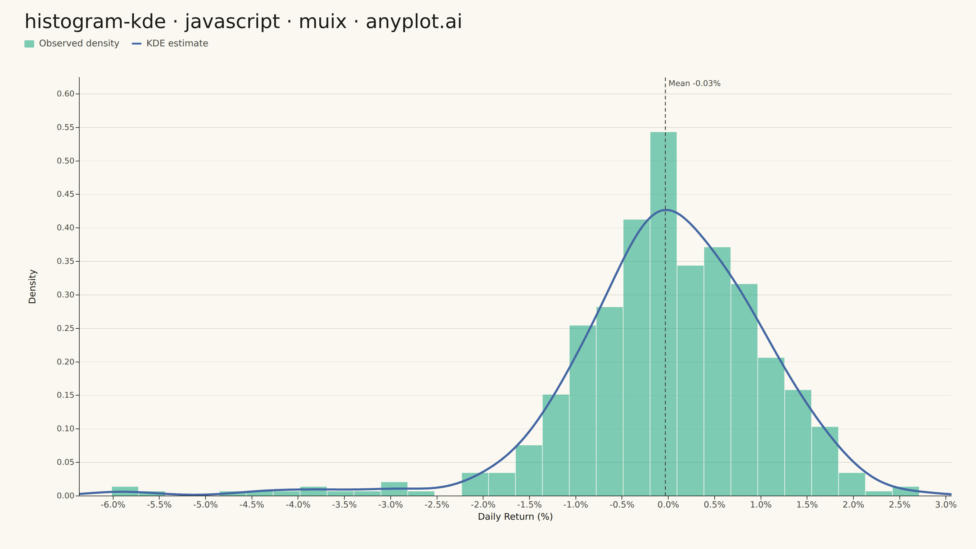
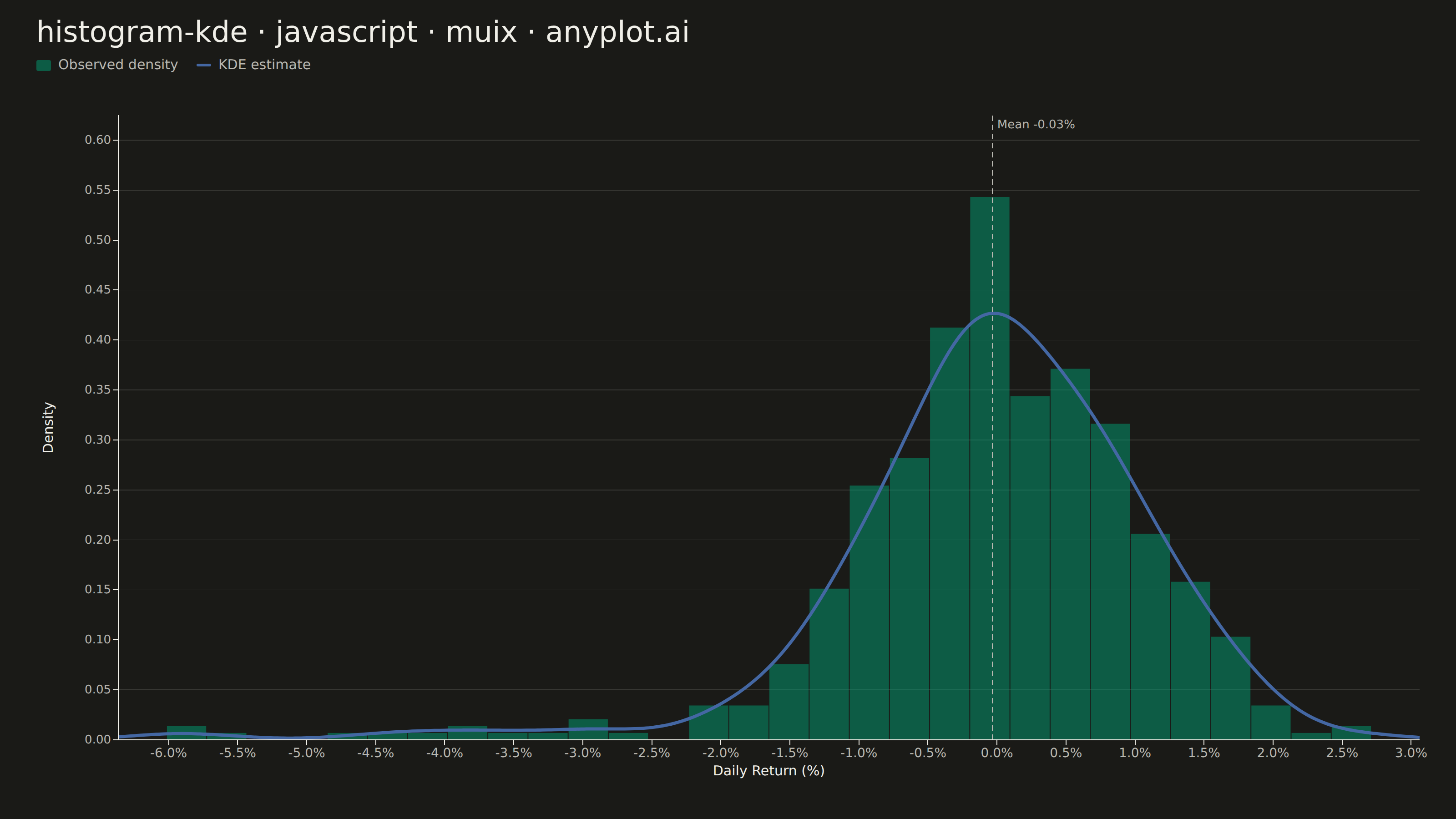
A histogram with kernel density estimate (KDE) overlay combines discrete binning with continuous density estimation to visualize the distribution of continuous data. The histogram bars show frequency counts in each bin while the smooth KDE curve reveals the underlying probability density, making it easier to perceive the true shape of the distribution without binning artifacts.
// anyplot.ai
// histogram-kde: Histogram with KDE Overlay
// Library: muix 7.29.1 | JavaScript 22.23.1
// Quality: 89/100 | Created: 2026-08-05

import { ChartContainer } from "@mui/x-charts/ChartContainer";
import { LinePlot } from "@mui/x-charts/LineChart";
import { ChartsXAxis } from "@mui/x-charts/ChartsXAxis";
import { ChartsYAxis } from "@mui/x-charts/ChartsYAxis";
import { ChartsGrid } from "@mui/x-charts/ChartsGrid";
import { ChartsReferenceLine } from "@mui/x-charts/ChartsReferenceLine";
import { useDrawingArea } from "@mui/x-charts/hooks";
import Box from "@mui/material/Box";
import Typography from "@mui/material/Typography";

const t = window.ANYPLOT_TOKENS;
const FONT = "system-ui, -apple-system, sans-serif";

// --- Data (in-memory, deterministic) ----------------------------------------
// Fixed-seed LCG + Box-Muller — the browser has no seeded Math.random.
let seed = 42;
function lcg() {
  seed = (Math.imul(1664525, seed) + 1013904223) >>> 0;
  return seed / 0x100000000;
}
function randn() {
  const u1 = Math.max(lcg(), 1e-10);
  const u2 = lcg();
  return Math.sqrt(-2 * Math.log(u1)) * Math.cos(2 * Math.PI * u2);
}

// Daily portfolio returns (%): most days are calm fluctuations around a small
// positive drift; a minority are downside-shock days, giving the distribution
// a left-skewed, fat tail that binning alone tends to obscure.
const N = 500;
const returns = Array.from({ length: N }, () => {
  const isShockDay = lcg() < 0.09;
  const mean = isShockDay ? -2.6 : 0.12;
  const sd = isShockDay ? 2.4 : 0.85;
  return mean + randn() * sd;
});

// --- Histogram (density-scaled so bars and KDE share the same y-axis) -------
const dataMin = Math.min(...returns);
const dataMax = Math.max(...returns);
const pad = (dataMax - dataMin) * 0.04;
const X_MIN = dataMin - pad;
const X_MAX = dataMax + pad;

const BIN_COUNT = 30;
const binWidth = (dataMax - dataMin) / BIN_COUNT;
const binCounts = new Array(BIN_COUNT).fill(0);
returns.forEach((v) => {
  const idx = Math.min(BIN_COUNT - 1, Math.floor((v - dataMin) / binWidth));
  binCounts[idx] += 1;
});
const histogramDensity = binCounts.map((c) => c / (N * binWidth));

// --- Gaussian KDE, evaluated on a fine continuous grid -----------------------
const sampleMean = returns.reduce((s, v) => s + v, 0) / N;
const sampleStd = Math.sqrt(
  returns.reduce((s, v) => s + (v - sampleMean) ** 2, 0) / (N - 1)
);
// Silverman's rule of thumb for bandwidth.
const bandwidth = 1.06 * sampleStd * N ** (-1 / 5);

function kernelDensity(x) {
  const sum = returns.reduce((acc, v) => {
    const u = (x - v) / bandwidth;
    return acc + Math.exp(-0.5 * u * u);
  }, 0);
  return sum / (N * bandwidth * Math.sqrt(2 * Math.PI));
}

const KDE_POINTS = 240;
const kdeX = Array.from(
  { length: KDE_POINTS },
  (_, i) => X_MIN + (i / (KDE_POINTS - 1)) * (X_MAX - X_MIN)
);
const kdeDensity = kdeX.map(kernelDensity);

const Y_MAX = Math.max(...histogramDensity, ...kdeDensity) * 1.15;

// Imprint palette colors
const BRAND = t.palette[0]; // #009E73 — histogram bars (first categorical series)
const BLUE = t.palette[2]; // #4467A3 — KDE curve, contrasts against the green bars

// Title sizing (scale down for longer-than-67-char titles)
const TITLE = "histogram-kde · javascript · muix · anyplot.ai";
const titleSize = Math.max(11, Math.round(22 * (67 / TITLE.length)));

// --- Histogram bars, drawn as SVG rects mapped onto the shared linear x-axis -
// A MUI X `<BarPlot>` needs a band-scale x-axis, which cannot share the same
// continuous axis as the KDE's fine-grained line — so the bars are positioned
// directly from the drawing-area coordinate map instead.
function HistogramBars() {
  const { left, top, width, height } = useDrawingArea();
  const toX = (v) => left + ((v - X_MIN) / (X_MAX - X_MIN)) * width;
  const toY = (d) => top + (1 - d / Y_MAX) * height;
  const binPx = (binWidth / (X_MAX - X_MIN)) * width;
  return (
    <g>
      {histogramDensity.map((d, i) => {
        const bx = toX(dataMin + i * binWidth);
        const by = toY(d);
        return (
          <rect
            key={i}
            x={bx + 0.5}
            y={by}
            width={Math.max(0, binPx - 1)}
            height={Math.max(0, top + height - by)}
            fill={BRAND}
            fillOpacity={0.5}
          />
        );
      })}
    </g>
  );
}

// --- Main component (default-exported — the harness mounts it) --------------
export default function Chart() {
  const { width, height } = window.ANYPLOT_SIZE;
  const TITLE_H = 56;
  const LEGEND_H = 34;

  return (
    <Box
      sx={{
        width,
        height,
        bgcolor: t.pageBg,
        display: "flex",
        flexDirection: "column",
        overflow: "hidden",
      }}
    >
      <Typography
        sx={{
          fontSize: titleSize,
          fontWeight: 500,
          color: t.ink,
          pt: "16px",
          px: "40px",
          pb: 0,
          lineHeight: 1.2,
          fontFamily: FONT,
        }}
      >
        {TITLE}
      </Typography>

      <Box sx={{ display: "flex", alignItems: "center", gap: "20px", px: "40px", pt: "6px" }}>
        <Box sx={{ display: "flex", alignItems: "center", gap: "8px" }}>
          <Box sx={{ width: 16, height: 12, bgcolor: BRAND, opacity: 0.5, borderRadius: "2px" }} />
          <Typography sx={{ fontSize: 15, color: t.inkSoft, fontFamily: FONT }}>
            Observed density
          </Typography>
        </Box>
        <Box sx={{ display: "flex", alignItems: "center", gap: "8px" }}>
          <Box sx={{ width: 16, height: 3, bgcolor: BLUE, borderRadius: "2px" }} />
          <Typography sx={{ fontSize: 15, color: t.inkSoft, fontFamily: FONT }}>
            KDE estimate
          </Typography>
        </Box>
      </Box>

      <ChartContainer
        width={width}
        height={height - TITLE_H - LEGEND_H}
        series={[
          {
            type: "line",
            id: "kde",
            data: kdeDensity,
            label: "KDE estimate",
            color: BLUE,
            showMark: false,
          },
        ]}
        xAxis={[
          {
            data: kdeX,
            scaleType: "linear",
            min: X_MIN,
            max: X_MAX,
            label: "Daily Return (%)",
            valueFormatter: (v) => `${v.toFixed(1)}%`,
            labelStyle: { fontSize: 15, fill: t.ink, fontFamily: FONT },
            tickLabelStyle: { fontSize: 14, fill: t.inkSoft, fontFamily: FONT },
          },
        ]}
        yAxis={[
          {
            min: 0,
            max: Y_MAX,
            label: "Density",
            labelStyle: { fontSize: 15, fill: t.ink, fontFamily: FONT },
            tickLabelStyle: { fontSize: 13, fill: t.inkSoft, fontFamily: FONT },
          },
        ]}
        margin={{ top: 44, right: 40, bottom: 80, left: 130 }}
        skipAnimation
      >
        <ChartsGrid horizontal sx={{ "& line": { stroke: t.grid, strokeWidth: 0.8 } }} />
        <HistogramBars />
        <LinePlot skipAnimation slotProps={{ line: { sx: { strokeWidth: 3.5 } } }} />
        {/* Mean reference line — calls out where the shock-day left tail pulls
            the average below the 0% no-change point the bulk of days cluster near. */}
        <ChartsReferenceLine
          x={sampleMean}
          label={`Mean ${sampleMean.toFixed(2)}%`}
          labelAlign="start"
          lineStyle={{ stroke: t.inkSoft, strokeDasharray: "6 4", strokeWidth: 1.5 }}
          labelStyle={{ fontSize: 13, fill: t.inkSoft, fontFamily: FONT }}
        />
        <ChartsXAxis />
        {/* Explicit axisLabel x offset — the default offset formula assumes short
            tick labels and clips against our 4-char decimal density values. */}
        <ChartsYAxis slotProps={{ axisLabel: { x: -72 } }} />
      </ChartContainer>
    </Box>
  );
}
Runnable source as JSON, for any HTTP client: https://api.anyplot.ai/specs/histogram-kde/muix/code. Any spec id and library id listed in llms-full.txt fit the same URL shape; every URL below is complete and callable.
{
  "spec_id": "histogram-kde",
  "language": "javascript",
  "library": "muix",
  "page": "https://anyplot.ai/histogram-kde/javascript/muix",
  "hub": "https://anyplot.ai/histogram-kde",
  "code_json": "https://api.anyplot.ai/specs/histogram-kde/muix/code",
  "spec_json": "https://api.anyplot.ai/specs/histogram-kde",
  "render_light_png": "https://storage.googleapis.com/anyplot-images/plots/histogram-kde/javascript/muix/plot-light.png",
  "render_dark_png": "https://storage.googleapis.com/anyplot-images/plots/histogram-kde/javascript/muix/plot-dark.png",
  "interactive_light_html": "https://storage.googleapis.com/anyplot-images/plots/histogram-kde/javascript/muix/plot-light.html",
  "interactive_dark_html": "https://storage.googleapis.com/anyplot-images/plots/histogram-kde/javascript/muix/plot-dark.html",
  "quality_score": 89.0,
  "license": "MIT",
  "guide": "https://anyplot.ai/llms.txt"
}
Part of Histogram with KDE Overlay on anyplot.ai.