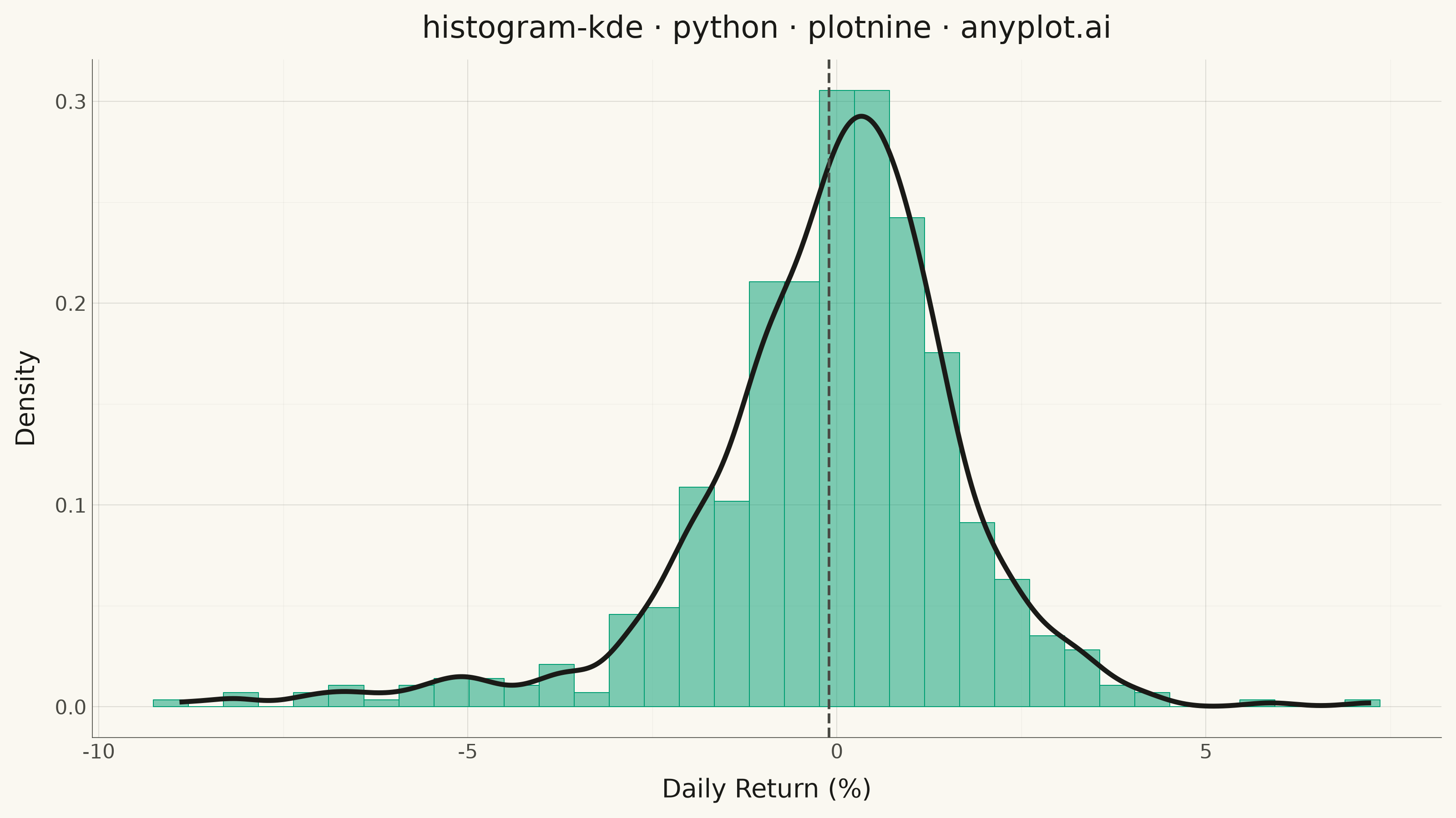
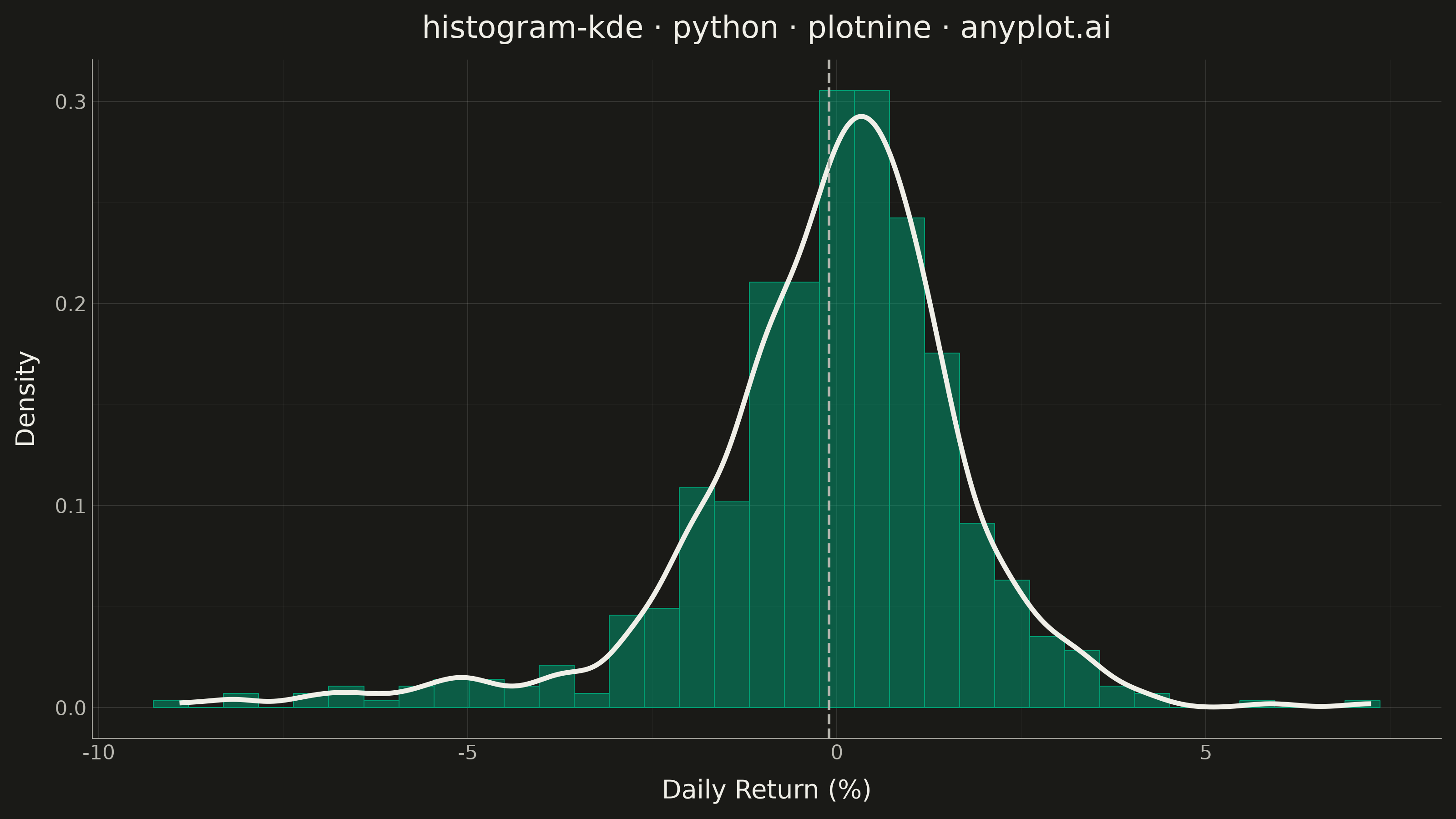
A histogram with kernel density estimate (KDE) overlay combines discrete binning with continuous density estimation to visualize the distribution of continuous data. The histogram bars show frequency counts in each bin while the smooth KDE curve reveals the underlying probability density, making it easier to perceive the true shape of the distribution without binning artifacts.
""" anyplot.ai
histogram-kde: Histogram with KDE Overlay
Library: plotnine 0.15.7 | Python 3.13.14
Quality: 87/100 | Updated: 2026-08-05
"""

import os

import numpy as np
import pandas as pd
from plotnine import (
    aes,
    after_stat,
    element_blank,
    element_line,
    element_rect,
    element_text,
    geom_density,
    geom_histogram,
    geom_vline,
    ggplot,
    labs,
    theme,
    theme_minimal,
)


# Theme tokens (Imprint palette)
THEME = os.getenv("ANYPLOT_THEME", "light")
PAGE_BG = "#FAF8F1" if THEME == "light" else "#1A1A17"
INK = "#1A1A17" if THEME == "light" else "#F0EFE8"
INK_SOFT = "#4A4A44" if THEME == "light" else "#B8B7B0"
BRAND = "#009E73"

# Data - Stock daily returns (realistic financial data)
np.random.seed(42)
# Simulate stock returns with slight negative skew and fat tails (realistic market behavior)
returns = np.concatenate(
    [
        np.random.normal(0.001, 0.015, 400),  # Normal trading days
        np.random.normal(-0.02, 0.03, 80),  # Volatile periods
        np.random.normal(0.005, 0.008, 120),  # Low volatility periods
    ]
)
returns = returns * 100  # Convert to percentage

df = pd.DataFrame({"returns": returns})
mean_return = returns.mean()

# Plot - Histogram with KDE overlay, mean marked for distributional context
plot = (
    ggplot(df, aes(x="returns"))
    + geom_histogram(aes(y=after_stat("density")), bins=35, fill=BRAND, color=BRAND, alpha=0.5, size=0.2)
    + geom_density(color=INK, size=1.1)
    + geom_vline(xintercept=mean_return, color=INK_SOFT, linetype="dashed", size=0.6)
    + labs(x="Daily Return (%)", y="Density", title="histogram-kde · python · plotnine · anyplot.ai")
    + theme_minimal()
    + theme(
        figure_size=(8, 4.5),
        plot_background=element_rect(fill=PAGE_BG, color=PAGE_BG),
        panel_background=element_rect(fill=PAGE_BG),
        panel_grid_major=element_line(color=INK, size=0.3, alpha=0.15),
        panel_grid_minor=element_line(color=INK, size=0.2, alpha=0.05),
        panel_border=element_blank(),
        axis_title=element_text(size=10, color=INK),
        axis_text=element_text(size=8, color=INK_SOFT),
        axis_line=element_line(color=INK_SOFT, size=0.3),
        plot_title=element_text(size=12, color=INK),
        text=element_text(size=7),
    )
)

plot.save(f"plot-{THEME}.png", dpi=400, width=8, height=4.5, units="in")
Runnable source as JSON, for any HTTP client: https://api.anyplot.ai/specs/histogram-kde/plotnine/code. Any spec id and library id listed in llms-full.txt fit the same URL shape; every URL below is complete and callable.
{
  "spec_id": "histogram-kde",
  "language": "python",
  "library": "plotnine",
  "page": "https://anyplot.ai/histogram-kde/python/plotnine",
  "hub": "https://anyplot.ai/histogram-kde",
  "code_json": "https://api.anyplot.ai/specs/histogram-kde/plotnine/code",
  "spec_json": "https://api.anyplot.ai/specs/histogram-kde",
  "render_light_png": "https://storage.googleapis.com/anyplot-images/plots/histogram-kde/python/plotnine/plot-light.png",
  "render_dark_png": "https://storage.googleapis.com/anyplot-images/plots/histogram-kde/python/plotnine/plot-dark.png",
  "quality_score": 87.0,
  "license": "MIT",
  "guide": "https://anyplot.ai/llms.txt"
}
Part of Histogram with KDE Overlay on anyplot.ai.