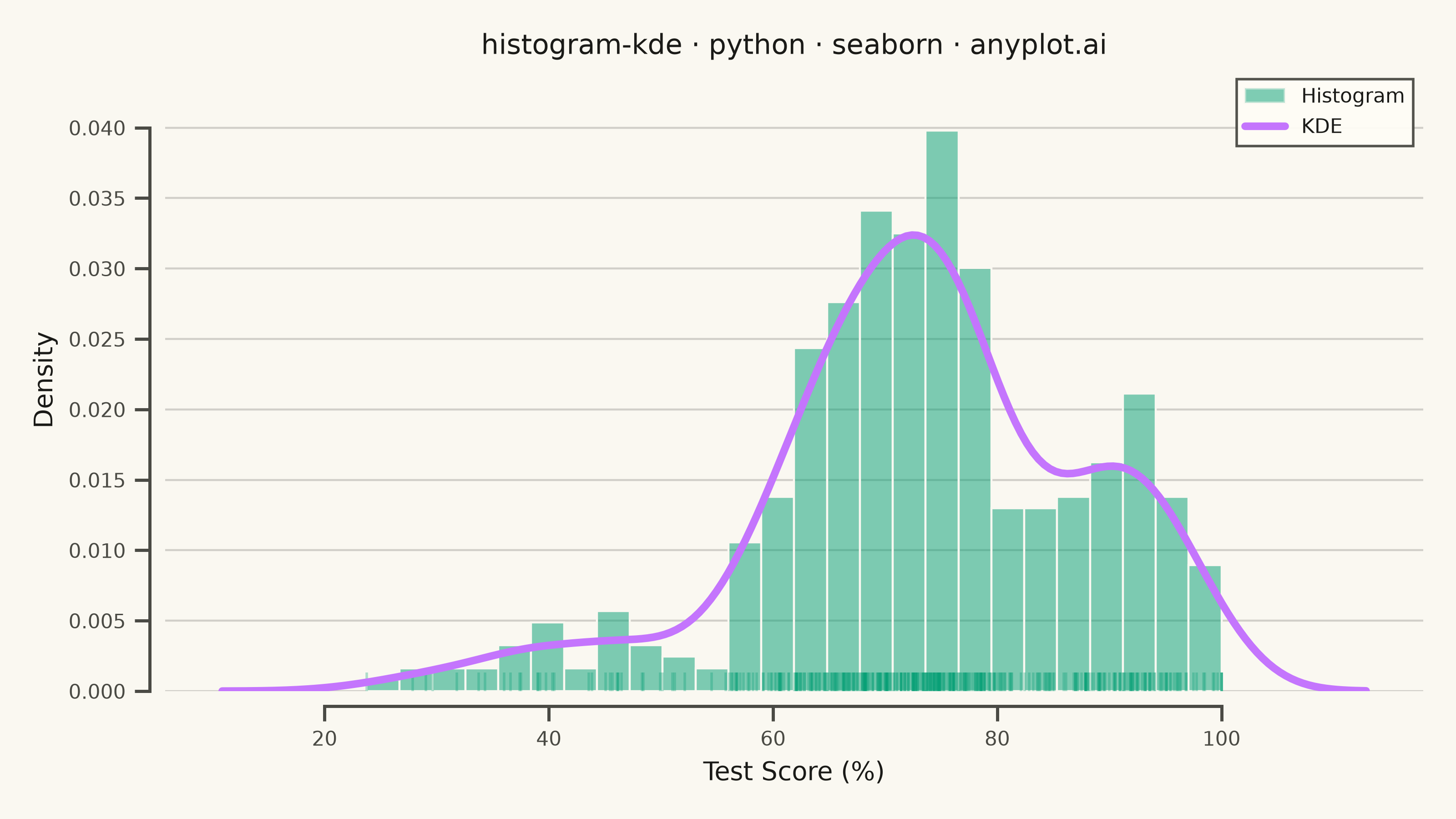
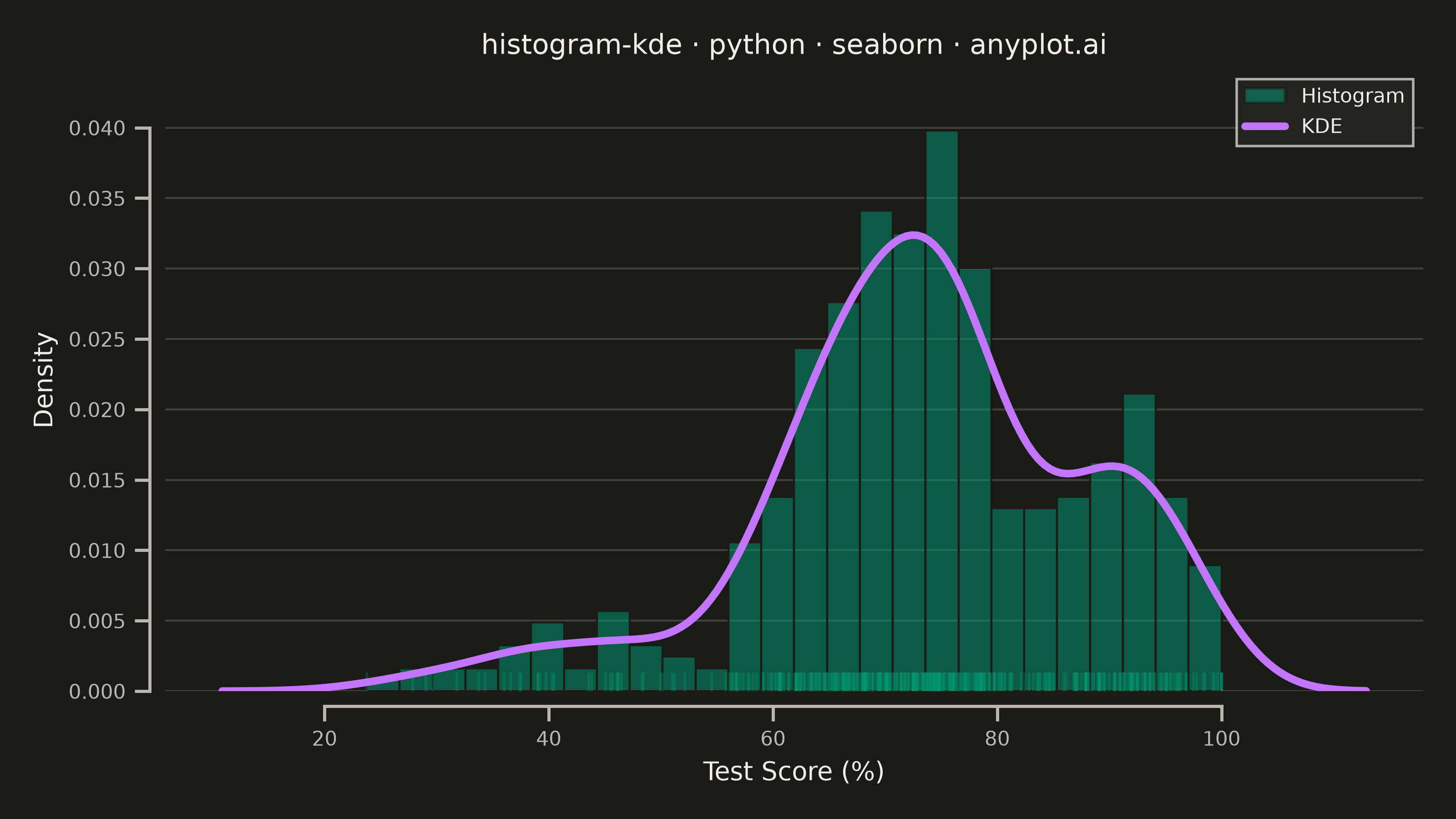
A histogram with kernel density estimate (KDE) overlay combines discrete binning with continuous density estimation to visualize the distribution of continuous data. The histogram bars show frequency counts in each bin while the smooth KDE curve reveals the underlying probability density, making it easier to perceive the true shape of the distribution without binning artifacts.
""" anyplot.ai
histogram-kde: Histogram with KDE Overlay
Library: seaborn 0.13.2 | Python 3.13.14
Quality: 91/100 | Updated: 2026-08-05
"""

import os

import matplotlib.patches as mpatches
import matplotlib.pyplot as plt
import numpy as np
import seaborn as sns
from matplotlib.lines import Line2D


# Theme tokens (see prompts/default-style-guide.md)
THEME = os.getenv("ANYPLOT_THEME", "light")
PAGE_BG = "#FAF8F1" if THEME == "light" else "#1A1A17"
ELEVATED_BG = "#FFFDF6" if THEME == "light" else "#242420"
INK = "#1A1A17" if THEME == "light" else "#F0EFE8"
INK_SOFT = "#4A4A44" if THEME == "light" else "#B8B7B0"

# Imprint palette — first series always #009E73
HISTOGRAM_COLOR = "#009E73"  # brand green
KDE_COLOR = "#C475FD"  # lavender (Imprint position 2)

# Configure seaborn theme with theme-adaptive colors
sns.set_theme(
    style="ticks",
    rc={
        "figure.facecolor": PAGE_BG,
        "axes.facecolor": PAGE_BG,
        "axes.edgecolor": INK_SOFT,
        "axes.labelcolor": INK,
        "text.color": INK,
        "xtick.color": INK_SOFT,
        "ytick.color": INK_SOFT,
        "grid.color": INK,
        "grid.alpha": 0.18,
        "legend.facecolor": ELEVATED_BG,
        "legend.edgecolor": INK_SOFT,
    },
)

# Data: Test score distribution (quality control scenario)
np.random.seed(42)
# Mix of different student performance patterns
test_scores = np.concatenate(
    [
        np.random.normal(72, 8, 300),  # Most students in 60-85 range
        np.random.normal(92, 5, 80),  # High-performing students
        np.random.normal(45, 10, 40),  # Struggling students
    ]
)
test_scores = np.clip(test_scores, 0, 100)  # Bound to valid range
np.random.shuffle(test_scores)

# Plot — canvas locked to figsize x dpi = 3200x1800, see prompts/library/seaborn.md
fig, ax = plt.subplots(figsize=(8, 4.5), dpi=400, facecolor=PAGE_BG)
ax.set_facecolor(PAGE_BG)

# Histogram with semi-transparent bars
sns.histplot(
    test_scores,
    bins=26,
    kde=False,
    stat="density",
    alpha=0.5,
    color=HISTOGRAM_COLOR,
    edgecolor=PAGE_BG,
    linewidth=0.8,
    ax=ax,
    label="Histogram",
)

# Rug plot surfaces the individual observations beneath the histogram
sns.rugplot(test_scores, color=HISTOGRAM_COLOR, alpha=0.3, height=0.03, ax=ax)

# KDE overlay for smooth density curve
sns.kdeplot(test_scores, color=KDE_COLOR, linewidth=3, ax=ax, label="KDE")

# Style
ax.set_xlabel("Test Score (%)", fontsize=10, color=INK)
ax.set_ylabel("Density", fontsize=10, color=INK)
ax.set_title("histogram-kde · python · seaborn · anyplot.ai", fontsize=11, fontweight="medium", color=INK)
ax.tick_params(axis="both", labelsize=8, colors=INK_SOFT)

# Trimmed, offset spines — idiomatic seaborn polish beyond the plain L-frame
sns.despine(ax=ax, offset=6, trim=True)
ax.spines["left"].set_color(INK_SOFT)
ax.spines["bottom"].set_color(INK_SOFT)

# Subtle grid
ax.yaxis.grid(True, alpha=0.18, linewidth=0.8, linestyle="-", color=INK)

# Legend — explicit handles so Histogram (primary, first-drawn series) lists above KDE
legend_handles = [
    mpatches.Patch(facecolor=HISTOGRAM_COLOR, alpha=0.5, edgecolor=PAGE_BG, label="Histogram"),
    Line2D([0], [0], color=KDE_COLOR, linewidth=3, label="KDE"),
]
ax.legend(
    handles=legend_handles,
    frameon=True,
    fancybox=False,
    fontsize=8,
    framealpha=0.95,
    edgecolor=INK_SOFT,
    facecolor=ELEVATED_BG,
)

plt.tight_layout()
output_dir = os.path.dirname(os.path.abspath(__file__))
plt.savefig(os.path.join(output_dir, f"plot-{THEME}.png"), dpi=400, facecolor=PAGE_BG)
Runnable source as JSON, for any HTTP client: https://api.anyplot.ai/specs/histogram-kde/seaborn/code. Any spec id and library id listed in llms-full.txt fit the same URL shape; every URL below is complete and callable.
{
  "spec_id": "histogram-kde",
  "language": "python",
  "library": "seaborn",
  "page": "https://anyplot.ai/histogram-kde/python/seaborn",
  "hub": "https://anyplot.ai/histogram-kde",
  "code_json": "https://api.anyplot.ai/specs/histogram-kde/seaborn/code",
  "spec_json": "https://api.anyplot.ai/specs/histogram-kde",
  "render_light_png": "https://storage.googleapis.com/anyplot-images/plots/histogram-kde/python/seaborn/plot-light.png",
  "render_dark_png": "https://storage.googleapis.com/anyplot-images/plots/histogram-kde/python/seaborn/plot-dark.png",
  "quality_score": 91.0,
  "license": "MIT",
  "guide": "https://anyplot.ai/llms.txt"
}
Part of Histogram with KDE Overlay on anyplot.ai.