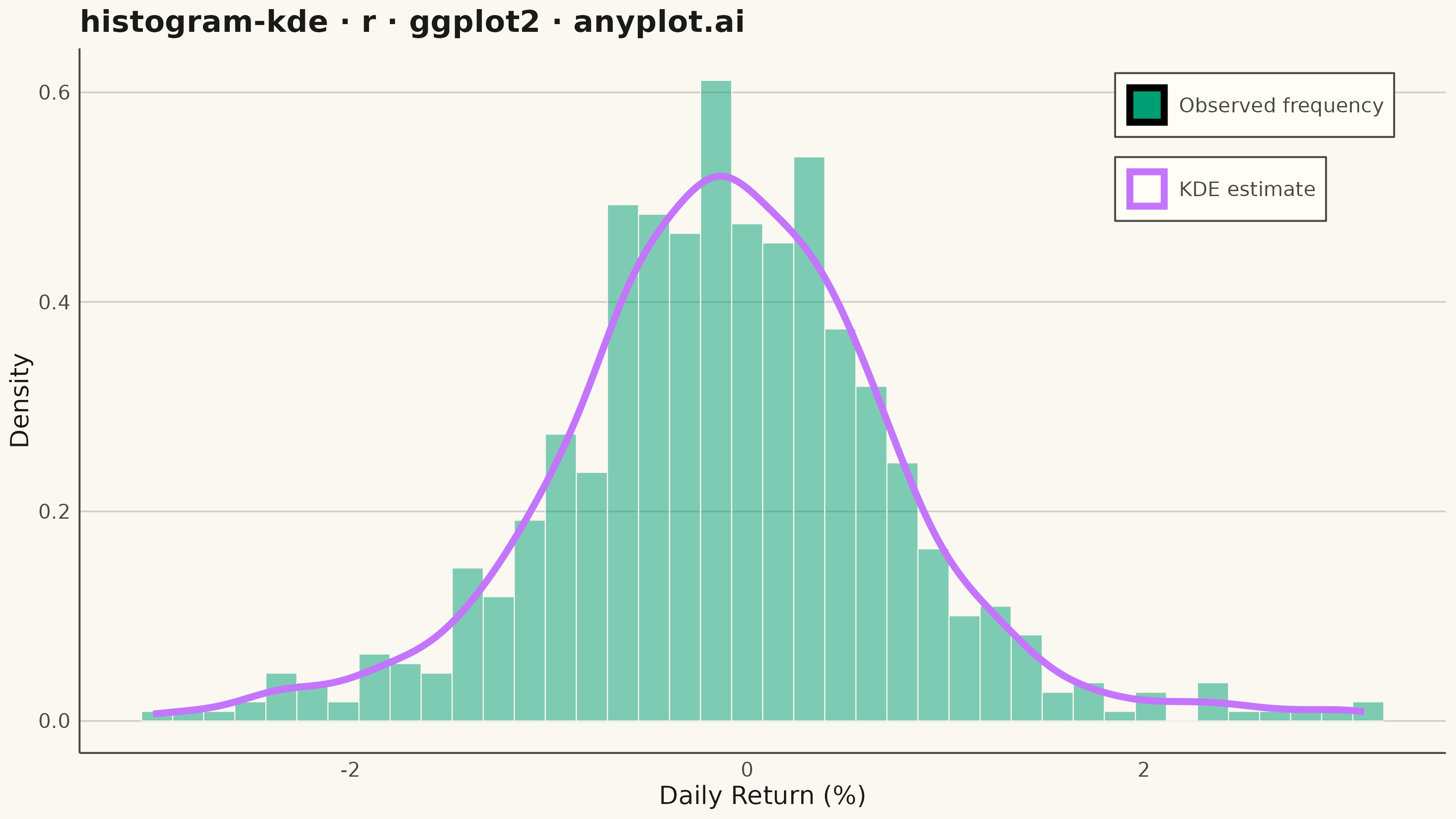
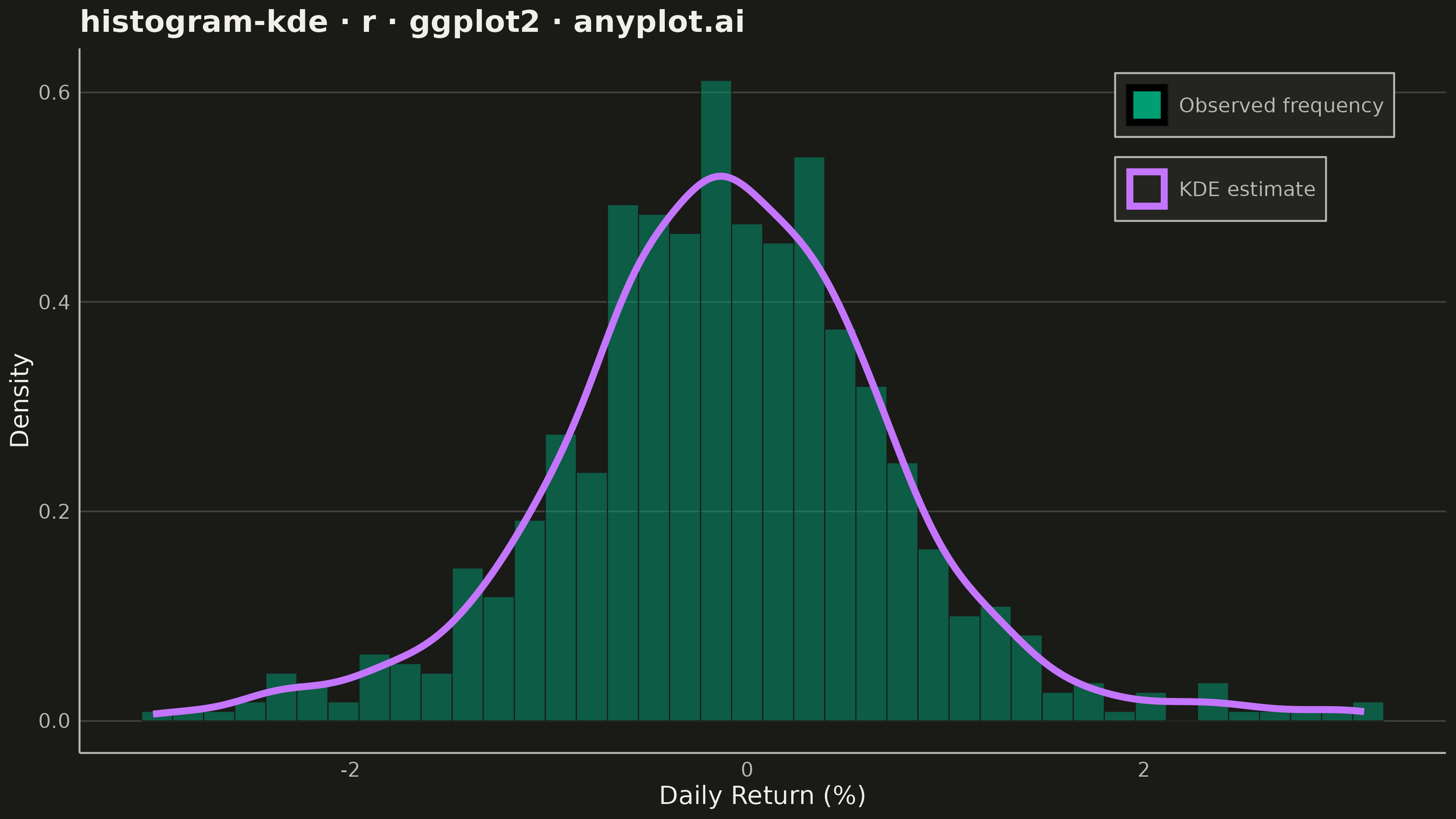
A histogram with kernel density estimate (KDE) overlay combines discrete binning with continuous density estimation to visualize the distribution of continuous data. The histogram bars show frequency counts in each bin while the smooth KDE curve reveals the underlying probability density, making it easier to perceive the true shape of the distribution without binning artifacts.
#' anyplot.ai
#' histogram-kde: Histogram with KDE Overlay
#' Library: ggplot2 3.5.1 | R 4.4.1
#' Quality: 87/100 | Created: 2026-08-05

library(ggplot2)
library(ragg)

set.seed(42)

# --- Theme tokens ------------------------------------------------------------
THEME       <- Sys.getenv("ANYPLOT_THEME", "light")
PAGE_BG     <- if (THEME == "light") "#FAF8F1" else "#1A1A17"
ELEVATED_BG <- if (THEME == "light") "#FFFDF6" else "#242420"
INK         <- if (THEME == "light") "#1A1A17" else "#F0EFE8"
INK_SOFT    <- if (THEME == "light") "#4A4A44" else "#B8B7B0"
# ggplot2 has no grid-line alpha, so blend INK 20% toward PAGE_BG for a subtle tint
GRID_COLOR  <- grDevices::colorRampPalette(c(PAGE_BG, INK))(100)[20]
IMPRINT_PALETTE <- c("#009E73", "#C475FD", "#4467A3", "#BD8233",
                     "#AE3030", "#2ABCCD", "#954477", "#99B314")

# --- Data ----------------------------------------------------------------
# Daily returns of a hypothetical equity index (%) — a Student-t generator
# gives the fat tails and mild negative skew typical of real return series,
# which the histogram bins obscure but the KDE curve reveals cleanly.
n_days <- 700
daily_returns <- (rt(n_days, df = 6) * 0.7 - 0.04 * rchisq(n_days, df = 2))

df <- tibble::tibble(return_pct = daily_returns)

# --- Plot ----------------------------------------------------------------
p <- ggplot(df, aes(x = return_pct)) +
  geom_histogram(
    aes(y = after_stat(density), fill = "Observed frequency"),
    bins = 40, color = PAGE_BG, linewidth = 0.2, alpha = 0.5
  ) +
  geom_density(
    aes(color = "KDE estimate"),
    linewidth = 1.3, adjust = 1.1
  ) +
  scale_fill_manual(name = NULL, values = c("Observed frequency" = IMPRINT_PALETTE[1])) +
  scale_color_manual(name = NULL, values = c("KDE estimate" = IMPRINT_PALETTE[2])) +
  labs(
    title = "histogram-kde · r · ggplot2 · anyplot.ai",
    x = "Daily Return (%)",
    y = "Density"
  ) +
  theme_minimal(base_size = 8) +
  theme(
    plot.background    = element_rect(fill = PAGE_BG, color = PAGE_BG),
    panel.background   = element_rect(fill = PAGE_BG, color = NA),
    panel.grid.major.x = element_blank(),
    panel.grid.minor.x = element_blank(),
    panel.grid.major.y = element_line(color = GRID_COLOR, linewidth = 0.3),
    panel.grid.minor.y = element_blank(),
    axis.title              = element_text(color = INK, size = 10),
    axis.text               = element_text(color = INK_SOFT, size = 8),
    axis.line               = element_line(color = INK_SOFT),
    plot.title               = element_text(color = INK, size = 12, face = "bold"),
    legend.position          = "inside",
    legend.position.inside   = c(0.86, 0.86),
    legend.background        = element_rect(fill = ELEVATED_BG, color = INK_SOFT),
    legend.text              = element_text(color = INK_SOFT, size = 8),
    legend.title             = element_blank(),
    legend.key               = element_rect(fill = ELEVATED_BG, color = NA)
  )

# --- Save --------------------------------------------------------------
ggsave(
  filename = sprintf("plot-%s.png", THEME),
  plot     = p,
  device   = ragg::agg_png,
  width    = 8,
  height   = 4.5,
  units    = "in",
  dpi      = 400
)
Runnable source as JSON, for any HTTP client: https://api.anyplot.ai/specs/histogram-kde/ggplot2/code. Any spec id and library id listed in llms-full.txt fit the same URL shape; every URL below is complete and callable.
{
  "spec_id": "histogram-kde",
  "language": "r",
  "library": "ggplot2",
  "page": "https://anyplot.ai/histogram-kde/r/ggplot2",
  "hub": "https://anyplot.ai/histogram-kde",
  "code_json": "https://api.anyplot.ai/specs/histogram-kde/ggplot2/code",
  "spec_json": "https://api.anyplot.ai/specs/histogram-kde",
  "render_light_png": "https://storage.googleapis.com/anyplot-images/plots/histogram-kde/r/ggplot2/plot-light.png",
  "render_dark_png": "https://storage.googleapis.com/anyplot-images/plots/histogram-kde/r/ggplot2/plot-dark.png",
  "quality_score": 87.0,
  "license": "MIT",
  "guide": "https://anyplot.ai/llms.txt"
}
Part of Histogram with KDE Overlay on anyplot.ai.