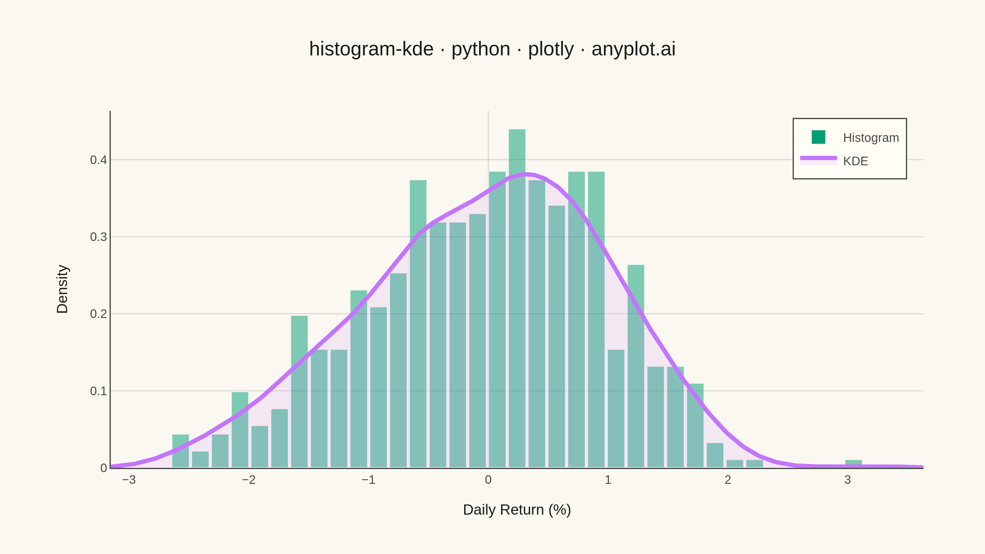
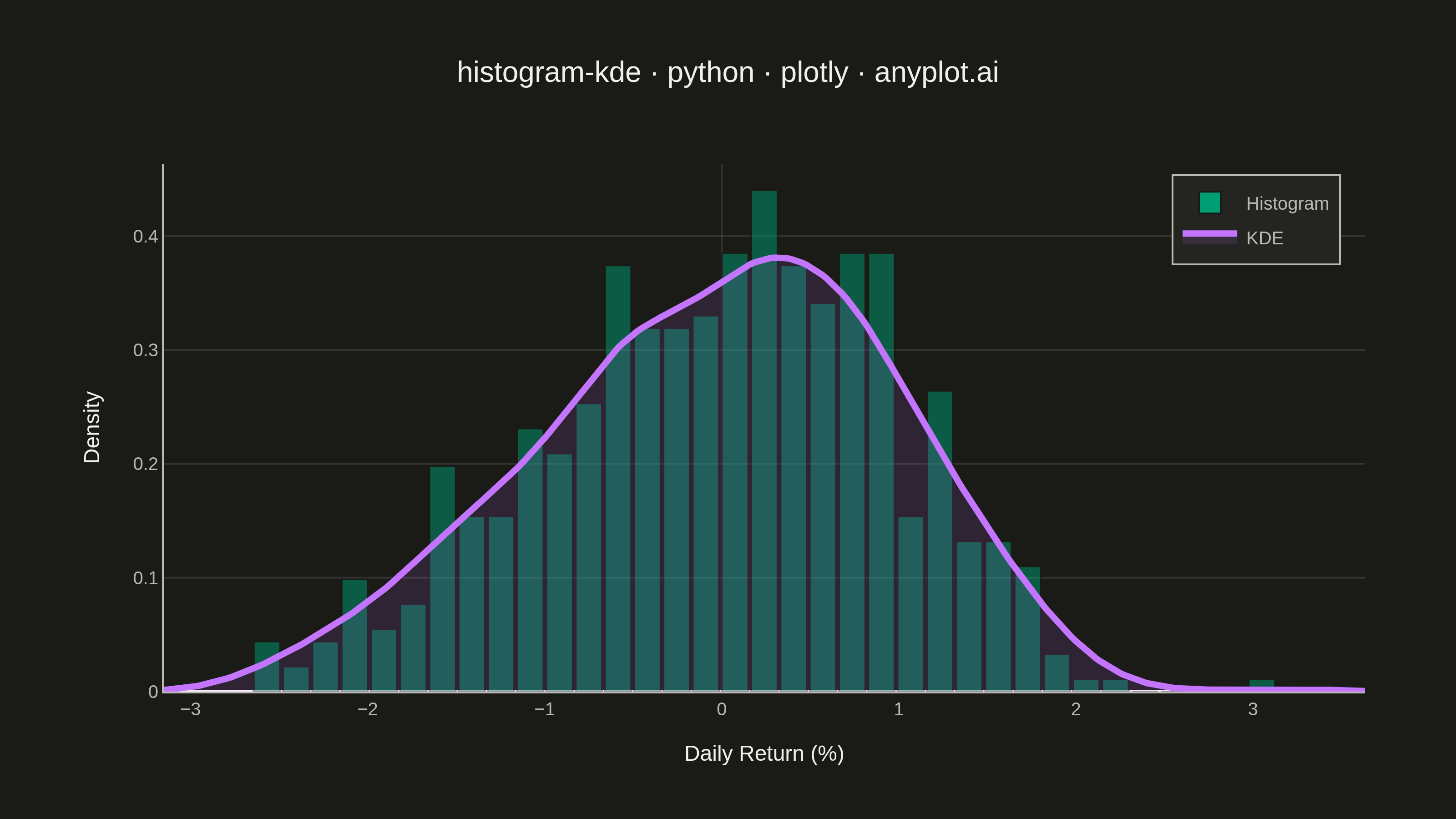
A histogram with kernel density estimate (KDE) overlay combines discrete binning with continuous density estimation to visualize the distribution of continuous data. The histogram bars show frequency counts in each bin while the smooth KDE curve reveals the underlying probability density, making it easier to perceive the true shape of the distribution without binning artifacts.
""" anyplot.ai
histogram-kde: Histogram with KDE Overlay
Library: plotly 6.9.0 | Python 3.13.14
Quality: 87/100 | Updated: 2026-08-05
"""

import os

import numpy as np
import plotly.graph_objects as go
from scipy import stats


# Theme tokens (see prompts/default-style-guide.md)
THEME = os.getenv("ANYPLOT_THEME", "light")
PAGE_BG = "#FAF8F1" if THEME == "light" else "#1A1A17"
ELEVATED_BG = "#FFFDF6" if THEME == "light" else "#242420"
INK = "#1A1A17" if THEME == "light" else "#F0EFE8"
INK_SOFT = "#4A4A44" if THEME == "light" else "#B8B7B0"
GRID = "rgba(26,26,23,0.12)" if THEME == "light" else "rgba(240,239,232,0.12)"

BRAND = "#009E73"  # Imprint palette position 1 — first series
KDE_COLOR = "#C475FD"  # Imprint palette position 2
# Fill is a touch stronger on dark so it doesn't read as pure background there
KDE_FILL = "rgba(196,117,253,0.12)" if THEME == "light" else "rgba(196,117,253,0.22)"

# Data - Stock returns simulation with realistic distribution
np.random.seed(42)
# Mix of normal returns with slight negative skew (typical for stock returns)
returns = np.concatenate(
    [
        np.random.normal(0.05, 0.8, 400),  # Main distribution
        np.random.normal(-1.5, 0.5, 80),  # Left tail (market drops)
        np.random.normal(1.2, 0.4, 70),  # Right tail (gains)
    ]
)
# Shuffle to mix
np.random.shuffle(returns)

# Calculate KDE (plotly has no built-in KDE, so scipy provides the smooth curve)
kde = stats.gaussian_kde(returns)
x_kde = np.linspace(returns.min() - 0.5, returns.max() + 0.5, 300)
y_kde = kde(x_kde)

# Create figure
fig = go.Figure()

# Native histogram trace (density-normalized) instead of manual np.histogram
# binning, edge matches page background for subtle bar separation
fig.add_trace(
    go.Histogram(
        x=returns,
        histnorm="probability density",
        nbinsx=35,
        marker={"color": BRAND, "opacity": 0.5, "line": {"color": PAGE_BG, "width": 1}},
        name="Histogram",
        hovertemplate="Return: %{x:.2f}%<br>Density: %{y:.3f}<extra></extra>",
    )
)

# Add KDE curve with a soft fill to reveal the density shape at a glance
fig.add_trace(
    go.Scatter(
        x=x_kde,
        y=y_kde,
        mode="lines",
        line={"color": KDE_COLOR, "width": 3.5},
        fill="tozeroy",
        fillcolor=KDE_FILL,
        name="KDE",
        hovertemplate="Return: %{x:.2f}%<br>Density: %{y:.3f}<extra></extra>",
    )
)

# Update layout for 3200x1800 px canvas
fig.update_layout(
    autosize=False,
    title={
        "text": "histogram-kde · python · plotly · anyplot.ai",
        "font": {"size": 16, "color": INK},
        "x": 0.5,
        "xanchor": "center",
    },
    xaxis={
        "title": {"text": "Daily Return (%)", "font": {"size": 12, "color": INK}},
        "tickfont": {"size": 10, "color": INK_SOFT},
        "showgrid": False,
        "zeroline": True,
        "zerolinecolor": GRID,
        "zerolinewidth": 1,
        "linecolor": INK_SOFT,
        "showspikes": True,
        "spikecolor": INK_SOFT,
        "spikethickness": 1,
        "spikemode": "across",
        "spikesnap": "cursor",
    },
    yaxis={
        "title": {"text": "Density", "font": {"size": 12, "color": INK}},
        "tickfont": {"size": 10, "color": INK_SOFT},
        "gridcolor": GRID,
        "gridwidth": 1,
        "linecolor": INK_SOFT,
    },
    paper_bgcolor=PAGE_BG,
    plot_bgcolor=PAGE_BG,
    legend={
        "font": {"size": 10, "color": INK_SOFT},
        "x": 0.98,
        "y": 0.98,
        "xanchor": "right",
        "yanchor": "top",
        "bgcolor": ELEVATED_BG,
        "borderwidth": 0,
    },
    margin={"l": 90, "r": 50, "t": 90, "b": 70},
    bargap=0.05,
    hovermode="x unified",
)

# Callouts naming the two tail components so the skew/tail story the
# spec calls out is explicit, not just visible in the shape
fig.add_annotation(
    x=-1.5,
    y=float(kde(-1.5)[0]),
    text="Left tail: market drops",
    showarrow=True,
    arrowhead=2,
    arrowcolor=INK_SOFT,
    ax=-10,
    ay=-45,
    font={"size": 10, "color": INK_SOFT},
)
fig.add_annotation(
    x=1.2,
    y=float(kde(1.2)[0]),
    text="Right tail: gains",
    showarrow=True,
    arrowhead=2,
    arrowcolor=INK_SOFT,
    ax=25,
    ay=-45,
    font={"size": 10, "color": INK_SOFT},
)

# Save as PNG and HTML
fig.write_image(f"plot-{THEME}.png", width=800, height=450, scale=4)
fig.write_html(f"plot-{THEME}.html", include_plotlyjs="cdn")
Runnable source as JSON, for any HTTP client: https://api.anyplot.ai/specs/histogram-kde/plotly/code. Any spec id and library id listed in llms-full.txt fit the same URL shape; every URL below is complete and callable.
{
  "spec_id": "histogram-kde",
  "language": "python",
  "library": "plotly",
  "page": "https://anyplot.ai/histogram-kde/python/plotly",
  "hub": "https://anyplot.ai/histogram-kde",
  "code_json": "https://api.anyplot.ai/specs/histogram-kde/plotly/code",
  "spec_json": "https://api.anyplot.ai/specs/histogram-kde",
  "render_light_png": "https://storage.googleapis.com/anyplot-images/plots/histogram-kde/python/plotly/plot-light.png",
  "render_dark_png": "https://storage.googleapis.com/anyplot-images/plots/histogram-kde/python/plotly/plot-dark.png",
  "interactive_light_html": "https://storage.googleapis.com/anyplot-images/plots/histogram-kde/python/plotly/plot-light.html",
  "interactive_dark_html": "https://storage.googleapis.com/anyplot-images/plots/histogram-kde/python/plotly/plot-dark.html",
  "quality_score": 87.0,
  "license": "MIT",
  "guide": "https://anyplot.ai/llms.txt"
}
Part of Histogram with KDE Overlay on anyplot.ai.