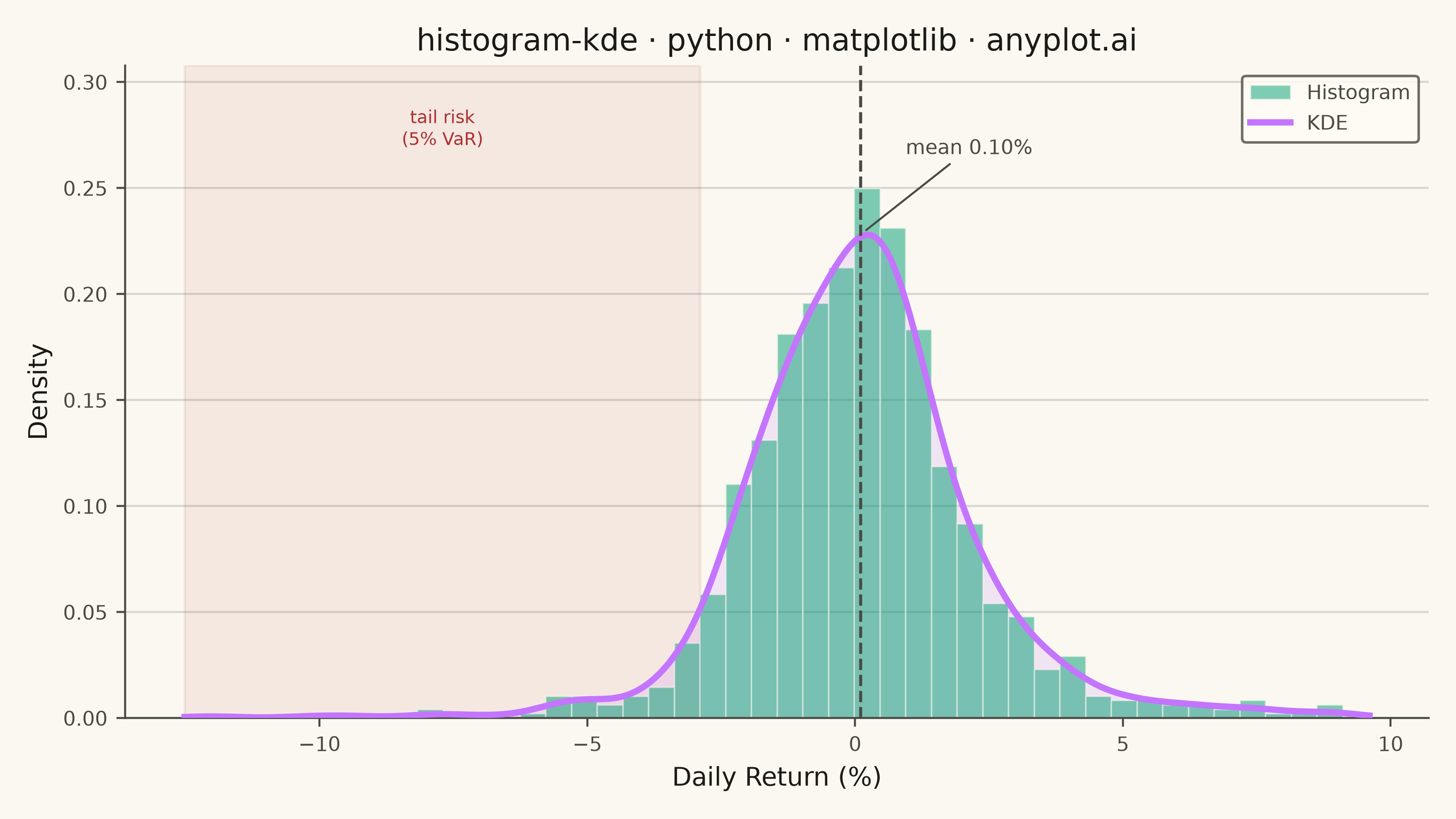
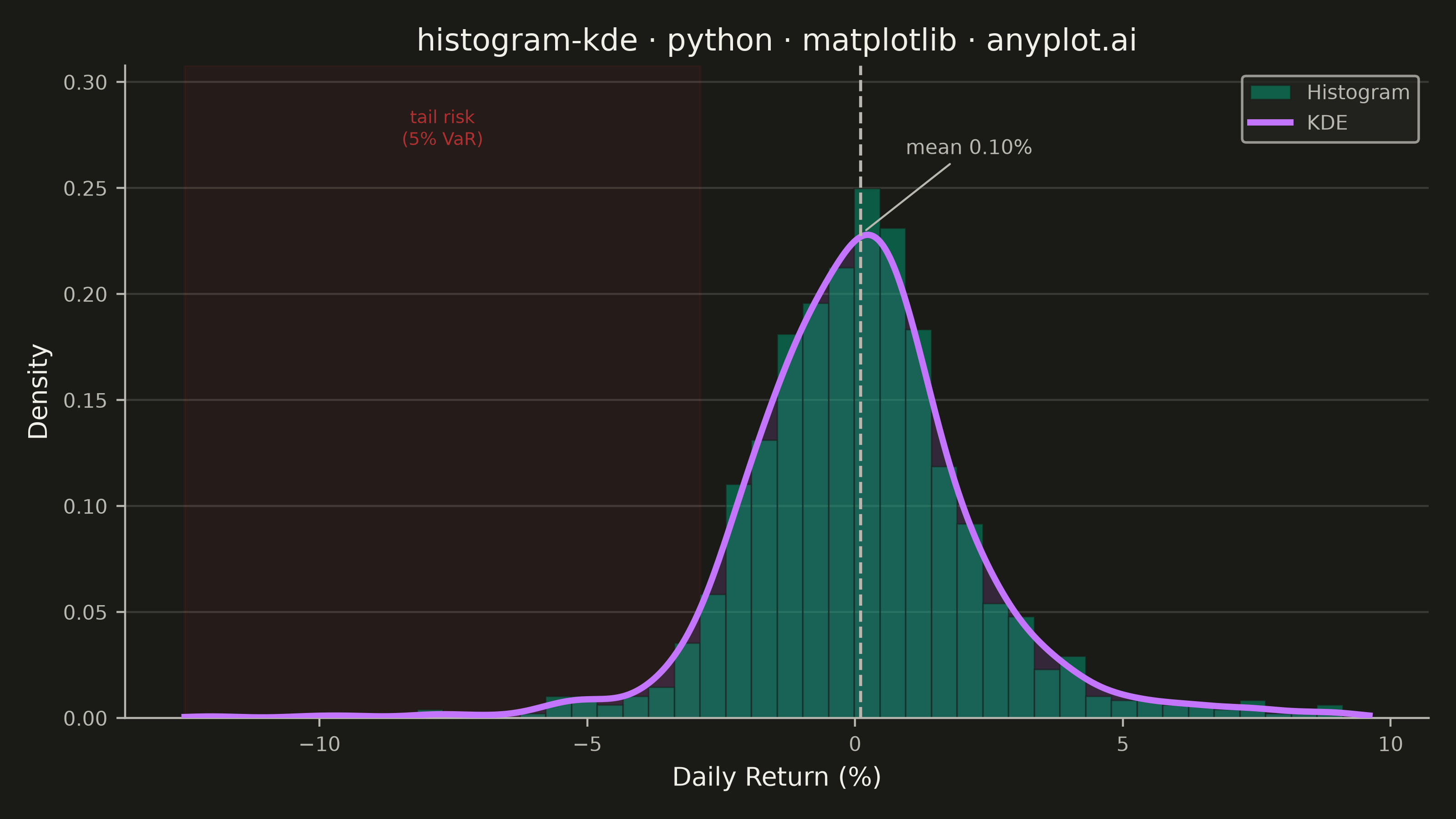
A histogram with kernel density estimate (KDE) overlay combines discrete binning with continuous density estimation to visualize the distribution of continuous data. The histogram bars show frequency counts in each bin while the smooth KDE curve reveals the underlying probability density, making it easier to perceive the true shape of the distribution without binning artifacts.
""" anyplot.ai
histogram-kde: Histogram with KDE Overlay
Library: matplotlib 3.11.1 | Python 3.13.14
Quality: 94/100 | Updated: 2026-08-05
"""

import os

import matplotlib.pyplot as plt
import numpy as np
from scipy.stats import gaussian_kde


# Theme tokens (see prompts/default-style-guide.md "Background" + "Theme-adaptive Chrome")
THEME = os.getenv("ANYPLOT_THEME", "light")
PAGE_BG = "#FAF8F1" if THEME == "light" else "#1A1A17"
ELEVATED_BG = "#FFFDF6" if THEME == "light" else "#242420"
INK = "#1A1A17" if THEME == "light" else "#F0EFE8"
INK_SOFT = "#4A4A44" if THEME == "light" else "#B8B7B0"
BRAND = "#009E73"  # Imprint palette position 1 — ALWAYS first series
ACCENT = "#C475FD"  # Imprint palette position 2 — KDE curve

# Data - simulate stock daily returns blending calm, volatile, and tail-risk regimes
np.random.seed(42)
normal_returns = np.random.normal(0.0005, 0.015, 800)
volatile_returns = np.random.normal(-0.002, 0.035, 150)
extreme_returns = np.random.normal(0.001, 0.05, 50)
returns = np.concatenate([normal_returns, volatile_returns, extreme_returns]) * 100
np.random.shuffle(returns)
mean_return = returns.mean()
var_5 = np.percentile(returns, 5)  # 5% Value-at-Risk — marks the downside tail

# Plot — see default-style-guide.md "Visual Sizing Defaults" for the canvas + sizing values
fig, ax = plt.subplots(figsize=(8, 4.5), dpi=400, facecolor=PAGE_BG)
ax.set_facecolor(PAGE_BG)

# Shade the downside tail-risk region (below the 5% VaR threshold) behind
# everything else, using the matte-red semantic anchor reserved for loss/risk
ax.axvspan(returns.min() - 0.5, var_5, color="#AE3030", alpha=0.08, zorder=0)

# Histogram with density scaling (semi-transparent, brand color)
ax.hist(
    returns,
    bins=44,
    density=True,
    alpha=0.5,
    color=BRAND,
    edgecolor=PAGE_BG,
    linewidth=0.6,
    label="Histogram",
    zorder=2,
)

# KDE overlay using scipy, with a soft fill to give the curve visual weight
# and separate it from the discrete bars beneath it
kde = gaussian_kde(returns)
x_range = np.linspace(returns.min() - 0.5, returns.max() + 0.5, 500)
kde_values = kde(x_range)
peak_density = kde_values.max()
ax.fill_between(x_range, kde_values, color=ACCENT, alpha=0.15, zorder=1)
ax.plot(x_range, kde_values, color=ACCENT, linewidth=2.5, label="KDE", zorder=3)

# Headroom above the KDE peak so callouts never overlap the curve
y_top = peak_density * 1.35
ax.set_ylim(0, y_top)

# Tail-risk callout inside the shaded region, clear of the histogram/KDE
ax.text(
    (returns.min() - 0.5 + var_5) / 2,
    y_top * 0.94,
    "tail risk\n(5% VaR)",
    fontsize=7,
    color="#AE3030",
    ha="center",
    va="top",
    linespacing=1.3,
)

# Mean reference line — draws the eye to the distribution's center of mass.
# The label sits well above the KDE peak with a short leader line so it
# never crowds the curve's apex.
ax.axvline(mean_return, color=INK_SOFT, linewidth=1.2, linestyle="--", zorder=4)
ax.annotate(
    f"mean {mean_return:.2f}%",
    xy=(mean_return, peak_density),
    xytext=(18, 30),
    textcoords="offset points",
    fontsize=8,
    color=INK_SOFT,
    ha="left",
    va="bottom",
    arrowprops={"arrowstyle": "-", "color": INK_SOFT, "linewidth": 0.8, "shrinkA": 0, "shrinkB": 3},
)

# Style
title = "histogram-kde · python · matplotlib · anyplot.ai"
ax.set_xlabel("Daily Return (%)", fontsize=10, color=INK)
ax.set_ylabel("Density", fontsize=10, color=INK)
ax.set_title(title, fontsize=12, fontweight="medium", color=INK)
ax.tick_params(axis="both", labelsize=8, colors=INK_SOFT)
ax.legend(fontsize=8, loc="upper right")
leg = ax.get_legend()
if leg:
    leg.get_frame().set_facecolor(ELEVATED_BG)
    leg.get_frame().set_edgecolor(INK_SOFT)
    plt.setp(leg.get_texts(), color=INK_SOFT)
ax.spines["top"].set_visible(False)
ax.spines["right"].set_visible(False)
for s in ("left", "bottom"):
    ax.spines[s].set_color(INK_SOFT)
ax.yaxis.grid(True, alpha=0.15, linewidth=0.8, color=INK)

# Save
plt.tight_layout()
plt.savefig(f"plot-{THEME}.png", dpi=400, facecolor=PAGE_BG)
Runnable source as JSON, for any HTTP client: https://api.anyplot.ai/specs/histogram-kde/matplotlib/code. Any spec id and library id listed in llms-full.txt fit the same URL shape; every URL below is complete and callable.
{
  "spec_id": "histogram-kde",
  "language": "python",
  "library": "matplotlib",
  "page": "https://anyplot.ai/histogram-kde/python/matplotlib",
  "hub": "https://anyplot.ai/histogram-kde",
  "code_json": "https://api.anyplot.ai/specs/histogram-kde/matplotlib/code",
  "spec_json": "https://api.anyplot.ai/specs/histogram-kde",
  "render_light_png": "https://storage.googleapis.com/anyplot-images/plots/histogram-kde/python/matplotlib/plot-light.png",
  "render_dark_png": "https://storage.googleapis.com/anyplot-images/plots/histogram-kde/python/matplotlib/plot-dark.png",
  "quality_score": 94.0,
  "license": "MIT",
  "guide": "https://anyplot.ai/llms.txt"
}
Part of Histogram with KDE Overlay on anyplot.ai.